Amazing near or how to make fun of stock analysts (using Excel)
From channels like CNBC, people in suits and expensive accessories broadcast with an intelligent look about the alleged movement of a particular course. As a visual aid, they use course graphs with lines of various indicators and technical analysis figures drawn on top of them.
The indicator (in the context of this article) is just some function over the price. For example, moving average (moving average). There are hundreds of different indicators.
A technical analysis figure is some well-known pattern, for example, a triangle, a double bottom, a head and shoulders. These figures are also hundreds.
The “science” of technical analysis links these or other combinations of indicators and figures with the likely future course behavior. For example, if a course crossed a moving average over 10 days, touched an average over 100 days, and with its appearance resembles the Flag figure, then the course “probably” will go there.
')
There are a lot of analysts, and they give different forecasts, and given that the course can only go up or down, there is always a large set of analysts who claim that they have conducted the “correct analysis”.
Perhaps you also think that these stock market analysts, some very smart people. I will try to dispel this view.
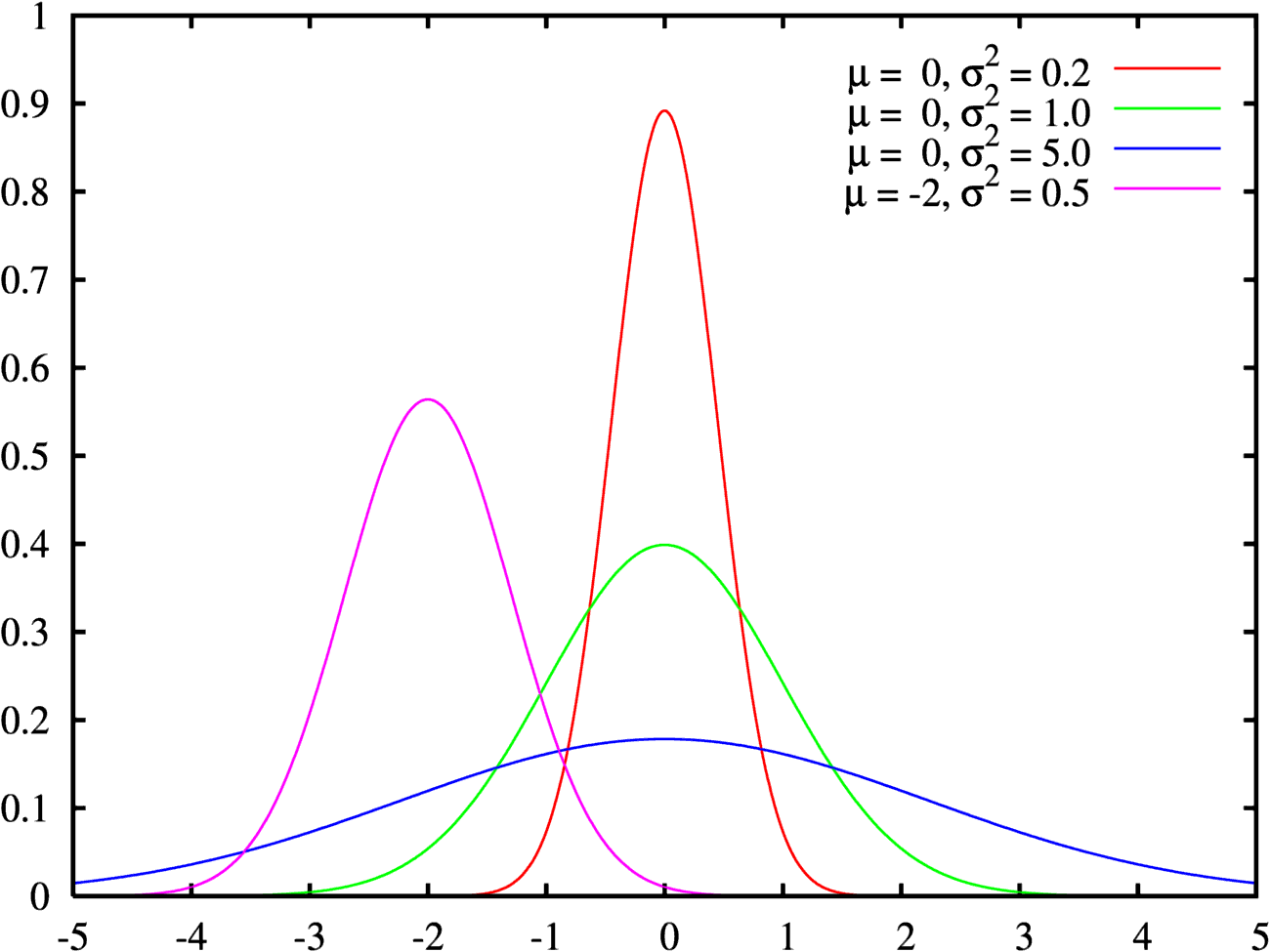
For a start, the question is: let's say we have 1000 values of a random variable distributed according to a normal law, with a mean of 0 and variance 1. (The green curve in the picture):
These values will be positive and negative, more or less symmetrical about 0, and usually not more than 3x, not less than -3x
If you plot these values, you get something like a band from 3 to -3.
And if now we make a series of sums:
Amount 1 to 2
Amount 1 to 3
Amount 1 to 4
...
Amount 1 to 1000
What do you think the schedule for these amounts will look like?
Logically, one can say “well, symmetrically distributed positive and negative numbers are right there. The graph of the amounts will resemble the graph of the original random variable - something that fluctuates around 0 "
Do you think so too?
If yes, then let's take Excel and check.
For a start, take random data (you can generate it in Excel)
Now hold the amounts.
And now the schedule. How do you like the result? They did not expect?
Generate new data, how do you like the new schedule?
Well, now you can to a familiar analyst. Do not say that these are random variables, say that they are some kind of action and need help with technical analysis.
Enjoy “smart” reasoning about “obvious” trends, trend reversals, rebounds and breakthroughs.
If someone is interested in the theory, then it is necessary to google "wandering a point on a straight line" and the "arcsine theorem".
For the lazy - sample graphs:


The indicator (in the context of this article) is just some function over the price. For example, moving average (moving average). There are hundreds of different indicators.
A technical analysis figure is some well-known pattern, for example, a triangle, a double bottom, a head and shoulders. These figures are also hundreds.
The “science” of technical analysis links these or other combinations of indicators and figures with the likely future course behavior. For example, if a course crossed a moving average over 10 days, touched an average over 100 days, and with its appearance resembles the Flag figure, then the course “probably” will go there.
')
There are a lot of analysts, and they give different forecasts, and given that the course can only go up or down, there is always a large set of analysts who claim that they have conducted the “correct analysis”.
Perhaps you also think that these stock market analysts, some very smart people. I will try to dispel this view.
For a start, the question is: let's say we have 1000 values of a random variable distributed according to a normal law, with a mean of 0 and variance 1. (The green curve in the picture):
These values will be positive and negative, more or less symmetrical about 0, and usually not more than 3x, not less than -3x
If you plot these values, you get something like a band from 3 to -3.
And if now we make a series of sums:
Amount 1 to 2
Amount 1 to 3
Amount 1 to 4
...
Amount 1 to 1000
What do you think the schedule for these amounts will look like?
Logically, one can say “well, symmetrically distributed positive and negative numbers are right there. The graph of the amounts will resemble the graph of the original random variable - something that fluctuates around 0 "
Do you think so too?
If yes, then let's take Excel and check.
For a start, take random data (you can generate it in Excel)
Now hold the amounts.
And now the schedule. How do you like the result? They did not expect?
Generate new data, how do you like the new schedule?
Well, now you can to a familiar analyst. Do not say that these are random variables, say that they are some kind of action and need help with technical analysis.
Enjoy “smart” reasoning about “obvious” trends, trend reversals, rebounds and breakthroughs.
If someone is interested in the theory, then it is necessary to google "wandering a point on a straight line" and the "arcsine theorem".
For the lazy - sample graphs:
Source: https://habr.com/ru/post/126421/
All Articles