W3C Digest. What's new in CSS3. Release 3
The CSS3 working group is constantly having discussions about what will be in the new standard. Sometimes wild imagination and the desire to do everything as cool as possible, leads developers into a dead end.
Previous part here
')
It seems that one of the major problems for the CSS3 Animations module will be objects that have
In this specification, properties that cannot be iterated are ignored. However, there is an example when you should not do this. Suppose there is a block, if you assign it a certain class of
The code should be:
However, if the
But, if you specify the following code for the animation declaration
and not to ignore uniterated properties, it turns out quite logical picture. If the browser has no idea what animation is, then it will simply hide the block, since the
This is not the first problem with the animation of hidden objects, and not the last.
To simplify the gradient syntax, a new
instead
For conventional encoders, the first option, of course, is many times more convenient than the second.
Another very useful suggestion has been made for 2D and 3D transformation modules. Suppose we have a square. We turn it 45 degrees and get a diamond. The user clicks on the diamond, and we need to know which coordinates of the click are relative to the diamond, and not the entire window. Here can help out the division into events that were hung on the
This week everything, thank you for your attention!
Previous part here
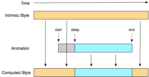
Hidden object animation
')
It seems that one of the major problems for the CSS3 Animations module will be objects that have
display: none and visibility: hidden .In this specification, properties that cannot be iterated are ignored. However, there is an example when you should not do this. Suppose there is a block, if you assign it a certain class of
hidden , then it should smoothly dissolve and completely get out of the stream. It is quite normal behavior, which is already present in many JS-libraries.The code should be:
div { display:block; } div.hidden { display:none; animation: slide-out 1s 1; } However, if the
display:none property is specified, there will be no animation. Well right, who needs animation for hidden objects?But, if you specify the following code for the animation declaration
@keyframes slide-out { 0% { display:block; opacity: 1; } 100% { display:none; opacity:0; } } and not to ignore uniterated properties, it turns out quite logical picture. If the browser has no idea what animation is, then it will simply hide the block, since the
display:none rule in div.hidden will work. If there is animation support, then at the beginning of the animation the value of the property as a block will be returned to the block , the opacity property will be iterated, and at the end the block will be hidden.This is not the first problem with the animation of hidden objects, and not the last.
Gradients will become easier?
To simplify the gradient syntax, a new
transparent keyword was proposed so that you can write it like this: linear-gradient(red, transparent, blue); instead
linear-gradient(red, rgba(255,0,0,0) 50%, rgba(0,0,255,0) 50%, blue); For conventional encoders, the first option, of course, is many times more convenient than the second.
Where did you click?
Another very useful suggestion has been made for 2D and 3D transformation modules. Suppose we have a square. We turn it 45 degrees and get a diamond. The user clicks on the diamond, and we need to know which coordinates of the click are relative to the diamond, and not the entire window. Here can help out the division into events that were hung on the
window and document 'a events. In the first case, the behavior remains as the prediction, the click coordinates are relative to the window, and in the second case, they are taken in relative coordinates of the element. This edge is necessary for the further development of these modules, otherwise for calculating the coordinates, it will be necessary to constantly apply complex calculations on JavaScript.This week everything, thank you for your attention!
Source: https://habr.com/ru/post/125297/
All Articles