How to make one website for all devices (Responsive Web Design)
Yesterday a good article “ Web Design. Each device has its own idea . ” Despite some good thoughts, unfortunately, the conclusion in it is rather stupid. Namely:
“You need to determine which devices your visitors can use, work out and create a presentation of your site for these devices, determine the device by checking the browser headers , and send the most appropriate presentation .”
First, no one can predict what devices your visitors will use. We need to focus not on the device, but on the resolution.
')
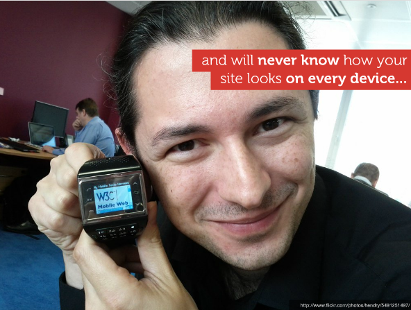
This is a screenshot from the “ Beyond the mobile web by yiibu ” presentation (highly recommended).
Secondly, if you are not facebook or yandex, most likely you will not pull the creation and support of different versions of the site for each device. Yes, and it does not make much sense. Because the situation becomes similar to the reality of fifteen years ago. Then they made the site “under the browser”, and now the author suggests making the site “under the device”.
The questions raised by the author of the above article have been thought over for quite some time in the civilized world, and, moreover, they have already been solved.
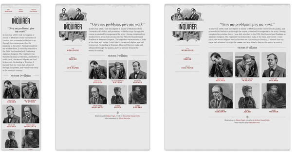
Now you can make 1 site with a single layout that will work on devices, starting with phones, ending with huge TVs. For example, yiibu.com or alistapart.com (reduce the browser window):

Responsive consists of the following techniques:
The main idea is a formula for calculating proportions in percent “target / context = result”. For example, we have a psd layout with a width of 1000px. It has two blocks: one on the left 270px wide, the other on the right 730px. We make them like this:
If there is another block inside the left column and, say, on the layout it is 170px wide, then the target and context will change for it, and the code will look like this:
On Habré was the translation of the original article Ethan Marcotte "Fluid Grids" .
Adjust their size under the parent unit. The basic idea is in the non-obvious application of the {max-width: 100%} property. An image with img {max-width: 100%} will never crawl out of its parent block.
If the parent block is smaller than the img size, the image will be proportionally reduced. This principle applies to both img and embed, object, video.
Detailed original article "Fluid Images" .
We need to display a layout that is optimized for the resolution from which this site currently looks. This is part of the CSS standard that allows you to apply styles based on device resolution information.
For example:
media queries are understood by all reasonable browsers . For ie, there is Respond.js
This is the technique in which the site is made up first for devices with lower capabilities, and then with the help of media queries, features and buns are added.
So stupid browsers without media queries will get the simplest content (for example, on mobile phones). And the more advanced ones will understand and draw the page, taking into account media queries.
Read more about Mobile first
1. Russian-language blog about Responsive Web Design
2. The only good book on this topic is Responsive Web Design . Written by Ethan Marcotte, which in general laid the foundation for adaptive layouts. After reading it, much will become clear.

“You need to determine which devices your visitors can use, work out and create a presentation of your site for these devices, determine the device by checking the browser headers , and send the most appropriate presentation .”
Why is it stupid
First, no one can predict what devices your visitors will use. We need to focus not on the device, but on the resolution.
')
This is a screenshot from the “ Beyond the mobile web by yiibu ” presentation (highly recommended).
Secondly, if you are not facebook or yandex, most likely you will not pull the creation and support of different versions of the site for each device. Yes, and it does not make much sense. Because the situation becomes similar to the reality of fifteen years ago. Then they made the site “under the browser”, and now the author suggests making the site “under the device”.
How to make one website for all devices
The questions raised by the author of the above article have been thought over for quite some time in the civilized world, and, moreover, they have already been solved.
Now you can make 1 site with a single layout that will work on devices, starting with phones, ending with huge TVs. For example, yiibu.com or alistapart.com (reduce the browser window):
All this is called “Responsive Web Design”
Responsive consists of the following techniques:
Proportional rubber layout (fluid grid)
The main idea is a formula for calculating proportions in percent “target / context = result”. For example, we have a psd layout with a width of 1000px. It has two blocks: one on the left 270px wide, the other on the right 730px. We make them like this:
.leftcolumn {
width : 27 % ; / * 270px / 1000px = 0.27 * /
float : left ;
}
.rightcolumn {
width : 73 % ; / * 730px / 1000px = 0.73 * /
float : right ;
}
If there is another block inside the left column and, say, on the layout it is 170px wide, then the target and context will change for it, and the code will look like this:
.leftcolumn .some-div {
width : 62 , 962963 % ; / * 170px / 270px = 0.62962963 * /
float : left ;
}
On Habré was the translation of the original article Ethan Marcotte "Fluid Grids" .
Rubber images (fluid images)
Adjust their size under the parent unit. The basic idea is in the non-obvious application of the {max-width: 100%} property. An image with img {max-width: 100%} will never crawl out of its parent block.
If the parent block is smaller than the img size, the image will be proportionally reduced. This principle applies to both img and embed, object, video.
Detailed original article "Fluid Images" .
Media queries
We need to display a layout that is optimized for the resolution from which this site currently looks. This is part of the CSS standard that allows you to apply styles based on device resolution information.
For example:
/ * start css * /
Here are the basic styles for stupid browsers. For example , for phones not high-end level. Pocket Internet Explorer for Windows Mobile 6.5 is here :) .
@media only screen and (min-width: 480px) {
Here, the styles are more reasonable , but still mobile. Android , iPhone and so on.
}
@media only screen and (min-width: 768px) {
Tablets in portrait mode.
}
@media only screen and (min-width: 992px) {
Tablets in landscape mode , netbooks , laptops , desktop.
}
@media only screen and (min-width: 1382px) {
High resolution desktop , televisions.
}
/ * end of css * /
media queries are understood by all reasonable browsers . For ie, there is Respond.js
Mobile first
This is the technique in which the site is made up first for devices with lower capabilities, and then with the help of media queries, features and buns are added.
So stupid browsers without media queries will get the simplest content (for example, on mobile phones). And the more advanced ones will understand and draw the page, taking into account media queries.
Read more about Mobile first
Links
1. Russian-language blog about Responsive Web Design
2. The only good book on this topic is Responsive Web Design . Written by Ethan Marcotte, which in general laid the foundation for adaptive layouts. After reading it, much will become clear.
Source: https://habr.com/ru/post/125247/
All Articles