10 scientifically based tips on how to use websites

Many sources share with us countless tips and techniques on how to use websites. And although many of these tips are logical and taken seriously by us, we still try to find confirmation in real life and in other sources in order to rely on these theories.
This article discusses such research findings in the field of web site usage opportunities, such as research and eye movement tracking reports (I-tracking) to improve web site usage. You will see that these are common sense tips and many experts adhere to them , but in any case, some of these tips may surprise you and change your perception of the processes taking place in modern design.
1. Forget the three-click rule.
For years, the idea has been discussed that the user abandons searching for information of interest to him, if he does not reach it in three mouse clicks. In 2001, Jeffrey Zeldman, a recognized authority in the field of web design, wrote in his book Taking Your Talent to the Web, that the three-click rule “will help create a convenient and logical hierarchical site structure”
')
If you follow the logic, this remark makes sense. Of course, users will not only engage in what to click on the links, in the end, perhaps, to find the information of interest to them.
But why the limitation is on three clicks? What indicates that users stop searching for information after just three clicks?
In fact, most users will not stop looking for information just because there is such a rule. The number of clicks they make is not related to their refusal to search for information.
A study by Joshua Porter, published on User Interface Engineering, shows that the majority of users, after three mouse clicks, do not think that they will not find the information. On average, users search for information in 12 clicks. Porter asserts: "Almost no one leaves looking for information after three clicks."
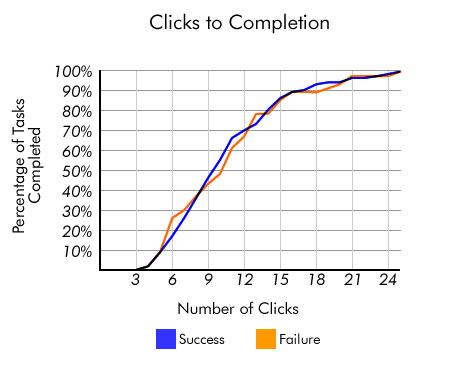
Source: User Interface Engineering
But here it is necessary to pay attention not to the increased magic number of clicks that the user makes, but to the ease of handling. If you create a convenient user interface that is simple and pleasant, but you can get to the information in 15 clicks (5 times more than specified in the three-click rule), do not pay attention to this rule.
Sources and further reading
2.Make viewing the content as an F-shaped model.
Dr. Jacob Nielsen, a pioneer in the study of the possibilities of using websites, conducted research on the movement of the eyes of Internet users (I-tracking) and studied this question on more than 230 participants. His research indicates that when users study the contents of the screen, they look with a glance at the letter F.

Source: Alertbox
A similar study with the participation of 50 subjects was conducted by marketing firms Enquiro and Did-it in a joint project with Eyetools eye movement research center and pointed to the same model for reading Google search results. Formed, so to speak, the “golden triangle of Google,” in which the concentration of sight fell on the upper part and the left side, which corresponded to the F-shaped model from an independent study by Jacob-Nielsen.
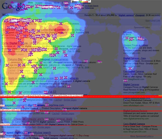
Source: Clickr Media
For designers and copywriters, this means that the information intended for primary viewing should be moved to the left and that information is generally better presented in an F-shape (for example, separate paragraphs with spaces or some unreadable characters), which will increase the probability of being what the user sees when they browse the web page.
Sources and further reading
3. Do not keep users waiting: speed up your site
We are always told that our users are impatient: they hate waiting. But, logically, who among us loves waiting as such? But is there any evidence besides this hackneyed statement that people really do not like to expect and that the slow work of the site annoys users?
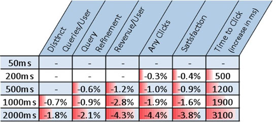
With the help of Bing, Microsoft's search engine, a study was conducted in which users were asked to rate page display speeds and, besides, the percentage of income that each visitor brought was estimated. The results showed that if the speed of displaying pages decreased by less than 2 seconds, the user rating decreased by 3.8%, while revenue decreased by 4.3%. For such a huge company like Microsoft, a 4.3% reduction in revenue is equal to multimillion-dollar loss of profits.
Source: O'Reilly Radar
Yes, users are really impatient: they don’t want to wait long and may stop clicking on links due to insufficient speed. And if you are dealing with the problem of ranking search engines, then an attempt to improve page response time is even more important, because Google now takes into account the speed at which the page is displayed in determining the positions of this page in the search results.
What can you do to improve page speed? Use tools to help find weaknesses in the display of pages, use CSS sprites to increase the speed of displaying pages and tools for measuring performance, such as YSlow , which help you see where you can do a quick pre-optimization.
Sources and further reading
4. Make content easy to read.
In fact, Internet users do not read the content online, at least based on Dr. Nilsen’s research on the behavior of people on his website. His research shows that people read only 28% of the text on a web page, i.e. its smaller part.

Source: Alertbox
In order for users to read most of the information, use techniques that make it easier to read the content. Highlight keywords, use headings, write small paragraphs and use lists.
Sources and further reading
5. Don't worry about placing important information on top and scrolling.
The existing myth that all your relevant information should be placed at the top of the page, which can be seen immediately without scrolling, was first proposed by Jacob Nielsen.
So long pages are bad? We should put everything at the top of the website, because people will not scroll the page and read on?
In accordance with the research of the web analytics company Clicktale, you can answer: “No”. The results of these studies have shown that the length of the page does not affect the user's decision to scroll further or not.

Source: Clicktale
According to research by Joe Leech of CX Partners - a design agency aimed at the user - a small amount of information before scrolling forces the user to search for information below, i.e. scroll the page.

Source: cxpartners
The main thing to clarify here is that you should not push all the most important information on top just because you are afraid that otherwise visitors will not be able to find it. Use the principles of visual hierarchy and the art of prioritization, make the various elements of the page content important.
Sources and further reading
- Unfolding the fold
- The Myth of the Fold: Evidence from User Testing
- Blasting the of the Fold
- The Impact of Paging vs. Scrolling on Reading Online Text Passages
6. Place important information on the left side of the webpage.
People, carriers of cultures, with writing from left to right, automatically start and write, and view any page from left to right. This is the reason why many Internet users pay the most attention to the left side of a web page. According to the study of eye movement , conducted by Dr. Nilsen with 20 Internet users, this happens in 69% of cases .

Source: Alertbox
The same results, just the opposite, were on websites with languages such as Hebrew or Arabic, where texts are read from right to left (more attention is paid to the right side of the page compared to the left).
There are two things that you need to learn from these results. First, when you think about the location of the site content, you need to take into account the language of the site; during the design of the site should make design decisions based on the characteristics of a particular culture . Secondly, for sites in cultures where people traditionally read from left to right, important design components should be placed on the left; and vice versa - for sites of cultures where they traditionally read from right to left.
Sources and further reading
7. Space in the text affects readability
Good readability of the text improves perception and reading speed, and also increases the likelihood that the user will not leave the site, but will continue to read. There are many factors that affect good readability, such as the right choice of fonts (the ratio of serif and sanserif), font size, line height, background / foreground contrast, and overclocking.
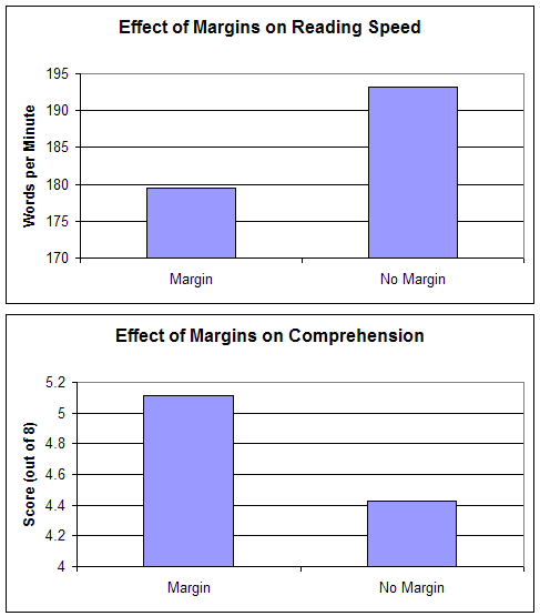
A study of the readability of the text was conducted on 20 subjects. They were offered the same passages of texts, but there were different fields around them and they had different line heights (the distance between the lines of the text). The study showed that although text without borders reads faster, reading perception decreases. Increasing the speed of reading borderless text is due to the fact that paragraphs and the entire text are compressed and therefore it takes less time to move your eyes from line to line and from paragraph to paragraph.
Source: Software Usability Research Laboratory
By the example of this study, we see that the way we design the content of the site helps or hinders the perception of the user. In the process of working on your website, be careful about the details - color, line height, planned eye movement, etc., and do not forget about the basic principles of layout . This will help not to disappoint readers who will use the information from your website. And what's more, work on the effective use of the so-called negative space (free space between the lines, blocks of information, etc.) in web design.
Sources and further reading
8. Small parts are important.
Very often, especially when time is running out, we, working on the design of the website, see the big picture and ignore the little things. If we are limited in time and opportunities, we discard thoughts about editing something or about the design of a particular button. After all, there are many things to do, then very often the details are ignored.
But even such a trifle as the button's shape can influence the overall success of the site, at least Jared Spool asserts that the remote button made it easier for visitors to count money, and thus the site’s revenue increased by $ 300 million over the course of a year. The first month recorded an increase in sales of 45%, which was explained by these changes.
Such attention to detail is also approved by Flow, a design company focused on the user. Employees of the company claim that by changing the page with the standard error message , so that the text appeared to help cope with this error, they improved the work of sites by 0.5%, which, if transferred to money, is equal to an additional quarter of a million pounds. per year from one site.
What was this text? It was a message consisting of two polite sentences, instead of an incomprehensible 404 error: “Sorry, there is a problem with your login. Unable to process a request for your card. Please try to pay again. ”
Pay attention to details. Use the control breakdown on the “first-second” and see which design is more effective for achieving your goals. Use analytical software to assess the results of design changes and their relationship to the goals that face the web site.
Sources and further reading
- The $ 300 Million Button
- £ 250,000 From Better Error Messages
- The thickness of napkins
- Myth # 10: If your design is good
9. Do not rely only on the search. Site management should be thoughtful
Users expect the site to be easy to handle and well organized. Even if the site has an excellent search system, users will still use the control buttons first. According to a study conducted by Gerry McGovern, about 70% of users start a task that they have in front of them, by clicking on the links on the page, instead of using the search capabilities.
The same result showed a test UIE, conducted with 30 users of online stores. Analysis of the study showed that "users often turn to search in the event that the links on the page do not suit them." Thus, the search becomes the most used tool, only when the user can not find what he needs on the page he opened.
The lesson to be learned from this is clear: do not think that the search can hide the poor organization of content management and the absence of a convenient transition to the desired material. So that users can find what they are looking for, you need to pay attention to the distribution of sections of the site, the location of the content, the control panel, and then improve the search function.
Sources and further reading
- Navigation is More Important Than Search
- Are There Users Who Always Always Search?
- Myth # 16: Search will solve a website's navigation problems
10. Homepage is not as important as you think.
Most likely, your website visitors will spend the least amount of time on your main page. Search systems play a big role here, because they redirect users to the right pages on your site. Links from other sites can also be sent not to the main page, but to where there is relevant information.
In accordance with the analysis of Gerry Mac Governa, views of the main pages of sites have visually fallen. He argues that if in 2003, 39% of visitors visited sites from the main page, by 2010 there was a decrease to 2%. He also confirmed this study with data from the site, where there was separate information for 2008 and 2010 (10% in 2008 and 5% in 2010).
McGovern's results indicate that more and more visitors follow links from search engines, social networks such as Twitter, and content-building resources such as AllTop. And there are much more such visitors than those who immediately went to the main page of the site. Consequently, the more attention you pay to the pages to which users follow the links, the more rational will be the costs of attracting visitors to your site.
Sources and further reading
- The Decline of the Home Page
- Is Home Page Design Relevant Anymore?
- Myth # 17: The homepage is your most important page
Related content
- Factors That Affect Usability
- Five Simple But Essential Web Usability Tips
- Four Aspects of Usable Modern Web Interface
Cameron Chapman is a professional web designer and graphic designer with nearly six years of experience in this field. She has written many articles for blogs such as Smashing Magazine and Mashable. You can visit the Cameron Chapman On Writing professional website. If you want to contact her, find it on Twitter .
Original article: Sixrevision .
Translated by project translators: BigIdeas .
Source: https://habr.com/ru/post/124516/
All Articles