How we show website design to client
Among web studios it is very often possible to meet the opinion that the design of the site should be shown to the customer only in person, with a presentation and explanation. This is really true for some projects, and first of all for those in which the budget is set for personal meetings. The second frequently used option is to send pictures with a letter with comments. This option is much cheaper, but has several disadvantages. In my company, we use the third option, which is inexpensive and allows us to remove a number of shortcomings when sending a design in the form of a picture to a letter.
So, what disadvantages appear when sending a design as an attachment to a letter?
At least the main ones are:
Overcoming these drawbacks takes, as a rule, from 1 to 4 hours of the manager on each project.
It usually looks like this:
Call:
- "Ivan Ivanovich? We sent you a design. Look here please!"
- “Why so small?”
- “You need to save the file to disk and open it in the viewer”
- “Oh, now big. Why are the fonts blurred? ”
“What is your scale?” 112%? Choose 100% and do not reduce the sketch! ”
and so on.
')
The next question the client has is when he wants to see how the design will look on different monitors. To do this, you have to spend a lot of time on the story about the background of the site and other nuances of web design.
To get rid of these shortcomings, we use the following system in our company:
- The designer develops a sketch immediately with a background, (if the background is not white, then at a resolution of 1920 pixels wide, if white, then at 1024).
- Each client is created a section in the inner part of our site, in which sketches of his project are laid out
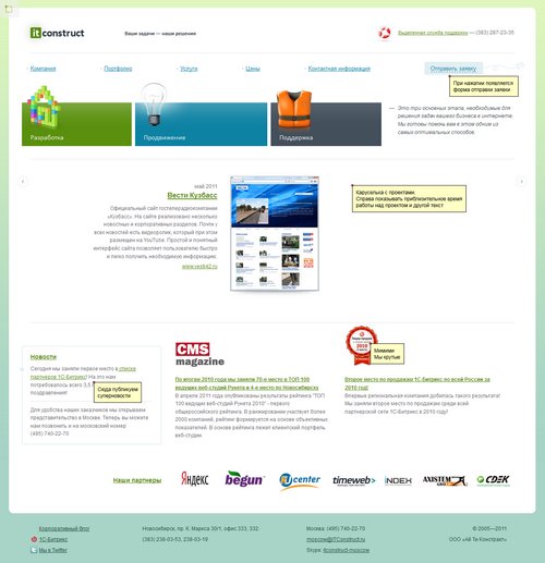
- Manager lays out a sketch. For each sketch, a special page is created, where the picture is placed in the background with centering (in this case, the person sees the site in the desired resolution on any monitor)
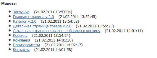
- The client sees a list of thumbnails on the page (these can be variants of the main page, internal pages or even site prototypes) with the name and date of placement. Choosing a sketch he is interested in, he sees the “site in the browser” and can immediately see if he imagined the project that way.
- The manager is also available to post comments on the sketch. Something like this is done by the business lynch on the site of Lebedev Studio.
As a result, we are able to show the design to the client in almost the same way as the site will look in the browser and eliminate a number of points that were previously spent a lot of time by the project manager. The introduction of this technology allowed, in my opinion, to significantly reduce communication at this stage of work on the site.
Finally, what it looks like (just below the picture, not the link):
list of project sketches:
thumbnail with comments (reduced):
So, what disadvantages appear when sending a design as an attachment to a letter?
At least the main ones are:
- Uncertainty that the client is looking at a sketch at the correct scale.
- Misunderstanding by the client exactly how the design will look at different screen resolutions and in different browsers
- Many saved design options in one folder and “tangle” between them
Overcoming these drawbacks takes, as a rule, from 1 to 4 hours of the manager on each project.
It usually looks like this:
Call:
- "Ivan Ivanovich? We sent you a design. Look here please!"
- “Why so small?”
- “You need to save the file to disk and open it in the viewer”
- “Oh, now big. Why are the fonts blurred? ”
“What is your scale?” 112%? Choose 100% and do not reduce the sketch! ”
and so on.
')
The next question the client has is when he wants to see how the design will look on different monitors. To do this, you have to spend a lot of time on the story about the background of the site and other nuances of web design.
To get rid of these shortcomings, we use the following system in our company:
- The designer develops a sketch immediately with a background, (if the background is not white, then at a resolution of 1920 pixels wide, if white, then at 1024).
- Each client is created a section in the inner part of our site, in which sketches of his project are laid out
- Manager lays out a sketch. For each sketch, a special page is created, where the picture is placed in the background with centering (in this case, the person sees the site in the desired resolution on any monitor)
- The client sees a list of thumbnails on the page (these can be variants of the main page, internal pages or even site prototypes) with the name and date of placement. Choosing a sketch he is interested in, he sees the “site in the browser” and can immediately see if he imagined the project that way.
- The manager is also available to post comments on the sketch. Something like this is done by the business lynch on the site of Lebedev Studio.
As a result, we are able to show the design to the client in almost the same way as the site will look in the browser and eliminate a number of points that were previously spent a lot of time by the project manager. The introduction of this technology allowed, in my opinion, to significantly reduce communication at this stage of work on the site.
Finally, what it looks like (just below the picture, not the link):
list of project sketches:
thumbnail with comments (reduced):
Source: https://habr.com/ru/post/124251/
All Articles