Results of the competition, part 1. Front-tenders
 Hi, Habr!
We summed up the competition . And, as you requested in the response letters, we publish a post with typical errors and successful examples of solved tasks. Now we will tell you about the results of the competition among the front-tenders.
The task was to develop an interface for viewing the exchange rate over the past three months. A paper prototype and XML data were provided as a basis. The purpose of the task was to determine how well a person possesses the technology and the “sense of interface” - that is, it represents how comfortable it will be to use, and how understandable it will be at a glance.
')
There were not many people who wanted to try themselves in the role of not only a developer, but also an interface designer. We would like to consider interesting works and talk about their shortcomings, as well as show the interface that we considered the best.
Typical shortcomings

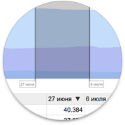
The dates indicate the current year.
The fact is that when it comes to the current year, it is not necessary to remind the user about this. It is worth reporting about it only in the case when it comes to past or future years.

Unsigned controls
A user who is not familiar with the description of the functional, it is not clear what will lead to a change in the values of these elements. It is worth signing that here is the “main currency”, and this is the “list of active exchange rates”.

Inefficient list sorting
The list of currencies is sorted randomly, although it is necessary to sort it in order of popularity so that the user does not waste time searching for the desired currency.
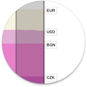
Abbreviation
The three-letter currency code is indicated only on the chart and it is not obvious what DKK and SGD are. Try to use at least the standard title attribute.
Incorrect use of color brightness
The active element should glow, and inactive should be faded and not attract attention.
Values in graphs
The graph is not just a nice image. This is the active interface element that should convey information. Do not forget to show the values on the axes, and when you hover the cursor - in this area of the graph.

Check content!
Here the developer forgot to close his eyes for a minute, and then open and with a fresh look to discover that the sorting is incorrect.
Now for the good
The interface that seemed to us the best and contained the minimum number of flaws: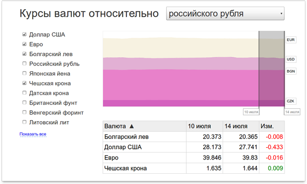
Recommendation on the presentation of the results
Since the task was for frontendders, it was expected that the archive would contain the client part with a minimum server (close to zero), but many archives packed entire projects in ruby and php with installation instructions.If for acquaintance with the work you need to spend more than two minutes, then the best solution would be to attach a link to a working server - this will help to evaluate the work at its true worth.
Thanks to everyone who participated!
Team Island
PS: The next post will be devoted to backenders.
PPS: By the way, we have vacancies for web technologists !
Source: https://habr.com/ru/post/124172/
All Articles