Unsolicited Advice - Sberbank Pilot Series
 Some time ago on Habré there was a lot of noise regarding Sberbank interfaces. It seems that even Sberbank decided to improve the situation, hired people and said that they are working on this problem. Since the organization is very large, it is unlikely that we will see any serious changes earlier than in a year.
In the meantime, I decided to start a separate branch to improve the interface of this bank and cover it on Habré. Since the topic is very extensive, it does not fit into one article. Therefore, if the topic is interesting to readers, I will release a new “series” of this series every week.
I will start with their kiosks for payment for services, as I use them much more often than ATMs. In this article I will discuss the general principles and problems.
')
Disclaimer:
Since I do not have access to Sberbank research and I cannot question them about their goals, I will make some assumptions and assumptions during the development process. In particular, I will skip the stage of field research and character drafting. But since the project is non-commercial, you can afford it. :) In actual development, field studies play an important role.
Kiosks, by and large, are designed to replace live cashiers in order to:
- Cost reduction;
- Increase the capacity of offices;
- Increase the number of branches at the expense of automated points.
Therefore, in the evaluation of the kiosk interface in the future we will proceed from these goals.
Consider a small picture:
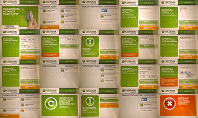
These are the 20 screens that need to go through to pay for phone and electricity. If you add a payment of utility bills, you get all 30 screens. And this is just to pay the rent. Already on the basis of this fact, it is clear that there is something wrong with the interface of the kiosk.
First you need to deal with those who use kiosks and for whom they are designed. The first thing that comes to mind is modern people who are at odds with the same modern technologies. But if you think about it, this is not quite the case. After all, such people have mastered (or will master in the near future) Internet banking, and they just have to go somewhere only to pay something in cash. In other words, the audience of the kiosks can be described as follows: people who are not sufficiently versed in modern technology to use Internet banking. But this does not mean that you can forget about those who know how to use Internet banking. You just need to try to take into account the interests of all, and not to simplify the task by discounting this or that audience.
This audience also includes the elderly - the nightmare of the interface designer, from whom they usually just brush it off, saying “you still cannot please them”. But I decided that I would design the interface in such a way that even such an audience could deal with it.
There are goals, with the audience more or less clear. At this stage, you need to proceed to field research and drafting characters. But this stage should be done either very seriously (and spend a lot of time on it) or not at all. Since the project is non-commercial and there is simply no time for it, we skip it.
Before designing, one more question needs to be solved: on what equipment will the interface work? Consider the main screen of an existing application:

You may notice that it was designed explicitly for kiosks with a push-button system on the sides of the screen (as on ATMs). But at the same time, there are no buttons on the kiosk on the sides of the screen, and the entire selection of options is made using the touch screen.
On the one hand, this approach may seem appropriate: the range of devices is large and you need to provide all possible options for devices in order to reduce software development and support costs. In addition, if the interface is the same everywhere, then the person will be able to easily use the kiosk in any branch.
But I believe that the push-button and touch devices must have different interfaces, since the idioms of interaction with them are still different. And if you do not use the capabilities of the touchscreen display just because the same interface needs to be used on push-button kiosks, then it is not clear why you should even add touchscreens, since such an interface will combine the disadvantages of both input methods, and not their advantages.
In a series of these articles, I will develop an interface specifically for a touch device.
So, we proceed.
Consider the welcome screen of the system:
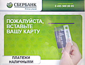
On the screen there is simultaneously a call to action “insert a card” and an indication of the section “cash payments”. Although in essence this is the same thing, only the methods for depositing money differ (although this statement needs to be checked, I’ll get a Sberbank card for this article and test it).
Perhaps there is some personification of the interface on the card (for example, all fields in the payment interface are pre-filled), but it is hard to believe.
You can get rid of this screen altogether and demand to insert a choice of payment method only when, in fact, it has approached payment.
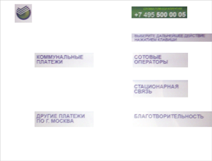
Let us now return to the main screen of the system, to which we fall, if we click on "Cash payments":
The most important place on this screen is reserved for the "BACK" button. It's nice, of course, that the developers made sure that if we forgot to insert the card on the first screen and accidentally chose cash payments, we would be able to go back, once again enjoy the beauty of the input screen and insert our card. But it is not clear why not just give the opportunity to insert a map right on this screen.
On this screen we see a healthy Sberbank logo (in case the user had a short-term memory loss and he forgot where he is and what he is doing), a huge plate with a small phone, a huge inscription “PAYMENT OF SERVICES”, a call to press a key for further action (Actually, there are no keys on the kiosk) and a few indistinct buttons are incomprehensible about what. More than 60% of the screen area is used meaninglessly.
If you simply remove from the screen all the elements that do not carry any meaning, you get this:
Mmm, how much free space you can now use properly for business. But about this - in the next series.
See the next series of Unsolicited Council:
- “First Touch” - how to help people unfamiliar with the touch-screen idiom to use the interface for the first time;
- "Group" - how to group categories based on the life scenarios of users.
- Rescuers Malibu is a kiosk user support organization.
Source: https://habr.com/ru/post/124128/
All Articles