Making online payments simple and convenient. A1Pay system redesign
To make a simple and convenient payment system in Russia for both the seller and the buyer is a serious challenge for any UX-specialist / interface designer. The more interesting and difficult the task, the more experience and knowledge you get in the process. It is on this task that I work and in this article I would like to share my experience in redesigning and finalizing the Internet payment system A1Pay .
The article describes the stages of work, the decisions that were made and what they were based on. Describe in one article all interesting ideas, difficulties encountered and their solutions, findings, etc. -. not an easy task. Some of the important issues, for example, the measured KPIs and their values, for obvious reasons, were completely beyond the scope.
By the beginning of my work on the interface, A1Pay was already a working system for accepting Internet payments with its strengths: high technological capacities, protection against fraud, support services for partners and subscribers, streamlined work processes, etc. However, the system is very lacking in friendliness of use.
For the management of the company it became obvious that in order for the system and business in the field of Internet payments to grow, a user-oriented product is needed.
')
Payment system users can be divided into three large groups:
- Vendors / Partners - Website Owners
- Buyers - users making a purchase on merchant sites
- Employees of the company
- Study: Examine goals, objectives and user needs when interacting with the system.
- Audit: Identify and fix existing interface problems. Create a usability guideline to standardize the UI.
- Design: Following the results of the first two stages, design the interface for the new version of the system.
- Testing: Measure KPI after the introduction of the new interface, get feedback from users.
- Kaizen (continuous improvement): Continuous minor system improvements.
Study
In the active phase of the project, research time is very limited. In this case, long series of in-depth interviews or comparative usability testing are not suitable.
You may have heard about the character techniques from Cooper, but I did not use it in this project. Why - a separate question for a separate discussion. Instead, I divided users into groups. The group “Sellers / Partners”, which was mentioned above, I divided into subgroups:
- Applicants are those who have just learned about the system and do not yet have an account in it.
- New partners - sellers who have just registered and started working with the system.
- Experienced partners - those who have long been working with the system.
- Former partners - left the system for some reason.
Web analytics
I used Google Analytics as a web analytics tool. In it, I tracked the frequency of visits, the navigation chain, the most visited pages, the conversion, etc. This gave a quantitative idea of the actual use of the system. In one paragraph of the article it is difficult to talk about the capabilities of this tool for a UX-specialist. I recommend reading the book by Brian Clifton “Google Analytics. Professional analysis of attendance of websites " and the book Avinash Koshyk.
Support tickets
There is no better way to develop empathy (empathy for another) and to feel the real pain of users than to answer the ticket support service for some time. At Zappos.com (which is famous for its corporate culture and customer-oriented approach) every employee, be it a developer, marketer, or project manager on a trial period, responds part of the time to requests for support. Questions and suggestions of current users of your system, while understanding the reasons and filtering, are an inexhaustible source of ideas for improving interaction. If the difficulty or the same question arises for several users, then this is a sure sign - in a particular place of the system there are difficulties. The task of the interface designer is to fix the problem, propose a solution, bring it up for discussion with the team (user advocate) and decide together how this should be implemented and achieve implementation or inclusion in the development plan.
Forum, social networks and blogs
As already mentioned, communication is important for creating an impressive UX. A1Pay is represented in all popular social networks and services: Twitter , Vkontakte , Facebook and LiveJournal. The account in each of them is got for dialogue. In them, the company's specialists answer user questions, are ready to listen to suggestions and comments. In addition, blogs and forums are constantly monitored, all messages are promptly processed. Unlike technical support in his own blog, a person is impartial and free in self-expression, so sometimes there are also emotional reviews. It should be understood that the user has all the reasons for outrage. The problem he faced is always the most important for him. He is your ally because he doesn't care. He wants the system to be better and more convenient. Of particular interest is constructive criticism . The reaction of the designer according to these messages, as well as on support tickets: fixing the problem, analyzing, discussing, correcting or adding to the development plan. In addition to external channels, there is a forum on the site where partners ask, offer, discuss, help each other, etc.
Questioning
Based on the data and familiarity with the system, I formulated a hypothesis about the main use cases of the system: registration - setting and testing - monitoring - withdrawing funds. In each of these scenarios there is interaction that can be improved. I decided to clarify the details and support the hypothesis by questioning. Among the sample of partners we distributed a questionnaire with the following questions:
- What information in the A1Pay system (indicators, reports, etc.) do you check and consider as the most important?
- How often do you check it?
- Do you have enough information you get? Are there any indicators that you have to count yourself?
- Do you have any difficulties with the A1Pay system? Please tell us more about it.
Audit
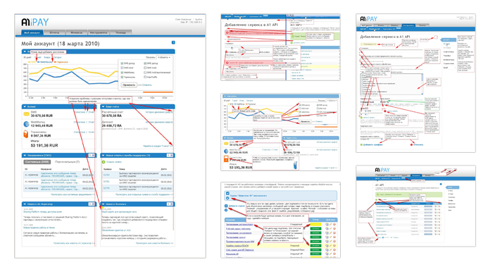
It turned out that there are no general requirements for UI and the interface was created by the developer of a specific module at each site of the system. As a rule, this approach creates two big problems: When everyone is responsible for his part, no one is responsible for the interaction as a whole. Another problem is interface inconsistency. The same operations in different parts of the system could be done in different ways. The larger the system, the more tangible the impact of these problems. The solution was the standardization of the interface in usability-guide .
About how guidelines can improve the quality of web projects, I wrote in detail in the article "Using usability guidelines to improve the quality of web development . " I will show some interface problems and their solutions.
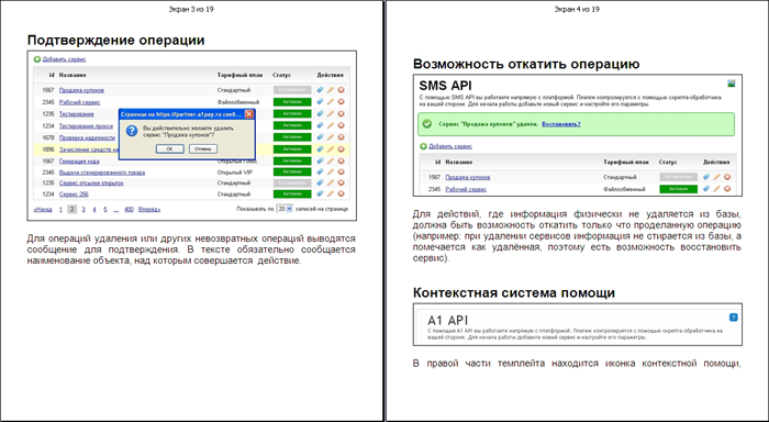
Confirmation of operation
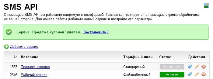
Important operations, when the data could not be restored (for example, deletion), were not confirmed. The following rule was formulated:
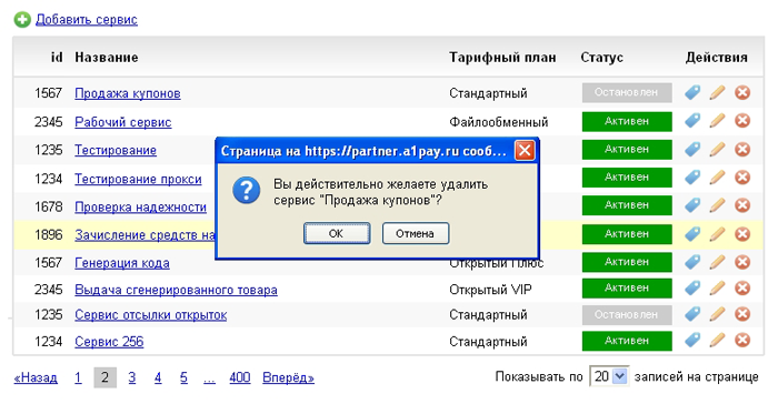
For delete operations or other non-return operations, a message is displayed for confirmation. In the text, the name of the object on which the action is performed must be reported.
Context help system
Judging by the calls to the technical support service, the meaning of some terms, principles of the system operation or conditions caused questions.
It was proposed to place the context help icon on the right side of the template, which leads to the description of the current screen (service, operation, etc.) in the knowledge base. Help opens in a new window.
Standardization of the UI is expected to require improvements in the system and the creation of new functionality.
Prototype
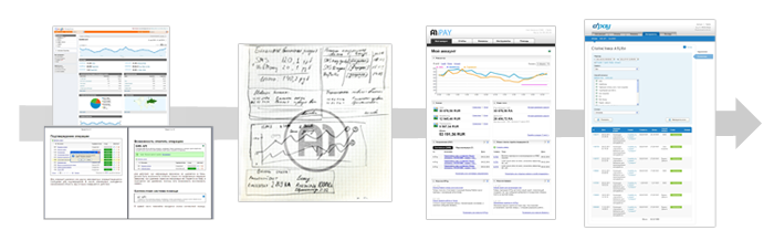
At the moment there are a large number of prototyping tools . Everyone can find a tool convenient for themselves and the tasks that they face. However, the point is not in the tool, but in what you create in it and what you want to work through. In this project, the task was to create an interactive, highly detailed prototype, so I used Axure .

The creation of a detailed prototype was preceded by a conceptual design. At this stage, information architecture, navigation, interaction architecture, etc. were worked out. It seems to me that before using any of the tools you need to “think” on paper. She can handle everything.
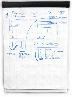
At the conceptual design stage, navigation was a matter for me. To make it horizontal with tabs and submenus or vertical, as in the old version? Having drawn both versions on paper (vertical in the image) and comparing it with the development plans of the system, I decided to focus on the horizontal version. The logic of my decision is as follows:
- When new modules and solutions appear in the system, the menu is not cluttered.
- Due to the vacated area on the left, the working area of the screen has increased.
- At any given time, the user works with one screen. There is no scenario in which the user would need fast navigation throughout the system.
- Even if such a need (quick navigation) arises, then it can be implemented through contextual links-operations.
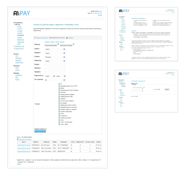
Another important point of conceptual design was the appearance of the previously missing “dashboard” (dashboard) as the main screen. The main and frequency scenario of working with the system is monitoring. Dashboards must unequivocally show the state of the system, changes and their cause. In places where this is due to the context, give quick links to detailed information deep into the system (for example, detailed statistics, etc.). So, on paper, dashboards were drawn with the main blocks: income graph, balance, accounts, news, new tickets, etc. Some elements of the modules were pulled out to the panel in order to increase the speed (give “quick links”).
About designing a dashboard You can read Stephen Fiue ’s excellent Information Dashboard: Design by The Effective Visual Communication of Data , see Aaron Harsman’s presentation or examples on the Dashboard Spy website.
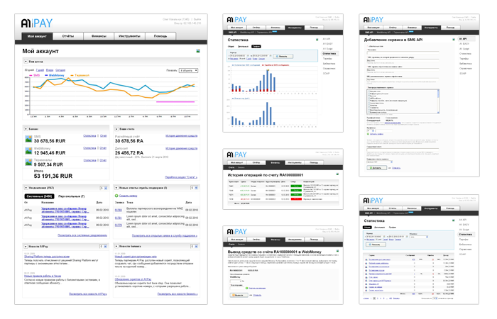
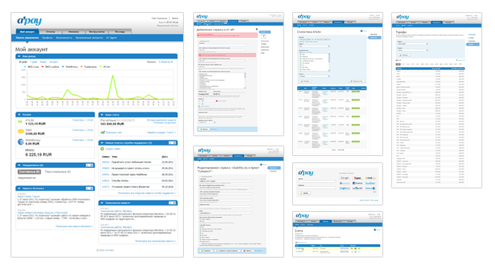
After conceptual design, detailed drawing of all screens of the system in the Axure program began. A total of about 30 screens were designed. The interactive prototype allowed us to demonstrate and discuss the planned UI with the team.
Design
After the protection and approval of the prototype, clarification of the requirements of the manual for graphic design, we moved on to drawing the design. The designer should actively work together with the graphic designer, explaining the mechanics of work and the possible states of some interface elements. When working with a remote designer, you must provide the prototype with additional comments. For these purposes, I used the capabilities of the program for taking screenshots of FastStone Capture. On Habrahabr, there are often articles about web-hosting web services that allow the team to discuss design in a civilized way and store the results in the cloud. Such services because of Lebedev sometimes called linkchelkami.
Graphic design is difficult to formalize. It is unlikely to get the desired result the first time. After several iterations, revision-revision managed to come closer to an acceptable option. The number of iterations depends on the skill of the graphic designer and on your ability to see the final result.
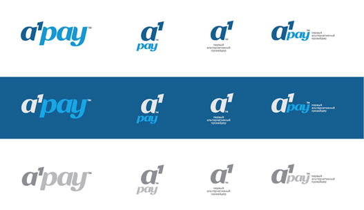
At this stage, the designer has also drawn a logo.
Verification of the decision and further actions
After some time after launch, I still see places that should be improved or improved. If you read the book User Interface Design2. The art of washing an elephant ”by Vlad Golovach, you know that this is typical of interface designers and this is part of professional development.
The system has specific KPIs that are tracked online. (displayed on a large TV). After redesign, the number of calls to the support service for working with the system has decreased, the total number of partners has grown, loyalty has increased, etc.
Refinement and improvement of the interaction are carried out in each sprint (working on SCRUM).
findings
Usability and user experience is an important, integral part of the client-oriented service. I know very few examples (services or products), where without specially selected specialists they achieved significant long-term results (unless it is 37 signals, where the UX is raised to a flag). On the other hand, the slogan "UX is king" remains in the articles of Western usability gurus. In reality, user experience and usability services the business. Often, a UX specialist has to run into technical, legal, and political constraints. Somewhere to seek a compromise, somewhere to push the solution in the originally proposed form, and sometimes, on the contrary, to abandon it entirely - the reality of interface design.
The work of a UX specialist within a web service or product is possible using the UCD methodology with many iterations.
In this case, I showed from which parts the work on the web interface of the Internet payment system A1Pay consisted . You can use my experience in part or in whole. Plans to tell about the redesign of the promo site and payment window. Ready to answer your questions.
Source: https://habr.com/ru/post/123859/
All Articles