We make a simple web service using the Yandex.Metrics API
Hello!
Not so long ago, Yandex discovered the use of the Yandex.Metrica API. In this article I will tell why it is needed, how to use it and briefly describe the differences from the Google Analytics API.
In addition, I will show how to use this API to create a web service where you can compare the site’s current performance with the past and see how the popularity of pages changed over time:
')
The main difference between the Metrics API and the Google Analytics API is that it focuses on reports, not indicators. A programmer using GA should tell the service “I want to see visits from advertising sources broken down by goal 1, the number of visits, the bounce rate”, the user of Metrics will say “I want to see a report on the content”.
The choice of targeting reports, rather than indicators, is consistent with the concept of Metrics as a tool for ordinary users, not professionals. Using the Metrics API is really much simpler.
However, the current approach has drawbacks. First of all, you can request from the service only reports predefined by Yandex programmers. Secondly, since the structure of the reports cannot be changed, each time you will receive an excess amount of information, which may affect the response time of the service.
The metric is developing very quickly (at the time of writing this article, I even managed to change the API a little), so I am sure that soon it will be possible, just like in GA, to generate reports only for the necessary indicators, and the problems described above will disappear.
So why do we need a metrics API? With it, you can mess things up a lot of interesting things, for example:
Point one is a funny whistle-fake, which, nevertheless, may be interesting to the advertisers of the site. You can directly on the page "advertise on the site" automatically display the most popular queries that come to the site, the schedule of attendance, geographic regions from which users come and much more.
For example, here’s how it was done on Habré ( http://habrahabr.ru/info/stats/ ):
Point 2 (integration of statistics in CRM) is understandable without explanation. Add to the internal information about the order of its source, the region of the buyer and sometimes even a specific advertising creative is the blue dream of any advertiser / analyst. After this is done, you will immediately see which advertising is effective and which is not and at the same time save the call center from at least a few unnecessary questions to the user.
Employee automation (point 3) is important for those who place a lot of advertising, spend a lot of money on SEO and constantly monitor the effectiveness of this whole business. Let's say that every week your employees process 40 reports from Yandex. Metrics. They spend 10 minutes on each report. It is 6 hours and 40 minutes. And if you give them the already processed documents, then these 7 hours can be spent on something really useful.
After working with the GA API and its cumbersomeXML format, I would like to separately emphasize another important point: The metric allows you to receive data in JSON! In my opinion, this is one of the most important competitive advantages over GA. All modern languages are able to work with JSON out of the box, and thus there is no need for any additional libraries. Unlike Google with Metric, you can immediately sit down and go.
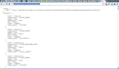
This is very easy to verify, open a new browser tab and go to the following URL (you should be logged in with Yandex): http://api-metrika.yandex.ru/counters.json?pretty=1 .
Congratulations, you have just used the metrics API. And you don’t even need any additional programs to parse the server’s response.
So, in order to get a deeper understanding of the API, we will try to create an Internet service that expands the standard capabilities of the Metric. By default, it lacks one very important thing - a comparison with the previous period. This is a very convenient feature, thanks to which site analytics become much easier. In GA, the period comparison looks like this:

Let's try to do something similar for Metrics.
Before you start creating reports directly, you must give the user the opportunity to select the counter whose statistics he wants to see. To do this, we must use the link that we have already seen above ( http://api-metrika.yandex.ru/counters.json ). From the information that the server sends, we need to pull out two parameters: id and site. ID is the number of the counter, without which it is impossible to get any statistics, and site is the name of the site specified during registration.
It should be noted that when creating an API, you need to log in. This can be done in several different ways, which I will not describe in this article. For my service, I chose oAuth, since I already used it when working with Google services. As it turned out, the implementation of oAuth from Yandex is much easier to use than the version of its overseas rival.
So, we will create for the user an interface for choosing a counter and a period with which we will compare our data. On python, the code for requesting counters will look like this:
Since this service is not intended for production, we will save a list of memcache counters for a user token in order not to pull the server once more. In reality, this is probably not worth doing on the Google AppEngine platform - memcache size is relatively small.
For the user, the interface will look like this:

Next, we need to select the appropriate report from the available list. The Metrics API has the following report groups:
To build a graph, you need to know the number of visits on each of the days of the period under consideration, therefore we need the “traffic” report group, and the “attendance” report in it. To get the necessary data we will form a request of the following form:
http://api-metrika.yandex.ru/stat/traffic/summary.json?id=XXXXXX&date1=YYYYMMDD&date2=YYYYMMDD&oauth_token=XXXXXX
The id is the ID of the user-selected counter, date1 and date2 - the dates in the specified format. Any request to the API metrics can be checked directly in the browser, so you can simply take the id of your counter and substitute it in this link. If you are logged in to Yandex services, you can omit the oAuth token.
In response, the metric will return a report, which contains a lot of different superfluous information, we only need the date (“date”) and the number of visits (“visits”):
Further, we will compare the period chosen by the user with the previous period with a similar number of days (for example,1.06-7.06 will be compared with 24.05-31.05). To do this, first calculate the length of the period in time:
And then we subtract the length from the end points of our period:
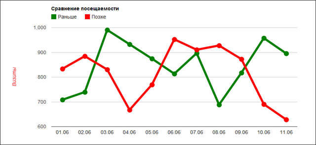
As a result, for each date from the user period, we will have the number of visits on that day and N days ago and on the basis of this data it is already possible to build a schedule. I used Google Charts to build graphs, because it’s easy to work with them, and the result looks pretty nice. The comparison chart looks like this:
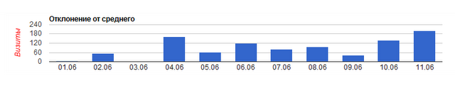
Now that we have data on days and visits, why don't we calculate the deviation from the average on each of the days. If you present this information in the form of a histogram, it will be easier to perceive than if you look at the plotted chart.
To do this, we calculate the average value by dividing the sum of visits by the number of days, and then compare the resulting value with the value of each individual day. As a result, we obtain the following diagram:
So, now we have diagrams for comparing traffic with the past, but in order to make our service truly useful, we need to add something else there.
Very often, when evaluating a site, one has to compare how the popularity of pages has changed. For example, the fact that telescopes on the Dobson stand go well this month does not mean that they also sold well in the past. Let's try to add a report in which you can quickly and easily see changes in page traffic.
To do this, we will use the report type "content", and in it the report "Popular". This report provides information on the number of entries, exits, and views. You can get the report data by clicking on the link http://api-metrika.yandex.ru/stat/content/popular.json?id=XXXXXX&date1=YYYYMMDD&date2=YYYYMMDD&oauth_token=XXXXXXper2page=20 .
Please note that this time a new parameter “per_page” has appeared in the link. This is an optional parameter that tells the Metrics API how many records should be in the server response. By default, the server always gives 100 entries, but in this case for us this is an excess value.
The rest of the data acquisition mechanisms are extremely similar.
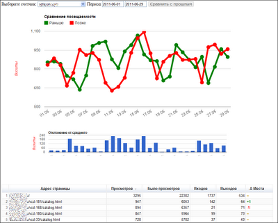
As a result, our service will look like this:

Due to the fact that the right column shows how the position has changed in comparison with the previous period, it is very easy to understand the dynamics of page popularity.
Play with the service can be made at http://metrika-api.appspot.com
Source code is available here: https://github.com/sakudayo/Hello-Metrics
API metrics documentation is posted by Yandex at the URL: http://api.yandex.ru/metrika/doc/ref/concepts/About.xml
Google Charts Documentation: http://code.google.com/intl/ru-RU/apis/chart/
Not so long ago, Yandex discovered the use of the Yandex.Metrica API. In this article I will tell why it is needed, how to use it and briefly describe the differences from the Google Analytics API.
In addition, I will show how to use this API to create a web service where you can compare the site’s current performance with the past and see how the popularity of pages changed over time:
')
About the Metrics API in Brief
The main difference between the Metrics API and the Google Analytics API is that it focuses on reports, not indicators. A programmer using GA should tell the service “I want to see visits from advertising sources broken down by goal 1, the number of visits, the bounce rate”, the user of Metrics will say “I want to see a report on the content”.
The choice of targeting reports, rather than indicators, is consistent with the concept of Metrics as a tool for ordinary users, not professionals. Using the Metrics API is really much simpler.
However, the current approach has drawbacks. First of all, you can request from the service only reports predefined by Yandex programmers. Secondly, since the structure of the reports cannot be changed, each time you will receive an excess amount of information, which may affect the response time of the service.
The metric is developing very quickly (at the time of writing this article, I even managed to change the API a little), so I am sure that soon it will be possible, just like in GA, to generate reports only for the necessary indicators, and the problems described above will disappear.
Why is it needed?
So why do we need a metrics API? With it, you can mess things up a lot of interesting things, for example:
- Show real-time statistics on the site
- Integrate site statistics into your CRM
- Automate and streamline employee work
Point one is a funny whistle-fake, which, nevertheless, may be interesting to the advertisers of the site. You can directly on the page "advertise on the site" automatically display the most popular queries that come to the site, the schedule of attendance, geographic regions from which users come and much more.
For example, here’s how it was done on Habré ( http://habrahabr.ru/info/stats/ ):
Point 2 (integration of statistics in CRM) is understandable without explanation. Add to the internal information about the order of its source, the region of the buyer and sometimes even a specific advertising creative is the blue dream of any advertiser / analyst. After this is done, you will immediately see which advertising is effective and which is not and at the same time save the call center from at least a few unnecessary questions to the user.
Employee automation (point 3) is important for those who place a lot of advertising, spend a lot of money on SEO and constantly monitor the effectiveness of this whole business. Let's say that every week your employees process 40 reports from Yandex. Metrics. They spend 10 minutes on each report. It is 6 hours and 40 minutes. And if you give them the already processed documents, then these 7 hours can be spent on something really useful.
The main advantage for the programmer
After working with the GA API and its cumbersome
This is very easy to verify, open a new browser tab and go to the following URL (you should be logged in with Yandex): http://api-metrika.yandex.ru/counters.json?pretty=1 .
Congratulations, you have just used the metrics API. And you don’t even need any additional programs to parse the server’s response.
We make our own service based on API Metrics
So, in order to get a deeper understanding of the API, we will try to create an Internet service that expands the standard capabilities of the Metric. By default, it lacks one very important thing - a comparison with the previous period. This is a very convenient feature, thanks to which site analytics become much easier. In GA, the period comparison looks like this:
Let's try to do something similar for Metrics.
Before you start creating reports directly, you must give the user the opportunity to select the counter whose statistics he wants to see. To do this, we must use the link that we have already seen above ( http://api-metrika.yandex.ru/counters.json ). From the information that the server sends, we need to pull out two parameters: id and site. ID is the number of the counter, without which it is impossible to get any statistics, and site is the name of the site specified during registration.
It should be noted that when creating an API, you need to log in. This can be done in several different ways, which I will not describe in this article. For my service, I chose oAuth, since I already used it when working with Google services. As it turned out, the implementation of oAuth from Yandex is much easier to use than the version of its overseas rival.
So, we will create for the user an interface for choosing a counter and a period with which we will compare our data. On python, the code for requesting counters will look like this:
class FetchCounters (webapp . RequestHandler):
def post ( self ):
token = cgi . escape( self . request . get( 'token' ))
counters = memcache . get(token)
if counters is None :
fetch_url = 'api-metrika.yandex.ru/counters.json?oauth_token=' + token
result = urlfetch . fetch(url = fetch_url, deadline =3600 )
if result . status_code == 200 :
counters = json . loads(result . content)[ "counters" ]
memcache . add(token, counters, 3600 ) # TTL 3600 __seconds__
else :
counters = 'Oops, looks like you don \' t have permission to access counters'
self . response . out . write(json . dumps(counters))
Since this service is not intended for production, we will save a list of memcache counters for a user token in order not to pull the server once more. In reality, this is probably not worth doing on the Google AppEngine platform - memcache size is relatively small.
For the user, the interface will look like this:
Next, we need to select the appropriate report from the available list. The Metrics API has the following report groups:
- Traffic
- Sources
- Content
- Geography
- Demography
- Computers
To build a graph, you need to know the number of visits on each of the days of the period under consideration, therefore we need the “traffic” report group, and the “attendance” report in it. To get the necessary data we will form a request of the following form:
http://api-metrika.yandex.ru/stat/traffic/summary.json?id=XXXXXX&date1=YYYYMMDD&date2=YYYYMMDD&oauth_token=XXXXXX
The id is the ID of the user-selected counter, date1 and date2 - the dates in the specified format. Any request to the API metrics can be checked directly in the browser, so you can simply take the id of your counter and substitute it in this link. If you are logged in to Yandex services, you can omit the oAuth token.
In response, the metric will return a report, which contains a lot of different superfluous information, we only need the date (“date”) and the number of visits (“visits”):
data1 = map ( lambda x: { "date" : self . format_date(x[ "date" ]), "visits" : x[ "visits" ] }, json . loads(res1 . content)[ "data" ])
Further, we will compare the period chosen by the user with the previous period with a similar number of days (for example,
period = [datetime . strptime(cgi . escape( self . request . get( 'date_1' )), "%Y-%m- %d " ), datetime . strptime(cgi . escape( self . request . get( 'date_2' )), "%Y-%m- %d " )]
rng = period[ 1 ] - period[ 0 ] + timedelta( 1 )
And then we subtract the length from the end points of our period:
res2 = self . fetch_data( map ( lambda x: x - rng, period))
if not res2:
return
data2 = map ( lambda x: { "visits" : x[ "visits" ] }, json . loads(res2 . content)[ "data" ])
As a result, for each date from the user period, we will have the number of visits on that day and N days ago and on the basis of this data it is already possible to build a schedule. I used Google Charts to build graphs, because it’s easy to work with them, and the result looks pretty nice. The comparison chart looks like this:
Now that we have data on days and visits, why don't we calculate the deviation from the average on each of the days. If you present this information in the form of a histogram, it will be easier to perceive than if you look at the plotted chart.
To do this, we calculate the average value by dividing the sum of visits by the number of days, and then compare the resulting value with the value of each individual day. As a result, we obtain the following diagram:
So, now we have diagrams for comparing traffic with the past, but in order to make our service truly useful, we need to add something else there.
Very often, when evaluating a site, one has to compare how the popularity of pages has changed. For example, the fact that telescopes on the Dobson stand go well this month does not mean that they also sold well in the past. Let's try to add a report in which you can quickly and easily see changes in page traffic.
To do this, we will use the report type "content", and in it the report "Popular". This report provides information on the number of entries, exits, and views. You can get the report data by clicking on the link http://api-metrika.yandex.ru/stat/content/popular.json?id=XXXXXX&date1=YYYYMMDD&date2=YYYYMMDD&oauth_token=XXXXXXper2page=20 .
Please note that this time a new parameter “per_page” has appeared in the link. This is an optional parameter that tells the Metrics API how many records should be in the server response. By default, the server always gives 100 entries, but in this case for us this is an excess value.
The rest of the data acquisition mechanisms are extremely similar.
res1 = self . fetch_data(period, 20 )
if not res1:
return
data1 = json . loads(res1 . content)[ "data" ]

res2 = self . fetch_data( map ( lambda x: x - rng, period))
if not res2:
return
data2 = make_url_tuple(json . loads(res2 . content)[ "data" ])
As a result, our service will look like this:
Due to the fact that the right column shows how the position has changed in comparison with the previous period, it is very easy to understand the dynamics of page popularity.
Appendix
Play with the service can be made at http://metrika-api.appspot.com
Source code is available here: https://github.com/sakudayo/Hello-Metrics
API metrics documentation is posted by Yandex at the URL: http://api.yandex.ru/metrika/doc/ref/concepts/About.xml
Google Charts Documentation: http://code.google.com/intl/ru-RU/apis/chart/
Source: https://habr.com/ru/post/123207/
All Articles