Mobile web development
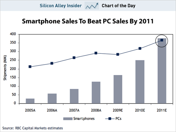
Nowadays, more and more people are using electronic devices to simplify their lives. Using bulky PCs seamlessly spilled over into laptops, and now into smartphones. Large companies like Apple, Dell and Microsoft want to get part of the smartphone market: by the end of 2011, global smartphone sales are expected to beat global PC sales.
That is why mobile web development is very relevant now. Sales of smartphones are growing every day and this suggests the need for increased attention to interfaces for mobile devices. How to satisfy all requests from users who are becoming more and more demanding? How to make people able to watch the site, both on a Full HD monitor and on a mobile phone?
Web developers have always had cross-browser problems. Now they have another headache: cross-platform, because the Android application will never work on the iPhone and vice versa.
The purpose of this article is to examine the problems of web developers, in connection with the advent of smartphones, offer ways to solve them and show effective solutions in practice using the Sencha Touch framework. The main problem is that more and more people use and want to use the Internet on their mobile devices, but not all sites are ready to provide this service.
First of all, it is important to understand why people actually need a mobile version of the site. Maybe someone will say that a too small percentage of users visit a website using a mobile phone to think about it. In fact, he is wrong. According to Facebook statistics, “more than 250 million active users are currently logging in to Facebook via mobile devices. [1] Facebook has more than 500 million active users, so 50% of them are mobile users. 75% of YouTube users report that mobile is their main way to access content. [2]
Why is that? Because people can not always carry a computer or laptop, and a mobile phone is always there.
The easiest way to find out the percentage of visitors using mobile devices is to launch Google Anlytics. Do not forget to pay attention to the types of devices and operating systems that are used by your users. Try to understand why users visit the site using a mobile device and what features they need.
')
Nowadays, many developers, after creating a website, test it in various browsers (IE, Firefox, Chrome, Opera, and Safari) and do not think about how their creation will look on a mobile device. Companies need to evaluate correctly how quickly smartphones and other mobile devices change the way clients access the Internet, as the BBC does.
There are several possibilities to create an application for smartphones. The first way is to hire an Objective-C programmer who writes code for the iPhone and iPad, a Java programmer who writes for Android, BlackBerry, and. NET programmer who writes for Windows Phone 7.
As you can see, this is not the easiest solution, so I offer one more thing: a web application.
Here are the main advantages for creating a web application, rather than native:
• Cross-platform.
• It is much easier to find an HTML programmer than an expert in Objective-C or. NET.
• It is much easier to remake one website than to change the design for each native application.
• You can update your site at any time.
• Users prefer browsers, rather than their own applications [4].
Often, companies start to think about the mobile version by saying that “they need an iPhone or Android application” instead of finding out that their users use not only these platforms.
There are many applications for smartphones with the Android or iOS operating system, but what about Windows Phone 7, Blackberry and Symbian ? Who wants to learn another SDK, who wants to learn another language? Who will update the code on all platforms with the slightest changes?
It is worth developing a native application only if you need access to a camera, accelerometer, etc. And even then, for the time being .
There is only one way to support all platforms: the use of web standards, and now this standard is HTML5 [5].
In addition to the cross-platform problem I wrote above, there can be different web browsers on any device. For example, a user with an Android phone can access your website using either the default browser or Opera Mini or Firefox Mobile.
Common problems for developers for mobile devices:
• Screen size. There are many devas and all have different sizes, starting from 240 x 320 and ending with 800 x 480. This means that the developer cannot make a design of a fixed width;
• Orientation. Moreover, these 240 x 320 can easily turn into 320 x 240.
• Touchable. There must be enough space between the different clickable elements.
The main goal of mobile development is to change the layout for a smaller display.
Mobile web page can be viewed in two modes: portrait and landscape. Using javascript you can access window.orientation :
• 0 - portrait orientation
• -90 and 90 - landscape orientation
You can also use the orientationchange event to perform any actions when the user flips the device. This example simply sets the class attribute when the current orientation changes:
After the page is loaded on the mobile device, the URL input line disappears only when scrolling.
But you can do it programmatically:
Optimization for a mobile site means that you must reduce the number of requests to the server:
• Use one CSS.
• Use CSS Sprites.
• Use HTML5 local storage to cache data.
• Do not try to fill all the empty space on the screen. All users have different connection speeds, so the site should not “weigh” too much. Excessive number of images, text, code, etc. not only worsens the perception of users of the site, but also significantly increases the load time.
• Even on a small screen, the user should not have problems reading the text.
• There should be enough space around the interactive elements of the site to click on them. All that the user touches must be at least the size of the middle finger.
• Show download progress with animation.
There is a very wide range of mobile devices, but unfortunately, web developers cannot check their web applications as easily as they do on a PC. On the one hand, testing should take place on real devices, but buying a device for each platform is stupid. For most platforms, there are device emulators, some of them even online. [6] About one even wrote on Habré .
Upd: Thank you easyman : Nokia Live for tests .
There are enough frameworks for mobile applications, I have tried these five: jQTouch, iWebKit, Wink Toolkit, jQuery Mobile and Sencha Touch. The first three are not very good - they only support one or two platforms. The two remaining ones are the ones to choose from. After reading this , I decided to start with Sencha Touch. In addition, I already had experience with Ext JS (product from the Sencha family). Lately, I follow this scheme for a new project: if I need support for a large number of platforms, then I use jQuery Mobile , but usually customers have enough iOS + Android, then my choice: Sencha Touch - there is really great documentation .
Sencha Touch is supported by the following platforms: iOS, Android, WebOS, BlackBerry + on Chrome, Safari.
As an example, I will show a simple game , the platforms are all of the above.
This is my first and trial article, I want to understand how interesting this topic is for users, in general I am going to write articles / lessons on mobile web application development using Sencha Touch and jQuery Mobile frameworks.
[1] Facebook Statistics www.facebook.com/press/info.php?statistics
[2] YouTube Mobile users report googlemobileads.blogspot.com/2010/11/75-of-youtube-mobile-users-report-that.html?m=0
[3] BBC mobile future www.bbc.co.uk/blogs/bbcinternet/2010/02/bbc_online_our_mobile_future.html
[4] Mobile Users Prefer Browsers over Apps www.emarketer.com/Article.aspx?R=1008010
[5] Dive into HTML5 diveintohtml5.org
[6] Mobile emulators www.mobilexweb.com/emulators
That is why mobile web development is very relevant now. Sales of smartphones are growing every day and this suggests the need for increased attention to interfaces for mobile devices. How to satisfy all requests from users who are becoming more and more demanding? How to make people able to watch the site, both on a Full HD monitor and on a mobile phone?
Web developers have always had cross-browser problems. Now they have another headache: cross-platform, because the Android application will never work on the iPhone and vice versa.
The purpose of this article is to examine the problems of web developers, in connection with the advent of smartphones, offer ways to solve them and show effective solutions in practice using the Sencha Touch framework. The main problem is that more and more people use and want to use the Internet on their mobile devices, but not all sites are ready to provide this service.
Mobile Web Review
First of all, it is important to understand why people actually need a mobile version of the site. Maybe someone will say that a too small percentage of users visit a website using a mobile phone to think about it. In fact, he is wrong. According to Facebook statistics, “more than 250 million active users are currently logging in to Facebook via mobile devices. [1] Facebook has more than 500 million active users, so 50% of them are mobile users. 75% of YouTube users report that mobile is their main way to access content. [2]
Why is that? Because people can not always carry a computer or laptop, and a mobile phone is always there.
The easiest way to find out the percentage of visitors using mobile devices is to launch Google Anlytics. Do not forget to pay attention to the types of devices and operating systems that are used by your users. Try to understand why users visit the site using a mobile device and what features they need.
')
Nowadays, many developers, after creating a website, test it in various browsers (IE, Firefox, Chrome, Opera, and Safari) and do not think about how their creation will look on a mobile device. Companies need to evaluate correctly how quickly smartphones and other mobile devices change the way clients access the Internet, as the BBC does.
Creation options
There are several possibilities to create an application for smartphones. The first way is to hire an Objective-C programmer who writes code for the iPhone and iPad, a Java programmer who writes for Android, BlackBerry, and. NET programmer who writes for Windows Phone 7.
As you can see, this is not the easiest solution, so I offer one more thing: a web application.
Here are the main advantages for creating a web application, rather than native:
• Cross-platform.
• It is much easier to find an HTML programmer than an expert in Objective-C or. NET.
• It is much easier to remake one website than to change the design for each native application.
• You can update your site at any time.
• Users prefer browsers, rather than their own applications [4].
Often, companies start to think about the mobile version by saying that “they need an iPhone or Android application” instead of finding out that their users use not only these platforms.
There are many applications for smartphones with the Android or iOS operating system, but what about Windows Phone 7, Blackberry and Symbian ? Who wants to learn another SDK, who wants to learn another language? Who will update the code on all platforms with the slightest changes?
It is worth developing a native application only if you need access to a camera, accelerometer, etc. And even then, for the time being .
There is only one way to support all platforms: the use of web standards, and now this standard is HTML5 [5].
Mobile development issues
In addition to the cross-platform problem I wrote above, there can be different web browsers on any device. For example, a user with an Android phone can access your website using either the default browser or Opera Mini or Firefox Mobile.
Common problems for developers for mobile devices:
• Screen size. There are many devas and all have different sizes, starting from 240 x 320 and ending with 800 x 480. This means that the developer cannot make a design of a fixed width;
• Orientation. Moreover, these 240 x 320 can easily turn into 320 x 240.
• Touchable. There must be enough space between the different clickable elements.
Recommendations for creating mobile applications
The main goal of mobile development is to change the layout for a smaller display.
Mobile web page can be viewed in two modes: portrait and landscape. Using javascript you can access window.orientation :
• 0 - portrait orientation
• -90 and 90 - landscape orientation
You can also use the orientationchange event to perform any actions when the user flips the device. This example simply sets the class attribute when the current orientation changes:
window.onorientationchange = function() { var orientation = window.orientation; switch(orientation) { case 0: document.body.setAttribute("class","portrait"); break; case 90: document.body.setAttribute("class","landscape"); break; case -90: document.body.setAttribute("class","landscape"); break; } } After the page is loaded on the mobile device, the URL input line disappears only when scrolling.
But you can do it programmatically:
window.addEventListener ('load', () { setTimeout (ScrollTo, 0, 0, 1); }, False); Optimization for a mobile site means that you must reduce the number of requests to the server:
• Use one CSS.
• Use CSS Sprites.
• Use HTML5 local storage to cache data.
Design Tips
• Do not try to fill all the empty space on the screen. All users have different connection speeds, so the site should not “weigh” too much. Excessive number of images, text, code, etc. not only worsens the perception of users of the site, but also significantly increases the load time.
• Even on a small screen, the user should not have problems reading the text.
• There should be enough space around the interactive elements of the site to click on them. All that the user touches must be at least the size of the middle finger.
• Show download progress with animation.
Mobile App Testing
There is a very wide range of mobile devices, but unfortunately, web developers cannot check their web applications as easily as they do on a PC. On the one hand, testing should take place on real devices, but buying a device for each platform is stupid. For most platforms, there are device emulators, some of them even online. [6] About one even wrote on Habré .
Upd: Thank you easyman : Nokia Live for tests .
Create your own mobile applications
There are enough frameworks for mobile applications, I have tried these five: jQTouch, iWebKit, Wink Toolkit, jQuery Mobile and Sencha Touch. The first three are not very good - they only support one or two platforms. The two remaining ones are the ones to choose from. After reading this , I decided to start with Sencha Touch. In addition, I already had experience with Ext JS (product from the Sencha family). Lately, I follow this scheme for a new project: if I need support for a large number of platforms, then I use jQuery Mobile , but usually customers have enough iOS + Android, then my choice: Sencha Touch - there is really great documentation .
Sencha Touch is supported by the following platforms: iOS, Android, WebOS, BlackBerry + on Chrome, Safari.
As an example, I will show a simple game , the platforms are all of the above.
This is my first and trial article, I want to understand how interesting this topic is for users, in general I am going to write articles / lessons on mobile web application development using Sencha Touch and jQuery Mobile frameworks.
Links
[1] Facebook Statistics www.facebook.com/press/info.php?statistics
[2] YouTube Mobile users report googlemobileads.blogspot.com/2010/11/75-of-youtube-mobile-users-report-that.html?m=0
[3] BBC mobile future www.bbc.co.uk/blogs/bbcinternet/2010/02/bbc_online_our_mobile_future.html
[4] Mobile Users Prefer Browsers over Apps www.emarketer.com/Article.aspx?R=1008010
[5] Dive into HTML5 diveintohtml5.org
[6] Mobile emulators www.mobilexweb.com/emulators
Source: https://habr.com/ru/post/123191/
All Articles