New catalog of web fonts from Google
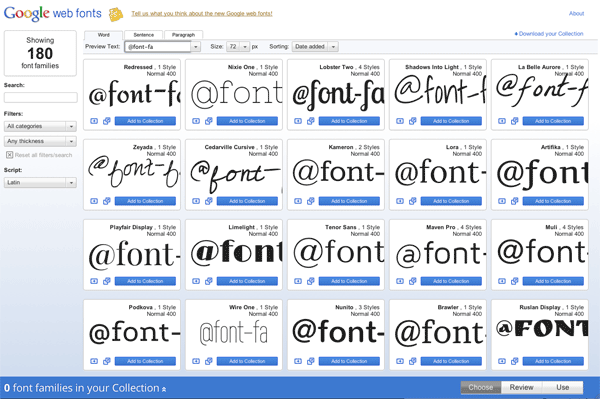
It's amazing how many great Google products can launch in one day, even if it's a tau day. On Habré, Google has already discussed new design , Takeout and Swiffy Converter , and here’s another release: a new interface for viewing Google Web Fonts web fonts. A link to the new version also appeared in the old interface (above). At the moment, the catalog contains 180 web font families. All of them are free and can be easily embedded on any page.
The developers not only updated the interface, but also added several useful features that they had been asked for a long time, including the ability to preview on any given text, character-by-character comparison, and the page load time indicator.
The interface is developed based on the results of usability tests on a group of users. It turned out that when choosing a font, users often have a particular way of using it. Therefore, three typical options for previewing and comparing fonts have been added to the font browser: 1) a word; 2) the proposal; 3) paragraph. When choosing one of the options, the font size and the preview window size automatically change, so that more fonts fit on the screen.
')
The new interface has added a filter for viewing fonts in width / thickness, regardless of the nominal characteristics of the font. That is, one font in the Bold version may be thinner than the other font in the standard version, and when choosing a filter, fonts of the same thickness are always on the screen. This feature is based on TypeDNA technology.
At the last stage, you can copy ready-made snippets for each font to embed them in the CSS on your page. At the same time, Google shows the page loading speed indicator, depending on the number of fonts that are loaded with the page.
You can use the free Google Fonts API to embed web fonts from the Google collection.
Source: https://habr.com/ru/post/123021/
All Articles