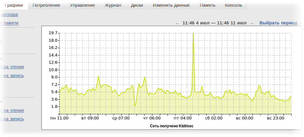
Charts in the cloud
News in one line: graphs of resource consumption by virtual machines in the cloud have become available to customers.
')
Several screenshots of this statistics even appeared in our blog.
We were almost ready to publish it for clients, when suddenly a regrettable fact emerged: with literally several hundred 8-core Xeon machines, it is not enough to calculate it all.
The reason was naive math. Sources of statistics for each virtual machine:
At the third hundred cars we had to turn off our “naive” statistics and think about how to do it right ...
The result was a little bit not enough - its own specialized database and a rather cunning algorithm for accumulating statistics. According to our calculations, the resulting design will be able to serve several tens of thousands of cars. For the sake of this database, we even had to abandon python - the language used to develop most of our system - and turn to Erlang. I myself do not really like him, but I have to admit that he solves the task set much more successfully than a python (for which full-fledged multi-tasking and tens of thousands of transactions per second is an obvious overkill). The second important feature was the good support of “non-negatives” (analogue of greenlet, fiber with competitive multitasking) with error isolation, ready supervisor and ITC (inter thread communication).
Why we did not choose RRD? The answer is simple and sad: RRD does not support bulk insertion - you cannot save multiple values in a single operation. This means that you have to make thousands of separate transactions, each of which hurts the disk.
Conveyors move at different speeds (read, have different resolutions), and have a certain length - in fact, the interval for which statistics are available with a given resolution. When recording a single value, it is distributed across all conveyors immediately (both slow and fast), plus, you can record values for many different conveyors for different circuits at a time.
I already wrote about the speed of this solution, but in addition to speed, this approach solved another problem - we don’t have a jitter (in fact, it is, due to the inaccuracy of determining the moment of recording in the bucket and rounding errors to the whole, but it is from 0.1 up to 0.5%, which is less than the thickness of a line on regular sized charts, compared to 1-5% on a naive 'rrd-like' database.
Unfortunately, this algorithm has some minor flaws - its first and last points are incorrectly displayed - the buckets are not completely filled there, so there is an obvious decline on the graph at the very beginning and at the very end of the conveyor. And if for the "beginning" of the schedule it is not particularly important, then the incorrect display of the last minute is a problem. Alas, this is the price for successful solution of other problems.
Clients who frequently connect-disconnect disks may find that every time a disk is reconnected, all I / O statistics are lost. In fact, it is not lost, just the connection between the virtual machine and the disk is new every time - and therefore, new pipelines in the database.
Statistics can be a little worn - unlike client machines and accounting data, we do not consider statistics as a priority service (we don’t even have a cluster under it) - and if the statistics server restarts (or is dropped by good programmers), then separate lacunae. Sorry, but as it is, so it is.
For the same reason, we may have some incomprehensibility in the statistics for the last month - we debugged some moments “on the living”.
Starting to scroll through the statistics in a certain resolution (for example, with hourly counts) you rather quickly stumble upon its end. Like RRD, we store data for graphs in high resolution only for some time - then data is available only in a more coarse form (that is, for example, instead of hourly counts - diurnal).
Appearance we will continue to refine, incl. based on comments here.
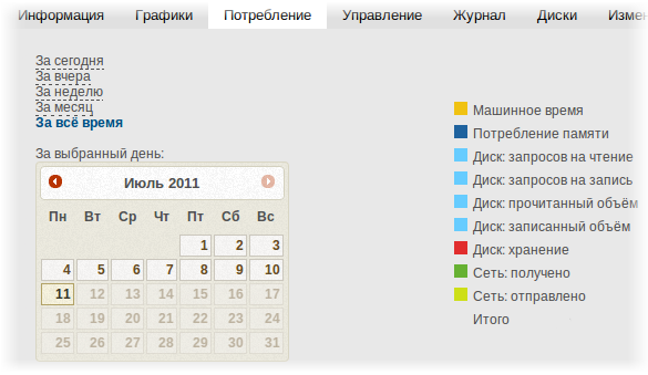
And one more small change that is clearly not worth a separate post: now you can see the consumption for each day, and not just fixed samples (today / yesterday / week / month / all time). This is clearly not what we want to do, but it was easy to fasten the calendar. This tab is still in the stub state, that is, we are still going to redo it significantly.
History of creation
Statistics, more precisely, its first version, was made around the month of November (until the public announcement of the launch of the cloud). It was a very naive version that honestly counted the statistics for each machine, wrote it to the database.')
Several screenshots of this statistics even appeared in our blog.
We were almost ready to publish it for clients, when suddenly a regrettable fact emerged: with literally several hundred 8-core Xeon machines, it is not enough to calculate it all.
The reason was naive math. Sources of statistics for each virtual machine:
- CPU
- memory
- disc operations: 2 pcs. (read / write)
- read / write data: 2 pcs.
- disk space
- net: 2 pcs
At the third hundred cars we had to turn off our “naive” statistics and think about how to do it right ...
The result was a little bit not enough - its own specialized database and a rather cunning algorithm for accumulating statistics. According to our calculations, the resulting design will be able to serve several tens of thousands of cars. For the sake of this database, we even had to abandon python - the language used to develop most of our system - and turn to Erlang. I myself do not really like him, but I have to admit that he solves the task set much more successfully than a python (for which full-fledged multi-tasking and tens of thousands of transactions per second is an obvious overkill). The second important feature was the good support of “non-negatives” (analogue of greenlet, fiber with competitive multitasking) with error isolation, ready supervisor and ITC (inter thread communication).
A little bit about RRD
Of course, with the words "statistics" and "graphics", the word "round robin database" is spinning in the language, one of the most popular systems for storing statistical data on drums . This article is not about RRD, so I’ll say the basic principle: data is stored in fixed-size files, new data crowds out old ones. The preemptive data from one drum is transferred to another drum in the summation mode. The drums have different dimensions, for example, “an hour with second counts”, “a day with minute counts”, “a month with hour counts”, “a year with daily counts”, etc.Why we did not choose RRD? The answer is simple and sad: RRD does not support bulk insertion - you cannot save multiple values in a single operation. This means that you have to make thousands of separate transactions, each of which hurts the disk.
Trembling
Another problem we encountered was the problem of graph jitter. It is worth staying at least a little while writing the value - as a slight failure appears on the graph - and in the next iteration - a light burst. Almost imperceptible on intermittent loads, this jitter looked rather silly on the graph of memory consumption and disk size.Problem solving
Our solution is a special method of collecting statistics, writing to the "buckets", moving along the conveyor. Buckets move regardless of whether there is a record in them or not. When a recording occurs, its contents are divided between two buckets in proportion to the moment of recording. If we have a bucket of 1: 1 and 1: 2, and the record occurred at 1: 01.33, then two-thirds of the value will be recorded in the first bucket, and a third - in the second.Conveyors move at different speeds (read, have different resolutions), and have a certain length - in fact, the interval for which statistics are available with a given resolution. When recording a single value, it is distributed across all conveyors immediately (both slow and fast), plus, you can record values for many different conveyors for different circuits at a time.
I already wrote about the speed of this solution, but in addition to speed, this approach solved another problem - we don’t have a jitter (in fact, it is, due to the inaccuracy of determining the moment of recording in the bucket and rounding errors to the whole, but it is from 0.1 up to 0.5%, which is less than the thickness of a line on regular sized charts, compared to 1-5% on a naive 'rrd-like' database.
Unfortunately, this algorithm has some minor flaws - its first and last points are incorrectly displayed - the buckets are not completely filled there, so there is an obvious decline on the graph at the very beginning and at the very end of the conveyor. And if for the "beginning" of the schedule it is not particularly important, then the incorrect display of the last minute is a problem. Alas, this is the price for successful solution of other problems.
Storage
The actual backend for us now (temporarily) is Redis due to the support of the data types and speed we need. However, this speed is still not enough for us, so as the cloud develops, we will replace it with our own storage, fully customized for our needs. Currently, processing a single tick through pipelines takes more than one transaction and we don’t like it.Display
Following our tradition, we tried to do everything using HTML / JS - the graphics are drawn directly by JS in SVG, without prior rendering in PNG from the server side. For this we use the gRaphaël library ( http://g.raphaeljs.com/ ).Known Issues
Clients who frequently connect-disconnect disks may find that every time a disk is reconnected, all I / O statistics are lost. In fact, it is not lost, just the connection between the virtual machine and the disk is new every time - and therefore, new pipelines in the database.
Statistics can be a little worn - unlike client machines and accounting data, we do not consider statistics as a priority service (we don’t even have a cluster under it) - and if the statistics server restarts (or is dropped by good programmers), then separate lacunae. Sorry, but as it is, so it is.
For the same reason, we may have some incomprehensibility in the statistics for the last month - we debugged some moments “on the living”.
Starting to scroll through the statistics in a certain resolution (for example, with hourly counts) you rather quickly stumble upon its end. Like RRD, we store data for graphs in high resolution only for some time - then data is available only in a more coarse form (that is, for example, instead of hourly counts - diurnal).
Appearance we will continue to refine, incl. based on comments here.
Consumption display
And one more small change that is clearly not worth a separate post: now you can see the consumption for each day, and not just fixed samples (today / yesterday / week / month / all time). This is clearly not what we want to do, but it was easy to fasten the calendar. This tab is still in the stub state, that is, we are still going to redo it significantly.
Source: https://habr.com/ru/post/122987/
All Articles