Web analytics tools for analyzing site usability
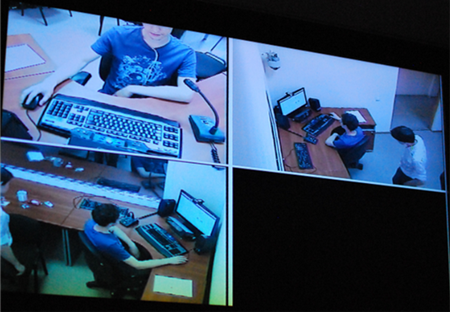
The other day, a group of usability and UX SPb interface designers visited the newly opened usability laboratory UNIC of SPbSU ITMO on the Exchange.
One of the results of usability testing is a heat map based on the user’s gaze tracking data:

This map gives us an idea of which parts of the site or program are being ignored by users, and which parts attract attention. Of course, this is not the only result that gives usability testing. But I wanted to share this: a simplified analysis of the aspect of attention or ignoring a web-site user by a user at any time, without having a lab at hand.
Thus, Yandex.Metrica provides an opportunity to view the “click map” and “link map” of the site. The map of clicks, respectively, shows where the user clicked the mouse on the page of the site, and the map of links to which links went from this page.
')
Click Map:

Link Map:

It should be noted that the link map may not work correctly with some CMS, even if there are redirects. This can be seen on the screenshots of the maps: for example, the menu item “Program”, judging by the clicks, is one of the most popular, according to the reference map it is not. Just in that section the redirect is configured. Another caveat: on the link map, if the same link is present on the page several times, then we see only the total number of transitions: it is impossible to establish which particular link was clicked (say, in the main menu or in the text).
The map of clicks in this sense is more accurate, but if the interface changed during the analyzed period, then this may introduce some confusion in the results. However, if you keep this in mind, it is quite possible to get to the bottom of the truth: remember what and where you moved and realize that some of the clicks belonged to the “moving out” area.
Why am I telling this. SEO-shnik, and many others, have long been aware of these and other capabilities of Yandex, Google and other analytics systems. And at the same time, these tools available to everyone are still not appreciated by web designers, usability, developers, web project managers.
Yes, maps have their drawbacks, but nevertheless, they instantly and in a form convenient for comprehension provide invaluable information about what is on the site is “in demand” and what is not, and allow making appropriate adjustments.
Here are some examples:
And so on. You will say: "It's all obvious, there are golden rules of usability, and most of them are known." I can only answer, if everything was so good, we would have much more convenient sites. And then, real data motivates much better than abstract rules and usability checklists :)
Good luck!
One of the results of usability testing is a heat map based on the user’s gaze tracking data:
This map gives us an idea of which parts of the site or program are being ignored by users, and which parts attract attention. Of course, this is not the only result that gives usability testing. But I wanted to share this: a simplified analysis of the aspect of attention or ignoring a web-site user by a user at any time, without having a lab at hand.
Thus, Yandex.Metrica provides an opportunity to view the “click map” and “link map” of the site. The map of clicks, respectively, shows where the user clicked the mouse on the page of the site, and the map of links to which links went from this page.
')
Click Map:
Link Map:
It should be noted that the link map may not work correctly with some CMS, even if there are redirects. This can be seen on the screenshots of the maps: for example, the menu item “Program”, judging by the clicks, is one of the most popular, according to the reference map it is not. Just in that section the redirect is configured. Another caveat: on the link map, if the same link is present on the page several times, then we see only the total number of transitions: it is impossible to establish which particular link was clicked (say, in the main menu or in the text).
The map of clicks in this sense is more accurate, but if the interface changed during the analyzed period, then this may introduce some confusion in the results. However, if you keep this in mind, it is quite possible to get to the bottom of the truth: remember what and where you moved and realize that some of the clicks belonged to the “moving out” area.
Why am I telling this. SEO-shnik, and many others, have long been aware of these and other capabilities of Yandex, Google and other analytics systems. And at the same time, these tools available to everyone are still not appreciated by web designers, usability, developers, web project managers.
Yes, maps have their drawbacks, but nevertheless, they instantly and in a form convenient for comprehension provide invaluable information about what is on the site is “in demand” and what is not, and allow making appropriate adjustments.
Here are some examples:
- Links and headings are in the same color. The map of clicks instantly and clearly shows that users take the title for the link, try to click it
- The current menu item is not sufficiently highlighted or is at odds with the page title. A click map will show that users are constantly clicking on it, not realizing that they are already on this page.
- links in the text are not underlined or not sufficiently different from plain text. I will not explain.
- A simple list of some, say, services, looks interactive to users: they constantly click on it, although there are no links in it.
And so on. You will say: "It's all obvious, there are golden rules of usability, and most of them are known." I can only answer, if everything was so good, we would have much more convenient sites. And then, real data motivates much better than abstract rules and usability checklists :)
Good luck!
Source: https://habr.com/ru/post/122689/
All Articles