Losing innocence: about the design of your first app
re-added post, now on its own behalf.
About ten years ago I read a very famous book about web design. Omitting the obvious fact that website design and interface design are two different things, I remember the phrase when answering the question “how to start website design”, experienced project managers answer “from the beginning”.
Two months ago, my colleague Andrei Vinogradov advised me to implement a great idea of a new application under the Apple Store. A month ago, I started selling, and I want to talk about how to start my first application from scratch in this area. It is difficult, but terribly interesting, and some of us will earn on it a comfortable old age.
')
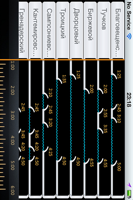
The task seems trivial, but for St. Petersburg the “map of bridges” is the same as for Moscow - the subway map, which the Lebedev Theme has been refining for a couple of months. The task was “to cling”, and that the interface would remain “in an Apple-style” intuitive (although we had to move far from the canons). What would be a cool icon, and that everything would be exactly where the user wanted to see it. That would not be bydlografki, an excess of unnecessary buttons (as it is usually homegrown programmers) and that everything would be left in their places. What I myself would like to spend ninety-nine cents on a small program in my pocket, and I don’t care about the rest.
The task was to assemble a team for the project, decide on the design and icon, test and promote the application. Everything in order: in this post we will discuss how the design was developed from scratch.
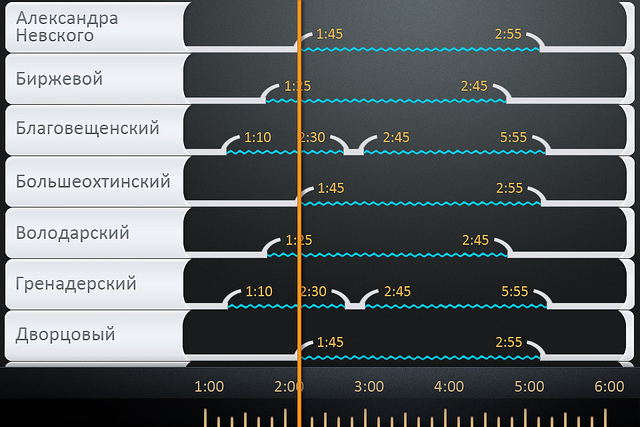
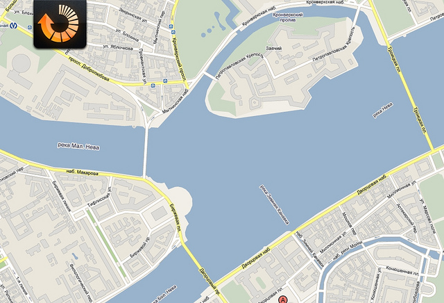
As a reference, the bridges.spb suddenly left the app-stor.
www.iphones.ru/iNotes/29206
and the task is to finalize the interface. The program solved the problem, but left the impression that instead of the iPhone’s screen, the owner misses a huge monitor on which everything should fit, and the retina display is a small ridiculous misunderstanding.
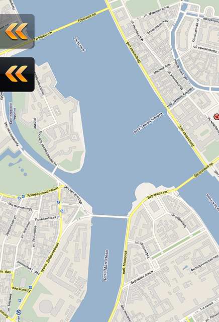
It was decided to change the palette and leave the colors of asphalt and road markings. The first sketch of the internal icons appears. An excellent site “razvodkamostov.ru” pushes on the idea of a pocket schedule that even Lebedev's Theme is not shy about expressions
www.artlebedev.ru/kovodstvo/business-lynch/2010/07/12
Andrey lays a version on a three-story mat, however, I decide to use the services of the designer who presented the layout. Together we are trying to find an idea: each graph with a bridge should become smaller, the icons more intuitive, and the information itself is more conveniently presented. We decide to abandon the lower tabs, so that the screen flows into one another when you rotate the device. The programmer confirms the ability to implement the task in the code, and now the ridiculous sorting buttons from the header flow into the basement, where they find their face. Along the way we play with the font, remove the handwritten mess from the first version, but it’s still far from the final decision.

Something similar to the truth, but still very far from ideal. We decided to add a social bookmark button (top left), which is already implemented in MobileRSS - if the user is satisfied, let him help us with advertising, and add a gps button (bottom left) to sort the bridges depending on the location of the owner. We are considering whether the car owner needs road junctions (from the bottom right), but it seems to be moving in the wrong direction. But with the horizontal screen there are still problems - better than last time, but it's not that, so the question is being put aside for a while. At this stage we build in the solution “clicked on time - it changed at a distance to the bridge - clicked on the distance to the bridge, it changed at the time”, which saves the screen space. Razvodka is something in the spirit of the 90s, changing the spelling to Cyrillic. After several hours in Photoshop, the colors became more contrasting and sharper:
The thought of making the program bilingual comes to my head by chance, there is just a little space left for the button at the top right. At the same time, we brush the colors, bring the icons in the footer to mind, redraw the fonts in the Russian logo again. We introduce the mechanism of the “favorite bridge”, but later refuse it for the sake of simplicity of the interface.
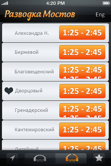
From this point on, the development of the program goes in two ways - it already exists in the code, and is actively tested in current work: every day brings several new ideas that are drawn, discussed, and again implemented in the program code. The version laid out in the Apple Store was the tenth build.
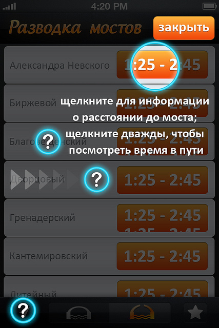
We think about the most convenient implementation of the help screen and make the first few sketches:

The idea is fresh, but “an idea for an idea” is not worth it - the first ten users of the program say that “everything is clear”. Already finished screens go to the scrap. Only the sorting button by location was called "incomprehensible," and for it a pair of small, reminiscent icons are created.

At this stage, it became obvious that a “tenacious logo is required for the“ best informer on bridges ”. The option proposed by the designer is good only as a stub, so that on my own skin I was convinced that everyone should do their own thing. All sorts of variations on the theme of bridges make me drowsy, and several well-known Russian firms specializing in logos (not Lebedev, of course) call the price "from a thousand euros."

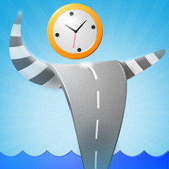
I again have to look for a workaround: the designer from Moscow comes up with the idea of “with a little man-regulator”, and his colleague from Ukraine is a concise graphical solution (it seems the sixth in a row). Having reviewed a couple of hundreds of other people's icons in a month (beginners can recommend deviantart and free-lance), I still find it difficult to say what evaluation criteria should be used when choosing, except for one thing: trust yourself. The designer spent the whole night drawing the sixth version, and seeing it in the morning I said to myself: oh, that's it!

We continue to work on the project and work on secondary elements: a window of social bookmarks appears, because the yard is already ten years old as the twenty-first century. We do not forget that the program has become bilingual - and the work on drawing the logo and working with social networks has doubled.

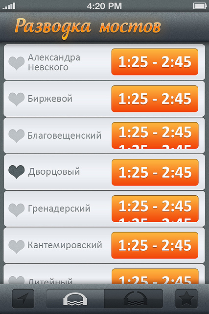
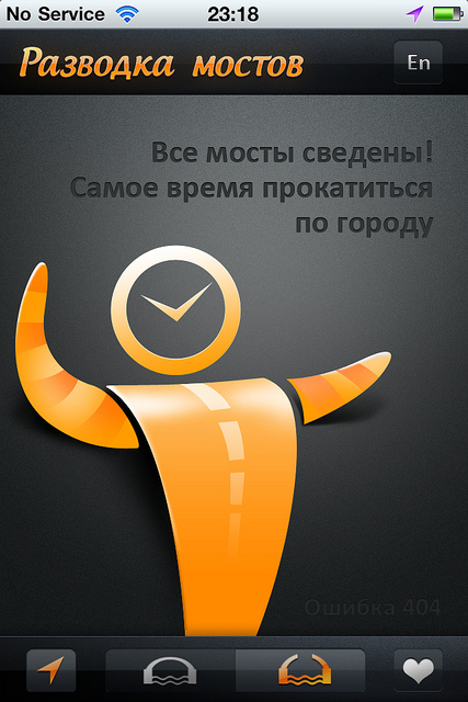
The first users of the program point out that on 3GS phones, the “bridges” button is indistinguishable from “reduced”: the distance between the spans is too small, so it was decided to redraw it. We reflect on the other buttons and change the star to the heart for the icon of favorites. Again, draw individual letters, add a logo, and change the implementation of the horizontal screen. Accidentally (when you treat your program as your child, such things happen unexpectedly) we discover an offensive bug with a blank screen - since during the day all the bridges are flattened, there is nothing on the screen when you click on the “bridges erected” button. This is logical, but it looks ugly. By this time, the icon is drawn, and a few laconic phrases solve the problem:
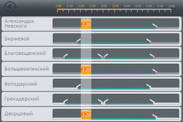
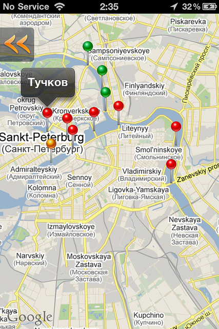
From the very beginning, it was clear that the geolocation program should embed a screen with Google Meps, but even such a simple idea fell into two problems: embed the map into the existing design and implement it in code, and if the map resolved the issue after several sketches:
it was more complicated with the code. At this point, it became obvious to me that the pins on the map should be of different colors, red for divorced, green for open to movement, and orange for "open last 15 minutes." The Google API did not share my love for the color orange, and the pins had to be repainted with pens to insert into the map in the form of raster images. Naturally, the functionality of “show yourself on the map” was added to the final build, so now, as a user, the first two screens seemed superfluous: at night I ride in map mode in the city.
A separate story with the coding of the program on the finished pictures - there are problems with drawing, fonts, interactions with social services, and other offensive problems, the solution of which takes a lot of time. The date of the display on the appstore is shifted by a couple of weeks, and one evening I notice that the bridges are already starting to be erected with the start of navigation, and our cart is all now there. We collect the will into a fist and brush the remaining minor flaws - a week after the start of navigation, the fully ready app is sent for approval.
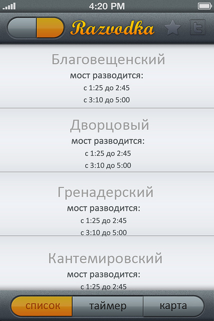
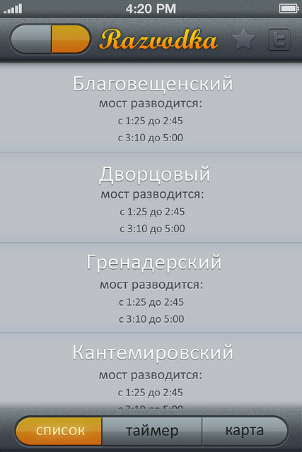
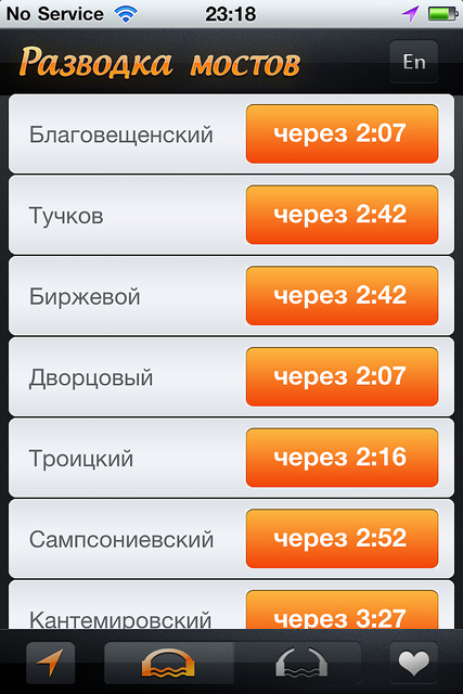
Two months of work and we get the implementation of the task:
About ten years ago I read a very famous book about web design. Omitting the obvious fact that website design and interface design are two different things, I remember the phrase when answering the question “how to start website design”, experienced project managers answer “from the beginning”.
Two months ago, my colleague Andrei Vinogradov advised me to implement a great idea of a new application under the Apple Store. A month ago, I started selling, and I want to talk about how to start my first application from scratch in this area. It is difficult, but terribly interesting, and some of us will earn on it a comfortable old age.
')
The task seems trivial, but for St. Petersburg the “map of bridges” is the same as for Moscow - the subway map, which the Lebedev Theme has been refining for a couple of months. The task was “to cling”, and that the interface would remain “in an Apple-style” intuitive (although we had to move far from the canons). What would be a cool icon, and that everything would be exactly where the user wanted to see it. That would not be bydlografki, an excess of unnecessary buttons (as it is usually homegrown programmers) and that everything would be left in their places. What I myself would like to spend ninety-nine cents on a small program in my pocket, and I don’t care about the rest.
The task was to assemble a team for the project, decide on the design and icon, test and promote the application. Everything in order: in this post we will discuss how the design was developed from scratch.
As a reference, the bridges.spb suddenly left the app-stor.
www.iphones.ru/iNotes/29206
and the task is to finalize the interface. The program solved the problem, but left the impression that instead of the iPhone’s screen, the owner misses a huge monitor on which everything should fit, and the retina display is a small ridiculous misunderstanding.
It was decided to change the palette and leave the colors of asphalt and road markings. The first sketch of the internal icons appears. An excellent site “razvodkamostov.ru” pushes on the idea of a pocket schedule that even Lebedev's Theme is not shy about expressions
www.artlebedev.ru/kovodstvo/business-lynch/2010/07/12
Andrey lays a version on a three-story mat, however, I decide to use the services of the designer who presented the layout. Together we are trying to find an idea: each graph with a bridge should become smaller, the icons more intuitive, and the information itself is more conveniently presented. We decide to abandon the lower tabs, so that the screen flows into one another when you rotate the device. The programmer confirms the ability to implement the task in the code, and now the ridiculous sorting buttons from the header flow into the basement, where they find their face. Along the way we play with the font, remove the handwritten mess from the first version, but it’s still far from the final decision.
Something similar to the truth, but still very far from ideal. We decided to add a social bookmark button (top left), which is already implemented in MobileRSS - if the user is satisfied, let him help us with advertising, and add a gps button (bottom left) to sort the bridges depending on the location of the owner. We are considering whether the car owner needs road junctions (from the bottom right), but it seems to be moving in the wrong direction. But with the horizontal screen there are still problems - better than last time, but it's not that, so the question is being put aside for a while. At this stage we build in the solution “clicked on time - it changed at a distance to the bridge - clicked on the distance to the bridge, it changed at the time”, which saves the screen space. Razvodka is something in the spirit of the 90s, changing the spelling to Cyrillic. After several hours in Photoshop, the colors became more contrasting and sharper:
The thought of making the program bilingual comes to my head by chance, there is just a little space left for the button at the top right. At the same time, we brush the colors, bring the icons in the footer to mind, redraw the fonts in the Russian logo again. We introduce the mechanism of the “favorite bridge”, but later refuse it for the sake of simplicity of the interface.
From this point on, the development of the program goes in two ways - it already exists in the code, and is actively tested in current work: every day brings several new ideas that are drawn, discussed, and again implemented in the program code. The version laid out in the Apple Store was the tenth build.
We think about the most convenient implementation of the help screen and make the first few sketches:
The idea is fresh, but “an idea for an idea” is not worth it - the first ten users of the program say that “everything is clear”. Already finished screens go to the scrap. Only the sorting button by location was called "incomprehensible," and for it a pair of small, reminiscent icons are created.
At this stage, it became obvious that a “tenacious logo is required for the“ best informer on bridges ”. The option proposed by the designer is good only as a stub, so that on my own skin I was convinced that everyone should do their own thing. All sorts of variations on the theme of bridges make me drowsy, and several well-known Russian firms specializing in logos (not Lebedev, of course) call the price "from a thousand euros."
I again have to look for a workaround: the designer from Moscow comes up with the idea of “with a little man-regulator”, and his colleague from Ukraine is a concise graphical solution (it seems the sixth in a row). Having reviewed a couple of hundreds of other people's icons in a month (beginners can recommend deviantart and free-lance), I still find it difficult to say what evaluation criteria should be used when choosing, except for one thing: trust yourself. The designer spent the whole night drawing the sixth version, and seeing it in the morning I said to myself: oh, that's it!
We continue to work on the project and work on secondary elements: a window of social bookmarks appears, because the yard is already ten years old as the twenty-first century. We do not forget that the program has become bilingual - and the work on drawing the logo and working with social networks has doubled.
The first users of the program point out that on 3GS phones, the “bridges” button is indistinguishable from “reduced”: the distance between the spans is too small, so it was decided to redraw it. We reflect on the other buttons and change the star to the heart for the icon of favorites. Again, draw individual letters, add a logo, and change the implementation of the horizontal screen. Accidentally (when you treat your program as your child, such things happen unexpectedly) we discover an offensive bug with a blank screen - since during the day all the bridges are flattened, there is nothing on the screen when you click on the “bridges erected” button. This is logical, but it looks ugly. By this time, the icon is drawn, and a few laconic phrases solve the problem:
From the very beginning, it was clear that the geolocation program should embed a screen with Google Meps, but even such a simple idea fell into two problems: embed the map into the existing design and implement it in code, and if the map resolved the issue after several sketches:
it was more complicated with the code. At this point, it became obvious to me that the pins on the map should be of different colors, red for divorced, green for open to movement, and orange for "open last 15 minutes." The Google API did not share my love for the color orange, and the pins had to be repainted with pens to insert into the map in the form of raster images. Naturally, the functionality of “show yourself on the map” was added to the final build, so now, as a user, the first two screens seemed superfluous: at night I ride in map mode in the city.
A separate story with the coding of the program on the finished pictures - there are problems with drawing, fonts, interactions with social services, and other offensive problems, the solution of which takes a lot of time. The date of the display on the appstore is shifted by a couple of weeks, and one evening I notice that the bridges are already starting to be erected with the start of navigation, and our cart is all now there. We collect the will into a fist and brush the remaining minor flaws - a week after the start of navigation, the fully ready app is sent for approval.
Two months of work and we get the implementation of the task:
Source: https://habr.com/ru/post/122533/
All Articles