Make the interface easier
 From the translator. The principle of simplicity is one of the fundamental in ergonomics and design. The terms “simplicity” and “intuitiveness” are among the most frequently used in publications on usability issues. However, it often happens that we use these terms as self-explanatory and do not think about their meaning. How can simplicity be defined? Is it possible to suggest some objective criteria for assessing the simplicity and intuitiveness of interfaces?
 We offer to our readers a translation of the article by Brandon Wokin (now engaged in interface design for Facebook), which addresses the issues outlined above.
Any designer working on complex applications tries to keep the interface from being too complex. Complicated interface can adversely affect the user efficiency, increase the time and effort spent on learning how to work with the program and scare users away.
This article will show you how to solve the problem of increased complexity.
Progressive disclosure
Sequential disclosure (progressive disclosure) is one of the most common approaches to reducing complexity. The idea is that the most complex and rarely used elements should be hidden and called only by a special command (by clicking the mouse or by pressing a certain key combination). It is imperative that the designer clearly identifies which elements are necessary and how often they are used.
')
Special attention should be paid to the hierarchy and mechanisms for consistent disclosure. The slightest mistake can lead to the exact opposite result: the interface will become even more complicated. For example, in Windows there is a tendency to eliminate the menu from individual windows and transfer them to the main interface, which leads to certain consequences. Consider some of them:
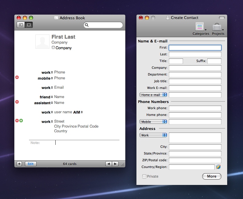
- Access to many important functions in various applications has become inconsistent. For example, the item “Print” is located in different places in the main interface and in the hierarchy of gradual disclosure. The screenshot below shows the location of the print function in the Interner Explorer, contacts Windows Explorer and WordPad. At the same time, in applications for Mac (respectively in Safari, AddressBook and TextEdit), the way to access the print function is unified (the last item in the File menu). A user who already has experience in one of these applications will easily transfer the acquired skill to the others. The principle of “learned once - use everywhere” works here.
- There is a tendency to abuse consistent disclosure. The Internet Explorer interface with Windows Live installed includes a total of 17 drop-down menus. Naturally, all such elements occupy a significant part of the screen space. The more screen space occupied by the controls, the less it is allocated for the main functions of the application.

Contextual actions
Contextual actions are a form of sequential disclosure, in which access to certain functions is displayed only when working with well-defined objects. Most often they are displayed in context menus called up by pressing the right mouse button. Although the context menus are convenient and useful, they are not always easy to detect, so they are not suitable for truly important actions in the work.
The standard way to make the context menu items more visible is as follows: a set of contextual controls is located next to each object. The level of complexity in this case only increases: duplicate controls are located next to each object on the screen. This problem can be solved by using a different technique of sequential disclosure: controls are displayed when an object is selected, when it is under the cursor, etc. This approach solves the problem, since only one specific set of elements is displayed on the screen at a specific time, but it also not without flaws.
Element layout and visual hierarchy
Proper layout of interface elements is an important step towards simplifying it. By simple visual ordering, you can make the interface much more harmonious and attractive.
Convincing examples are the object properties menu in Microsoft Expression Blend and Adobe Lightroom. For a variety of reasons, the Expression Blend interface looks much more complicated, but the main reason is the horizontal layout of the elements:
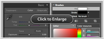
In the Lightroom menu, there are very clear distinctions between the page titles and their content. Headlines are noticeable. They are executed in large type, highlighted with indents and spaces; font color contrasts with the background color. Links and relationships between design elements are clear and understandable.
Visual noise and contrast
The level of visual noise in the interface has a significant impact on its perception. An important role is played by the contrast. The use of less contrasting elements leads to a reduction in the level of visual noise, and the interface is perceived as less complex. We illustrate what has been said with concrete examples.
In the AddressBook user interface, preference is given not to fields with high contrast, but to fields that become visible when focusing. As a result, the fields merge with the rest of the interface. In the New Contact window of Entourage 2008, the standard background color of the window and the standard text entry field are used, making the interface more complex than AddressBook.
As another example, consider the slightly modified screenshot of Aperture 2.0. The figure shows what the program interface would look like if it included more contrast text fields from iLife08 (and partly from iLife09). The modified interface looks much more complicated than the real one. As you can see from the above examples, even by changing colors in the usual way, the interface can be significantly simplified.

Using icons
Complicated and incomprehensible interfaces are often characterized by an abundance of icons that are not accompanied by any explanation. When the user first opens the application with a lot of incomprehensible icons, he will be horrified. In order to truly master the application, you need to know the meaning of all these icons.
This problem is difficult to solve. It so happens that next to the icons there is simply no room for labels and explanations. Making an adequate decision in such a situation is a real art.
With regard to solving this problem, you can give the following tips:
- Make the icons so that their meaning can be easily guessed in appearance. Carefully think over metaphors, colors, sizes.
- Divide icons into groups based on their meaning.
- Use the technique of sequential disclosure: include infrequently used items in the drop-down menus, denoting them with the help of the icon with a text explanation.
Thinking styles
When designing the interface, try to adjust it as much as possible to the thinking style of your users. Inattention to this moment can seriously complicate the work: it will be necessary to spend too much extra intellectual effort to study the interface.
As an example, consider the Windows calendar: it is clearly built in accordance with the logic of the developer's thinking - but not the user. Take a close look at the screenshot below:
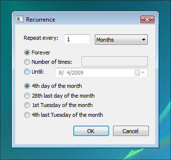
a. What does “28 last day of month” mean (28th last day of the month)?
b. What does “4 last Tuesday of the month” mean (4th last Tuesday of the month)?
with. How much time did it take you to understand what it all means?
The given interface seems difficult, since its functionality and the language used are in no way consistent with your understanding of the repeatability of events. Learn and consider the specifics of user understanding - it will help to make your interfaces intuitive. You can read more about this in Apple's interface design guide.
Finally, try to think carefully. Each of the above techniques requires a certain amount of effort and effort. Analyze the capabilities of each technology in relation to your interface and decide which one is best for your application and how best to use it.
Source: https://habr.com/ru/post/122088/
All Articles