What units to choose when layout
In my last article, I touched on the units of measurement and right there in the comments began discussions and discussions on this topic, so I decided to put this issue in a separate post. Now we will discuss :)
Units of length come in two categories: absolute and relative . The absolute are:
In terms of the specification css 1pt = 1 / 72in, and 1pc = 12pt.
In the font-size property, specifying a negative value in units of length, for example -25cm, is not allowed .
Why absolute? Because behind them in the physical world is a real value, that is, standards .
With such units, an output device works that has a real physical size, for example: when printing, we will use such units.
But for monitors these units have no meaning, there is a certain convention , but this is really just a convention .
Relative units include:
Percentages (%) are always a value that is worth talking about separately. It is so important that the W3C took it out in a separate column. Ie% you can write not all the rules, but only some, and when we write% we need to understand what they are considered from.
Pixel is the smallest point that can be set on a computer screen.
Why is pixel relative value? We take a physical monitor that has a diagonal - this is a real physical quantity. But we can put any permission on it, right? Depending on the resolution we set, the pixel size may vary . That is why a pixel is a relative value. Ie on different monitors px has a different size.
The em unit refers to the size of the standard font set in the global browser options.
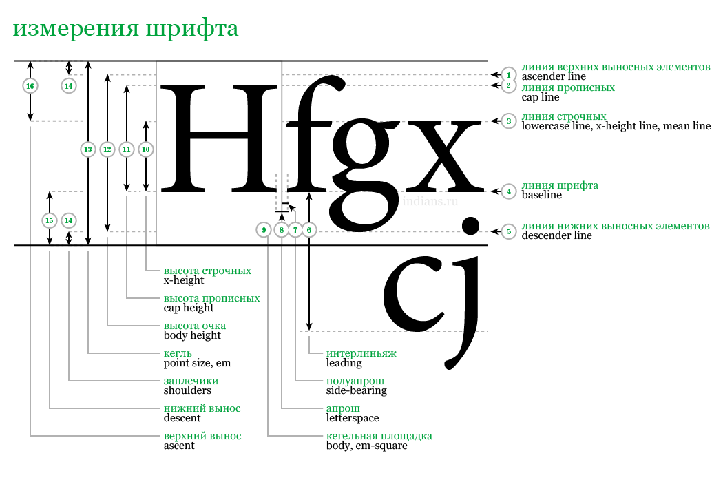
On the table designation of individual important font sizes. Most of them are not useful to us, but some need to know.
The numeral 4 denotes the base line of font elements, and the numeral 13 denotes font-size, em. So, em is the size of the font, which is determined by the height of the capital letter and the size of the extension elements at the top and bottom (diacritical marks may appear at the top, for example: or).
What is ex? This is the height of a lowercase letter. Under the number 3 in the table and written. For different fonts, this ratio has a different size. But not all browsers support this ratio.
For example: Microsoft suggested counting 1em = 2ex for all types of fonts. It is for the reason that ex can be different in different browsers, it is better not to use it in work. Some browsers do consider ex correctly, and some, like IE half em. But in reality it can be 0.46, on small fonts such inconsistency is imperceptible, and on large fonts there will be a significant difference.
Now, regarding the use on sites pt, pc, in.
If we specify the size of the element on the site in pt, it will still be taken from something. So how does the browser solve this problem?
At the dawn of the development of computer technology, the size of the monitors was small. And Microsoft offered to take 96px = 1in for definiteness, and this will be our resolution of our devices.
1in = 96px
And Apple said no :) Let's focus on printers and take:
1in = 72pt
But in practice the following happened: the smaller the resolution, the less there is the opportunity to place information there.
Therefore, Apple changed its mind and made 1in = 96px, but this is all complete nonsense , since the actual physical resolution of your devices ranges from about 60 - 600px / in.
But still the value 96 is decisive for recalculation. This means that if you write a size of 10pt, then the browser will do the following: 96/72 * 10. This is the story when converting pt to px.
In practice, I do not advise using absolute units on monitors. It doesn’t matter on monitors at all, but it’s advisable to use them when printing. When printing, you need to take care that everything is displayed in pt.
Units of length come in two categories: absolute and relative . The absolute are:
- inches (in)
- centimeters (cm)
- millimeters (mm)
- items (pt)
- peaks (pc)
In terms of the specification css 1pt = 1 / 72in, and 1pc = 12pt.
In the font-size property, specifying a negative value in units of length, for example -25cm, is not allowed .
Why absolute? Because behind them in the physical world is a real value, that is, standards .
With such units, an output device works that has a real physical size, for example: when printing, we will use such units.
But for monitors these units have no meaning, there is a certain convention , but this is really just a convention .
Relative units include:
- em (bowling)
- x-height (ex)
- px (pixels)
Percentages (%) are always a value that is worth talking about separately. It is so important that the W3C took it out in a separate column. Ie% you can write not all the rules, but only some, and when we write% we need to understand what they are considered from.
Pixel is the smallest point that can be set on a computer screen.
Why is pixel relative value? We take a physical monitor that has a diagonal - this is a real physical quantity. But we can put any permission on it, right? Depending on the resolution we set, the pixel size may vary . That is why a pixel is a relative value. Ie on different monitors px has a different size.
The em unit refers to the size of the standard font set in the global browser options.
On the table designation of individual important font sizes. Most of them are not useful to us, but some need to know.
The numeral 4 denotes the base line of font elements, and the numeral 13 denotes font-size, em. So, em is the size of the font, which is determined by the height of the capital letter and the size of the extension elements at the top and bottom (diacritical marks may appear at the top, for example: or).
What is ex? This is the height of a lowercase letter. Under the number 3 in the table and written. For different fonts, this ratio has a different size. But not all browsers support this ratio.
For example: Microsoft suggested counting 1em = 2ex for all types of fonts. It is for the reason that ex can be different in different browsers, it is better not to use it in work. Some browsers do consider ex correctly, and some, like IE half em. But in reality it can be 0.46, on small fonts such inconsistency is imperceptible, and on large fonts there will be a significant difference.
Now, regarding the use on sites pt, pc, in.
If we specify the size of the element on the site in pt, it will still be taken from something. So how does the browser solve this problem?
At the dawn of the development of computer technology, the size of the monitors was small. And Microsoft offered to take 96px = 1in for definiteness, and this will be our resolution of our devices.
1in = 96px
And Apple said no :) Let's focus on printers and take:
1in = 72pt
But in practice the following happened: the smaller the resolution, the less there is the opportunity to place information there.
Therefore, Apple changed its mind and made 1in = 96px, but this is all complete nonsense , since the actual physical resolution of your devices ranges from about 60 - 600px / in.
But still the value 96 is decisive for recalculation. This means that if you write a size of 10pt, then the browser will do the following: 96/72 * 10. This is the story when converting pt to px.
In practice, I do not advise using absolute units on monitors. It doesn’t matter on monitors at all, but it’s advisable to use them when printing. When printing, you need to take care that everything is displayed in pt.
')
Source: https://habr.com/ru/post/121964/
All Articles