Typography on the Web
Typography on the Web has come a long way since Tim Burners-Lee pushed the switch in 1991. A long time ago, in the time of IE 1.0, the expression “good typography on the Web” was rather an oxymoron (a combination of words of opposite meaning ). Much has changed. We have not only browsers that can show pictures (ah!); we have the ability to animate our web pages using excellent typography.

First, it should be noted that Typography is not only the ability to choose a font or distinguish one headset from another. As shown by recent experiments, hand-held monkeys accurately recognize Helvetica in 90% of cases.
')

Let's try to talk about typography as a recipe of the four most important ingredients. If you have ever tried to make a soufflé, you know how important the recipe is. Follow this recipe and your typography will grow as if ... well, enough of the culinary metaphors, let's cook.
Pale pink text on a pale blue background may look good on your T-shirt, but it does not read well. The text exists to be read, so make sure that it contrasts well enough with the background. If you are in doubt about the contrast, take a screenshot of the page and turn it into a grayscale image in any graphics editor. You can easily see if there is enough contrast. According to Robert Bringhest, a virtuoso typographer, typography exists to show respect for the content . Do we follow this advice when designing web pages so that the text — the content itself — is hard to read?
Personally, I do not like to read long fragments of inverse text (for example, light text on a dark background); Do we often see books written like this? This approach may be very appropriate for short passages of the text, but it seems to me that reading such a text is very difficult, even less than a minute.
With the birth of Web 2.0, I noticed a rather annoying trend: the fine print. I even wrote to the creators of the sites and kindly offered them to increase the default font size. I received different answers - from "man, buy glasses" to grateful, "thank you, I never even thought that the font on my website might be too small for readers." I even heard the following argument in defense of the tiny text: “it fits my minimalist design”. Far more likely that it reflects a little something else. If Superman and the Sharp-Sighted Falcon are not your only readers, then a small font simply does not fit.

Do not make body text less than 12 px; If possible, increase it. Remember: what looks legible on a 65 ”HD plasma may not look so good on a laptop with a 13” screen. If you have doubts - increase the text. On ILT, the size of the main text is 16 px.
Changing the font size is one of the best ways to show the difference between different content types. Colors and cute dies can help, but the different font sizes systematically used on all pages will clearly and clearly inform readers of the importance of page elements relative to one another. Hurrying readers will be able to quickly catch important fragments and, perhaps, they will remain and continue to read further.

Hierarchy can be achieved in other ways. We just mentioned how fonts of various sizes can be used; we can also use different styles: for example, capital letters for headings and italics for subtitles. You can achieve a good effect by combining serif and non- serif fonts ( serif and sans serif ).
Let the font breathe. Do not be afraid to leave empty space on the pages. This white space will help focus on the text - it is the text that speaks the loudest, so let it be heard. Further, remember the CSS property line-height ; A good and proven rule is to set the spacing between lines to at least 140% of the size of the text (remember that I write about typography on the Web ). Good font designers invest incredible efforts in creating small ( micro ) free space that lives in the font itself. They spend countless hours trying to strike a balance between the black type and the empty space that surrounds it. In the same way, we should spend time and think over large ( macro ) empty space - “emptiness”, which give shape to blocks of text.

Remember: these are not rules, but recommendations. However, follow them — the contrast , size , hierarchy , and space — and the quality of your typography rises like a Gordon Ramsey souffle. By the way, I was joking about monkeys.
Word translator
The article is already three years old, and it covers only the most basic aspects of typography on the Web. However, these simple rules are not respected by many, and I do not consider it superfluous to remind them to those who make the Web today.
I advise you to see the original: an interesting discussion has unfolded in the comments.
First, it should be noted that Typography is not only the ability to choose a font or distinguish one headset from another. As shown by recent experiments, hand-held monkeys accurately recognize Helvetica in 90% of cases.
')
Let's try to talk about typography as a recipe of the four most important ingredients. If you have ever tried to make a soufflé, you know how important the recipe is. Follow this recipe and your typography will grow as if ... well, enough of the culinary metaphors, let's cook.
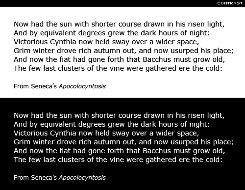
Contrast
Pale pink text on a pale blue background may look good on your T-shirt, but it does not read well. The text exists to be read, so make sure that it contrasts well enough with the background. If you are in doubt about the contrast, take a screenshot of the page and turn it into a grayscale image in any graphics editor. You can easily see if there is enough contrast. According to Robert Bringhest, a virtuoso typographer, typography exists to show respect for the content . Do we follow this advice when designing web pages so that the text — the content itself — is hard to read?
Personally, I do not like to read long fragments of inverse text (for example, light text on a dark background); Do we often see books written like this? This approach may be very appropriate for short passages of the text, but it seems to me that reading such a text is very difficult, even less than a minute.
The size
With the birth of Web 2.0, I noticed a rather annoying trend: the fine print. I even wrote to the creators of the sites and kindly offered them to increase the default font size. I received different answers - from "man, buy glasses" to grateful, "thank you, I never even thought that the font on my website might be too small for readers." I even heard the following argument in defense of the tiny text: “it fits my minimalist design”. Far more likely that it reflects a little something else. If Superman and the Sharp-Sighted Falcon are not your only readers, then a small font simply does not fit.
Do not make body text less than 12 px; If possible, increase it. Remember: what looks legible on a 65 ”HD plasma may not look so good on a laptop with a 13” screen. If you have doubts - increase the text. On ILT, the size of the main text is 16 px.
Hierarchy
Changing the font size is one of the best ways to show the difference between different content types. Colors and cute dies can help, but the different font sizes systematically used on all pages will clearly and clearly inform readers of the importance of page elements relative to one another. Hurrying readers will be able to quickly catch important fragments and, perhaps, they will remain and continue to read further.
Hierarchy can be achieved in other ways. We just mentioned how fonts of various sizes can be used; we can also use different styles: for example, capital letters for headings and italics for subtitles. You can achieve a good effect by combining serif and non- serif fonts ( serif and sans serif ).
Space
Let the font breathe. Do not be afraid to leave empty space on the pages. This white space will help focus on the text - it is the text that speaks the loudest, so let it be heard. Further, remember the CSS property line-height ; A good and proven rule is to set the spacing between lines to at least 140% of the size of the text (remember that I write about typography on the Web ). Good font designers invest incredible efforts in creating small ( micro ) free space that lives in the font itself. They spend countless hours trying to strike a balance between the black type and the empty space that surrounds it. In the same way, we should spend time and think over large ( macro ) empty space - “emptiness”, which give shape to blocks of text.
Conclusion
Remember: these are not rules, but recommendations. However, follow them — the contrast , size , hierarchy , and space — and the quality of your typography rises like a Gordon Ramsey souffle. By the way, I was joking about monkeys.
Word translator
The article is already three years old, and it covers only the most basic aspects of typography on the Web. However, these simple rules are not respected by many, and I do not consider it superfluous to remind them to those who make the Web today.
I advise you to see the original: an interesting discussion has unfolded in the comments.
Source: https://habr.com/ru/post/121920/
All Articles