Review of the official VKontakte application for Android
The official Vkontakte app for Android has been released. The official group of applications in the social network: vk.com/android_app . You can request installation in the web version of the Android Market at: market.android.com/details?id=com.vkontakte.android .
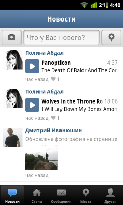
The application icon is made quite neat and not catchy. By opening the application first, as in the application from Facebook, we will see the news feed. Immediately the bottom panel of the menu in the style of iOS apps catches the eye immediately. Apparently, the official recommendations of Google on the style of VK applications were ignored. Well, a big minus for not knowing the features of the platform.

The next item is “Wall”. With the icon "house". Sasha for the lack of logic in the design. On the wall page, at its very top - the name, surname and profile picture. It is not entirely clear what they are doing there, along with the status line: the impression remains that a valuable place has been wasted.
')


In the next tab - the messages reflected in the dialogue mode. Which is much more convenient than if a list of all recent posts were displayed in a row. (After a stormy correspondence with one person, it would be an eternity to flip through to the old ones.) But the dialogue itself was built, again, with complete disregard for the design recommendations. It is customary in iOS to use “bulls”, in Android (as can be seen on the example of the design of an SMS correspondence page), a solid “wall” of text is used and a solid line is divided. No timestamps next to messages not found: neither the date nor the time. For which you can put another fat minus.


This is followed by the "Places" window. Here is a Google map with a mark of your location and the location of other users (not at all from your list of friends, but generally from the entire site) who wanted to fix it. Clicking "Mark" you, oddly enough, you will not be able to mark your exact location, and you will get to the list of places around (in my case cafes and restaurants dominate) and you can "dance" only from such a point.


The last tab is your friends list. In it you can do a search on the list of friends. It’s impossible to simply search for people on the site with the aim of adding to friends or viewing profiles here, which is also a huge minus. Clicking on scribbling with the name and surname of the desired friend will lead you to its wall.

The number of settings wealth is not amazing, just to say. There are exactly three settings available. You can upload or not upload pictures; You can choose the method of sorting the list of friends: by name, by last name and by popularity (I think normal people are interested in the first two items, and the default is the third one); and, finally, the display of the “Back” button (one-in-one as on iOS), which also gives off with a head ignorance of the principles of application design for the Google Android platform, devices running which always contain an “iron” Back button.


From the main page, you can write a message to your wall for broadcast in the news feed of friends. Image attachment from the phone's image catalog is available.

The application icon is made quite neat and not catchy. By opening the application first, as in the application from Facebook, we will see the news feed. Immediately the bottom panel of the menu in the style of iOS apps catches the eye immediately. Apparently, the official recommendations of Google on the style of VK applications were ignored. Well, a big minus for not knowing the features of the platform.
The next item is “Wall”. With the icon "house". Sasha for the lack of logic in the design. On the wall page, at its very top - the name, surname and profile picture. It is not entirely clear what they are doing there, along with the status line: the impression remains that a valuable place has been wasted.
')
In the next tab - the messages reflected in the dialogue mode. Which is much more convenient than if a list of all recent posts were displayed in a row. (After a stormy correspondence with one person, it would be an eternity to flip through to the old ones.) But the dialogue itself was built, again, with complete disregard for the design recommendations. It is customary in iOS to use “bulls”, in Android (as can be seen on the example of the design of an SMS correspondence page), a solid “wall” of text is used and a solid line is divided. No timestamps next to messages not found: neither the date nor the time. For which you can put another fat minus.
This is followed by the "Places" window. Here is a Google map with a mark of your location and the location of other users (not at all from your list of friends, but generally from the entire site) who wanted to fix it. Clicking "Mark" you, oddly enough, you will not be able to mark your exact location, and you will get to the list of places around (in my case cafes and restaurants dominate) and you can "dance" only from such a point.
The last tab is your friends list. In it you can do a search on the list of friends. It’s impossible to simply search for people on the site with the aim of adding to friends or viewing profiles here, which is also a huge minus. Clicking on scribbling with the name and surname of the desired friend will lead you to its wall.
The number of settings wealth is not amazing, just to say. There are exactly three settings available. You can upload or not upload pictures; You can choose the method of sorting the list of friends: by name, by last name and by popularity (I think normal people are interested in the first two items, and the default is the third one); and, finally, the display of the “Back” button (one-in-one as on iOS), which also gives off with a head ignorance of the principles of application design for the Google Android platform, devices running which always contain an “iron” Back button.
From the main page, you can write a message to your wall for broadcast in the news feed of friends. Image attachment from the phone's image catalog is available.
Source: https://habr.com/ru/post/121854/
All Articles