Web interfaces: development or vice versa?
Thoughts about user interfaces and the development degradation have been circulating for a long time, of course, I want to share them today. Many people remember the old interfaces with pseudographics in text mode with stingy functionality and limited usability. Then they were replaced by window interfaces in graphical mode and now the web interfaces. But has the speed of application users, users, and input operators improved? Has the speed of developing screens and reports improved? Many will tell you a solid “no” - the average productivity of programmers and users declined with each new technology step forward. And for this there are a number of objective reasons. In addition to them, we will dwell today on how to improve the sowing performance.
We will not dwell on the shortcomings of text interfaces, they are obvious. But in text mode there were undeniable advantages:
Full screen control . The entire screen was completely covered by the application interface of the program, leaving no room for buns and excesses, there were not a dozen running programs, pop-up windows of communicators, a browser with open social networks.
High keyboard usage . Everyone knows that in specialized packages it was always impossible to do without the knowledge of key combinations. But with the advent of the mouse, users have been unaccustomed to hotkeys and even cursors, and many programmers, after them, have unlearned from implementing full control of the application using the keyboard.
')
Unambiguous action . It is typical that at each moment for the text mode there is a very limited number of actions, which facilitates the work with the programs, their development and testing. The various functionalities practically do not overlap and there are much fewer problems with the fact that something breaks during modifications.
The graphical user interface, the use of OOP and window systems, are based on the transfer of messages between visual controls, using the mouse and the touchscreen, gave us a lot, but took even more.
Positive moments in window applications:
Now criticism:
Of course, experienced developers started making much better interfaces, but most of both developers and users relaxed and wallowed in heresy.
Conclusion: Excessive freedom is detrimental to the masses .
And happiness came to everyone , you no longer need to install clients on computers to users, you do not need to bathe about the DLL versions, .NET versions and a lot of settings on their machines and take care of software conflicts on user computers. Everything happens in the browser and even the standards are already quite tolerably supported by all browsers. Update software is not necessary. Data security aspect: everything is stored on the server and centrally backed up and protected. As for the protocols, we do not steam, we have HTTPS and JSON, everything is both convenient and secure. An illegal version of the application software will not be available at all soon, since it is not placed on computers, but is used in the SaaS model over the network.
But is everything so good?
In the absence of a network, we cannot work, well, this is still somehow tolerable, the network must always be there, otherwise there is no group work and communication. If something hangs during the input or the network disappears - the entered data is lost, you cannot send it over the network, and there is nowhere to save it locally (local storage and Web SQL are not yet available everywhere). All print ideology REST, the complete lack of state. Lack of funds Different browsers, and their features, require additional testing and debugging. Sometimes we do the layout separately for IE (less often there are versions for other browsers), but this is with very tricky markup.
What is inherited from window interfaces?
Only a few units rethought the PLO and patterns, others thoughtlessly. And the specificity of the web is that server applications live for a fraction of a second, while they are stateless and the user interface does not retain its state when refreshing pages (values in forms, variables, objects). In general, REST is not our way, for the user interfaces and database applications, the state is necessary as air, and the solution has already been found by many, it is the session and cookie mechanism, the “everyone's favorite” viewstate and the outdated way of passing the state in URLs, the upcoming standards Local Storage and Web SQL from HTML5, a key-value DBMS on the server side.
Taking into account all the problems and new opportunities, the mainstream has been formed, actively supported by the entire advanced part of the network, namely:
Scroll zone - typical for sites is scrolling full screen, when all content with controls is scrolled at once with one trackbar on the right (or on the left for right-to-left). However, for web applications this is not convenient and the principle of “attaching panels” (as is customary in window applications) will be much more adequate, for example, the tools are on the panel that is attached to the upper border of the browser window and stretched to its full width, and on the left can be placed a panel with a dynamically loaded tree glued to the left edge of the window, below is the status bar, to the right is a panel with contextual tasks, the entire central part of the screen is occupied by the work object: document, map, table, image, etc. Each zone has its own scrolling. Of course, ideally, the scrolling would have only a zone in the central part, and all other panels would be without scrolling or scrolling would be carried out not in the trackbar and only along one axis.
Splitter For window applications, a dynamic splitter between panels is popular, which can be dragged with a mouse. It was also implemented for web interfaces, but it is not often used, and the splitter is not applicable at all in mobile applications. There are several solutions: a “discrete splitter” that has several states and switches between them when you press a control element. "Smart splitter" - adjusts the panel size to the resolution and context, and drag it with the mouse very rarely. “A floating splitter” - with a long inactivity hides the panel, and when you move the mouse - returns, but with this there are problems on the touchscreen, there is no mouse cursor there.
Grids - tables and more complex composite grids. There are a number of problems with them:
What do you want to have in the grid:
Tree - for complete happiness, the tree should satisfy almost the same list as the grid: load dynamically, be controlled with the mouse and from the keyboard, be edited locally, etc.
The main menu - forget like a bad dream! This atavism from window applications on the web has no right to life.
Toolbar - instead of dumping buttons and combo boxes, toolbars gradually become adaptive, contextual, we see only those functions that can be applied in the current state of the application or to the element that is in focus.
Combobox - standard html combo box is terrible in design, which cannot be completely redefined by functionality, which is limited by a banned drop-down list of strings. We need a combo box with many modes, with an incremental search, allowing you to choose from large directories, with the possibility to choose several values, with groups, with pictures (and in general with elements with rich html + css design).
All the way, our team, for itself and not only, forms a set of controls for web applications, we write a part, we take a part and we comb it, we buy a part (this only if there is no time to do it), but we are constantly expanding the set used and tested. This article is only an overview, if it is interesting to someone, then we can publish briefly about our developments in our free time, for example, we recently undertook to refine jQuery UI of several control and missing curves. Also, we will be grateful for your opinion on the above approach, links to good controls, demos, screenshots and applications that you think deserve attention.
Added: removed the picture for meditations, you don’t like it, I feel.
And I will try to collect illustrations in the coming days.
Figure 1: How ugly to do leaving toolbars on the example of GMail
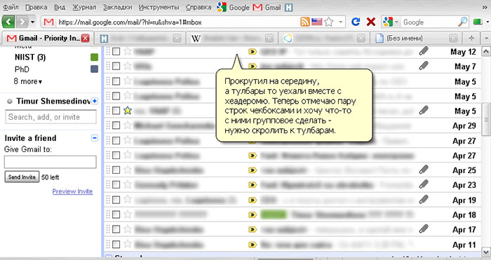
Figure 2: How beautiful it is to do the layout, toolbars and scrolling on the example of GoogleDocs
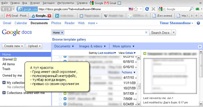
Figure 3: Several options for default combo boxes
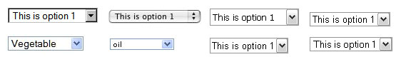
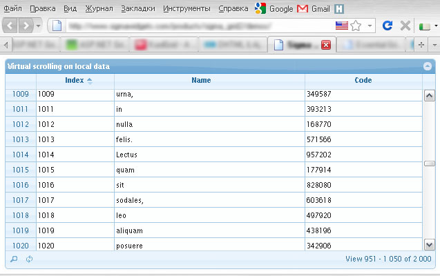
Figure 4: Virtual scrolling and paging - to whom what?
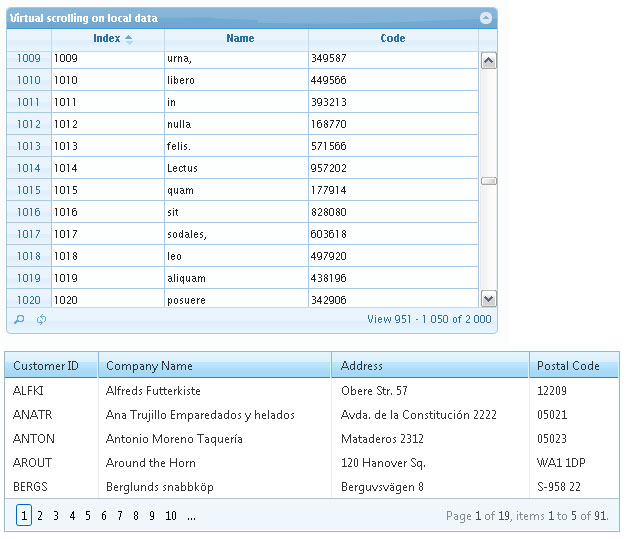
Figure 5: Scrolling inside scrolling is bad
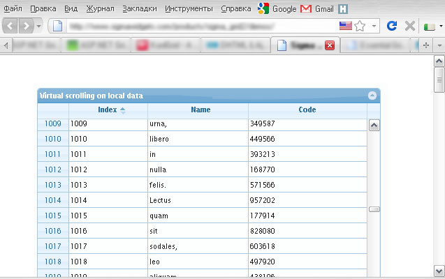
Figure 6: A grid stretched across the entire accessible zone (so that there is one scrolling) is good
Text mode
We will not dwell on the shortcomings of text interfaces, they are obvious. But in text mode there were undeniable advantages:
Full screen control . The entire screen was completely covered by the application interface of the program, leaving no room for buns and excesses, there were not a dozen running programs, pop-up windows of communicators, a browser with open social networks.
High keyboard usage . Everyone knows that in specialized packages it was always impossible to do without the knowledge of key combinations. But with the advent of the mouse, users have been unaccustomed to hotkeys and even cursors, and many programmers, after them, have unlearned from implementing full control of the application using the keyboard.
')
Unambiguous action . It is typical that at each moment for the text mode there is a very limited number of actions, which facilitates the work with the programs, their development and testing. The various functionalities practically do not overlap and there are much fewer problems with the fact that something breaks during modifications.
Window Interfaces
The graphical user interface, the use of OOP and window systems, are based on the transfer of messages between visual controls, using the mouse and the touchscreen, gave us a lot, but took even more.
Positive moments in window applications:
- The interface context in a user application exists long enough to deploy the object model, state machine, service data structures to speed up processes (cache, indexes or associative arrays, trees, etc.). The same is true for the server account if the application is client-server.
- It is possible to display rich graphics with hardware acceleration and control graphic objects by directly moving them around the screen with the mouse. This is indispensable for programs working with graphics and games, but for application database applications - this is overkill.
- You can put much more information on the screen, group it and highlight it with visual elements (with the help of color, font, pictograms, etc.). Various dynamic effects are available, such as: tooltips, context menus, graphic markers for fields during validation.
- The tables have become much more convenient: changing the width of columns, multiple selection, controls in cells, scrolling, sorting by clicking on the title, and even the ability to display a tree in the table. Some of this was available in text mode, but in the GUI there are ready-made solutions for everything implemented at the OS level or the development tool.
Now criticism:
- The right hand on the mouse (and the input as the left hand or what?). Therefore, the right hand is constantly moving between the mouse and the keyboard. For example: instead of pressing F4 or a combination of keys, we take the mouse, move it across the entire screen to the toolbar, and there it presses a small screen button.
- Development and testing has become complicated, many asynchronous events, timer, server, signals from other windows and applications have appeared. The environment of the information system has become less stable and predictable.
- The program code has often become “tied” to the interfaces, in the OOP a mixture has occurred in system functionality with the logic of the subject area and with the logic of visualization, since opportunities have increased, freedom in means of implementation has become much greater, and the formation of approaches and architectures has been late.
Of course, experienced developers started making much better interfaces, but most of both developers and users relaxed and wallowed in heresy.
Conclusion: Excessive freedom is detrimental to the masses .
Web applications
And happiness came to everyone , you no longer need to install clients on computers to users, you do not need to bathe about the DLL versions, .NET versions and a lot of settings on their machines and take care of software conflicts on user computers. Everything happens in the browser and even the standards are already quite tolerably supported by all browsers. Update software is not necessary. Data security aspect: everything is stored on the server and centrally backed up and protected. As for the protocols, we do not steam, we have HTTPS and JSON, everything is both convenient and secure. An illegal version of the application software will not be available at all soon, since it is not placed on computers, but is used in the SaaS model over the network.
But is everything so good?
In the absence of a network, we cannot work, well, this is still somehow tolerable, the network must always be there, otherwise there is no group work and communication. If something hangs during the input or the network disappears - the entered data is lost, you cannot send it over the network, and there is nowhere to save it locally (local storage and Web SQL are not yet available everywhere). All print ideology REST, the complete lack of state. Lack of funds Different browsers, and their features, require additional testing and debugging. Sometimes we do the layout separately for IE (less often there are versions for other browsers), but this is with very tricky markup.
What is inherited from window interfaces?
- The dominance of the mouse has worsened.
- Distractions were added in large quantities.
- The principles of OOP are inherited, but they need to be rethought for the web.
Only a few units rethought the PLO and patterns, others thoughtlessly. And the specificity of the web is that server applications live for a fraction of a second, while they are stateless and the user interface does not retain its state when refreshing pages (values in forms, variables, objects). In general, REST is not our way, for the user interfaces and database applications, the state is necessary as air, and the solution has already been found by many, it is the session and cookie mechanism, the “everyone's favorite” viewstate and the outdated way of passing the state in URLs, the upcoming standards Local Storage and Web SQL from HTML5, a key-value DBMS on the server side.
Web Interface Development Trends
Taking into account all the problems and new opportunities, the mainstream has been formed, actively supported by the entire advanced part of the network, namely:
- Minimalism and simplicity - and websites and applications become more complicated inside and easier outside, this is what all the advanced players teach us and most of all - Google, we try. The user must perform a minimum of actions and choices to obtain the desired result.
- Interactivity and asynchrony - the interfaces become dynamic, page reloading and screen changing disappear, loading occurs gradually, in fragments. The application gradually modifies the screen, responding to user actions.
- Contextuality - information output and controls for calling operations appear where it is logically expected and are shown only as long as it is necessary. We save screen and user attention.
- Synchronization and comets - more and more applications appear in which the server generates events on its own initiative, this allows you to synchronize the user's screen with the current state of the data in the database or in the server memory.
- Full-screen layout - not in the whole web, but in web applications, there is a tendency to fill the screen as much as possible with the redistribution of sizes and borders between interface elements depending on the resolution.
- Simplified mobile interface - with the proliferation of mobile devices equipped with normal browsers, there is a need to separately develop interfaces for small resolutions and with touchscreen support.
- Standards support - it's up to solve problems using new features and specifications, but with a flashback to old technologies, for example, you want to play audio and video through html5, but the flash insures us, or in the absence of Local Storage, we store the state on the server, there will simply be more requests, visualization is also simplified when displayed in the old browser, but the application continues to work, and it looks simpler.
Consider more visual controls and solutions.
Scroll zone - typical for sites is scrolling full screen, when all content with controls is scrolled at once with one trackbar on the right (or on the left for right-to-left). However, for web applications this is not convenient and the principle of “attaching panels” (as is customary in window applications) will be much more adequate, for example, the tools are on the panel that is attached to the upper border of the browser window and stretched to its full width, and on the left can be placed a panel with a dynamically loaded tree glued to the left edge of the window, below is the status bar, to the right is a panel with contextual tasks, the entire central part of the screen is occupied by the work object: document, map, table, image, etc. Each zone has its own scrolling. Of course, ideally, the scrolling would have only a zone in the central part, and all other panels would be without scrolling or scrolling would be carried out not in the trackbar and only along one axis.
Splitter For window applications, a dynamic splitter between panels is popular, which can be dragged with a mouse. It was also implemented for web interfaces, but it is not often used, and the splitter is not applicable at all in mobile applications. There are several solutions: a “discrete splitter” that has several states and switches between them when you press a control element. "Smart splitter" - adjusts the panel size to the resolution and context, and drag it with the mouse very rarely. “A floating splitter” - with a long inactivity hides the panel, and when you move the mouse - returns, but with this there are problems on the touchscreen, there is no mouse cursor there.
Grids - tables and more complex composite grids. There are a number of problems with them:
- It looks very bad if the table has scrolling separate from the whole page, that is, it turns out that we have scrolling in scrolling. This is also true for textarea.
- Duplication of action buttons for each row of the grid is a common problem of all web interfaces of the old generation - it’s flashing.
- Buttons with actions leave: I will explain how - like in GMail, that is, the page has a common scrolling, which scrolls both the grid and all at once with the toolbar together. It turns out that we scrolled the grid in the middle and want to do something with the lines in the middle, and to access the toolbar, you need to turn the screen up or down (as it is in the editor of Habr articles).
- And paging (even if they condemn me, but I will say everything that I think about it) - there are few people who go beyond the third page; long lists users do not browse - it is meaningless, if somewhere they are organized, then only to filter them in more detail, and flipping through is superfluous; especially fun, when the whole page is reloaded when flipping paging; sorting is not always convenient; Not all DBMSs are optimized for selecting data for paging, with large data sets this in any case increases the load on the server. What instead? Virtual Grids - see below.
What do you want to have in the grid:
- Grid virtualization is scrolling at once large (by the number of records), and only the visible ones are loaded, or even a small margin (read ahead). There are options; old records can be saved until the entire data set is transferred to the client or a specific buffer of 100-200 records is allocated with forcing out the loading of lines, while scrolling old blocks are deleted.
- Formation on the server side or on the browser side - to solve this problem forever and fundamentally impossible. You can argue for a long time, someone used to send JSON data via AJAX and output to the prepared grid on the client, and someone sends the records via AJAX immediately to HTML. There is another variant of pre-filled grids (this is justified if there are not many records). How correctly - is determined by the specifics of the task and a good grid must implement all three options.
- Keyboarding has already talked a lot about this, but I really miss the full keyboard experience in all modern web applications, this is an alternative way, but it should be, and navigation with cursors and hot combinations and function keys.
- Inline editing - that is, editing the values locally, without invoking forms with AJAX / JSON sending the edited value to the server or accumulating the buffer and sending the whole bundle at once when you click “save”.
Tree - for complete happiness, the tree should satisfy almost the same list as the grid: load dynamically, be controlled with the mouse and from the keyboard, be edited locally, etc.
The main menu - forget like a bad dream! This atavism from window applications on the web has no right to life.
Toolbar - instead of dumping buttons and combo boxes, toolbars gradually become adaptive, contextual, we see only those functions that can be applied in the current state of the application or to the element that is in focus.
Combobox - standard html combo box is terrible in design, which cannot be completely redefined by functionality, which is limited by a banned drop-down list of strings. We need a combo box with many modes, with an incremental search, allowing you to choose from large directories, with the possibility to choose several values, with groups, with pictures (and in general with elements with rich html + css design).
Conclusion
All the way, our team, for itself and not only, forms a set of controls for web applications, we write a part, we take a part and we comb it, we buy a part (this only if there is no time to do it), but we are constantly expanding the set used and tested. This article is only an overview, if it is interesting to someone, then we can publish briefly about our developments in our free time, for example, we recently undertook to refine jQuery UI of several control and missing curves. Also, we will be grateful for your opinion on the above approach, links to good controls, demos, screenshots and applications that you think deserve attention.
Added: removed the picture for meditations, you don’t like it, I feel.
And I will try to collect illustrations in the coming days.
Figure 1: How ugly to do leaving toolbars on the example of GMail
Figure 2: How beautiful it is to do the layout, toolbars and scrolling on the example of GoogleDocs
Figure 3: Several options for default combo boxes
Figure 4: Virtual scrolling and paging - to whom what?
Figure 5: Scrolling inside scrolling is bad
Figure 6: A grid stretched across the entire accessible zone (so that there is one scrolling) is good
Source: https://habr.com/ru/post/120318/
All Articles