The best fonts for programming
The article was written in 2009, and much has changed since then, including some alternative fonts for programming, for example, Anonymous Pro .
As a developer and a real boom in the field of typography, if we are talking about a font that will have to stare all day, then I will choose very carefully. When I recently noticed that my friend uses a rather non-ordinary font for the console and in the code editor (it's too terrible to mention here), my jaw dropped and my heart stopped beating for a second, and I realized that it was time for me to write this article.
I post a list of ten monospaced fonts ready for use. Some of them come bundled with modern operating systems, but most can be downloaded for free from the Internet. Separate, including Consolas, are part of commercial software.
')
If you have any doubts that the smoothed fonts are suitable for coding, please note that even the highly respected BBEdit, which for many years has been supplied in the unstitched Monaco 9 set as default, jumped off the train. The application now comes bundled with a specially licensed version of Ascender's Consolas, which has been increased in size, with default anti-aliasing. Panic also contains a special smoothed font (Panic Sans, which is actually just a version of Deja Vu Sans Mono) in its popular Coda application.
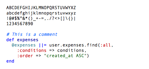
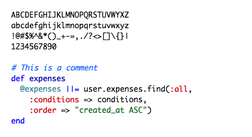
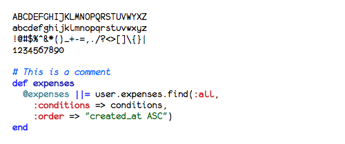
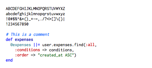
Unless otherwise noted, for illustrations here I used a 15 point font size here with anti-aliasing turned on to demonstrate its suitability on large sizes.

Courier new
9. Andale Mono
As far as I know, you can get Monaco only with Mac OS, but there are other options, so read on.
Monaco

Monaco 9 points, no smoothing

Profont 9 points, no smoothing
Monofur

Proggy Clean 15 points (yes, 15 points), without smoothing
Droid Sans Mono is great for programming. It is made with a special taste and stands out among the other monospaced fonts in this list, but it has a single major drawback - an uncrossed zero. Version with corrected zero here - approx. per.

Droid sans mono
I used this headset for many years. It looks great on any size with anti-aliasing turned on.
Panic supplies a font with its Coda application called Panic Sans, which is based on this font. Gruber told me in a letter that when comparing Panic Sans and Vera, the first one had “markedly sharper punctuation marks,” and it looks like they still improved the hinting of some characters.

Deja vu sans mono
This font was created by Lucas de Groot specially for Microsoft ClearType ( here is a great description with examples of all new Microsoft fonts). Consolas is a commercial font, but it comes with many Microsoft products, and there is a high probability that it is already installed on your system.
You are strongly recommended to enable anti-aliasing for Consolas, because otherwise it looks terrible.
It is a pity that the font is not free, otherwise it would have deserved first place in this list.

Consolas
Inconsolata is designed for use with anti-aliasing, but it is surprisingly sharp at the smallest sizes. Many thanks to Raph Levien for creating this font and for being free.
Inconsolata
As a developer and a real boom in the field of typography, if we are talking about a font that will have to stare all day, then I will choose very carefully. When I recently noticed that my friend uses a rather non-ordinary font for the console and in the code editor (it's too terrible to mention here), my jaw dropped and my heart stopped beating for a second, and I realized that it was time for me to write this article.
I post a list of ten monospaced fonts ready for use. Some of them come bundled with modern operating systems, but most can be downloaded for free from the Internet. Separate, including Consolas, are part of commercial software.
Note on anti-aliasing
In the past, one had to choose either a small mono font or jagged edges. But modern operating systems do an excellent job with anti-aliasing, so monospace headsets look good on any pin. This is no longer 1990, so rest your tired eyes and increase the font size.')
If you have any doubts that the smoothed fonts are suitable for coding, please note that even the highly respected BBEdit, which for many years has been supplied in the unstitched Monaco 9 set as default, jumped off the train. The application now comes bundled with a specially licensed version of Ascender's Consolas, which has been increased in size, with default anti-aliasing. Panic also contains a special smoothed font (Panic Sans, which is actually just a version of Deja Vu Sans Mono) in its popular Coda application.
Unless otherwise noted, for illustrations here I used a 15 point font size here with anti-aliasing turned on to demonstrate its suitability on large sizes.
10. Courier
All operating systems come bundled with some Courier modification (often referred to as Courier New). Unfortunately, many have chosen this font for the console and editor. He does his job, but it is dull and boring, suffers from a lack of style and gloss. I do not recommend this font if you have at least some alternative - and, fortunately, you have it. If you still use it, then at least increase the size and enable anti-aliasing.Courier new
9. Andale Mono
Slightly better than the Courier family, the Andale Mono font also falls into the default category, as it comes with some systems. It is unlikely that you would want to download and use it if it had not already been installed. For my taste, the letter spacing is clumsy, and the letters are too wide.9. Andale Mono
8. Monaco
Monaco is the default monospaced font on Mac since System 6 . It is completely solid, a good workhorse that really looks great with a small size with anti-aliasing turned off. I used to like this font, when my eyes could look at the size of 9 points for several hours, but those times were gone. This font looks good on 9 or 10 points, but not very happy on larger sizes with anti-aliasing.As far as I know, you can get Monaco only with Mac OS, but there are other options, so read on.
Monaco
Monaco 9 points, no smoothing
7. Profont
Profont is modeled on Monaco and is available for Mac, Windows and Linux (there is also a modified version for Mac OS X called ProFontX , from another author). They look best on a small size and are a great alternative to Monaco, if you are not working on a “mac”. Profont and ProFontX are intended for use with a size of 9 points with anti-aliasing turned off.Profont 9 points, no smoothing
6. Monofur
Monofur is a unique monospaced font that looks great on any size with anti-aliasing. This is a pretty funny font with individual outlines, vaguely reminiscent of the Sun OPEN LOOK graphical interface, which worked on Solaris systems (SunOS) in the late 80s. If you are looking for something special, try this font, but do not forget to enable anti-aliasing, even on a small size.Monofur
5. Proggy
Proggy is a pure monospace font. It seems that Windows users especially prefer it, although it works fine on Mac. This is a clear font that should be used only on small sizes without anti-aliasing.Proggy Clean 15 points (yes, 15 points), without smoothing
4. Droid Sans Mono
The Droid family (available for download here ) is specifically created for use on small screens of smartphones, such as Android, and published under the Apache license.Droid Sans Mono is great for programming. It is made with a special taste and stands out among the other monospaced fonts in this list, but it has a single major drawback - an uncrossed zero. Version with corrected zero here - approx. per.
Droid sans mono
3. Deja Vu Sans Mono
The Deja Vu family is one of my favorite free headsets, based on the gorgeous Vera Font . Deja Vu fonts are complemented by a wide range of characters, while retaining the familiar look of Vera.I used this headset for many years. It looks great on any size with anti-aliasing turned on.
Panic supplies a font with its Coda application called Panic Sans, which is based on this font. Gruber told me in a letter that when comparing Panic Sans and Vera, the first one had “markedly sharper punctuation marks,” and it looks like they still improved the hinting of some characters.
Deja vu sans mono
2. Consolas
Consolas unexpectedly appeared on my Mac when I installed Microsoft Office, and with it a whole set of new fonts from Microsoft.This font was created by Lucas de Groot specially for Microsoft ClearType ( here is a great description with examples of all new Microsoft fonts). Consolas is a commercial font, but it comes with many Microsoft products, and there is a high probability that it is already installed on your system.
You are strongly recommended to enable anti-aliasing for Consolas, because otherwise it looks terrible.
It is a pity that the font is not free, otherwise it would have deserved first place in this list.
Consolas
1. Inconsolata
Inconsolata is my favorite monospaced font, and it's free. When I discovered it, I immediately replaced Deja Vu Sans Mono as a working font for programming. I use it everywhere, from console windows to code editors. He has an almost flawless and at the same time original style, and he looks fantastic on both large and small sizes. I use this headset, showing the code on the presentations, and also in the console and TextMate windows for PeepCode screencasts . The font does not support Cyrillic - approx. per.Inconsolata is designed for use with anti-aliasing, but it is surprisingly sharp at the smallest sizes. Many thanks to Raph Levien for creating this font and for being free.
Inconsolata
Source: https://habr.com/ru/post/120316/
All Articles