Simplify registration and access to the site
I present to you the translation of the article titled " Innovative Techniques To Simplify Sign-Ups and Log-Ins " by Anthony T. Translated in the company UXDepot specifically for users of Habrahabr with the approval of the publication Smashing Magazine .
There are many different ways to create registration and authorization forms. Most designers are familiar with traditional ways.
However, knowing and using some innovative techniques, it is possible to make the forms clearer and easier to fill.
')
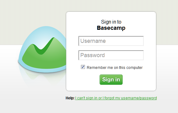
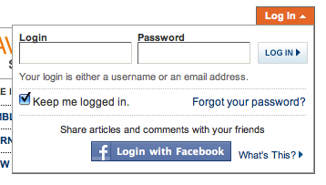
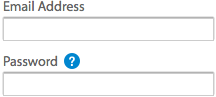
Authorization form on Basecamp website
In this article, we present several ideas that could be useful for your projects. But when going to use them, please make sure you understand the context in which they should be applied. And we will be happy to see the results of usability testing, confirming or refuting the tips outlined below.
Simplify the registration form
The goal of any web form is to make the user fill it easily and correctly. If the form is too long and complex, then the user's impression of the site may be spoiled. Below are a few tricks that will help make users fill out your forms quickly and easily.
.
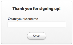
Ask for a username after registration
While filling in the registration form, the user is required to come up with and enter a unique name. And if the user comes up with and enters a name already taken by someone, he has to think more, he spends his time and patience. Instead of asking your visitors for a name during the registration process, you may well ask it immediately after this process. In this case, you will not slow down the user registration process by the need to come up with the original name just to satisfy the hated form.
.
Ask for the password only once
Many registration forms offer users to enter a password in two fields. The reasons for this are quite understandable - the entered password in the form hides behind a mask for security reasons: so people behind it will not be able to see it. And two fields in this case help to avoid typos.
However, in practice this leads to even more errors, because the user has to type more. He does not see which characters he enters, and every time you enter a password, he is not sure what the correct password is typing.
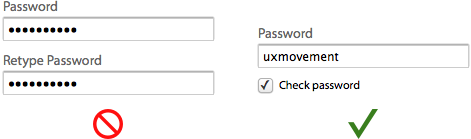
A more effective approach would be to ask the user to fill in the password only once, and to include in the form a checkbox, a tick in which will remove the mask from the field and allow the user to verify the correctness of the entered password. This approach will help reduce the number of fields and save the user from unnecessary work.
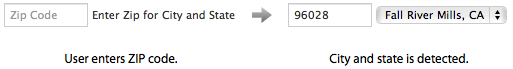
Autocomplete field "city" based on zip code
If you ask the user to fill in the home address, then consider auto-filling the city and region from the zip code entered. As a result, your form will be more efficient, since the user does not have to spend time and effort to type in his city in the field or select it from a long drop-down list.
.
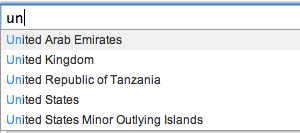
Auto substitution in the field "country"
Usually, users are asked to choose their country of residence from a long drop-down list. However, it would be more reasonable to use auto-substitution of the name of a country by the characters entered in the field - the user will be able to choose his country by typing a couple of characters of its name.
.
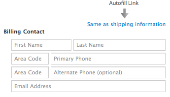
Allow users to copy billing address from shipping address
In the USA and other countries, the user, wishing to purchase something online, must indicate not only the delivery address of the goods, but also the so-called payment address (a check can be delivered to it). In most cases, these addresses are the same, so why not allow users to copy them from one to another? You can include the link “Delivery address coincides with the payment address” in the form - after clicking on it, the data from the corresponding fields of the delivery address will be copied to the payment address fields.
- Copy billing address and shipping address using jQuery
- Copying entered data to another input field using jQuery
.
Do not tick the “Subscribe to the newsletter” checkbox by default, suggest first to see the preview of the letter
Most websites by default sign up their newly registered visitors in the hope of getting more subscribers to their corporate newsletter. Yes, this method sometimes works, but the subscription is meaningless if the user simply did not notice the option to disable it or did not understand the purpose of this option. If the user is not interested in receiving your newsletter, he will still unsubscribe from it, and in the long term, this method will not help you. And sending letters to users who were unaware of the existence of a mailing list can easily push them away from you.
A more effective approach would be to demonstrate a preview or an excerpt from a mailing list. In this case, users will be able to visualize what they will lose if they do not subscribe. And you will sleep well, knowing that only those who are interested in it receive your newsletter.

.
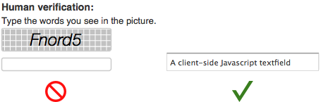
Fight spam by hiding a text field using javascript instead of using captcha
If you suffer from an abundance of spam, you do not need to use captcha at all. When using a captcha in its traditional form, the user is prompted to enter the distorted characters from the image into the field. The presence of a captcha, unfortunately, has a negative impact on the conversion, because its filling is an additional effort expended by the user.A simple way to overcome spam without losing conversion is to use a hidden, mandatory input field created by JavaScript on the client side. Spambots cannot interact with Javascript objects on the client side; only the user can do this. This method is quite simple and effective, and at the same time it does not annoy the user. Its only drawback is that using JS in some cases can be problematic.
You can also use the Honeypot Captcha approach - a field is created in the form, which should be left blank, and then in CSS it is hidden from the user (but not from bots). And if some text appears when sending data in the field, you can ignore this case of filling out the form, since before you spam bot.
Simplify the form of entry to the site
The task of any form of authorization is to let the user into his account. Despite this simple task, some forms of authorization solve it better than others. Here are some easy ways to help users sign in to their account easier and faster.
.
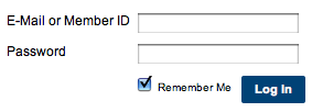
Give the opportunity to use email addresses as a login
Remembering an email address is much easier (we use it all the time) than remembering a login (which is invented for a specific site). Give users the ability to log in using both their username and their email. In case the user forgets his login, he will always be able to log in using his email.
.
Authorize the user to stay on the same page.
Authorization on the site is an important function, and users will want to be able to log in from any page on the site. So do not forget to make sure that after logging on to the site the user gets on the same page with which he logged in. This will make the process easier and will help the user to immediately begin to solve their problem on the site.
There are two ways to implement this process: a drop-down form and a modal window.
Drop-down form opens without carrying the user off the current page. It takes up only a small area on the page, which allows you to make a form in this form a quick and unloaded solution.
- Simple and effective drop-down authorization form for jQuery
- Drop-down AJAX authorization form for jQuery
The modal window also does not carry away the user from the current page - it unfolds in the center of the page, concentrating fully on the authorization form. This option allows you to put in the form of additional information.
- How to embed AJAX authorization form for jQuery in a modal popup window
- Tutorial on creating a simple modal window for jQuery
.
Automatically place the cursor in the first form field.
As soon as users see an authorization form in front of them, they will be ready to enter the site. You can make it easier for them by placing the cursor in the first input field. Then users do not have to hover the mouse on the field and click on it. They will be able to hold hands on the keyboard and immediately begin to enter the necessary data. When auto-focusing the field should be clearly highlighted - this will help the user to understand what can already be started to print.
.
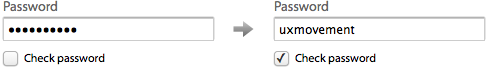
Let users see their passwords.
This option is useful for authorization in the same way as for registration. If users do not see the characters in the field, they can easily be sealed, after which they will have to re-enter the password until they enter it correctly.
The problem is that the user does not know which character he entered incorrectly, and cannot correct the error the first time. It takes more effort and slows down the user. You can get rid of this problem by including the “show password” checkbox in the form.
.
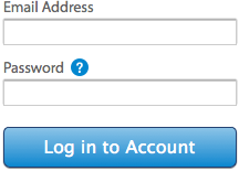
Use the question icon as a link to reset your password.
Users should not experience problems with finding a password recovery link in the form. Instead of using the words “Forgot your password?” As a link, it is enough to make a link a small icon in the form of a question mark, which is not lost among other links and does not take up much space. The question mark is a clear help icon for everyone, so that users will understand where they need to go in order to recover a forgotten password.
.
Make the "Confirm" button the same width as the input fields
The confirmation button was created not just to make the action possible - it also shows what kind of action the user will perform now. The small size of the button means a weak prompt for manipulation, because of which the user may doubt that this action is necessary.
The wide button gives confidence, and it is difficult not to notice. The name of the button also becomes more noticeable, so the user better understands the action that is going to take.
.
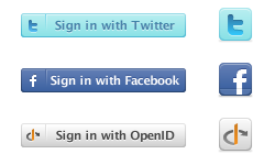
Allow users to log in from accounts on Facebook, Twitter or using OpenID
Now almost everyone has accounts on Facebook and Twitter or use OpenID. Allow users to log in with their help, and they will be able to access the site almost instantly, without having to bother with the authorization form. And they will be spared from the need to store dozens of logins and passwords for visited sites.
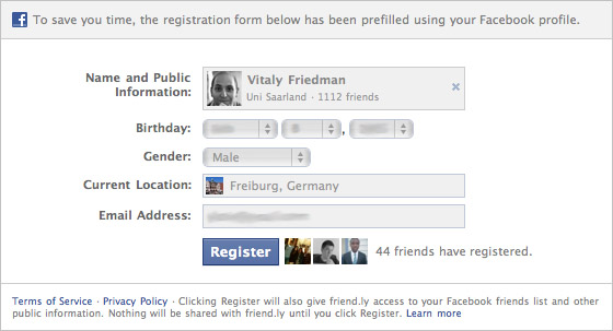
Of course, you can go ahead and use Facebook Connect to automatically collect and save the necessary data. For example, on the Friend.ly service — a Facebook application — in the registration process, users simply click on the “Register” button — all information about the user is collected automatically. Such an approach immediately gives rise to a lot of concern about privacy, so perhaps it should not be used.
Conclusion
Your registration and authorization forms should not make life difficult for users, because filling out forms is something else. Our tips will help you make the forms easier and more efficient, so that the path of your users to the content of the site will be shorter and more pleasant.
.
PS from translators : I hope you enjoyed the article. We will be happy if you point us to errors in the translation so that we can correct them promptly. Write me in PM, please :)
Source: https://habr.com/ru/post/120079/
All Articles