MUX.Dialog plugin for beautiful dialogs in your project
 This plugin allows you to easily and elegantly display messages and small forms in your web projects built on Mootools.
Main characteristics
- Full-featured dialogues. So, modality, multiwindow, Esc closing, dragging, stretching (optional), a convenient mechanism for adding buttons and other goodies work out of the box. In this case, everything is very unobtrusive.
- Simple API for customizing and manipulating dialogs.
- Styling through CSS, which means that many, if not all properties related to appearance, and even some behavior-related, can be overridden in your CSS files, which means you can easily enter dialogs in your project's style (see examples).
- Events will allow you to intercept key moments of the behavior of dialogues and complement them with your own behavior.
- Works out of the box with MUX.Loaders , but does not require them if you do not want to use them. Just connect the loader file to the dialogs and that's it — the animation itself will start before the
submitevent and stop when closed. - Full documentation and examples .
The project on github https://github.com/lavmax/MUX.Dialog .
Tested on IE7 +, FF3 +, Chrome, Safari, Opera latest versions.
')
Some examples of use and customization
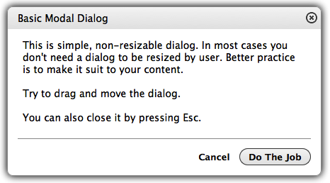
Creating and outputting the simplest modal dialog with a message and a cross-button for closing
new MUX.Dialog({ content: new Element('p', {html: ' . .'}) }); Creating and displaying a typical modal message
new MUX.Dialog({ title: '!', content: new Element('p', {html: ' . .'}), buttons: [{ title: ' ', click: 'close' }] }); Work with events
new MUX.Dialog({ title: '!', content: new Element('p', {html: ' . .'}), buttons: [{ title: ' ', click: 'submit' }], onOpen: function() { // . // // , . this.content.getElement('my-selector').doSomething(); }, onSubmit: function() { // ' '. var self = this; new Request({ ..., onFailure: function(xhr) { ... self.loader.stop(); }, onSuccess: function(responseText, responseXML) { ... self.close(); } }).post(); }, onClose: function() { // onClose , // .. . // // ( ). this.loader.stop(); } }); Working with styles - change the mouse cursor. By default, the heading and drag corner are shaped like an arrow. If, for example, you want to make a move and an extension window arrow, add the following styles to your CSS.
.mux-dialog-header { cursor: move; } .mux-dialog-resize-icon { cursor: se-resize; } More examples of working conversations and code .
Description of all possible options, events and methods here .
I will make a reservation, before writing this library, I got acquainted with everything that lies on Mootools Forge, Mocha UI, ExtJS and jQueryUI. However, I will refrain from describing what each of the listed libraries did not suit me, so as not to make unnecessary disputes. Everyone decides for himself.
I rely on constructive criticism in the comments on all aspects (appearance, use, code). If you will use this library in work projects, please let me know in a personal or on github, so that I can post links to your projects on github.
Source: https://habr.com/ru/post/119948/
All Articles