Music Player Interface: Ergonomics and Design
 From the translator. Thanks to the Internet, truly endless possibilities have opened up for music lovers: just type in the search engine the name of the desired composition, and numerous links for listening and downloading will appear on the screen. Digital audio storage formats are constantly evolving. Recently, listening to music online has become widespread. There are numerous sites offering music for every taste and even selecting compositions for the current mood of the user. One of the key interface elements of such sites is the music player. In this article we would like to discuss the ergonomic characteristics of streaming audio players .
Listening to music online has become a very common practice among Internet users. There are many sites where you can listen to music recordings without downloading them.
Sites that offer audio recordings online differ in the nature of the music presented, as well as in their usability.
')
In this article we will look at the question of the ergonomics of online players, i.e., of the interfaces through which streaming audio playback is controlled. How should this interface be arranged for it to be really convenient to use?
Functionality: nothing extra
In the 90s of the twentieth century, radio receivers and CD players were often overloaded with various functions: shuffle, repeat, equalizer, etc., etc. At the same time, in most cases, these functions remained unclaimed: few of the owners of the equipment regularly used them. The same can be said about the interfaces of modern software players: the redundant functionality is unlikely to attract the user, but will significantly complicate the work with the application.
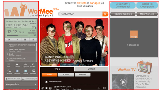
Consider the French website Wormee./a>, one of the first web portals in Europe for searching and listening to audio streams. Some obvious flaws can be explained by the fact that the site was created when there were still few such web projects, and the developers had to act in many ways, as they say, by touch. The design of the player is based on the following idea: to fit all the functions and all the information on a small screen that looks like a liquid crystal display:

Such an interface can hardly be considered convenient because:
- on a small screen, too much information is displayed, and it is practically not structured;
- the small size of all interface components significantly reduces the ease of operation;
Looking at such a player, the user can hardly immediately notice many important controls (in fact, only the play, pause and skip to next / previous tracks are clearly visible). The volume control icon is generally located in an awkward place, which makes controlling the volume with the mouse an extremely inconvenient and time-consuming process. The small screen size also does not allow displaying the album cover (for this you have to open a separate window).
The player interface for listening to Spotify / a> streaming audio is quite adequate in terms of design and usability: only the most necessary functions are present. The Play button is located in the middle and has the largest size, the volume control is the optimal size and is convenient to control with a mouse, etc.:
Recommendations
Highlight the main scenarios of using the player and based on them select the optimal size and location of its components.
The controls for the most frequently used functions of the player should occupy the main part of the screen space; it is highly undesirable to place major and minor elements next to each other.
Size does matter: the player should not be bulky
On the first sites for online listening to music, which appeared in 2006-2007,
Player interface looked quite traditional. The player had a square shape, the information line was at the top, and the control buttons at the bottom. Currently, this model is increasingly giving way to a new, horizontal

What are the benefits of this design? First, the horizontal model is quite consistent with the traditional linear pattern of time perception for European culture. Secondly, it allows you to significantly save screen space. Even if the player is the main element of the music site, it is not necessary to give him the main place. A square-shaped player is too cumbersome and can become an insurmountable obstacle to the realization of interesting design solutions. As an example, consider the site mentioned above: a significant part of the screen on the left is occupied by a player, on the right is an advertisement, and there is no space left to host the main content of the site (music search results and recommendations). In addition, when viewing the following screenshot of the page, it seems that its elements are devoid of stylistic unity:

The horizontal representation of the player seems to be more advantageous. Firstly, it essentially frees up space for the location of the rest of the site's design elements. Secondly, it allows you to better visualize (in the form of a horizontal bar) two important functions for users: volume control and fast movement across the track (rewind).
In the Grooveshark player, the panel of additional functions (“share” in popular social networks) is displayed as a tooltip when you hover over a progress bar. This solution also seems interesting:

Based on the above, it can be concluded that modern players are becoming more simple and minimalist. However, the player must be correctly placed on the page: do not take up much space, but at the same time be noticeable and attract the attention of the user.
Small but noticeable
For all its flaws, traditional square players have a significant advantage: they can not be overlooked. A horizontal player allows you to save space and display more information on a web page (this is important when it comes to, for example, displaying search results).
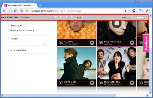
An interesting variant of the location of the horizontal player can be seen on the website WeAreHunted , offering to listen to the most discussed in social networks musical compositions. The main part of the page is occupied by photos of the performers, by clicking on which you can start playing a particular song. The player is located directly below the address bar of the browser and is displayed only during playback of the audio recording. When you stop playing it disappears.

This solution seems to be optimal: there is enough space for the location of all design elements, and access to all important functions of the player is carried out promptly. A similar solution is offered by the Jiwa website, only the player on it is located not at the top, but at the bottom of the page:

Source: https://habr.com/ru/post/119685/
All Articles