Rasterization of vector fonts
If you write programs for coffee grinders (refrigerators, ZX Spectrum, TVs, embedded systems, old computers - underline the necessary), and you want to use beautiful fonts, do not rush to save letters in raster format. Because now I will tell you how to make a rasterizer of vector fonts the size of a couple of kilobytes, not inferior in quality to FreeType 2 with hinting turned off.
The article will be interesting for those who just want to find out how rasterizing libraries work.
To make a rasterizer, you must first understand how the vector fonts are arranged. I chose SVG as the main font format because it relies on XML and is perhaps the most readable and understandable to humans.
')
The first font I took to study was DejaVu Sans Mono Bold. Here’s how it looks from the inside:
The main part of the SVG format is the paths . They contain most of the information about the image. The contour tag looks like this:
Style describes the fill and stroke color, id specifies the name of the outline, and d is the outline itself.
Stop ... Wait a minute! Glyph tag from the font:
Here it is. The shape of the letter (glyph) is described in the same way as the SVG contours. Complete
a description of the parameter d can be found in the specification , and a brief description is given below:
x_prev and y_prev - coordinates of the previous point
xc_prev and yc_prev - coordinates of the previous control point
Having a library on hand to display Bezier curves and converting commands of the SVG path tag into commands of this library, you can easily and quickly get an autline (stroke) of any glyph.
We have vector glyphs, and the screen is raster. This means that the task of outputting an autline is reduced to obtaining an array of pixels from a set of segments and Bezier curves. The segments are very easy to turn into pixels, there are many algorithms, they are good and different.
For Bezier curves, you can find the set of points of the curve along the coordinates of the initial point (xz0, yz0), the end point (xz2, yz2) and the control point (xz1, yz1). This is done like this:
As a result, we have an array of 10 coordinates of points belonging to the Bezier curve. Depending on the length of the curve from a complex system of differential equations, the number of points into which the curve should be broken (that is, the highest step value) is found.
However, turning bezier curves into pixels by points is slow and bad. If the curve is of complex shape and large length, then the calculation of the number of points will take a very long time. And if you draw a Bezier curve by points, and these points will be less than necessary - in the outline of the glyph there will be gaps, which is unacceptable. Therefore, the Bezier curves are divided into segments. The initial and final coordinates of the segments are taken as the coordinates of points lying on the curve. In most cases, this approximation gives good results.
How to determine the number of segments? I think it's enough to make the maximum step value proportional to the difference between the initial and final coordinates (for example, step = (xz2-yz2) / 100). By the way, for all the fonts that I have met, with a glyph height of less than 32 pixels, it is enough to break Bezier curves into two segments.
The result of the rasterizer will be something like this:
All this is good, but on the screen we see letters that are filled with color. So somehow you can? I spent about two months on improving the algorithms for filling an already rasterized contour, and in the end I was convinced that this approach was fundamentally wrong. To fill vector images raster fill is not suitable.
In search of a solution to this fun task, I stumbled upon a MIT OCW lecture on computer graphics. I was interested in a lecture on rasterization of three-dimensional graphics (namely, triangular polygons). The essence of the method was as follows: in a vector form, a projection of a triangular polygon on the screen was built, and then the vector triangle was painted over. The painting was done as follows: the screen area was chosen, beyond which the triangle definitely does not come out, and for each point of this area it was determined whether it belongs to the given triangle. The same lecture claims that the Sweeping Line fill method (which is used by Cairo and FreeType) is outdated, but this method is a little later.
It remains to learn to determine whether the point belongs to the contour of the glyph, or does not belong. The outline of the glyph is always closed. So, if we draw a ray in any direction from any point, and it crosses the outline of the glyph an odd number of times, the point belongs to the glyph, and even if it does not belong.
Interestingly, this method works even if there are self-intersections or holes in the contour. It turns out that this algorithm is a textbook, and one of its implementations is
such:
Here xp and yp are arrays of coordinates of the vertices of the polygon. InPoly (x, y) function
returns 1 or 0 - the point belongs to the polygon or not. Given that we can
break the glyph contour into segments (i.e., sides of a polygon), then this function
great for us.
Now, by translating the glyph into an array of vertices xp and yp, we can write the simplest rasterizer. Let the array contain segments with coordinates from 0 to 2000. Then:
This simplest function will create a rasterized glyph image in the raster [x] [y] array. The result displayed on the screen will look something like this (I displayed several glyphs in turn, and magnified the image about 20 times):
The glyphs with a resolution of 2000x2000 pixels on the screen are hardly needed by anyone, and the inPoly algorithm will process them rather slowly. To display a smaller glyph, let's do something like this:
If scalefactor = 2, then the glyph will be displayed in a square of 1000x1000 pixels, and if scalefactor = 100, then in a square of 20x20 (quite normal size for screen fonts).
This rasterizer displays the clearest (and most uneven) contours of the contours, and it needs the hinting and cut-off control algorithms more than all other rasterizers (they change the shape of the contour depending on the resolution). To store one rasterized glyph in memory, you need x * y / 8 bytes. The full set of ASCII characters will take up no more than x * y * 32 bytes in the memory (3200 bytes for the 10x10 font and 8192 bytes for the 16x16 font). The rasterization process uses slightly more than points * 2 * 4 bytes of memory (where points is the number of points in the glyph, points are usually less than 100, and sometimes less than 10).
Rasterization with smoothing gives much better results. FreeType 1 library was used
5-semitone smoothing, now in FreeType2 something more substantial is used (10- or 17-semitone smoothing, I did not go into details). Having experimented, I was convinced that 10-half-tone smoothing is much better than 5-half-tone.
Here size is the size of the glyph (in a simple rasterizer, I substituted 2000 instead of size). To store intermediate data, the landscape array is used, and the final result is saved to the byte array color [x] [y].
Subpixel anti-aliasing is often used to display fonts on LCD monitors. On conventional monitors, subpixel anti-aliasing gives the result almost the same as regular anti-aliasing, but on the LCD anti-aliasing on subpixels allows you to increase the horizontal resolution threefold. The essence of the method is as follows: the human eye distinguishes between intensity and not shade much better. Details are in many sources, and even on the Russian Wikipedia page description is sufficient for practical use.
The problem with simple sub-pixel anti-aliasing is that the output image quality is lower than that of the 10-half-tone smoothing algorithm. To increase the quality, I use four-halftone anti-aliasing vertically, and sub-pixel - horizontally. The subpixel smoothing algorithm from the reference books gives such terrible results:

To get rid of multicolored “stains”, I changed the blur coefficients by
horizontals, and in addition slightly changed the range. The result looks like this (the best
quality is achieved when viewed on the LCD monitor):

Let's look at the inPoly algorithm, about which I told, once again. It works, but it works slowly on large characters. Why? Because the processing speed is proportional to the square size. Size doubled, speed decreased fourfold, size quadrupled - speed dropped 16 times.
If you look a little at the algorithm and think about it, you can find that for each point from those that we iterate, a horizontal beam is emitted, and its intersections with the contours are determined. It turns out that a lot of calculations are done in vain: for all points with the same Y coordinate, the equation of the horizontal line passing through these points will be the same.
Previously, we found a ray for each point, and counted how many times it crosses the contours. We found the coordinates of the intersection, but did not save. And now we will try to do this: we will find the beam only for points (0, y), and save the coordinates of the intersection of the rays with the contours.
Paying attention:
1) If the part of the contour is horizontal and coincides with the sweeping lines, the intersections with this part of the contour are not taken into account.
2) On one sweeping is always an even number of points of intersection, because the contour is closed.
It remains only to paint over the places between odd and even points, and leave the spaces between even and odd intersection points unpainted (when passing the line from left to right). Fonts should be well designed, and the resolution of the glyphs should not be tiny, then the quality will not suffer.
Compare speed. Our old algorithm would have to emit rays from 9x9 points and find the coordinates of their intersection with contours. The new algorithm has emitted only 9 rays - that is, it works an order of magnitude faster. And at the same time, the sweeping line algorithm is very close to the one we had.
So, we have a function inPoly. Let's make a sweep function out of it.
Obviously, the input parameter x is no longer needed. The input sweep function only gets the current line number. But the scale input parameter comes in handy to get x at the right scale right away.
The x coordinate of the intersection of the current sweeping line with some straight contour was found like this:
That is, it will now be:
At the output of the function, we must obtain an array of the coordinates of the intersection points. It would be nice to know the length of this array. So now it will be not c =! C, but c ++.
As a result, we have this:
So, for each line, we call a sweep, find the intersection of the sweeping line, and fill the array with these intersections. However, the sweep function can return to us for example the following array of coordinates:
14, 8, 16, 7
To properly fill the contour, you need to fill it with lines (7, y) - (8, y) and (14, y) - (16, y). In short, you need to sort the results of the sweep function. Quicksort works well, and it is advisable to use it with a large number of coordinates. However, for the fonts that I had on hand, the curline array basically had from 2 to 8 intersection coordinates, and in order not to complicate my life, I used bubble sorting. My bubble function accepts an array and its length as input, does not explicitly return anything, but the array becomes sorted.
Let's go directly to the rasterizer. First we need to call a sweep for each line, then sort the curline array with the bubble command:
The array starts at 0 — so you need to draw lines from curline [0 + x] to curline [1 + x]. That's all. We got an array of landscape, and we need to work with it in the same way as before. That is, after that it can be smoothed by anti-aliasing or sub-pixel anti-aliasing, or both. The main thing is to pay attention to the fact that the sweep function is also transmitted to the scale, it determines the horizontal stretching.
Now you know how to make a rasterizer of vector fonts with your own hands. A working example of a rasterizer can be downloaded here , but it is written for the Hummingbird operating system (so you will have to download it if you want to run this example). The size of the compiled program is 2589 bytes, the maximum use of RAM is about 300 kilobytes. And this is not the limit!
The article will be interesting for those who just want to find out how rasterizing libraries work.
SVG vector fonts
To make a rasterizer, you must first understand how the vector fonts are arranged. I chose SVG as the main font format because it relies on XML and is perhaps the most readable and understandable to humans.
')
The first font I took to study was DejaVu Sans Mono Bold. Here’s how it looks from the inside:
<? xml version = "1.0" standalone = "no" ?>
<! DOCTYPE svg PUBLIC "- // W3C // DTD SVG 1.0 // EN" "http://www.w3.org/TR/2001/REC-
SVG-20010904 / DTD / svg10.dtd ">
<svg xmlns = " www.w3.org/2000/svg" width = "100%" height = "100%" >
<defs >
<font horiz-adv-x = "1233" > <font-face
font-family = "DejaVu Sans Mono"
units-per-em = "2048"
panose-1 = "2 11 7 9 3 6 4 2 2 4"
ascent = "1901"
descent = "-483"
alphabetic = "0" />
<glyph unicode = "" glyph-name = "space" />
<glyph unicode = "$" glyph-name = "dollar" d = "M 694 528 V 226 Q 757 235 792 274 T
827 375 Q 827 437 793 476 T 694 528 Z M 553 817 V 1100 Q 491 1092 460 1059 T 428
967 Q 428 910 459 872 T 553 817 Z M 694-301 H 553 L 552 0 Q 465 3 370 26 T 172
92 V 354 Q 275 293 371 260 T 553 226 V 555 Q 356
594 260 689 T 164 942 Q 164 1109 266 1208 T 553 1319 V 1556 H 694 L 695 1319 Q
766 1315 842 1301 T 999 1262 V 1006 Q 937 1046 861 1070 T 694 1100 V 793 Q 891
762 991 659 T 1092 383 Q 1092 219 984 114 T 695 0 L 694 -301 Z " />
<! - ... omitted .... ->
<glyph unicode = "~" glyph-name = "asciitilde" d = "M 1145 811 V 578 Q 1070 518 999
491 T 848 463 Q 758 463 645 514 Q 623 524 612 528 Q 535 562 484 574 T 381 586 Q
303 586 233 557 T 88 465 V 694 Q 166 755 239 782 T 395 809 Q 448 809 498 798 T
622 756 Q 633 751 655 741 Q 771 686 864
686 Q 934 686 1003 716 T 1145 811 Z " />
</ font >
</ defs >
</ svg >
The main part of the SVG format is the paths . They contain most of the information about the image. The contour tag looks like this:
<path d=" M 1145 811 V 578 Q 1070 518 999 491 T 848 463 Q 758 463 645 514 Q 623 524 612 528 Q 535 562 484 574 T 381 586 Q 303 586 233 557 T 88 465 V 694 Q 166 755 239 782 T 395 809 Q 448 809 498 798 T 622 756 Q 633 751 655 741 Q 771 686 864 686 Q 934 686 1003 716 T 1145 811 Z " id="path4840" style="fill:#000000;stroke:#000000;stroke-width:1px;stroke- linecap:butt;stroke-linejoin:miter;stroke-opacity:1" /> Style describes the fill and stroke color, id specifies the name of the outline, and d is the outline itself.
Stop ... Wait a minute! Glyph tag from the font:
<glyph unicode="~" glyph-name="asciitilde" d=" M 1145 811 V 578 Q 1070 518 999 491 T 848 463 Q 758 463 645 514 Q 623 524 612 528 Q 535 562 484 574 T 381 586 Q 303 586 233 557 T 88 465 V 694 Q 166 755 239 782 T 395 809 Q 448 809 498 798 T 622 756 Q 633 751 655 741 Q 771 686 864 686 Q 934 686 1003 716 T 1145 811 Z " /> Here it is. The shape of the letter (glyph) is described in the same way as the SVG contours. Complete
a description of the parameter d can be found in the specification , and a brief description is given below:
x_prev and y_prev - coordinates of the previous point
xc_prev and yc_prev - coordinates of the previous control point
Outline (stroke) glyph and initial rasterization
Having a library on hand to display Bezier curves and converting commands of the SVG path tag into commands of this library, you can easily and quickly get an autline (stroke) of any glyph.
We have vector glyphs, and the screen is raster. This means that the task of outputting an autline is reduced to obtaining an array of pixels from a set of segments and Bezier curves. The segments are very easy to turn into pixels, there are many algorithms, they are good and different.
For Bezier curves, you can find the set of points of the curve along the coordinates of the initial point (xz0, yz0), the end point (xz2, yz2) and the control point (xz1, yz1). This is done like this:
for (step=0;step<10;step++) { t=step/10; bx[step]=(1-t)*(1-t)*xz0+2*t*(1-t)*xz1+t*t*xz2; by[step]=(1-t)*(1-t)*yz0+2*t*(1-t)*yz1+t*t*yz2; } As a result, we have an array of 10 coordinates of points belonging to the Bezier curve. Depending on the length of the curve from a complex system of differential equations, the number of points into which the curve should be broken (that is, the highest step value) is found.
However, turning bezier curves into pixels by points is slow and bad. If the curve is of complex shape and large length, then the calculation of the number of points will take a very long time. And if you draw a Bezier curve by points, and these points will be less than necessary - in the outline of the glyph there will be gaps, which is unacceptable. Therefore, the Bezier curves are divided into segments. The initial and final coordinates of the segments are taken as the coordinates of points lying on the curve. In most cases, this approximation gives good results.
How to determine the number of segments? I think it's enough to make the maximum step value proportional to the difference between the initial and final coordinates (for example, step = (xz2-yz2) / 100). By the way, for all the fonts that I have met, with a glyph height of less than 32 pixels, it is enough to break Bezier curves into two segments.
The result of the rasterizer will be something like this:
The glyph outline is the main stage of rasterization.
All this is good, but on the screen we see letters that are filled with color. So somehow you can? I spent about two months on improving the algorithms for filling an already rasterized contour, and in the end I was convinced that this approach was fundamentally wrong. To fill vector images raster fill is not suitable.
In search of a solution to this fun task, I stumbled upon a MIT OCW lecture on computer graphics. I was interested in a lecture on rasterization of three-dimensional graphics (namely, triangular polygons). The essence of the method was as follows: in a vector form, a projection of a triangular polygon on the screen was built, and then the vector triangle was painted over. The painting was done as follows: the screen area was chosen, beyond which the triangle definitely does not come out, and for each point of this area it was determined whether it belongs to the given triangle. The same lecture claims that the Sweeping Line fill method (which is used by Cairo and FreeType) is outdated, but this method is a little later.
It remains to learn to determine whether the point belongs to the contour of the glyph, or does not belong. The outline of the glyph is always closed. So, if we draw a ray in any direction from any point, and it crosses the outline of the glyph an odd number of times, the point belongs to the glyph, and even if it does not belong.
Interestingly, this method works even if there are self-intersections or holes in the contour. It turns out that this algorithm is a textbook, and one of its implementations is
such:
xp = new Array (10, 20, 30, 40); yp = new Array (30, 40, 20, 10); function inPoly(x,y){ npol = xp.length; j = npol - 1; var c = 0; for (i = 0; i < npol;i++){ if ((((yp[i]<=y) && (y<yp[j])) || ((yp[j]<=y) && (y<yp[i]))) && (x > (xp[j] - xp[i]) * (y - yp[i]) / (yp[j] - yp[i]) + xp[i])) { c = !c;} j = i;} return c;} Here xp and yp are arrays of coordinates of the vertices of the polygon. InPoly (x, y) function
returns 1 or 0 - the point belongs to the polygon or not. Given that we can
break the glyph contour into segments (i.e., sides of a polygon), then this function
great for us.
The simplest rasterizer
Now, by translating the glyph into an array of vertices xp and yp, we can write the simplest rasterizer. Let the array contain segments with coordinates from 0 to 2000. Then:
function simple(){ for (x=0;x<2000;x++) { for (y=0;y<2000;y++) { if (inPoly(x,y)>0) raster[x][y]=1;}}} This simplest function will create a rasterized glyph image in the raster [x] [y] array. The result displayed on the screen will look something like this (I displayed several glyphs in turn, and magnified the image about 20 times):
The glyphs with a resolution of 2000x2000 pixels on the screen are hardly needed by anyone, and the inPoly algorithm will process them rather slowly. To display a smaller glyph, let's do something like this:
function simple(scalefactor){ for (x=0;x<2000/scalefactor;x++) { for (y=0;y<2000/scalefactor;y++) { if (inPoly(x*scalefactor,y*scalefactor)>0) raster[x][y]=1;}}} If scalefactor = 2, then the glyph will be displayed in a square of 1000x1000 pixels, and if scalefactor = 100, then in a square of 20x20 (quite normal size for screen fonts).
This rasterizer displays the clearest (and most uneven) contours of the contours, and it needs the hinting and cut-off control algorithms more than all other rasterizers (they change the shape of the contour depending on the resolution). To store one rasterized glyph in memory, you need x * y / 8 bytes. The full set of ASCII characters will take up no more than x * y * 32 bytes in the memory (3200 bytes for the 10x10 font and 8192 bytes for the 16x16 font). The rasterization process uses slightly more than points * 2 * 4 bytes of memory (where points is the number of points in the glyph, points are usually less than 100, and sometimes less than 10).
Anti-aliasing (anti-aliasing)
Rasterization with smoothing gives much better results. FreeType 1 library was used
5-semitone smoothing, now in FreeType2 something more substantial is used (10- or 17-semitone smoothing, I did not go into details). Having experimented, I was convinced that 10-half-tone smoothing is much better than 5-half-tone.
function aadraw(scalefactor){ // (3*3) , for (x=0;x<size*3/scalefactor;x++) { for (y=0;y<size*3/scalefactor;y++) { if (inpoly(x*scalefactor/3,y*scalefactor/3)>0) landscape[x][y]=1;}} // for (x=0;x<size/scalefactor;x++) { for (y=0;y<size/scalefactor;y++) { // , 00 FF color[x][y]=255-28*(landscape[x*3][y*3]+landscape[x*3][y*3+1]+landscape[x*3][y*3+2]+landscape[x*3+1][y*3]+landscape[x*3+1][y*3+1]+landscape[x*3+1][y*3+2]+landscape[x*3+2][y*3]+landscape[x*3+2][y*3+1]+landscape[x*3+2][y*3+2]));}}// }// Here size is the size of the glyph (in a simple rasterizer, I substituted 2000 instead of size). To store intermediate data, the landscape array is used, and the final result is saved to the byte array color [x] [y].
Subpixel smoothing
Subpixel anti-aliasing is often used to display fonts on LCD monitors. On conventional monitors, subpixel anti-aliasing gives the result almost the same as regular anti-aliasing, but on the LCD anti-aliasing on subpixels allows you to increase the horizontal resolution threefold. The essence of the method is as follows: the human eye distinguishes between intensity and not shade much better. Details are in many sources, and even on the Russian Wikipedia page description is sufficient for practical use.
The problem with simple sub-pixel anti-aliasing is that the output image quality is lower than that of the 10-half-tone smoothing algorithm. To increase the quality, I use four-halftone anti-aliasing vertically, and sub-pixel - horizontally. The subpixel smoothing algorithm from the reference books gives such terrible results:
To get rid of multicolored “stains”, I changed the blur coefficients by
horizontals, and in addition slightly changed the range. The result looks like this (the best
quality is achieved when viewed on the LCD monitor):
function xdraw(scalefactor){ // (3*2) , for (x=0;x<size*3/scalefactor;x++) { for (y=0;y<size*2/scalefactor;y++) { if (inpoly(x*scalefactor/3,y*scalefactor/2)>0) landscape[x][y]=1;}} // for (x=0;x<size*3/scalefactor;x++) { for (y=0;y<size*2/scalefactor;y++) { if (x>2 && x<size*3/scalefactor-2) landscape1[x][y]=landscape[x-2][y]*(1/9)+landscape[x+2][y]*(1/9)+landscape[x-1][y]*(2/9)+landscape[x+1][y]*(2/9)+landscape[x][y]*(1/3)}} // , for (x=0;x<size*3/scalefactor;x++) { for (y=1;y<size/scalefactor;y++) { landscape2[x][y]=landscape1[x][y*2-1]*(2/9)+landscape1[x][y*2+1]*(2/9)+landscape1[x][y*2]*(4/9); if (landscape2[x][y]==8/9) landscape2[x][y]=1;}} // // for (x=0;x<size/scalefactor;x++) { for (y=0;y<size/scalefactor;y++) { r[x][y]=Math.floor(255-255*landscape2[x*3][y]);g[x][y]=Math.floor(255-255*landscape2[x*3+1][y]);b[x][y]=Math.floor(255-255*landscape2[x*3+2][y]);}} }// Sweeping line method. main idea
Let's look at the inPoly algorithm, about which I told, once again. It works, but it works slowly on large characters. Why? Because the processing speed is proportional to the square size. Size doubled, speed decreased fourfold, size quadrupled - speed dropped 16 times.
If you look a little at the algorithm and think about it, you can find that for each point from those that we iterate, a horizontal beam is emitted, and its intersections with the contours are determined. It turns out that a lot of calculations are done in vain: for all points with the same Y coordinate, the equation of the horizontal line passing through these points will be the same.
Previously, we found a ray for each point, and counted how many times it crosses the contours. We found the coordinates of the intersection, but did not save. And now we will try to do this: we will find the beam only for points (0, y), and save the coordinates of the intersection of the rays with the contours.
Paying attention:
1) If the part of the contour is horizontal and coincides with the sweeping lines, the intersections with this part of the contour are not taken into account.
2) On one sweeping is always an even number of points of intersection, because the contour is closed.
It remains only to paint over the places between odd and even points, and leave the spaces between even and odd intersection points unpainted (when passing the line from left to right). Fonts should be well designed, and the resolution of the glyphs should not be tiny, then the quality will not suffer.
Compare speed. Our old algorithm would have to emit rays from 9x9 points and find the coordinates of their intersection with contours. The new algorithm has emitted only 9 rays - that is, it works an order of magnitude faster. And at the same time, the sweeping line algorithm is very close to the one we had.
Sweeping line. Changes in the code inPoly
So, we have a function inPoly. Let's make a sweep function out of it.
function inPoly(x,y){ npol = xp.length; j = npol - 1; var c = 0; for (i = 0; i < npol;i++){ if ((((yp[i]<=y) && (y<yp[j])) || ((yp[j]<=y) && (y<yp[i]))) && (x > (xp[j] - xp[i]) * (y - yp[i]) / (yp[j] - yp[i]) + xp[i])) { c = !c;} j = i;} return c;} Obviously, the input parameter x is no longer needed. The input sweep function only gets the current line number. But the scale input parameter comes in handy to get x at the right scale right away.
The x coordinate of the intersection of the current sweeping line with some straight contour was found like this:
(x >(xp[j]- xp[i])*(y - yp[i])/(yp[j]- yp[i])+ xp[i])) That is, it will now be:
x =(xp[j]- xp[i])*(y - yp[i])/(yp[j]- yp[i])+ xp[i]) At the output of the function, we must obtain an array of the coordinates of the intersection points. It would be nice to know the length of this array. So now it will be not c =! C, but c ++.
As a result, we have this:
function sweep(y,scale){ npol = xp.length; // .... j = npol -1; var c =0; for(i =0; i < npol;i++){ if(((yp[i]<=y)&&(y<yp[j]))||((yp[j]<=y)&&(y<yp[i]))) { x =(xp[j]- xp[i])*(y - yp[i])/(yp[j]- yp[i])+ xp[i]; curline[c]=x/scale; c++;} // , j = i;} return c;} // And again - a simple rasterizer
So, for each line, we call a sweep, find the intersection of the sweeping line, and fill the array with these intersections. However, the sweep function can return to us for example the following array of coordinates:
14, 8, 16, 7
To properly fill the contour, you need to fill it with lines (7, y) - (8, y) and (14, y) - (16, y). In short, you need to sort the results of the sweep function. Quicksort works well, and it is advisable to use it with a large number of coordinates. However, for the fonts that I had on hand, the curline array basically had from 2 to 8 intersection coordinates, and in order not to complicate my life, I used bubble sorting. My bubble function accepts an array and its length as input, does not explicitly return anything, but the array becomes sorted.
Let's go directly to the rasterizer. First we need to call a sweep for each line, then sort the curline array with the bubble command:
for(y=0;y<size/scale;y++){ // x every=sweep(y*scale, scale); //every — bubble(curline,every); // for(point=0;point<every;point=point+2){ // for(x=curline[point];x<curline[point+1];x++){landscape[x][y]=1;} // }}// The array starts at 0 — so you need to draw lines from curline [0 + x] to curline [1 + x]. That's all. We got an array of landscape, and we need to work with it in the same way as before. That is, after that it can be smoothed by anti-aliasing or sub-pixel anti-aliasing, or both. The main thing is to pay attention to the fact that the sweep function is also transmitted to the scale, it determines the horizontal stretching.
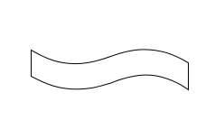
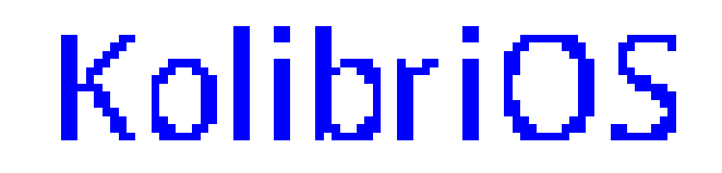
Work results
Now you know how to make a rasterizer of vector fonts with your own hands. A working example of a rasterizer can be downloaded here , but it is written for the Hummingbird operating system (so you will have to download it if you want to run this example). The size of the compiled program is 2589 bytes, the maximum use of RAM is about 300 kilobytes. And this is not the limit!
Source: https://habr.com/ru/post/119608/
All Articles