Context menu design
I present to your attention the translation of an article entitled " Context Menu design " by Hagan Rivers . Translated to UXDepot specifically for Habrahabr users with the approval of Two Rivers Consulting Corporation .
What is the context menu?
The context menu is a menu that contains commands related to the object that the cursor is currently pointing at. This menu is often referred to as the right-click menu - because historically it was invoked by the right mouse click in Windows.
')
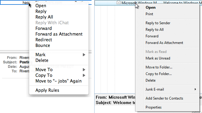
Context menu messages in Apple Mail (left) and Windows Mail (right).
Should I use context menus?
Context menus are not suitable for all applications . I strongly advise against using them for online stores, such as Lands End or Amazon. I also do not recommend using context menus for consumer sites that do not require complex interactions: banking sites, dating sites, even for Facebook.
I consider that context menus are most effective in serious corporate applications that the user often uses and is well versed in. In such applications, context menus are extremely useful. Why?
First of all, context menus help to save mouse movements . If the user is forced to frequently use repetitive actions, then using the context menu helps to prevent unnecessary movements — instead of selecting objects and then “moving the cursor” to the toolbar in order to select an action, the user can do everything right on the spot .
Second, context menus help users learn more about objects in the application. By opening the context menu, they see which commands are available for this object. This helps users understand what they are interacting with at a given time and what the application allows to do with an object of this type.
However, even in such applications, you may notice that many users do not use the context menu at all . For the most part, this is the same user group that also does not use hotkeys. Therefore, you should accept the fact that not all your users will use the context menus, and create your product based on these considerations (more on that later).
So, if you have firmly decided that you cannot do without the context menu, then let's think about how to do it correctly.
How is the context menu called?
Traditionally, in Windows applications, the context menu is invoked by hovering over an object and clicking on it with the right mouse button. In MacOS systems, the user can also use the right mouse button or can click on the object with the left button while holding down the Control button. Usually this action is simply called “ right click ”.
Right click at any point of the object should call the context menu . If this is a captioned icon, then right-clicking on both the icon and the caption should bring up the same context menu. If the object is a row in the table, then the same menu should open no matter where the user clicks on this row. Never, hear, never show different context menus depending on which column of the line the user clicked.
A small note: In the world of touchscreen devices (such as, for example, iPad), we do not have a cursor that can be pointed at an object. In this case, you can quickly name three possible ways to point to an object:
- Show the context menu immediately after clicking on the object (but this can be annoying)
- Show the context menu after pressing the finger and holding it down for a fraction of a second (in this case, the problem of non-obviousness always arises, but this is better than the first option)
- Adding a control that brings up a context menu (perhaps this is the best way to solve a problem — it is described below).
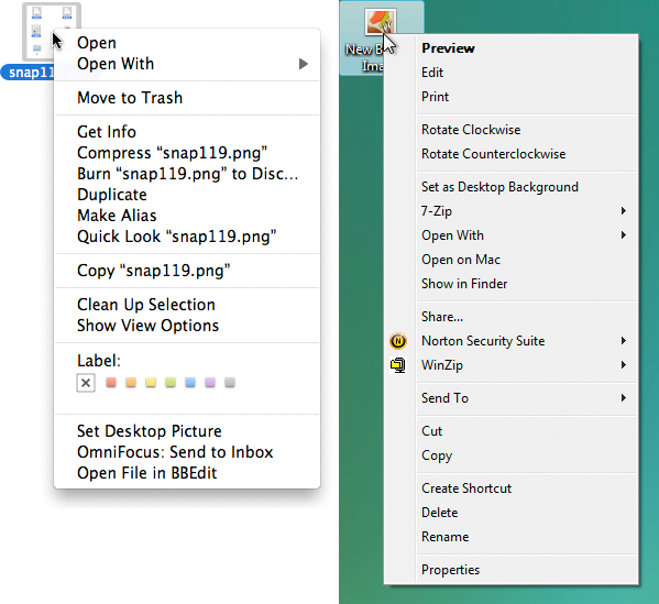
Context menu for image file in MacOS X (left) and Windows Vista (right).
Add item to popup context menu
In some web applications there is an interface element, clicking on which brings up the context menu. It is usually called the “menu icon” —it is an icon depicting a down arrow, which is located right next to the name (or image) of an object.
When using this control, the user can click the left or right mouse button to open the context menu ( never use mouse hovering as a way to open the menu ). The worst thing you can do in this case is not to show the menu just because the user clicked on the control, not with the right mouse button, but with the left one.
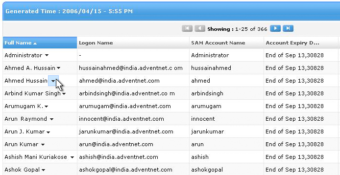
Control menu showing that in this case the menu is available.
If you are going to use the menu control, then you should make it so that clicking on it is different from clicking on the object itself. In the example above, if the user clicks anywhere in the Ahmed Hassain line, then he simply selects the entire Ahmed Hassain line, but if he clicks the menu icon for this line, he gets the context menu (and the line is not highlighted).
In addition, the user should also be able to simply right-click anywhere on the line to open the context menu - without having to click on the icon.
Should I use the menu control? It perfectly solves one of the big problems with context menus: many users do not know that the context menu is available. In web applications, users often assume that there is no context menu (sometimes it is not even in desktop applications).
The menu control helps to show that the context menu is there and is pushing the user to use it . On the other hand, there are users who always assume that the menu is available, and they will try to open it themselves. If you are making an application for this group of users, then you do not need to make a noticeable control to bring up the menu.
The big problem with the menu icon is that it often repeats on the screen and litters it. This problem can be solved by showing the icon only when the mouse is over the object.

Control menu that appears when you hover the mouse.
Another problem with the menu control is that it is difficult to attach to some objects. Take, for example, the context menu for the toolbar: the toolbar itself is a big element of the interface, and it’s not quite clear where to put the menu control in it, so that it is clear that there is a menu. Therefore, menu controls do not work everywhere.
What should be contained in the context menu?
The context menu should contain commands that relate to the selected item . This means that it can contain commands from the menu bar or toolbar that can be applied to the selected item.
The context menu should not contain ALL the commands available for the object — this makes the menu huge and difficult to use. Focus on the most frequently used and most important teams. To overload the menu with unnecessary commands is the worst thing you can do with it. Focus on the important, reduce the mess.
For example, here are three context menus for a selected text fragment: in Dreamweaver, Microsoft Word and Apple Pages. The Dreamweaver menu tries to look like a Swiss folding knife and offers all possible commands in one context menu. Because of this, it turns out so large, with a bunch of nested lists, that it becomes difficult to use it. Personally, I avoid calling the context menu in Dreamweaver.
In it, the most frequently used functions (for example, "Copy" or "Paste") are located near the end of the list. In Word and Pages, on the contrary, frequently used commands are placed at the top of the list, and commands containing nested lists are placed at the end. They also selected only the most important functions for the menu, and organized them better.
If you want to make your context menu more convenient, leave only 60% of the most important commands in place of all 100% . If you try to fit all the important commands in one menu, then this will not lead to anything good - the size of the menu will increase, and the convenience of using it and the speed of working with it will, on the contrary, decrease.
Remember: the main reason why context menus are generally used is the ability to save user time.
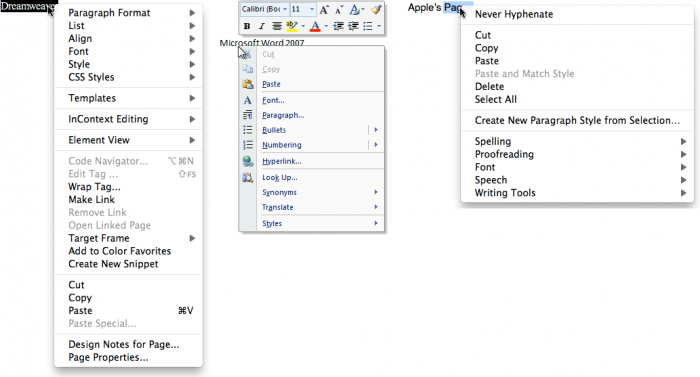
Context menus in Dreamweaver, Microsoft Word and Apple Pages
The context menu should not contain commands that are not related to the selected object (such as, for example, “Refresh page”). Concentrate on those commands that would be useful for working with the object that the user directs.
When possible, group teams into blocks of 1 to 6 pieces each . Separate the blocks with lines. The most frequently used commands should be moved to the top of the list, the least frequently used should be moved down. If the command is used especially rarely, then perhaps it has no place in the context menu.
Feel free to use nested lists , however commands with nested lists should be blown down the context menu. I do not like nested lists, because the user can make a mistake because of them, and besides, a lot of time is spent on their opening - while the meaning of the context menus comes down to saving time.
In addition, you can use custom menu items .
For example, along with the context menu in Microsoft Word 2007, a floating palette opens, and in the context menu of the file in Mac OS there are special colored buttons for choosing the color of the shortcut. Just because we say "menu" does not mean that it should be limited to text only.
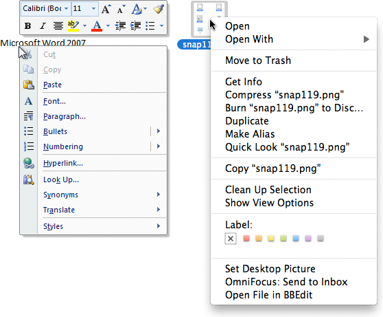
The context menu can be more than just a list of commands.
The context menu cannot contain unique commands peculiar only to it . In other words, any command from the context menu must also be accessible in other ways: on the toolbar, on the menu bar, or in any other place on the screen. Remember that most users will probably never open the context menu in your application. And this means that they will not see a team that is only there.
Usually I put the “default command” first in the context menu. This is the command that will be performed when you double-click on an object (for example, the Open command in the context menu of a file). If the object does not have a default command, concentrate on the most used commands.
You can use the object name in the context menu in order to make the commands clearer . For example, instead of the name of the “Open” command you can use the phrase “Open Screenshot.png”. When using this technique, it can be difficult to find a middle ground - you need to make the menu quite self-evident, but not too wordy. The menu in Mac OS contains the name of the object in some commands, and does not contain in others.
In my context menu, I do not use icons. Honestly, I don’t use them at all in my applications - in my opinion, they clog up the interface and don’t carry much benefit ( translators ’note - O_O ). However, this is only my opinion, and you decide for yourself.
In the context menu of many applications there is no indication of hot keys near the commands. I think this is done to make the menu seem easier. Here you also decide.
What about a few selected objects?
Usually the context menu is called for one selected object, but what if the user selects several objects and then opens the context menu? Let's look at a few examples.
Imagine that we have six objects: four folders (A, B, C, D) and two graphic files (E and F).
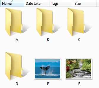
Windows folders and files
Example 1
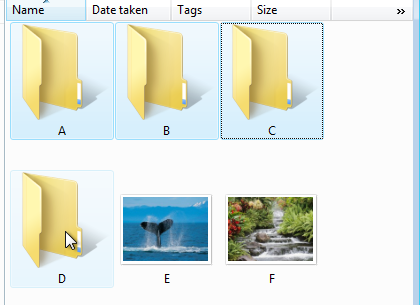
The user selects the folders A, B, C, and then brings up the context menu, while using the mouse on folder D (important: folder D was not selected initially). In this case, for objects A, B, and C, you must deselect the selection and open the context menu only on the selected D.
Example 2
If the user selects A, B, and C, and then calls the context menu while using C, then we must first determine whether A, B, and C are objects of the same type. In other words, do all of these objects have the same menu? If yes, then everything is simple: make all the commands in this menu apply to all selected objects .
If, for example, this is the “Open” command, then it should open all three objects. If there is a command that cannot be applied to more than one object, then you need to make the command inactive, without removing it from the menu.

Earlier, I said that we could write “Open Screenshot.png” instead of “Open” in order to help the user understand what the command is applied to. Similarly, in our case, we can write “Open 3 objects” - this will help to understand that the action applies to all selected objects. In our case, the context menu might look like this:
- Open 3 objects
- Delete 3 items
- Copy 3 objects
Example 3
And now let's consider the case when the user selects several disparate objects, such as folders A, B and graphic file E. As you understand, the context menus for folders and graphic files are completely different.
This is the so-called mixed selection. In the example below, you can see the context menu for the folder (on the left) and for the image (on the right) - they are very different.
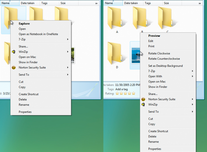
Windows context menu for folders (left) and image files (right)
What should we do in the case of mixed selection, which context menu to use? The most common answer is to show the context menu for the object the user hovers over.
Use the context menu of the object that the mouse is over.
For example, the user selects A, B, and E with a mixed selection and brings up a context menu on E. The context menu that you see is the context menu for E (you will always see the context menu for the object that has the mouse cursor).
Left: The folder A is highlighted, the context menu for the folder is shown.
In the center: The image E is highlighted, the context menu for the graphic file E. is displayed.
Right: Two folders are highlighted (A and B) and a graphic file E, the context menu for the file E is shown.
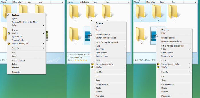
Context menu in the case of mixed selection
However, if the user selects a command from the context menu for files of different types that can apply to all selected objects, this should be done. So, if the “Delete” command is selected, all selected objects should be deleted, even if they are objects of different types.
On the other hand, if the user invokes a menu for E and selects a command that cannot apply to A and B, it will only apply to E. If the user selects the Export command, and it can only apply to E, only E will be exported.
In the two pictures below, the same selection is shown: A, B, and E. In the picture on the left, the context menu on B is open, and we see a menu for folders. In the picture on the right we have the same objects selected, but the menu is open on E, and therefore we see the menu for the image file.

You will be surprised - this approach is used in the vast majority of applications that you regularly use. Think about it: if you choose the “Delete” command, you expect that all three objects will be deleted.
This is one of those things that sound difficult, but work for users.
The problem with this approach is that it is not always predictable . Choosing "Export" you do not know exactly which of the objects will be exported. You can be confident in the principles of this approach only in those applications that are already well known.
In order to get rid of this discrepancy, I can once again suggest using a clear name for commands, for example:
- Delete 3 files
- Export Screenshot.png
This approach has one difficulty in implementation - you need to go through all the commands in all context menus and think about which commands you can apply in mixed selections, and which cannot. The more similar the context menus for different objects, the easier this task will be for you. On Mac OS X, the context menus for folders and files are almost the same, which greatly simplifies Apple’s life.

Mixed selection and context menus in OS X
This example shows that the best way to solve a problem is simply to avoid it. In other words, if you try not to use different context menus for different objects, then the problem associated with mixed selection will not threaten you.
Therefore, one solution would be to make the context menus the same for all types of objects.
And what if you reset the selection?
If the user selects several objects (for example, A, B and E), and then calls the context menu on any of the objects, the selection is reset. The object on which the user called the menu is highlighted, and the menu is applied only for this object.
Personally, I do not like this approach, because sometimes there are cases when the user has spent a lot of time to make a certain selection. An unexpected reset of the selection would be a nuisance. I think this approach should be avoided.
What about building a new menu?
Another solution may be to create a new context menu containing only commands that are suitable for all selected objects at the same time.
I can say so - not worth it. This is bad for a number of reasons. This is a mix of design and programming issues — every time you add a new command to any menu, you’ll have to recycle all possible menu combinations. This is not fun, trust me.
And worst of all - this approach is bad for the users themselves . This is a non-standard solution and it is rejected by people. The user in the menu relies on positional memory (certain patterns that our brain forms to facilitate interface scanning), that is, he remembers WHERE there are commands in the menu.
When you show him unusual menus, which change depending on the current selection, you mess up in his positional memory, which is why the user spends more time working with the menu.
That is, because of this approach, the user can make more mistakes and spend more time - the exact opposite of why we generally use context menus.
findings
And now let's summarize:
Context menus are not suitable for all applications . Before creating them, make sure that users will use them and that they need them.
If you are unsure, do some usability tests and make sure that users at least try to open them. If testers perform repetitive routine tasks and none of them have ever opened a context menu, it is not needed.
The purpose of creating a context menu is to save time . Create them so that they really save time. Keep them short and well organized.
Think about ways to improve the context menu design.
I mentioned a few ideas: adding a menu control that appears when you hover over an object; indication in the menu which objects will be affected by one or another command. I am sure there are many opportunities for development. Feel free to base this “standard” formula and improve it.
PS from translators : I hope you enjoyed the article. We will be happy if you point us to errors in the translation so that we can correct them promptly. Write me in PM, please :)
Source: https://habr.com/ru/post/119285/
All Articles