Usability Psychology: The Impact of Custom Settings on Interface Perception
 Disputes between rationalists and empiricists about the source of human knowledge are one of the most interesting pages in the history of philosophy and psychology. In our time, discoveries in the field of the special sciences (neurophysiology, cognitive psychology, linguistics, research in artificial intelligence, etc.) force us to revert to these discussions and look at traditional problems from an unexpected perspective.
By empiricism is understood the position that a key source of human knowledge is sensory experience. According to the expression of the 18th century English philosopher John Locke, one of the most famous adherents of empiricism in philosophy and psychology, human consciousness is a “clean board” (tabula rasa), on which labels of sensual impressions are applied. Intellect has no effect on sensory perception; its functions are reduced only to the generalization of data obtained in sensory experience.
In contrast to empiricism, rationalism is considered by the main source of knowledge to be reason. Philosophers and psychologists, who stand on the positions of rationalism, believe that the human mind is not at all a “clean board”: our inherent perception of things can be influenced by both innate components and previous experience. Experimental psychology of the twentieth century showed that our sensory knowledge is always definitely oriented. Perceiving new things, we always interpret them on the basis of a whole system of prejudice and forethought. To illustrate the stated theses, you can, for example, compare how the same event is covered in news bulletins on different TV channels: different texts are superimposed on the same visual row, creating an installation for the audience on the basis of which the interpretation is made.
Prejudice and preconceptions play a huge role in the process of human-machine interaction. To create the most user-friendly interface, it is necessary to take into account all the settings and user expectations - otherwise the application or site may turn out to be non-ergonomic or, in modern terms, not usable.
Often, developers, designers and usabilityists themselves forget that they also form a system of prejudices and prejudices that influence their work. As a result, it is often the case that a finished product is highly appreciated by programmers and designers, but not by end users. Of course, based on numerous studies, you can get a more or less clear idea of user needs. But this is the way a person works, that in his daily activities he will take into account the opinion of representatives of the group in which he is permanently than the opinion of some abstract users. Based on the SixRevisions blog, we will look at some typical custom installations.
"I know where it should be."
Internet users have a system of ideas about where certain elements of the site should be located. For example, very many users “on the machine” begin to look for a field to enter a login and password in the upper right corner of the screen.
')

The field for entering a login and password in the upper right corner of the site Mint.Com.
Recommendation : The placement of the elements that control the key functions of the application or site should be approached with great care.
“I know how it should look.”
Users have a system of prejudices and prejudices related to the appearance of sites. For example, a graphic element with beveled edges is almost always perceived by them as a button.
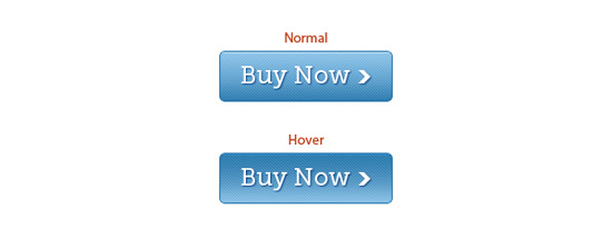
Recommendation : The appearance of the key elements of the interface is of great importance. To make the interface understandable, it is necessary to take into account the specifics of user perception.
“I know how it should work.”
In the course of everyday interaction with things (both online and offline), the user forms prejudices that subsequently influence his perception of interfaces. For example, when following a link, most people expect new content to appear on the screen in the same place and be presented in the same format. If the user clicks on the link and sees not the expected text in the html-format, but a message about the start of the download of the pdf-file, it can confuse it. Therefore, it is highly desirable that there are warnings on the site about possible deviations from user expectations.
Recommendation : when developing applications and sites should carefully consider all possible actions of users. Unfortunately, it often happens that design issues are given much more attention than building an adequate presentation logic. Possible user behavior strategies can be explored through usability testing based on interactive prototypes.
"I know how it should be called"
It is known that users do not read texts posted on web pages carefully, but only scan them with a glance in search of necessary information. Therefore, the texts published on the sites should contain keywords on which visitors can easily find what they need. For example, by clicking on the “contacts” or “contact us” link, the user expects to see a page with addresses, phone numbers and other contact information.
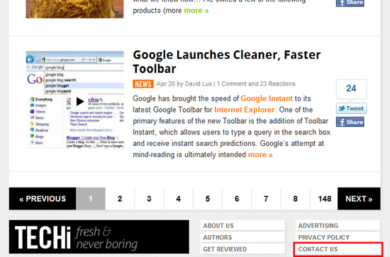
On the Techi.Com website, which publishes news from the world of high technology, the Contact us link is at the bottom of every page.
Recommendation : Address users in a language they understand. The interface should be clear and transparent to the audience of the site. Avoid originality for the sake of originality and do not give fancy names to typical interface elements.
From the above we can draw the following conclusion: when creating an application or website, you need to be able to see the “thing in work” through the eyes of the user. Creating favorable conditions for the work of users, you need to accept them as they really are. And strive to ensure that the product being created is as understandable as possible for everyone - both for specialists and for those who are just starting to use a computer in their daily activities.
Source: https://habr.com/ru/post/119178/
All Articles