Responsive and mobile design with CSS3 Media Queries
The screen resolution nowadays ranges from 320px (iPhone) to 2560px (large monitors) or even higher. Users no longer browse sites only on desktops. Users now use mobile phones, small laptops, tablet devices such as iPads or Playbooks to access the Internet. Therefore, the traditional fixed-width design no longer works. The design should be adaptive. The structure should automatically change to reflect all display resolutions. This article will show you how to create cross-browser responsive design using HTML5 and CSS3 media queries.
Before starting, look at the final demo to see how good it looks. Change the browser size to see how the structure automatically changes based on the width of the window.

If you want to see more examples, see the following WordPress themes that I did using media queries: iTheme2 , Funki , Minblr, and Wumblr .
')
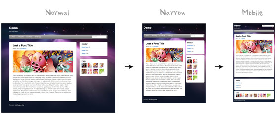
The page container is 980px wide for any resolution, greater than 1024px. To check the width, media queries are used if the width is less than 980px, in this case the layout becomes rubber, instead of a fixed width. If the width is less than 650px, then the containers with content and side panel expand to full screen and become in one column.
We will not stop at the detailed description of HTML. The basic structure of the layout is described below. I have a “pagewrap” that includes “header”, “content”, “sidebar” and “footer”.
Please note that the demo uses HTML5. Internet Explorer below version 9 does not support new elements contained in HTML5, such as <header>, <article>, <footer>, <figure>, and others. Therefore, we include the Javascript html5.js file into an HTML document that will allow IE to understand new elements.
The following CSS will make HTML5 elements (article, aside, figure, header, footer, etc.) block.
I will not go into details again. The main container “pagewrap” has a width of 980px. Header has a fixed height of 160px. Container "content" 600px wide and pressed to the left. The sidebar is 280px wide and pressed to the right.
At the first step, media queries are not implemented in the demo , so when you change the size of the browser window, the layout will remain a fixed width.
Now the fun begins - media queries .
Internet Explorer 8 and earlier versions do not support CSS3 media queries. You can enable it by adding a javascript css3-mediaqueries.js file .
Create a new CSS file for media queries. Check out my previous article to see how media queries work.
For screen sizes below 980px, the following rules apply:
Tip: use percentages (%) to make blocks rubber.
Then, set CSS rules for screen sizes smaller than 650px.
This CSS will be used for screen sizes smaller than 480px, which corresponds to the width of the iPhone in landscape orientation.
To make the images elastic, just add
For video, we apply the same rules as for images. For unknown reasons,
By default, iPhone Safari compresses the pages to fit into the screen. The following meta tag tells iPhone Safari to use the width of the device as the width of the window and disable.
Open the final demo and change the screen size to see media queries in action. Do not forget to check in the iPhone, iPad, Blackberry (latest versions) and Android phones to see the mobile version.
First, let's see it in action.
Before starting, look at the final demo to see how good it looks. Change the browser size to see how the structure automatically changes based on the width of the window.
Other examples
If you want to see more examples, see the following WordPress themes that I did using media queries: iTheme2 , Funki , Minblr, and Wumblr .
')
Overview
The page container is 980px wide for any resolution, greater than 1024px. To check the width, media queries are used if the width is less than 980px, in this case the layout becomes rubber, instead of a fixed width. If the width is less than 650px, then the containers with content and side panel expand to full screen and become in one column.
HTML
We will not stop at the detailed description of HTML. The basic structure of the layout is described below. I have a “pagewrap” that includes “header”, “content”, “sidebar” and “footer”.
< div id = "pagewrap" >
<header id = "header" >
<hgroup>
< h1 id = "site-logo" > Demo < / h1 >
< h2 id = "site-description" > Site Description < / h2 >
< / hgroup>
<nav>
< ul id = "main-nav" >
< li > <a href = "#"> Home < / a > < / li >
< / ul >
< / nav>
< form id = "searchform" >
< input type = "search" >
< / form >
< / header>
< div id = "content" >
<article class = "post" >
blog post
< / article>
< / div >
<aside id = "sidebar" >
<section class = "widget" >
widget
< / section>
< / aside>
<footer id = "footer" >
footer
< / footer>
< / div >
HTML5.js
Please note that the demo uses HTML5. Internet Explorer below version 9 does not support new elements contained in HTML5, such as <header>, <article>, <footer>, <figure>, and others. Therefore, we include the Javascript html5.js file into an HTML document that will allow IE to understand new elements.
<! - [if lt IE 9]>
<script src = "http://html5shim.googlecode.com/svn/trunk/html5.js"> </ script>
<! [endif] ->
CSS
We reset HTML5 elements in block
The following CSS will make HTML5 elements (article, aside, figure, header, footer, etc.) block.
article , aside , details , figcaption , figure , footer , header , hgroup , menu , nav , section {
display : block ;
}
Describe the basic structure in CSS
I will not go into details again. The main container “pagewrap” has a width of 980px. Header has a fixed height of 160px. Container "content" 600px wide and pressed to the left. The sidebar is 280px wide and pressed to the right.
#pagewrap {
width : 980px ;
margin : 0 auto ;
}
#header {
height : 160px ;
}
#content {
width : 600px ;
float : left ;
}
#sidebar {
width : 280px ;
float : right ;
}
#footer {
clear : both ;
}
Step 1
At the first step, media queries are not implemented in the demo , so when you change the size of the browser window, the layout will remain a fixed width.
CSS3 Media Queries
Now the fun begins - media queries .
Connecting Media Queries Javascript
Internet Explorer 8 and earlier versions do not support CSS3 media queries. You can enable it by adding a javascript css3-mediaqueries.js file .
<! - [if lt IE 9]>
<script src = "http://css3-mediaqueries-js.googlecode.com/svn/trunk/css3-mediaqueries.js"> </ script>
<! [endif] ->
We connect CSS media queries
Create a new CSS file for media queries. Check out my previous article to see how media queries work.
< link href = "media-queries.css" rel = "stylesheet" type = "text / css" >
Screen size less than 980px (rubber layout)
For screen sizes below 980px, the following rules apply:
- pagewrap = 95% width;
- content = width 60%;
- sidebar = width 30%.
Tip: use percentages (%) to make blocks rubber.
@media screen and (max-width: 980px) {
#pagewrap {
width : 95 % ;
}
#content {
width : 60 % ;
padding : 3 % 4 % ;
}
#sidebar {
width : 30 % ;
}
#sidebar .widget {
padding : 8 % 7 % ;
margin-bottom : 10px ;
}
}
Screen size less than 650px (single column layout)
Then, set CSS rules for screen sizes smaller than 650px.
- header = reset height to auto;
- searchform = position - 5px on top;
- main-nav = reset positioning to static;
- site-logo = reset positioning in static;
- site-description = reset positioning to static;
- content = set the width to auto (this will stretch the container to the full width)
- sidebar = set the width to 100% and remove the float.
@media screen and (max-width: 650px) {
#header {
height : auto ;
}
#searchform {
position : absolute ;
top : 5px ;
right : 0 ;
}
# main-nav {
position : static ;
}
# site-logo {
margin : 15px 100px 5px 0 ;
position : static ;
}
# site-description {
margin : 0 0 15px ;
position : static ;
}
#content {
width : auto ;
float : none ;
margin : 20px 0 ;
}
#sidebar {
width : 100 % ;
float : none ;
margin : 0 ;
}
}
Screen size less than 480px
This CSS will be used for screen sizes smaller than 480px, which corresponds to the width of the iPhone in landscape orientation.
- html = disable font size adjustment. By default, the iPhone increases the font size for more comfortable reading. You can disable this by adding
-webkit-text-size-adjust: none; - main-nav = reset the font size to 90%.
@media screen and (max-width: 480px) {
html {
-webkit-text-size-adjust : none ;
}
# main-nav a {
font-size : 90 % ;
padding : 10px 8px ;
}
}
Elastic images
To make the images elastic, just add
max-width:100% and height:auto . Images max-width:100% and height:auto works in IE7, but does not work in IE8 (yes, another weird bug). For the fix you need to add width:auto\9 for IE8.img {
max-width : 100 % ;
height : auto ;
width : auto \ 9 ; / * ie8 * /
}
Resilient Embedded Videos
For video, we apply the same rules as for images. For unknown reasons,
max-width:100% (for video) does not work in Safari. Need to use width: 100% ..video embed ,
.video object ,
.video iframe {
width : 100 % ;
height : auto ;
}
Initial Scale Meta Tag (iPhone)
By default, iPhone Safari compresses the pages to fit into the screen. The following meta tag tells iPhone Safari to use the width of the device as the width of the window and disable.
< meta name = "viewport" content = "width = device-width; initial-scale = 1.0" >
Final Demo
Open the final demo and change the screen size to see media queries in action. Do not forget to check in the iPhone, iPad, Blackberry (latest versions) and Android phones to see the mobile version.
Source: https://habr.com/ru/post/119127/
All Articles