Our New Logo
Good afternoon, Habravchane!
Last week, we officially announced a new logo for our project CUBRID . Today I am very glad to share this work with you. I want to tell you what contributed to this change, as well as the meaning of the new shapes and colors.
I believe some of you have already noticed changes on our official website http://www.cubrid.org . If not, then this is the time to see how our new logo looks on the background of the community site.
')
Since we first introduced the developers of other countries to the new CUBRID DBMS in 2009-2010, we have been receiving various comments on the forums, via email about the previous CUBRID logo. Some users liked it, some didn't. The most important reason for disliking the previous logo was its similarity to the Oracle logo. The font was very similar, and a similar red color was used. At the same time, many users were indifferent, since, according to them, they needed the DBMS itself, and not the logo. Nevertheless, some users insisted and advised to change the logo due to the fact that it caused some negative impressions, or users had negative feelings towards the commercial Oraklu, or even some of them had the idea that we try to imitate Oraklu or our future goal is to sell CUBRID to Oraklu.
To get a more or less solid foundation for reinforcement of these reviews or their opposite, we conducted a small study. The result was in favor of those who advised the rebranding, which finally pushed us to start developing a replacement for the three-year-old logo. With such a request, we turned to the design team of our parent corporation NHN. We asked to create a logo that would look resilient, scalable, easily expandable, bright and friendly. We wanted the new logo to represent what CUBRID is at the root.
A few months later we received 15 candidates of the new logo. With this, we again surveyed developers from Romania, China and Korea, and in the end we chose a logo that you can see below.
Thus, on May 6th of this year, we announced a new logo along with the release of a new version of CUBRID 8.4.0, which provides 80% compatibility with the SQL syntax of MySQL, as well as a performance gain of almost 2 times compared with the previous version.
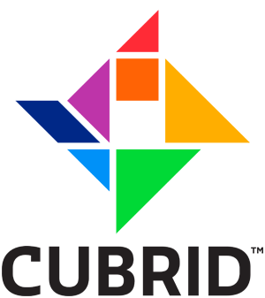
The new logo represents tangram . It consists of 7 flat figures, also known as tang , which can be laid out in different ways to form many other beautiful figures. This means elasticity , scalability and ease of expansion .
As in the original tangram, in the CUBRID logo you can see 2 large right triangles, 1 medium triangle, 2 small right triangles, 1 square, and also 1 parallelogram.


The 7 tans of the logo represent the 7 colors of the rainbow, visible to human vision. This “Every Hunter Wants to Know Where the Pheasant Is Sitting”, i.e. red, orange, yellow, green, blue, blue and purple.
However, we slightly changed the color gamut of the original colors of the rainbow, so that when combined, they could be well combined with each other. As a result, tangram consists of red # FF2B36, orange # FF6305, yellow # FFAE00, green # 00D936, blue # 0091F8, blue # 002887, and purple # BE34A9. We will also consider these colors as rainbow colors. And we like them very much! Hope you like it too!
The new font that we started using in our logo and other official documents is called Sansa , which is available in thin, regular, bold, and cursive fonts. Although this font covers only Latin letters, I think we'll think of something for the Cyrillic alphabet. As you can see, the font is very beautiful with smooth edges, therefore we liked it. Sansa is commercially available and can be purchased online, for example, at FontShop.
Since tangram represents a universal figure, we can collect many other derived forms and use them as icons for different purposes. This is a matter of creativity. This is what I like the most!
While we are replacing the old logo with a new one, I ask you to be active and express your opinion about our new logo in the comments. What do you think?
Last week, we officially announced a new logo for our project CUBRID . Today I am very glad to share this work with you. I want to tell you what contributed to this change, as well as the meaning of the new shapes and colors.
I believe some of you have already noticed changes on our official website http://www.cubrid.org . If not, then this is the time to see how our new logo looks on the background of the community site.
')
Prerequisites
Since we first introduced the developers of other countries to the new CUBRID DBMS in 2009-2010, we have been receiving various comments on the forums, via email about the previous CUBRID logo. Some users liked it, some didn't. The most important reason for disliking the previous logo was its similarity to the Oracle logo. The font was very similar, and a similar red color was used. At the same time, many users were indifferent, since, according to them, they needed the DBMS itself, and not the logo. Nevertheless, some users insisted and advised to change the logo due to the fact that it caused some negative impressions, or users had negative feelings towards the commercial Oraklu, or even some of them had the idea that we try to imitate Oraklu or our future goal is to sell CUBRID to Oraklu.
To get a more or less solid foundation for reinforcement of these reviews or their opposite, we conducted a small study. The result was in favor of those who advised the rebranding, which finally pushed us to start developing a replacement for the three-year-old logo. With such a request, we turned to the design team of our parent corporation NHN. We asked to create a logo that would look resilient, scalable, easily expandable, bright and friendly. We wanted the new logo to represent what CUBRID is at the root.
A few months later we received 15 candidates of the new logo. With this, we again surveyed developers from Romania, China and Korea, and in the end we chose a logo that you can see below.
Thus, on May 6th of this year, we announced a new logo along with the release of a new version of CUBRID 8.4.0, which provides 80% compatibility with the SQL syntax of MySQL, as well as a performance gain of almost 2 times compared with the previous version.
The form
The new logo represents tangram . It consists of 7 flat figures, also known as tang , which can be laid out in different ways to form many other beautiful figures. This means elasticity , scalability and ease of expansion .
As in the original tangram, in the CUBRID logo you can see 2 large right triangles, 1 medium triangle, 2 small right triangles, 1 square, and also 1 parallelogram.
Logo CUBRID in the form of a tangram with the inscription.

Logo CUBRID in the form of a tangram with an inscription in a horizontal arrangement.

Colors
The 7 tans of the logo represent the 7 colors of the rainbow, visible to human vision. This “Every Hunter Wants to Know Where the Pheasant Is Sitting”, i.e. red, orange, yellow, green, blue, blue and purple.
However, we slightly changed the color gamut of the original colors of the rainbow, so that when combined, they could be well combined with each other. As a result, tangram consists of red # FF2B36, orange # FF6305, yellow # FFAE00, green # 00D936, blue # 0091F8, blue # 002887, and purple # BE34A9. We will also consider these colors as rainbow colors. And we like them very much! Hope you like it too!
Font
The new font that we started using in our logo and other official documents is called Sansa , which is available in thin, regular, bold, and cursive fonts. Although this font covers only Latin letters, I think we'll think of something for the Cyrillic alphabet. As you can see, the font is very beautiful with smooth edges, therefore we liked it. Sansa is commercially available and can be purchased online, for example, at FontShop.
Icons
Since tangram represents a universal figure, we can collect many other derived forms and use them as icons for different purposes. This is a matter of creativity. This is what I like the most!
While we are replacing the old logo with a new one, I ask you to be active and express your opinion about our new logo in the comments. What do you think?
Source: https://habr.com/ru/post/118943/
All Articles