Drop-down lists: ergonomics and design
 From the translator. In continuation of a series of publications on the materials of the French blog Usaddict, we offer to our readers an article by Thierry Buyo and Jules Leclerc on the role and functions of drop-down lists in the interface. We invite you to discuss and exchange practical experience.
Drop-down lists are among the most commonly used interface components of both desktop and web applications. In some cases, using drop-down lists really can confuse a user. This happens if the drop-down list does not perform its main function, which is to facilitate the selection of the desired menu item that occupies a limited space on the screen. In this article we will try to consider the key problems associated with the ergonomics of drop-down lists.
Efficient list display
')
The main purpose of the drop-down list is to display a list of a number of elements in a limited area of the screen space and provide the ability to quickly select.
If the list is small (3-4 items), it is preferable to display all the items one by one; Radio buttons can be used, both horizontally and vertically.
If the number of items to select is more than four, then it is better to use the drop-down list. The height of the list and the number of elements must be adapted to the user's requests. It should include the most popular items and provide the user with the opportunity to introduce their own version. If the slider or scroll bar is used to navigate through the list, this will make it much more difficult to work with it.
But the solution to this problem is possible! For example, in the drop-down menu to select the font size, it is not at all necessary to enter all possible options into the list. In this case, it is easier to use the so-called combo box, in which you can both choose one of the options and enter your own version in the appropriate field.
Practical recommendations :
- If the list consists of less than four items, the preferred option is to use radio buttons.
- The number of options to choose should be limited and reduced to the most necessary user.
- The use of scroll bars to limit the height of the displayed list should be avoided - this creates unnecessary difficulties;
It is desirable to provide the user with the possibility of their own version through the use of combo boxes.
Easier choice
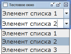
When a certain list item is already selected, you should inform the user. In some cases, the fact of choice is obvious, but sometimes it is necessary to notify the user once again. For example, if the list is displayed below the selection field, the selected item should be in the first place in it. If the selected item is in the middle or end of the list, then it should be highlighted.
What if the list really contains too many items? You can use the solution already implemented in many programs: the elements of the list can be visually divided into groups made up of the following reasons:- type of action
- frequency of use
- alphabetically
- around graphic

Example: grouping drop-down menu items into categories (Mozilla Thunderbird) and around a graphic image (Office 2007 - 10).
A good solution would be to offer the user the ability to group menu items at their own discretion.
Practical recommendations:
The names of the elements of the list should be reduced to a single style (so that the element can be identified by the first word);
When sorting elements in alphabetical order, all names must begin either with uppercase letters or only with lowercase letters;
When self-entering the names of the list items from the keyboard, use the hints;
Lists should be organized so that the default item is always visible to the user. In this case, the user can always verify the correctness of his own choice, simply by comparing the corresponding items.
It is also necessary to group the list items into categories of frequency of use, etc.
Create favorable conditions for selection
In the drop-down lists, the user is often offered a large number of options to choose from. To make the choice easier, you can use various methods: for example, in the font selection menu the name of each item is printed with the corresponding font (as is done in many text editors). In some cases, it may not be useful to put a room next to each element of the sample list (as implemented, for example, in InDesign).
Example: drop-down font selection menus (OpenOffice and InDesign).
As an example, you can also cite rich content drop-down menus in Office 2007 and 2010. In the menu for selecting fonts, for example, you can demonstrate how a piece of text selected before opening a menu will look like in one style or another.
Example: select a piece of text in a selectable font (Office 2007)
An interesting option is also a combination of a drop-down menu with checkboxes. By setting the necessary checkboxes, the user can select the menu items that will be really needed in his work.
Example: selection of displayed menu items in WindowsExplorer7 and on the French site CadresOnline.
In the space allocated for the menu, there should be enough space to display all the necessary elements. In some cases, the drop-down list becomes not so much useful as cumbersome precisely because of the unsuccessful display of multiple elements of the list.
As an example, the site of the French Post Office:
Drop-down lists go far beyond the place intended for them. As can be seen in the figure above, the lists could be shifted to the left (i.e., closer to the heading name), which would make the menu more convenient and understandable.
Another possible solution is a graphical representation of the elements of the list. This approach is increasingly used in the design of web applications and sites. What is obtained as a result is sometimes difficult to call a drop-down list in the traditional sense. Graphic drop-down lists allow you to more clearly present the content and facilitate navigation.
Recommendations :- use the possibilities of visualizing the elements of the list (fonts, sizes, formatting styles, etc.)
- the names of the elements of the list should be brought to the same style
- for large lists, display only the most necessary items on the screen;
group items by headings - allow the user to independently select the displayed list items
Conclusion
The drop-down list is a very convenient interface component: it helps save screen space and makes navigation much easier. At the same time, when incorporating this component into the interface design, one should be guided by considerations of ergonomics and aesthetics in order to ensure maximum convenience for the user.
Source: https://habr.com/ru/post/118853/
All Articles