Oculographic research: what the eye can tell
 From the translator. Methods for oculometric testing (eytreking) have recently become widespread in the field of usability. Publishing a translation of the article by French usability researchers Thierry Buyo and Sophie Radesdorf, we invite our readers to discuss the problems of visual perception of interfaces. What interface elements attract the attention of users? How are visual appeal and functionality related? How important is the consideration of the psychological characteristics of human perception in the development of application interfaces and sites?
 Talking about eytreking is impossible without discussion of important methodological issues. With the help of an oculograph, it is possible to present with high accuracy the trajectory of the movement of the gaze, to fix areas of increased attention, but can this at least tell something about how the subjects interpret the visible? The thoughts and feelings of users cannot be fixed with the help of instruments; The results of semantic research cannot be subjected to experimental verification. Is it possible (and if possible, how) to develop a strategy for studying the human factor, in which taking into account all subjective moments would be combined with the rigor of the methodology and the validity of the results?
We hope that representatives of various fields of knowledge will take part in the discussion of the article: programmers, designers, philosophers, psychologists.
Oculographic research (sometimes also called aytracking, from the English eye tracking) has become a very fashionable trend in the field of web development. Are they really so helpful and effective? What is the difference between oculography and traditional usability testing and ergonomic assessment techniques? An attempt to answer these questions will be made below.
Analysis of what we see
Oculography has long been used in scientific research, as well as in industry. The meaning of the study is to analyze the movement of the eye and the zones of visual focalization, on which the eye is concentrated. The analysis is carried out on the basis of the indications of a special device, the oculograph (aytrekera).
Most often, the purpose of the study is to study the real scenarios of working with the site by tracking the movements of the eye. The subject of research is the layout of information on the site and its pertinence, that is, compliance with the information needs of the user. Data analysis can be presented in two forms: the trajectory of the movement of the sight (eng. Gaze plot) and heat map (eng. Heat map).
')

The gaze motion chart displays the sequence of eye movements when viewing an image. Stops of sight are indicated by circles, and lines of movement are indicated by features.

The heat map documents the areas of long or multiple gaze fixation. The red color indicates the places where the sight stayed the longest (or to which it returned several times).
Aytreking and marketing
The use of okulography in the field of Internet and multimedia began relatively recently. Technicians are interested in marketing specialists, who realized that they have enormous potential for developing ways to attract the attention of the consumer. If it is true that a person scans the field of view with his gaze, fixing himself on areas of increased attention, it is possible to identify patterns of typical visual behavior. For example, if the illustration to the text depicts a human face, the fact of the look will be fixed on this face, and the information communicated in the text will be associated with the emotion expressed on the face. The presence of a spectacular illustration can cause a decline in interest in the text as such. This can be clearly seen in the figures below, depicting two variants of the design of an advertisement for children's diapers. In the figure to the left you can see that the subjects most often held their gaze on the image of the face; the right figure shows that the subjects' views were delayed on the text and on the photo with the same frequency.

The results of the study of the distribution of the gaze of 106 subjects on the material of two variants of the design of advertising children's diapers. The example is taken from the article of James Breeze. You look where they look
Oculographic studies are of interest because they provide an opportunity to establish exactly how people will perceive the visual product. Competently performed analysis is a guarantee that the images and text will be perceived adequately. In other words, it can be assumed that the information contained in the text will be better remembered if it is associated with visual images and interpreted on the basis of the emotions created by these images.
Identification of navigation patterns using oculographic examination
If earlier, okulographic studies were conducted mainly to study the perception of simple static web pages, now they are increasingly used to study the behavior of users while navigating through multi-page sites (for example, when searching for information or making purchases on the Internet). During the study, subjects are asked to describe what they see on the web page, and also to find some information on the page or to perform certain actions. The results of such studies often confirm things that are already well known to specialists in ergonomics: the view is moving on a web page far from random; the trajectory of its movement directly depends on what kind of information the user is looking for, how he got used to using the Internet, and also on how the information is organized and presented on the site.
The movement of a look on a web page directly depends on how information is located on it. Thus, the results of the analysis suggest that users almost do not delay the view on advertising banners (this phenomenon is called banner blindness, from the English. Banner blindness). The figures below show that the views of the subjects almost did not stop at banners (both static and animated), located both in the upper part and along the edges of the web page:

Practice shows that experienced Internet users altogether stop paying attention to advertising, concentrating on what they really need and are interested in.
Another pattern of visual behavior found by oculographic studies is the so-called F-scan. You have to deal with it when reading texts on web pages, as well as when viewing search results, when information is presented in the form of text blocks located one above another. The trajectory of the movement of the eye resembles the Latin letter F (hence the name): two horizontal lines, and then one vertical. The process of an F-shaped scan can be divided into three phases: first, the user reads the text at the top of the page (the first horizontal element of the letter F), then directs the view below, finds and reads the most interesting text fragments (the second horizontal element), and then looks at the rest part of the page from top to bottom (vertical element).

F-scan heat maps (from the Jacob Nielsen article F-shaped web content reading pattern )
When reading texts written in alphabetical letters from left to right, there is also often a phenomenon called the “Gutenberg Chart” or Z-shaped reading: a user looking for the necessary information when viewing the text from top to bottom almost does not delay the view on the fragments located in the side section pages (the trajectory of the movement of the eye resembles the Latin letter Z).
Once again: the location of information on the page affects how the user will view it. Text fragments and illustrations located along the edges of the page are, in most cases, viewed very fluently and do not attract attention. If it is necessary that all the information on the page is carefully read by its visitors, you need to take care of its location. If the information is presented in an inconvenient form for the user, it will read not so much as skimming the page.
Oculographic research as a means of measuring the usability of web pages
From the point of view of ergonomics and usability, a web page that fully meets user expectations, different accessible content and easy to navigate should be considered as high-quality.
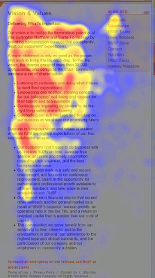
Users, as a rule, immediately pay attention to the important elements of the page: useful links, search forms, navigation menus, etc. Oculographic research results indicate that these elements attract attention and are instantly recognized by the subjects. Secondary elements (advertising banners, links to the site version in another language, etc.) should not immediately attract the eye: otherwise they will distract from solving really important tasks.
The time interval between the beginning of the page view and the discovery of the desired content element should be as short as possible. Fragments of text written in large or bold type attract the attention first of all, largely because they are headings or short and succinct phrases that do not require time and effort to read and understand. It is important that the ways of presenting text on a web page meet the expectations of visitors: the most interesting and important information should be placed where the user's view is directed first of all. By presenting all the text content in the same manner, it may happen that the look will wander around the page without lingering on any specific fragments, which is why important information can be ignored.
Competent visual arrangement is very important for such elements as filled text fields, checkboxes, radio buttons. Labels denoting these elements should be in close proximity to them. Unfortunately, developers often forget about this simple and obvious truth. Oculographic study allows you to choose the best location options:

Goggle points on filled text fields (from the article Why Users Faster Fill Forms with Labeled Top Names ), published on the UX Movement blog
Placing the names of the forms to be filled above them, rather than on the right, is a better option that makes the user's work much easier. The number of points on which it is necessary to fix the view, with this arrangement is reduced by half. Both the form itself and its name immediately enter the field of vision. Looking through the page, the user is not “scattered”, but instantly captures the necessary information. As a result, the reading time is significantly less. Of course, the page design should be organized so that there is enough space for vertical layout.
Drawings, photographs, video clips attract the attention of visitors to the web page: they do not require significant intellectual effort to understand and interpret them. Placing any illustrations should have a clear purpose and meet the expectations of those who will view them. For example, if the list of apartments for sale contains photos of views from the window, users are unlikely to be interested in ads and will search for the necessary information from other sources. Another example: if a video inserted on a page looks like a black screen, few people will want to view it. If the user immediately sees on the screen the most spectacular fragment of the video, it attracts the eye and, of course, makes you want to get acquainted with this video.
Conclusion
Oculographic research allows to establish exactly which elements of a web page attract the eye, and also to recreate the logic of perception of the information presented on it. It allows you to understand whether the most important information attracts the attention of users. However, based on the research data it is impossible to draw conclusions about how the information presented on the site is interpreted by visitors.
From the location of the information directly depends on how the view will move around the screen. Some elements attract more attention than others, and this should be taken into account when developing ergonomic and design solutions. Oculographic research allows developers to understand exactly how a user views a web page.
With all its obvious advantages, the techniques of lighttracking have one major drawback: they can be used to get an idea of the movement of the eye, but it is impossible to explain why the eye was fixed on some specific elements of the page and how they attracted the user's attention. How to explore the process of interpreting the contents of a web page? This will be discussed in our next publication.
Source: https://habr.com/ru/post/118398/
All Articles