Font Zoom and Layout
Before I had a 23 inch monitor, I practically didn’t use the zoom anywhere. The native resolution was ideal for the perception of any texts. The monitors of those who prepared the content and their readers roughly matched. Therefore, if the reader had no vision problems, he almost always received a font size that was well optimized for his resolution. Recently, large monitors have significantly fallen in price and widespread widespread, which led to some inconvenience with sites that are optimized to support small resolutions.
I use a resolution of 2048x1152 (native to my monitor) and this leads to the need to use the zoom for almost any page. I have no vision problems, but when I read a long article, I want to do it with maximum comfort. My distance to the monitor is about 1 meter. Leaning back in a chair, the distance increases somewhere up to 1.5 m. I tried to change the DPI of the monitor, included a large font as default for pages and / or the system, but all this leads to various inconveniences. As a result, I stopped at setting up a zoom for web pages, since FF remembers the zoom set for the domain.
')
As it is used, I was faced with the fact that few of the web designers are testing their pages on an enlarged zoom. Layout designers very diligently optimize the site for "fossil" screen resolutions, but they don’t think at all about how their layout will look on large screens. If the layout is rubber, then there is practically no problem: you can set a giant font and it will be distributed across the screen. But, for pages with a static width, the owner of a widescreen is forced to accept the fact that 50% of the screen is occupied by background, and the text, for the sake of which the visitor came - is skukozhen somewhere in the center. Moreover, the zoom does not facilitate the situation, but rather aggravates: the font becomes larger, but with the same width of the column it fits into the line less. The text becomes larger, but reminds reading from some long roll.
This is especially true for informational publications that practice three columns: two at the edges for news, menus, banners and other garbage and one central. It would seem that for such sites the most important text and the coder should think first of all about him and the convenience of perception. But for some reason, the coder is concerned only with the problems of those with a screen resolution of 800x600: the site will be perfect for them. It will fit entirely into the screen and the font size will be as comfortable as possible. But that on a high resolution, the site will look like a check from a supermarket, without the possibility of correcting even something with a zoom — for some reason, many do not think. Some publications make such a layout, but at the same time it reacts correctly to the zoom: it stretches in width (that is, it behaves almost like rubber). But in most cases, the width of the page does not change.
In my opinion, this is very important for today's typesetter. It is clear that you will not please everyone: small resolutions must also be maintained. Moreover, there are mobile devices, and not everyone knows about the existence of a subdomain for smartphones. You can solve the problem by the presence of a button or a drop-down list, with templates for different resolutions. Well, automatic detection of the visitor's permission with the choice of the appropriate formation is generally a dream.
Recently, the layout on divas occupies a leading position. With all its advantages, it is more sensitive to the zoom, which is also forgotten by many. In this regard, such a container as a table column behaves more predictably: it simply stretches in width and / or height. With divas, you can expect anything: an influx of text to each other, a congress of columns much aside from the headings, the emergence of text from frames, etc. It looks completely unreadable. I do not agitate for tabular layout and do not incite holivar, I just want to turn to the layout makers: test your layout in zoom! Finished layout? Press "Ctrl +" a couple of times and see if you have something going on. You never know what kind of zoom will look at your page: maybe someone will lie on the couch and flipping through her remote. Below in the screenshots are typical problems of zoom in block layout (pictures are clickable)

The “Find” button that came off is nothing compared to the “Last articles in the section” column: only single letters are visible in it. Up to zoom - its width was equal to the width of the header. And as you can see from the size of the picture - it is impossible to make a page wider than 1000 pixels, so on my resolution, exactly 50% of the screen is occupied by emptiness.

The same problem, the column "This Day" allows you to parse exactly one letter in each row. The column "Cinema" almost withstood the zoom, only a few letters disappeared from it.
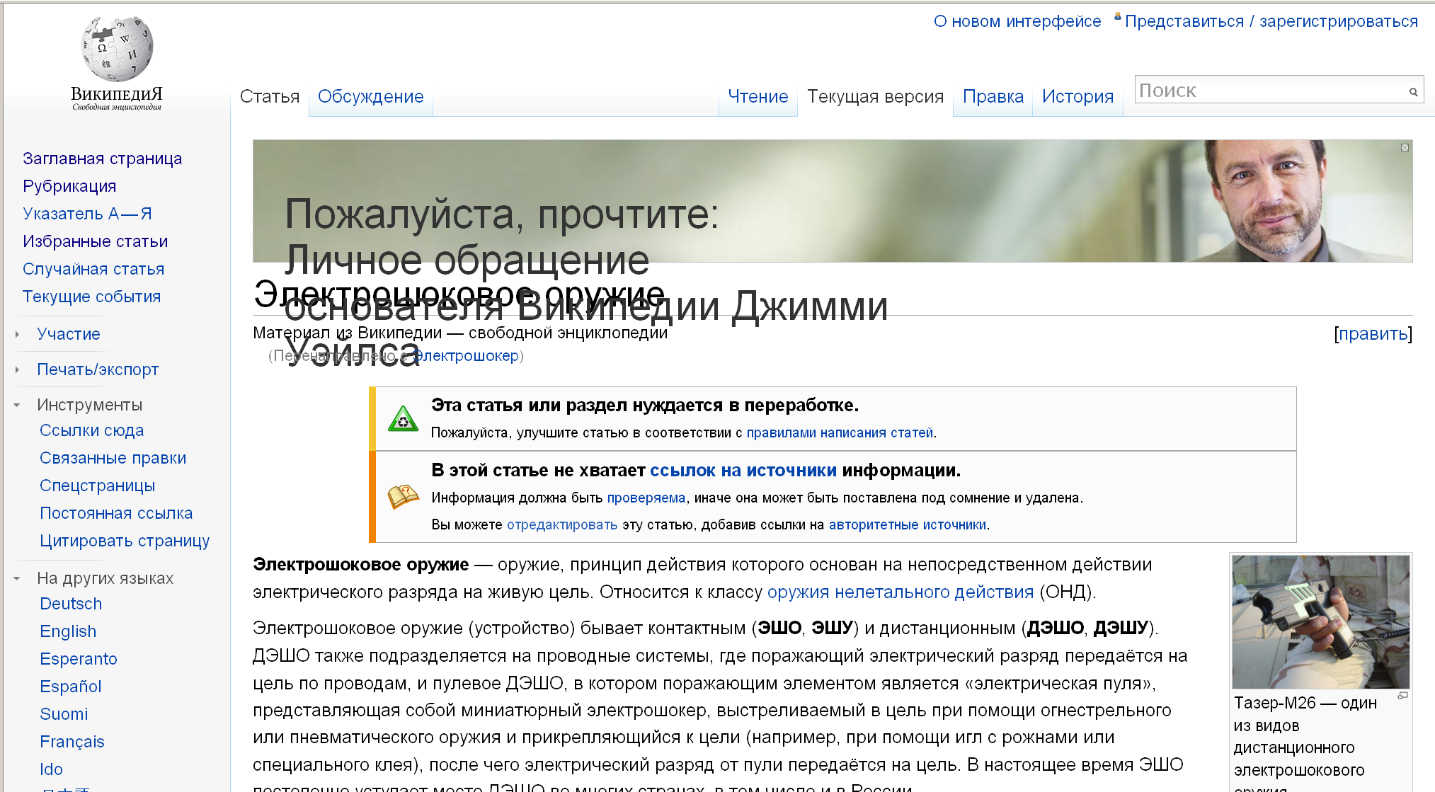
There are no complaints about the wiki at all. First, the layout is rubber. Secondly, a sans serif font (you can zoom in less). Nothing floats, does not fit, all the blocks in their places. The only cant - the upper block with the founder's address, the text of which, when zooming, became gigantic and completely climbed onto the article title
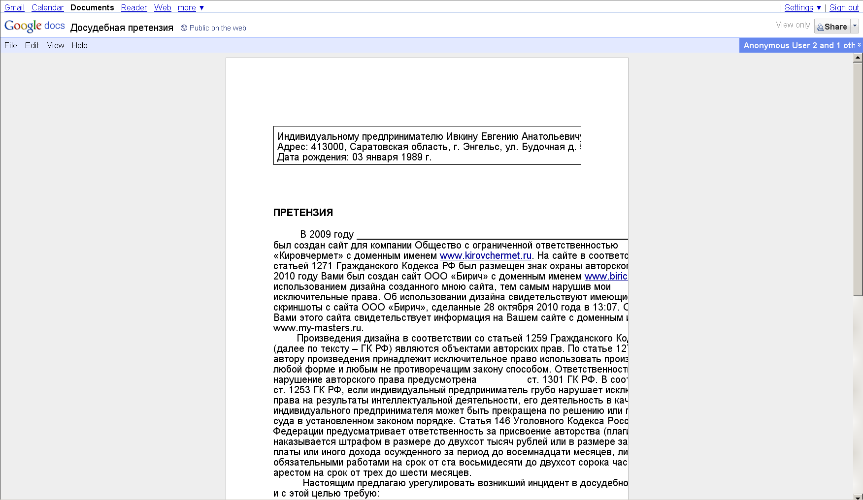
Google, great and terrible, the gurus of web applications and interfaces also do not think about zoom. The screenshot shows that with a small zoom, the text floats to the right and cannot be read. Change the width of the sheet can not be. We have empty spaces and the inability to make the font size more comfortable. Considering that this application for documents (that is, reading, the most important thing here is all) is a huge disadvantage.

And here is the favorite Habr :) True, this is an advertising partner page. It is likely that the layout was done by those who posted the information. As you can see, a part of the text flows around, and the text in gray blocks is irrevocably hidden under the lower border.
There are actually more examples; I just don’t always remember that I wanted to write an article about zoom when you meet such a disgrace. If you use the zoom on the pages, then you probably met such examples. If it seems to you that the zoom is excessively large - remember the difference in resolution.
To deal with this is now much easier, thanks to plug-ins and online solutions that format content in a convenient way. However, it would be desirable that all the same makers should pay attention to those who have big monitors. We are tired of reading the “footwoman” in the center of the screen :) Make at least some buttons for us to optimize for a widescreen or, at least, remove the jambs at the zoom.
UPD: The topic is about increasing the font size (in the settings it is necessary to “increase only the text”) and not about the zoom of all elements.
I use a resolution of 2048x1152 (native to my monitor) and this leads to the need to use the zoom for almost any page. I have no vision problems, but when I read a long article, I want to do it with maximum comfort. My distance to the monitor is about 1 meter. Leaning back in a chair, the distance increases somewhere up to 1.5 m. I tried to change the DPI of the monitor, included a large font as default for pages and / or the system, but all this leads to various inconveniences. As a result, I stopped at setting up a zoom for web pages, since FF remembers the zoom set for the domain.
')
Are you testing layout with different zoom?
As it is used, I was faced with the fact that few of the web designers are testing their pages on an enlarged zoom. Layout designers very diligently optimize the site for "fossil" screen resolutions, but they don’t think at all about how their layout will look on large screens. If the layout is rubber, then there is practically no problem: you can set a giant font and it will be distributed across the screen. But, for pages with a static width, the owner of a widescreen is forced to accept the fact that 50% of the screen is occupied by background, and the text, for the sake of which the visitor came - is skukozhen somewhere in the center. Moreover, the zoom does not facilitate the situation, but rather aggravates: the font becomes larger, but with the same width of the column it fits into the line less. The text becomes larger, but reminds reading from some long roll.
This is especially true for informational publications that practice three columns: two at the edges for news, menus, banners and other garbage and one central. It would seem that for such sites the most important text and the coder should think first of all about him and the convenience of perception. But for some reason, the coder is concerned only with the problems of those with a screen resolution of 800x600: the site will be perfect for them. It will fit entirely into the screen and the font size will be as comfortable as possible. But that on a high resolution, the site will look like a check from a supermarket, without the possibility of correcting even something with a zoom — for some reason, many do not think. Some publications make such a layout, but at the same time it reacts correctly to the zoom: it stretches in width (that is, it behaves almost like rubber). But in most cases, the width of the page does not change.
In my opinion, this is very important for today's typesetter. It is clear that you will not please everyone: small resolutions must also be maintained. Moreover, there are mobile devices, and not everyone knows about the existence of a subdomain for smartphones. You can solve the problem by the presence of a button or a drop-down list, with templates for different resolutions. Well, automatic detection of the visitor's permission with the choice of the appropriate formation is generally a dream.
Block layout
Recently, the layout on divas occupies a leading position. With all its advantages, it is more sensitive to the zoom, which is also forgotten by many. In this regard, such a container as a table column behaves more predictably: it simply stretches in width and / or height. With divas, you can expect anything: an influx of text to each other, a congress of columns much aside from the headings, the emergence of text from frames, etc. It looks completely unreadable. I do not agitate for tabular layout and do not incite holivar, I just want to turn to the layout makers: test your layout in zoom! Finished layout? Press "Ctrl +" a couple of times and see if you have something going on. You never know what kind of zoom will look at your page: maybe someone will lie on the couch and flipping through her remote. Below in the screenshots are typical problems of zoom in block layout (pictures are clickable)
The “Find” button that came off is nothing compared to the “Last articles in the section” column: only single letters are visible in it. Up to zoom - its width was equal to the width of the header. And as you can see from the size of the picture - it is impossible to make a page wider than 1000 pixels, so on my resolution, exactly 50% of the screen is occupied by emptiness.
The same problem, the column "This Day" allows you to parse exactly one letter in each row. The column "Cinema" almost withstood the zoom, only a few letters disappeared from it.
There are no complaints about the wiki at all. First, the layout is rubber. Secondly, a sans serif font (you can zoom in less). Nothing floats, does not fit, all the blocks in their places. The only cant - the upper block with the founder's address, the text of which, when zooming, became gigantic and completely climbed onto the article title
Google, great and terrible, the gurus of web applications and interfaces also do not think about zoom. The screenshot shows that with a small zoom, the text floats to the right and cannot be read. Change the width of the sheet can not be. We have empty spaces and the inability to make the font size more comfortable. Considering that this application for documents (that is, reading, the most important thing here is all) is a huge disadvantage.
And here is the favorite Habr :) True, this is an advertising partner page. It is likely that the layout was done by those who posted the information. As you can see, a part of the text flows around, and the text in gray blocks is irrevocably hidden under the lower border.
There are actually more examples; I just don’t always remember that I wanted to write an article about zoom when you meet such a disgrace. If you use the zoom on the pages, then you probably met such examples. If it seems to you that the zoom is excessively large - remember the difference in resolution.
To deal with this is now much easier, thanks to plug-ins and online solutions that format content in a convenient way. However, it would be desirable that all the same makers should pay attention to those who have big monitors. We are tired of reading the “footwoman” in the center of the screen :) Make at least some buttons for us to optimize for a widescreen or, at least, remove the jambs at the zoom.
UPD: The topic is about increasing the font size (in the settings it is necessary to “increase only the text”) and not about the zoom of all elements.
Source: https://habr.com/ru/post/118319/
All Articles