Create an application for Windows Phone 7 from start to finish. Part 8. Creating a consistent look.
Previous part
There are various ways to create a consistent look. For example, you can use the inline styles and resources, you can create your own style, and you can also use data templates to customize the items in the list.
In this part you will learn:
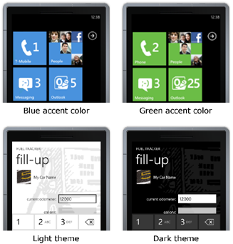
Coordinated appearance and compliance with the recommendations of Metro design is extremely important for Windows Phone applications. The following image shows examples of different primary colors (accent colors), as well as light and dark themes.
')
As with Cascading Style Sheets (CSS) with HTML, XAML allows you to apply the same settings for control properties using a special syntax called a markup extension. Using styles and resources, you can reuse settings and create a consistent look for your application.
There are many built-in styles and resources for use in Windows Phone projects that meet the requirements of Metro design and are suitable for both light and dark themes. These resources include brushes, colors, fonts, text styles, and themes.
The following example shows how to bind to the background of the Button control a brush, which is a resource embedded in Windows Phone, using a markup extension.
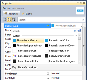
The following image shows how to bind to the background (background) of the Button control a brush, which is a resource integrated into Windows Phone, using the Properties window.
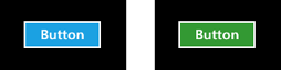
Since the background of the previous example is set to PhoneAccentBrush, the button color will be based on the current primary color (accent color) selected by the user. The following image shows how the button looks when the user chooses blue or green as the primary color.
Interface Design Recommendation:
If the main or background color of the control is explicitly set, make sure that its content is equally well visible both with a dark and a light theme. If the specified color is not visible, also explicitly set the background or base color so that it is sufficiently contrast or choose a more suitable color.
The following example shows a TextBlock from a page with summary information for the Fuel Tracker application, where the Style property has a style value, which is a resource embedded in Windows Phone, using a markup extension.
Interface Design Recommendation:
Adhere to the same style of capitalization.
You can see the list of available inline styles and resources for Windows Phone here: Theme Resources for Windows Phone . More information about markup extensions can be found here: XAML Overview .
If you want to create your own style, as a rule, you must declare the style as a page or panel resource and apply it as a static resource using the markup extension. Each style typically has a key (key), which is used to refer to it later, and a target type (target type), which indicates to which type of control it can be applied. The main part of the style is a collection of Setter objects that contain Property (property) and Value (value) parameters. You can create styles in Visual Studio by pointing them directly in XAML code, or you can use Expression Blend, which allows you to create styles in a more visualized way. When creating resources that set colors, you need to make sure that your choice of colors looks equally good in both light and dark themes.
The Fuel Tracker application uses styles in many places. For example, the summary page contains the LabelStyle and ValueStyle styles in the first Pivot element, which is defined in the Grid resource section. In the summary page file, these styles are applied to TextBlock objects. The following XAML code snippet shows an example of how styles are defined and how they are applied.
When you bind a collection of objects to a ListBox control or any other list, the ListBox displays a string representation of the objects in the collection. In order to customize the appearance of the objects in the collection, you must set the ItemTemplate property of the ListBox control to the value DataTemplate, which determines the appearance of the objects. You will learn more about how you can use data templates to customize the look in the next section, titled “Displaying Data.”
Next part
There are various ways to create a consistent look. For example, you can use the inline styles and resources, you can create your own style, and you can also use data templates to customize the items in the list.
In this part you will learn:
- How to use the styles built into Windows Phone.
- How to create your own style.
- What are data templates.
Colors and themes
Coordinated appearance and compliance with the recommendations of Metro design is extremely important for Windows Phone applications. The following image shows examples of different primary colors (accent colors), as well as light and dark themes.
')
Using inline styles
As with Cascading Style Sheets (CSS) with HTML, XAML allows you to apply the same settings for control properties using a special syntax called a markup extension. Using styles and resources, you can reuse settings and create a consistent look for your application.
There are many built-in styles and resources for use in Windows Phone projects that meet the requirements of Metro design and are suitable for both light and dark themes. These resources include brushes, colors, fonts, text styles, and themes.
The following example shows how to bind to the background of the Button control a brush, which is a resource embedded in Windows Phone, using a markup extension.
< Button Content ="Button" Height ="72" Background ="{StaticResource PhoneAccentBrush}" Width ="160" /> * This source code was highlighted with Source Code Highlighter .
< Button Content ="Button" Height ="72" Background ="{StaticResource PhoneAccentBrush}" Width ="160" /> * This source code was highlighted with Source Code Highlighter .< Button Content ="Button" Height ="72" Background ="{StaticResource PhoneAccentBrush}" Width ="160" /> * This source code was highlighted with Source Code Highlighter .
The following image shows how to bind to the background (background) of the Button control a brush, which is a resource integrated into Windows Phone, using the Properties window.
Since the background of the previous example is set to PhoneAccentBrush, the button color will be based on the current primary color (accent color) selected by the user. The following image shows how the button looks when the user chooses blue or green as the primary color.
Interface Design Recommendation:
If the main or background color of the control is explicitly set, make sure that its content is equally well visible both with a dark and a light theme. If the specified color is not visible, also explicitly set the background or base color so that it is sufficiently contrast or choose a more suitable color.
The following example shows a TextBlock from a page with summary information for the Fuel Tracker application, where the Style property has a style value, which is a resource embedded in Windows Phone, using a markup extension.
* This source code was highlighted with Source Code Highlighter .
- < TextBlock Grid . Row = "0" Grid . Column = "0"
- Style = "{StaticResource PhoneTextLargeStyle}"
- Text = "CURRENT MPG:"
- HorizontalAlignment = "Right" VerticalAlignment = "Center" />
Interface Design Recommendation:
Adhere to the same style of capitalization.
You can see the list of available inline styles and resources for Windows Phone here: Theme Resources for Windows Phone . More information about markup extensions can be found here: XAML Overview .
Creating your own styles
If you want to create your own style, as a rule, you must declare the style as a page or panel resource and apply it as a static resource using the markup extension. Each style typically has a key (key), which is used to refer to it later, and a target type (target type), which indicates to which type of control it can be applied. The main part of the style is a collection of Setter objects that contain Property (property) and Value (value) parameters. You can create styles in Visual Studio by pointing them directly in XAML code, or you can use Expression Blend, which allows you to create styles in a more visualized way. When creating resources that set colors, you need to make sure that your choice of colors looks equally good in both light and dark themes.
The Fuel Tracker application uses styles in many places. For example, the summary page contains the LabelStyle and ValueStyle styles in the first Pivot element, which is defined in the Grid resource section. In the summary page file, these styles are applied to TextBlock objects. The following XAML code snippet shows an example of how styles are defined and how they are applied.
* This source code was highlighted with Source Code Highlighter .
- < Grid.Resources >
- < Style x: Key = "LabelStyle" TargetType = "TextBlock" >
- < Setter Property = "HorizontalAlignment" Value = "Right" />
- < Setter Property = "Margin" Value = "15.5" />
- </ Style >
- < Style x: Key = "ValueStyle" TargetType = "TextBlock" >
- < Setter Property = "Margin" Value = "15.5" />
- </ Style >
- </ Grid.Resources >
- . . .
- < TextBlock Grid . Row = "2" Grid . Column = "0"
- Style = "{StaticResource LabelStyle}"
- Text = "date:" > </ TextBlock >
- < TextBlock Grid . Row = "2" Grid . Column = "1"
- Style = "{StaticResource ValueStyle}"
- Text = "{Binding FillupHistory [0] .Date, Converter = {StaticResource StringFormatter}, ConverterParameter = \ {0: d \}}" > </ TextBlock >
Data templates
When you bind a collection of objects to a ListBox control or any other list, the ListBox displays a string representation of the objects in the collection. In order to customize the appearance of the objects in the collection, you must set the ItemTemplate property of the ListBox control to the value DataTemplate, which determines the appearance of the objects. You will learn more about how you can use data templates to customize the look in the next section, titled “Displaying Data.”
Next part
Source: https://habr.com/ru/post/118281/
All Articles