Create an application for Windows Phone 7 from start to finish. Part 7, the anniversary. Adding images and icons
Previous part
If you want to make your application different from the rest, you should add your own images and icons.
In this part you will learn:
You can find free artwork on the Internet or you can have artwork created by the designer. Below are some tips on how to design images and icons to match them with the same Metro design style.
Usually a JPG encoder (encoder) is much faster than a PNG encoder (encoder). If you do not need transparency, choose the JPG file format, not the PNG format. Also, try to limit the size of the images.
')
To display images on the page, you can specify an image in your project or bind to an image at runtime.
To add an image to the page:
You can also display images by accessing them at run time. The following fragment of the XAML code of the Fuel Tracker application shows how to set the Source property to the value of the Picture property of the Car object using the markup capabilities.
Sometimes you might want to display an image behind controls and other user interface elements on the page. The first step in adding a background image to a page is selecting the image to display. Some recommendations when choosing a background image:
Avoid using too much white in applications, for example, white background, as this can have a serious impact on the battery life of devices with an OLED display.
You may need some trial and error to select an appropriate background that appears equally well with both light and dark themes. Be sure to check the background on both topics. Below is the background image of the page used in the Fuel Tracker application, it has a transparent background.

The following image shows how the background image on the page looks on dark and light themes. Since it has a transparent background, the text is visible on both topics.

To add a background image to the page:
When you create a new Windows Phone project in Visual Studio, you automatically get a standard splash screen called SplashScreenImage.jpg, which looks like this.

To add your own image to the splash screen, replace SplashScreenImage.jpg with your 480-by-800-pixel JPG file. Using a screenshot of your application is the fastest way to create a similar image.
Certification Requirement:
Your application should render the first screen within 5 seconds after launch. Using splash screen will help you fulfill this requirement.
If you want to display a more complex splash screen, such as an animation, you will not be able to use a JPG image. Keep in mind that if you use a page to display a splash screen, then this page will be part of the stack for the back button. This means that if the user presses the “Back” button on the first page of the application, a splash screen will appear instead of the expected exit from the application. To work around this problem, use Popup to create a splash screen.
Certification Requirement:
When you press the "Back" button on the first page of the application, the application should exit.
The application icon is the image that is displayed for your application in the list of phone applications. Application icons must meet the following requirements:

Below is shown how the application icon in the list of applications.

To set the application icon:
An app tile is a view of your app that appears when users place your app on the start screen.
The tile icon of the application must meet the following requirements:

The following shows how the tile icon of the application looks like when the main color is green.

To set the tile icon of the application:
If you want to make your application different from the rest, you should add your own images and icons.
In this part you will learn:
- Tips for the design of images and icons.
- How to add an image to a page.
- How to add an image as a page background.
- How to change the image on the splash screen.
- How to add an application icon.
- How to add an application tile icon (application tile).
Image and Icon Design Tips
You can find free artwork on the Internet or you can have artwork created by the designer. Below are some tips on how to design images and icons to match them with the same Metro design style.
- Avoid 3D text.
- Avoid gradients, bevels and shadows.
- Avoid rounded corners.
- Avoid the black or white background.
- Use transparency only in the tile icon of the application.
- If you use transparency in the tile icon of the application, the icon in the foreground should be white.
- Replace the standard splash screen.
Usually a JPG encoder (encoder) is much faster than a PNG encoder (encoder). If you do not need transparency, choose the JPG file format, not the PNG format. Also, try to limit the size of the images.
')
Add image to page
To display images on the page, you can specify an image in your project or bind to an image at runtime.
To add an image to the page:
- Add a JPG or PNG image to the project and set the Build Action to Content .
- Add an Image control to the page.
- Set the Source property of the Image control to the location of the image file.
< Image Source ="/Images/myPicture.jpg" > * This source code was highlighted with Source Code Highlighter .
< Image Source ="/Images/myPicture.jpg" > * This source code was highlighted with Source Code Highlighter .< Image Source ="/Images/myPicture.jpg" > * This source code was highlighted with Source Code Highlighter .
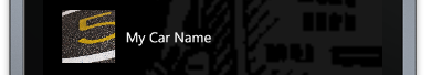
You can also display images by accessing them at run time. The following fragment of the XAML code of the Fuel Tracker application shows how to set the Source property to the value of the Picture property of the Car object using the markup capabilities.
* This source code was highlighted with Source Code Highlighter .
- < Image Height = "75" Width = "75" Margin = "15" Stretch = "UniformToFill"
- Source = "{Binding Picture}" VerticalAlignment = "Top" />
Adding a background image to the page
Sometimes you might want to display an image behind controls and other user interface elements on the page. The first step in adding a background image to a page is selecting the image to display. Some recommendations when choosing a background image:
- Choose an image that displays equally well with both light and dark themes.
- Use JPG or PNG file formats. If you are going to use image transparency, you must use a PNG file.
Avoid using too much white in applications, for example, white background, as this can have a serious impact on the battery life of devices with an OLED display.
You may need some trial and error to select an appropriate background that appears equally well with both light and dark themes. Be sure to check the background on both topics. Below is the background image of the page used in the Fuel Tracker application, it has a transparent background.
The following image shows how the background image on the page looks on dark and light themes. Since it has a transparent background, the text is visible on both topics.
To add a background image to the page:
- Add images to the project and set the Build Action to Content .
- Create an ImageBrush resource and set the ImageSource property to the relative URI (uniform resource identifier) of the image. You must also set a Key for the image.
If you use a PNG file, you can also set the Opacity property between 0 and 1 and the Stretch property (stretching) to specify how you want to resize the image to fit the space allotted to it.
For the Fuel Tracker application, ImageBrush is advertised in App.xaml, as this brush is used for all pages.- < ImageBrush x: Key = "gasBrush" ImageSource = "/ Images / gasPump.png" Opacity = ". 1" Stretch = "UniformToFill" />
- Apply ImageBrush as the Background property for the root element or other page elements using the key set for the brush, as shown in the following XAML code fragment.
You can also apply an ImageBrush using the Properties window, as shown in the following image.- <! - LayoutRoot is the root grid where all page content is placed ->
- < Grid x: Name = "LayoutRoot" Background = "{StaticResource gasBrush}" >

Adding an image to Splash Screen
When you create a new Windows Phone project in Visual Studio, you automatically get a standard splash screen called SplashScreenImage.jpg, which looks like this.
To add your own image to the splash screen, replace SplashScreenImage.jpg with your 480-by-800-pixel JPG file. Using a screenshot of your application is the fastest way to create a similar image.
Certification Requirement:
Your application should render the first screen within 5 seconds after launch. Using splash screen will help you fulfill this requirement.
If you want to display a more complex splash screen, such as an animation, you will not be able to use a JPG image. Keep in mind that if you use a page to display a splash screen, then this page will be part of the stack for the back button. This means that if the user presses the “Back” button on the first page of the application, a splash screen will appear instead of the expected exit from the application. To work around this problem, use Popup to create a splash screen.
Certification Requirement:
When you press the "Back" button on the first page of the application, the application should exit.
Adding an application icon
The application icon is the image that is displayed for your application in the list of phone applications. Application icons must meet the following requirements:
- PNG format
- 62 x 62 pixels
Below is shown how the application icon in the list of applications.
To set the application icon:
- Add an icon to the project and set the Build Action to Content .
- In the project designer (Project designer), on the Application tab, specify your application icon in the Icon drop-down list.

In addition, you can change the IconPath element in the WMAppManifest.xml file to select an application icon, as shown in the following markup fragment.- < IconPath IsRelative = "true" IsResource = "false" > gasIcon.png </ IconPath >
Adding an app tile icon
An app tile is a view of your app that appears when users place your app on the start screen.
The tile icon of the application must meet the following requirements:
- PNG format
- 173 x 173 pixels
The following shows how the tile icon of the application looks like when the main color is green.
To set the tile icon of the application:
- Add an icon to the project and set the Build Action to Content .
- In the project designer (Project designer), on the Application tab, specify your tile icon in the Background image drop-down list.

In addition, you can change the BackgroundImageURI element in the WMAppManifest.xml file to select an application icon, as shown in the following markup fragment.- < PrimaryToken TokenID = "FuelTrackerToken" TaskName = "_ default" >
- < TemplateType5 >
- < BackgroundImageURI IsRelative = "true"
- IsResource = "false" > gasTileIcon.png </ BackgroundImageURI >
- < Count > 0 </ Count >
- < Title > Fuel Tracker </ Title >
- </ TemplateType5 >
- </ PrimaryToken >
Source: https://habr.com/ru/post/118242/
All Articles