Stockholm Guide
 Hej, habr - welcome to you in Swedish! In the crisis year of 2009, a bit of free time appeared, which we decided to use in order to “make it beautiful” for ourselves. The result was, in our opinion, an interesting example of an approach to creating a city guidebook, which we would like to share - stockholmania.ru . Perhaps our ideas will be useful to someone in other projects.
Why Stockholm? This is the manic favorite city of our designer (who visits him at regular intervals), and I, as a traveler, were interested in “awakening my appetite.” Our weblog is an attempt to get away from the usual tourist approach and show Stockholm from a slightly different angle. Both in form and in content.
Visual navigation
A kind of "chip" of the site is the navigation grid. Guides sin with an abundance of text, and a person is still easier to see once. It is logical that the picture with the train is identified with transport and movement, and the blonde - with local girls. So it turned out laconic and functional, like the Scandinavian design itself, the grid. And when the cursor moves, everything is so appetizingly revealed that I could “stick” myself into the resulting dynamic mosaic for minutes.
')
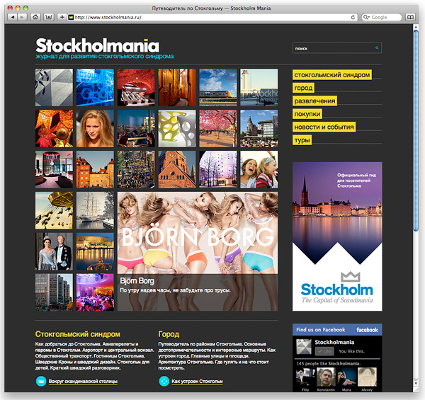
However, filling out the site, it became clear that I wanted to look at the contents of the entire section. Unscrew and made more familiar "consolidated" navigation sections.

Cons of visual navigation:
- You can not read the title of the article, without placing the cursor.
- It works poorly on tablets, where in fact, there is no onMouseOver event.
- Not suitable for articles of the same type (for ski resorts it is difficult to select pictures - all the same: white snow, blue sky and a skier in a red hat).
But there is an undeniable plus - a large number of images quickly form the visual image of the city.
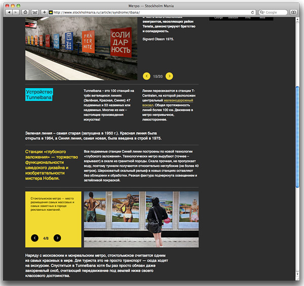
Magazine layout
We are really tired of the monotonous web pages: the title, the picture, the text-text-text-text ... well, and a few more pictures at the bottom of the article. Any decorations in the caps of the site - do not count. And we spent a lot of time to fundamentally do the "wrong." This is important, because, after all, not the “juicy title” is important to the visitor, but information. Here we decided to arrange it in such a way that it was not boring to read, and the eye was happy. As a result, the magazine layout was a feature of the site.

The approach is simple: there is a grid of 3 columns (continuity from photo mosaic). Any semantic block can / must place information within itself according to these same columns. For example:
- Picture in 2 columns and text on the right;
- Subtitle and 2 columns with text;
- Gallery of pictures on the entire width.
We use about 15 blocks. Some blocks are well combined with each other, some - less successfully, but the main thing is that it turned out to dilute the dry text with layouts, alternating columns, juicy pictures in rotation and all sorts of lists.
By the way, in the process it turned out that a large number of galleries with captions to the photo slightly change the principle of reading: you can quickly run through the article from the top down,
and if something “hooked”, scrolling from left to right, you can get acquainted in more detail with information on the principle of photo comics.
If I worked on the Discovery Channel and had a low and slightly hoarse voice, I would say: “How it works.” In short: the site is spinning on django, blocks are attached to the articles that are assembled into the final text of the article. Some blocks are “glued together” and are processed as a gallery. I will not go into the technical details - this is still the topic of a separate article; if interested, I will write.
Instead of conclusions
We spent more than a year to make a website: most of the time was spent writing texts, editing them and posting. Magazine layout requires a lot of work on the design - you have to customize the texts and pictures "under the format." Visual navigation is unusual, but has limited application.
The site is not yet fully completed and is in beta. But according to the first reviews, it is clear to us that it performs its task: after a cursory review, many people have a desire to visit Stockholm. In the warm season there is especially nice.
Source: https://habr.com/ru/post/118139/
All Articles