Conversion optimization
Your attention is invited to the translation of the article by Frank Pashera. Translation is approved for publication for dear Habrahabr readers.

Usability is important for conversion rates in e-commerce. However, usability means not only an improved visual guide or an improved site hierarchy. It also means more contact with a potential buyer through professionally made serious design, presenting the right information when it is needed. This communication with users instead of throwing their advertising slogans.
')
From this article, you will learn what to look for when preparing a high-quality source page for your products, how to draw the visitor's attention to the most important sections of your site and how you can use video and user ratings to improve conversion rates.
The most important rule for website usability is: "The simpler, the better . " Let the links speak for themselves. Make the site structure understandable. Let the feedback be noticeable, and its work - understandable. Let the stay on the site be comfortable and the opportunity to make a mistake is minimized.
But although these (fairly obvious) recommendations will help readers of the site better understand its work, they will not necessarily lead to an increase in sales. In addition, you may have certain goals that are not combined with the concept of simplicity. Most likely, the most important ones are additional and cross-selling.
When it comes to calling the buyer's trust in your company, a professional, solid design is crucial. People do not tend to trust online business, so you need to be sure that you look serious and trustworthy. Inkd.com achieves this in this way: a professional look, a solid layout based on the grid, and observance of the classic rules of usability.
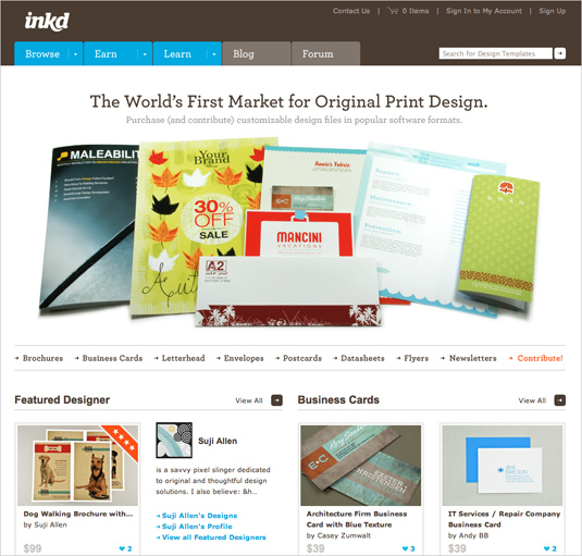
Inkd.com
Whatever you do on your site, do not forget that the user must control what is happening. This is true for advanced users who will use an internal search to quickly get to the products that interest them. They may need the ability to somehow process the search results. The same applies to novice users, who should understand everything on the home page, as they will most likely use a set of basic commands for navigation.
If a user has been attracted by an advertisement for a certain product, then all you have to do is send it directly to the page with this product. The next click should lead the buyer directly to the checkout page. By the way, why do you need a basket if the buyer wants to purchase only one item? The cart becomes completely useless and creates the need for additional actions in the sale process. And with each additional action increases the risk that the buyer refuses to purchase.
Based on practical experience: if the user has found a product by internal search, he should not click more than twice to find the necessary information about the product.
If we talk about information, another important rule: provide information when it is needed (information about the product, delivery, risks associated with the security of a credit card, privacy and everything else). You must provide the user with a large amount of information, so you need to sort it by importance.
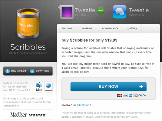
It is very important to provide information when it is needed. “Drawing” Scribbles : Before the user enters any information, he is already informed about payment methods, confidentiality and the possibility of buying for educational purposes. Although both references to privacy and study could be made more visible.
The user may have questions at any stage of the purchase process. Focus on the answers to these questions, let them be noticeable on the page. Additional useful information can be “hidden” behind the hyperlink (as the “training” link in the Scribbles example above).
Be careful with the graphic elements of the selection of information. They should not look like ads. People tend to skip those parts of the page that look like advertisements. Of course, you can illustrate all the advantages of your product with large pictures - really big pictures. Jacob Nielsen even recommends using a fullscreen view: “If I click on the product image, then I want to see a larger image. And since I clicked on the picture, I can wait until the big picture is loaded. I can’t just wait, I’ll definitely wait, despite the long loading time. ”
The concept of simplicity means that when developing a store, designers need to be very careful with experimenting with new technologies, such as AJAX and numerous Internet applications with Flash backbone. If you use them, then you need to test the practicality of the site. Studies clearly show that many are still far from all of these functions, such as dragging, and do not know what the words like “tagging” mean.
Newsberry
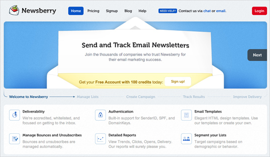
The design of Newsberry is very attractive. However, readers have problems in order to immediately subscribe to the service - the user needs time to find the inconspicuous modest "subscribe" button. How much time do you need to find it? Perhaps in this case it would be more appropriate to make this button more visible.
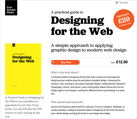
Be careful with the graphic elements of the selection of information. They should not look like ads. An example of successful use: Five Simple Steps
Mark Bolton's Five Simple Steps is a job well done to draw the user's attention to the purchase options. And while there and does not smell of advertising. The visibility of the sales process is achieved solely through visual design and layout.
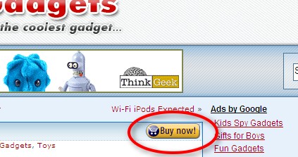
Let us return to the questions that arise from buyers. When you hit the original page one of the main questions: "And then what?" See what is on the network. You will find thousands of stores that either hid their order buttons or gave them rather dubious names. For example, the German store Werbemittelguide combines the concept of "Order or request a proposal" on one button. Since the user will have to understand the difference between a direct order and a request for quotation, it is not very reasonable to place two different concepts side by side on the same button. In this particular case, clicking on the button only sends the goods to your basket. And the basket is located in the lower left corner - a real mockery of the user.
Go to www.guut.de , look for a second and close your eyes. Open them again for a second and close again. What did you notice? Big picture with the goods on the left? Time report? Huge orange order button? The button says: “Order now” - a couple of years ago, many web designers thought it was disgusting and inconsistent. Today it is the last word in design.
“Explain clearly to the person what he needs to do next,” says Peter Blackshaw, an American e-commerce expert. What works in online sales is also true for downloading PDF documentation and any other form of conversion. Make the most important option the most visible. The “Learn More”, “Details” and “Specifications” links are also very important, but less important than conversion. They should be displayed in smaller font, or not in such a bright color.
The US agency MarketingExperiments tested how much correct wording affects conversion rates . They tested their own company, whose goal was to get the reader to pay a subscription. Every single element of the mail company has been tested. The button that slowed down the conversion was called “Continue here,” and at first glance it should have worked perfectly. The test result surprised even experienced experts. The conversion of the button renamed “Continue on” was 3.3% higher than the previous one. And the third option, “Click to continue,” liked another 10% of users additionally.
Al Carlton doubled the sales of his website after using a button in the style of Amazon.
It is becoming the norm to include video in the product description and on the product page, so that it can be viewed in action. In Germany, about 60% of retailers surveyed by BVDW said they plan to increase their efforts through video.
The bike seller Fahrrad.de invites sales agents of all brands to a new studio, created specifically for the production of video for this site. Sales agents were asked to explain why their goods are better than others. Many trademarks send to stand in front of the camera not only sales agents, but also winners of competitions and world champions. Some merchants may argue that their goods are not suitable for video. But the product that is already advertised using online video, today, more and more.
Both, and Getbackboard.com , ..

... and GoodBarry.com use impressive video blocks on the start pages. Videos are often used to talk about the essence of the product, and what advantages its use gives the buyer.
It is important to understand that the video does not have to be produced in a studio with a huge budget. In many cases, unprofessional simple video will work. It may even be better than a traditional advertising video, because it looks more honest. Sites that promote new concepts, such as eBags.com , are trying to unite sites around product videos, and users can vote on which video they like the most.
A great idea was used by Pleo, a company that sells something like an electronic pet that looks like a dinosaur. Representatives of Pleo wandered through the streets of the cities along with dinosaurs and filmed how people reacted to it. It is hardly possible to get more sincere and natural advertising.
And do not let yourself be fooled, today there is only one format of online video - Flash . Only Flash allows you to qualitatively embed video on a web page and integrate it with other page elements. Thanks to YouTube’s success, many users can play Flash videos. And the production of video is not so expensive, even if it was ordered by the agency.
Today it is theme number one. In the tourism industry, about 60% of all travelers make decisions based on opinions found on the web. They study ratings on sites to select the most suitable vacation spots and hotels. They are interested in open-minded opinions, free from marketing flirting of the companies themselves. Similar sites can be found for electronics, as well as other products.
This raises two questions:
The answer to the first question is very simple. In most cases, this is no. And for this there are many reasons. The most important of them - no merchant here is trustworthy. People will understand that there is a commercial interest behind each recommendation. To support such a system requires decent means and effort. And only very large sites that attract many visitors can create a useful rating system. If the site owner decided to create his own system, then it is necessary to make an assessment exactly where users expect to see it - near the goods.
Take Take Thomas Cook Travel as an example. After a long search, he created his own user rating system, which is now a serious filter for internal search. An external system like Idealo.de (or PriceGrabber.com ) might be the best solution. Idealo collects ratings from multiple sites and combines them with tests and reviews of sites and magazines. The system itself is neutral because individual sellers cannot change the content.
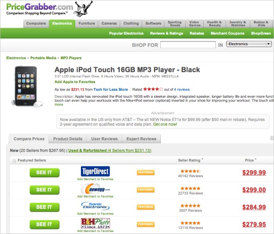
PriceGrabber.com
The second question is also easy to answer, but the consequences can be serious. When criticism sounds on the site, it is better for the company to leave it in the system (unless, of course, there are no obscene things and laws are not violated). So experts advise. This is a very slippery question for merchants, their suppliers, manufacturers and brands. All those who work for common success. If you encounter such criticism, redirect it to an interested partner and give him the opportunity to respond to it.
From the translators - we welcome your comments and suggestions. Thanks for attention!
Usability is important for conversion rates in e-commerce. However, usability means not only an improved visual guide or an improved site hierarchy. It also means more contact with a potential buyer through professionally made serious design, presenting the right information when it is needed. This communication with users instead of throwing their advertising slogans.
')
From this article, you will learn what to look for when preparing a high-quality source page for your products, how to draw the visitor's attention to the most important sections of your site and how you can use video and user ratings to improve conversion rates.
Professional design inspires confidence
The most important rule for website usability is: "The simpler, the better . " Let the links speak for themselves. Make the site structure understandable. Let the feedback be noticeable, and its work - understandable. Let the stay on the site be comfortable and the opportunity to make a mistake is minimized.
But although these (fairly obvious) recommendations will help readers of the site better understand its work, they will not necessarily lead to an increase in sales. In addition, you may have certain goals that are not combined with the concept of simplicity. Most likely, the most important ones are additional and cross-selling.
Be trustworthy
When it comes to calling the buyer's trust in your company, a professional, solid design is crucial. People do not tend to trust online business, so you need to be sure that you look serious and trustworthy. Inkd.com achieves this in this way: a professional look, a solid layout based on the grid, and observance of the classic rules of usability.
Inkd.com
Whatever you do on your site, do not forget that the user must control what is happening. This is true for advanced users who will use an internal search to quickly get to the products that interest them. They may need the ability to somehow process the search results. The same applies to novice users, who should understand everything on the home page, as they will most likely use a set of basic commands for navigation.
If a user has been attracted by an advertisement for a certain product, then all you have to do is send it directly to the page with this product. The next click should lead the buyer directly to the checkout page. By the way, why do you need a basket if the buyer wants to purchase only one item? The cart becomes completely useless and creates the need for additional actions in the sale process. And with each additional action increases the risk that the buyer refuses to purchase.
Based on practical experience: if the user has found a product by internal search, he should not click more than twice to find the necessary information about the product.
Provide the right information when you need it.
If we talk about information, another important rule: provide information when it is needed (information about the product, delivery, risks associated with the security of a credit card, privacy and everything else). You must provide the user with a large amount of information, so you need to sort it by importance.
It is very important to provide information when it is needed. “Drawing” Scribbles : Before the user enters any information, he is already informed about payment methods, confidentiality and the possibility of buying for educational purposes. Although both references to privacy and study could be made more visible.
The user may have questions at any stage of the purchase process. Focus on the answers to these questions, let them be noticeable on the page. Additional useful information can be “hidden” behind the hyperlink (as the “training” link in the Scribbles example above).
Do not advertise, but help the user
Be careful with the graphic elements of the selection of information. They should not look like ads. People tend to skip those parts of the page that look like advertisements. Of course, you can illustrate all the advantages of your product with large pictures - really big pictures. Jacob Nielsen even recommends using a fullscreen view: “If I click on the product image, then I want to see a larger image. And since I clicked on the picture, I can wait until the big picture is loaded. I can’t just wait, I’ll definitely wait, despite the long loading time. ”
The concept of simplicity means that when developing a store, designers need to be very careful with experimenting with new technologies, such as AJAX and numerous Internet applications with Flash backbone. If you use them, then you need to test the practicality of the site. Studies clearly show that many are still far from all of these functions, such as dragging, and do not know what the words like “tagging” mean.
Newsberry
The design of Newsberry is very attractive. However, readers have problems in order to immediately subscribe to the service - the user needs time to find the inconspicuous modest "subscribe" button. How much time do you need to find it? Perhaps in this case it would be more appropriate to make this button more visible.
Be careful with the graphic elements of the selection of information. They should not look like ads. An example of successful use: Five Simple Steps
Mark Bolton's Five Simple Steps is a job well done to draw the user's attention to the purchase options. And while there and does not smell of advertising. The visibility of the sales process is achieved solely through visual design and layout.
Let us return to the questions that arise from buyers. When you hit the original page one of the main questions: "And then what?" See what is on the network. You will find thousands of stores that either hid their order buttons or gave them rather dubious names. For example, the German store Werbemittelguide combines the concept of "Order or request a proposal" on one button. Since the user will have to understand the difference between a direct order and a request for quotation, it is not very reasonable to place two different concepts side by side on the same button. In this particular case, clicking on the button only sends the goods to your basket. And the basket is located in the lower left corner - a real mockery of the user.
The highlight of the site: "what is important" and the use of correct wording
Go to www.guut.de , look for a second and close your eyes. Open them again for a second and close again. What did you notice? Big picture with the goods on the left? Time report? Huge orange order button? The button says: “Order now” - a couple of years ago, many web designers thought it was disgusting and inconsistent. Today it is the last word in design.
“Explain clearly to the person what he needs to do next,” says Peter Blackshaw, an American e-commerce expert. What works in online sales is also true for downloading PDF documentation and any other form of conversion. Make the most important option the most visible. The “Learn More”, “Details” and “Specifications” links are also very important, but less important than conversion. They should be displayed in smaller font, or not in such a bright color.
The US agency MarketingExperiments tested how much correct wording affects conversion rates . They tested their own company, whose goal was to get the reader to pay a subscription. Every single element of the mail company has been tested. The button that slowed down the conversion was called “Continue here,” and at first glance it should have worked perfectly. The test result surprised even experienced experts. The conversion of the button renamed “Continue on” was 3.3% higher than the previous one. And the third option, “Click to continue,” liked another 10% of users additionally.
Al Carlton doubled the sales of his website after using a button in the style of Amazon.
Video is the easiest solution to the problem.
It is becoming the norm to include video in the product description and on the product page, so that it can be viewed in action. In Germany, about 60% of retailers surveyed by BVDW said they plan to increase their efforts through video.
The bike seller Fahrrad.de invites sales agents of all brands to a new studio, created specifically for the production of video for this site. Sales agents were asked to explain why their goods are better than others. Many trademarks send to stand in front of the camera not only sales agents, but also winners of competitions and world champions. Some merchants may argue that their goods are not suitable for video. But the product that is already advertised using online video, today, more and more.
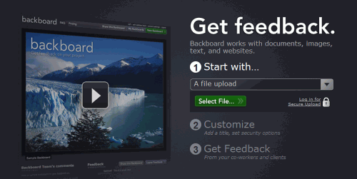
Both, and Getbackboard.com , ..
... and GoodBarry.com use impressive video blocks on the start pages. Videos are often used to talk about the essence of the product, and what advantages its use gives the buyer.
It is important to understand that the video does not have to be produced in a studio with a huge budget. In many cases, unprofessional simple video will work. It may even be better than a traditional advertising video, because it looks more honest. Sites that promote new concepts, such as eBags.com , are trying to unite sites around product videos, and users can vote on which video they like the most.
A great idea was used by Pleo, a company that sells something like an electronic pet that looks like a dinosaur. Representatives of Pleo wandered through the streets of the cities along with dinosaurs and filmed how people reacted to it. It is hardly possible to get more sincere and natural advertising.
And do not let yourself be fooled, today there is only one format of online video - Flash . Only Flash allows you to qualitatively embed video on a web page and integrate it with other page elements. Thanks to YouTube’s success, many users can play Flash videos. And the production of video is not so expensive, even if it was ordered by the agency.
Don't underestimate the importance of user ratings and customer reviews.
Today it is theme number one. In the tourism industry, about 60% of all travelers make decisions based on opinions found on the web. They study ratings on sites to select the most suitable vacation spots and hotels. They are interested in open-minded opinions, free from marketing flirting of the companies themselves. Similar sites can be found for electronics, as well as other products.
This raises two questions:
- Should store owners create their own rating system?
- What to do if the goods are criticized?
The answer to the first question is very simple. In most cases, this is no. And for this there are many reasons. The most important of them - no merchant here is trustworthy. People will understand that there is a commercial interest behind each recommendation. To support such a system requires decent means and effort. And only very large sites that attract many visitors can create a useful rating system. If the site owner decided to create his own system, then it is necessary to make an assessment exactly where users expect to see it - near the goods.
Take Take Thomas Cook Travel as an example. After a long search, he created his own user rating system, which is now a serious filter for internal search. An external system like Idealo.de (or PriceGrabber.com ) might be the best solution. Idealo collects ratings from multiple sites and combines them with tests and reviews of sites and magazines. The system itself is neutral because individual sellers cannot change the content.
PriceGrabber.com
The second question is also easy to answer, but the consequences can be serious. When criticism sounds on the site, it is better for the company to leave it in the system (unless, of course, there are no obscene things and laws are not violated). So experts advise. This is a very slippery question for merchants, their suppliers, manufacturers and brands. All those who work for common success. If you encounter such criticism, redirect it to an interested partner and give him the opportunity to respond to it.
From the translators - we welcome your comments and suggestions. Thanks for attention!
Source: https://habr.com/ru/post/118060/
All Articles