Create an application for Windows Phone 7 from start to finish. Part 6. Support for landscape orientation, using controls
Previous part
In this part you will learn:
Portrait orientation is standard for Windows Phone applications. In order to implement support for landscape orientation, you will have to write additional code. To indicate that the application supports both portrait and landscape orientation, you must set the SupportedOrientations property to PortraitOrLandscape either in XAML or in code. Then you need to make sure that the contents of your application pages are displayed correctly in landscape orientation.
Interface Design Recommendation:
If the application supports text input, you must support landscape orientation due to the possibility of a hardware keyboard.
')
There are various ways to guarantee the correct display of content in both portrait and landscape orientation. The two main methods are scrolling and grid layout. These methods can be used alone or in combination with each other.
Scrolling uses the StackPanel control that is in the ScrollViewer control. Use this method if the content is displayed in a list or if the various controls follow each other on the page. StackPanel allows you to set the order of the child elements one by one, and the ScrollViewer control allows you to scroll through the contents of the StackPanel if the user interface elements do not fit on the screen.
Supports portrait and landscape orientation by scrolling
Support for portrait and landscape orientation using the grid

The controls in the application are used to display data and allow the user to interact with the application.
You can use a large number of controls by simply dragging them from the toolbox onto the designer’s surface.

The following table will give you some guidance on which control you should use depending on your application requirements. The table shows Silverlight controls (such as Button and TextBox), as well as controls created specifically for Windows Phone (for example, Panorama and Pivot). There are other controls available in the Silverlight for Windows Phone Toolkit .
* Not styled for Metro design, but can be used if properly designed.
Performance Improvement Tip:
If you use the ProgressBar control in indeterminate mode, this may affect application performance. If you need an indeterminate progress bar, consider creating your own control.
Performance Improvement Tip:
When using demanding controls (such as Bing Maps or video) and if your application does not have enough memory, you can call the DeviceExtendedProperties.GetValue method to monitor memory usage.
The following image shows an example of using some controls on the summary page of the Fuel Tracker application. Notice that this page uses the Pivot control to expand the usable space.
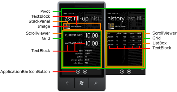
Windows Phone has two special controls that effectively extend the markup area. The Panorama and Pivot controls provide the ability to horizontally navigate the content of the page, which allows the user to scroll and scale the content as needed. The Panorama control creates a panoramic view of the elements. The Pivot control provides an easy way to manage the views of large data sets in an application. The Pivot control can be used as a navigation interface to filter large sets or to switch between views.
On the summary page in the Fuel Tracker application, the Pivot control element is used, which allows the user to quickly switch between the information on the last refueling and the summary information on all of the refueling. Originally this information was located on one page. But such markup created a feeling of a strong page clutter, so two different views were paged into the Pivot control.
Design guidelines for Panorama and Pivot controls:
When adding controls for entering text into the application, you must leave space for the on-screen keyboard, also called the soft input panel (SIP). You must make sure that the keyboard does not hide the buttons or other navigation controls. One way to prevent this behavior is to place the navigation in the application bar.
To prevent user input errors, you must use the most appropriate on-screen keyboard by setting the InputScope property for the control. Two examples of InputScope values are given in the following table.
Providing the correct keyboard layout will limit the possibility of the user making a mistake, but you must also implement user input validation.
Interface Design Recommendation:
If the application supports text input, you must support landscape orientation due to the possibility of a hardware keyboard.
A gesture event occurs when the user interacts with the screen, for example, by tapping or dragging his finger over it. Gesture processing is automatically included in all elements of the user interface and translates all gestures into standard events. For example, the Button control contains a Click event that occurs when a button is pressed. You create a method called an event handler to handle the event (to handle the event). You can create an event handler in the Properties window or in XAML code.
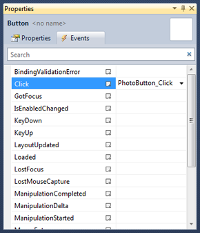
You can create an event handler using the Events tab of the Properties window. The Properties window lists all the events available for the selected control. The following image shows some of the events for Button.
To create an event handler with the default name, you can simply double-click the event name in the Properties window. An event handler is created and the code-behind file opens in the code editor. The following code fragment shows the Button event handler for the Button control.
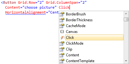
Once you have defined an event, you can specify the name of the event handler or double-click <New Event Handler> in the IntelliSense window that appears. The following image shows the IntelliSense window, which appears to help you create a new event handler.
The following XAML snippet binds the Click event of a Button control to the PhotoButton_Click event handler .
In this part you will learn:
- How to implement support for portrait and landscape orientation.
- What controls are available and how to choose the right one.
- How to choose between the Panorama and Pivot controls.
- How to use controls to enter text.
- How to handle control events.
Support for portrait and landscape orientation
Portrait orientation is standard for Windows Phone applications. In order to implement support for landscape orientation, you will have to write additional code. To indicate that the application supports both portrait and landscape orientation, you must set the SupportedOrientations property to PortraitOrLandscape either in XAML or in code. Then you need to make sure that the contents of your application pages are displayed correctly in landscape orientation.
Interface Design Recommendation:
If the application supports text input, you must support landscape orientation due to the possibility of a hardware keyboard.
')
There are various ways to guarantee the correct display of content in both portrait and landscape orientation. The two main methods are scrolling and grid layout. These methods can be used alone or in combination with each other.
Scrolling uses the StackPanel control that is in the ScrollViewer control. Use this method if the content is displayed in a list or if the various controls follow each other on the page. StackPanel allows you to set the order of the child elements one by one, and the ScrollViewer control allows you to scroll through the contents of the StackPanel if the user interface elements do not fit on the screen.
Supports portrait and landscape orientation by scrolling
- Change the SupportedOrientations page property to PortraitOrLandscape.
- Replace standard Grid with ScrollViewer and StackPanel.
Support for portrait and landscape orientation using the grid
- Change the SupportedOrientations page property to PortraitOrLandscape.
- Use the grid as a panel for content.
- If necessary, create an OrientationChanged event handler and add code to move the elements to the grid.
The controls in the application are used to display data and allow the user to interact with the application.
Selection of controls
You can use a large number of controls by simply dragging them from the toolbox onto the designer’s surface.
The following table will give you some guidance on which control you should use depending on your application requirements. The table shows Silverlight controls (such as Button and TextBox), as well as controls created specifically for Windows Phone (for example, Panorama and Pivot). There are other controls available in the Silverlight for Windows Phone Toolkit .
| Application Requirement | Control element |
|---|---|
| Navigation | PhoneApplicationFrame PhoneApplicationPage ApplicationBarIconButton ApplicationBarMenuItem HyperlinkButton |
| Markup | Border Canvas ContentControl Grid Panorama Pivot Stackpanel Scrollviewer VirtualizingStackPanel |
| Text display | Textblock |
| Text input | Textbox Passwordbox |
| Displaying a list of items | Listbox |
| Buttons | Button HyperlinkButton |
| The control to select from the list | Checkbox Radiobutton Slider Combobox * |
| Image display | Image |
| Work with cards | Bing maps |
| Video display | MediaElement |
| HTML display | Webbrowser |
| Progress | Progressbar |
| Pop up messages | Popup |
Performance Improvement Tip:
If you use the ProgressBar control in indeterminate mode, this may affect application performance. If you need an indeterminate progress bar, consider creating your own control.
Performance Improvement Tip:
When using demanding controls (such as Bing Maps or video) and if your application does not have enough memory, you can call the DeviceExtendedProperties.GetValue method to monitor memory usage.
The following image shows an example of using some controls on the summary page of the Fuel Tracker application. Notice that this page uses the Pivot control to expand the usable space.
Choose between Panorama and Pivot controls
Windows Phone has two special controls that effectively extend the markup area. The Panorama and Pivot controls provide the ability to horizontally navigate the content of the page, which allows the user to scroll and scale the content as needed. The Panorama control creates a panoramic view of the elements. The Pivot control provides an easy way to manage the views of large data sets in an application. The Pivot control can be used as a navigation interface to filter large sets or to switch between views.
On the summary page in the Fuel Tracker application, the Pivot control element is used, which allows the user to quickly switch between the information on the last refueling and the summary information on all of the refueling. Originally this information was located on one page. But such markup created a feeling of a strong page clutter, so two different views were paged into the Pivot control.
Design guidelines for Panorama and Pivot controls:
- Use Panorama elements as a starting point for more detailed information.
- Use the Pivot control to filter large amounts of data, providing the ability to view multiple data sets or a way to switch between different display modes for the same data.
- Do not use the Pivot control for navigation tasks, such as in the wizard.
- Vertical scrolling of a list or grid in Panorama sections is acceptable as long as it is within the boundaries of the section and not parallel to horizontal scrolling.
- Never place a Pivot control inside another Pivot control.
- Never place a Pivot control inside a Panorama control.
- You should minimize the number of pages containing Pivot in your application.
- The Pivot control should only be used to display items or data of a similar type.
- You do not need to use the buttons on the application bar to navigate in the Pivot control. If the Pivot requires navigation tools, you probably use it for other purposes.
Using text entry controls
When adding controls for entering text into the application, you must leave space for the on-screen keyboard, also called the soft input panel (SIP). You must make sure that the keyboard does not hide the buttons or other navigation controls. One way to prevent this behavior is to place the navigation in the application bar.
To prevent user input errors, you must use the most appropriate on-screen keyboard by setting the InputScope property for the control. Two examples of InputScope values are given in the following table.
| Keyboard | Layout |
|---|---|
| TelephoneNumber | Layout with 12 numeric keys |
| Text | Standard layout with features such as autocorrection and text suggestion (text suggestion) |
Interface Design Recommendation:
If the application supports text input, you must support landscape orientation due to the possibility of a hardware keyboard.
Handling Control Events
A gesture event occurs when the user interacts with the screen, for example, by tapping or dragging his finger over it. Gesture processing is automatically included in all elements of the user interface and translates all gestures into standard events. For example, the Button control contains a Click event that occurs when a button is pressed. You create a method called an event handler to handle the event (to handle the event). You can create an event handler in the Properties window or in XAML code.
You can create an event handler using the Events tab of the Properties window. The Properties window lists all the events available for the selected control. The following image shows some of the events for Button.
To create an event handler with the default name, you can simply double-click the event name in the Properties window. An event handler is created and the code-behind file opens in the code editor. The following code fragment shows the Button event handler for the Button control.
You can also create an event handler in XAML. In XAML edit mode, enter the name of the event you want to handle. When you start typing in XAML editing mode, the IntelliSense window appears. The following image shows how to define a Click event in XAML code.private void PhotoButton_Click( object sender, RoutedEventArgs e) { } * This source code was highlighted with Source Code Highlighter .
private void PhotoButton_Click( object sender, RoutedEventArgs e) { } * This source code was highlighted with Source Code Highlighter .private void PhotoButton_Click( object sender, RoutedEventArgs e) { } * This source code was highlighted with Source Code Highlighter .private void PhotoButton_Click( object sender, RoutedEventArgs e) { } * This source code was highlighted with Source Code Highlighter .private void PhotoButton_Click( object sender, RoutedEventArgs e) { } * This source code was highlighted with Source Code Highlighter .
Once you have defined an event, you can specify the name of the event handler or double-click <New Event Handler> in the IntelliSense window that appears. The following image shows the IntelliSense window, which appears to help you create a new event handler.
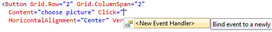
The following XAML snippet binds the Click event of a Button control to the PhotoButton_Click event handler .
Next part* This source code was highlighted with Source Code Highlighter .
- < Button Grid . Row = "2" Grid . ColumnSpan = "2"
- Content = "choose picture" Click = "PhotoButton_Click"
- HorizontalAlignment = "Center" VerticalAlignment = "Center" />
Source: https://habr.com/ru/post/118050/
All Articles