Interfaces of mobile applications: design and ergonomics
 From the translator . Sales of smartphones and tablets are growing every day, and this already indicates the need for increased attention to interfaces for mobile devices. On what principles should the design of applications and sites for mobile devices be based? How to satisfy all user requests that are becoming more and more demanding?
 According to available forecasts, in 2011 the sales of tablets will increase significantly, and the sales of smartphones will significantly exceed the sales of traditional-style phones. As practice shows, users prefer web-browsing applications already installed on the phone to special software that needs to be specifically bought or downloaded. What does this mean? First of all, the fact that at present, web developers and designers face the challenge of taking into account the features of mobile devices. The task, it should be noted, is not the simplest (see the article “Mobile content: doubly more difficult” by the famous web design expert Jacob Nielsen - www.useit.com/alertbox/mobile-content-comprehension.html , Russian translation- itopti. livejournal.com/2578.html , as well as many design examples on www.mobileawesomeness.com ).
Usability specialist Patrick Cox formulated 10 principles on which to develop mobile applications and websites ( www.ergonomie-interface.com/mobile-tactile-nomade/conception-site-web-mobile ). We invite readers to discuss; We will be happy if someone can share their own experience in designing interfaces for mobile applications.
1. Use semantic markup
We know that we must always try to separate the content from the form. But when creating websites for mobile devices, you need to go even further. Semantic markup provides better segmentation between form and content. It provides better accessibility, allows you to reduce file sizes (and these files require a minimum of code) and allows the user to better understand the content of the web page.
In addition, if the mobile browser does not load images, JavaScript or CSS styles, the site will always be displayed properly and adequately perceived by users.
Practical recommendations:
')
1. Images improve understanding, but are not self-sufficient to indicate something. Present images using CSS background properties or other methods.
use tags to indicate the type of content: for example, em to underline or abbr to designate an abbreviation. A detailed list of tags can be found here: www.webdesignfromscratch.com/html-css/list-of-html-tags-with-semantic-usage
2. Use the div tag only to highlight large blocks of material related to each other. To select individual paragraphs, use special tags: ul to compile bulleted lists, span to select small blocks of content.
3. Remember that the semantic web is a way of organizing content, which has nothing to do with the style.
2. Clearly formulate the task
Mobile version of the site should be designed to solve a limited number of tasks. When creating it, it is necessary to formulate goals especially clearly. If the site space is reduced by 80%, then 80% of the planned plans will also have to be abandoned. The functionality of the mobile version of the site is significantly limited due to the small screen size. For example, in the site version for a large screen, you can easily include such functions as advertising new company products, viewing personal messages, filling out small contact forms, displaying recent messages on Twitter, etc. But for the mobile version this option is not suitable: place all It is unlikely to work on the smartphone screen. Reducing the size of content elements is also not an option: the user will not be able to view the site through a magnifying glass!
Only one way out: to restrict yourself to the most necessary functions so that there is enough space for them on the screen.
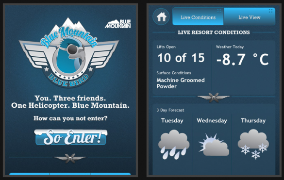
Example: a concise and clear presentation of information on the site
(mobile version of the portal bluemountain.ca ).
Practical recommendations:
1. When working on the design of the mobile version of the site, think not in the categories of pages, but in the categories of screens. Each screen should include no more than three functions or elements.
2. Orientation to simplify the screen not only makes it easier, but also helps you clarify the goals, objectives, functions assigned to the mobile version of the site.
3. Avoid refilling!
Do not seek to fill all the empty places on the screen. All users have different connection speeds, so the site should not “weigh” too much. Excessive number of images, text, code, etc., not only worsens the perception of the site by users, but also significantly increases the download time. Efficiency is important for users of the mobile Internet: they do not sit in front of a computer, and they need to access a particular website to solve urgent tasks.
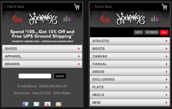
Example: simplified and well-organized horizontal navigation (http://m.journeys.com/).
Practical recommendations:
1. Reduce the number of images in the mobile version of the site to the most necessary minimum.
2. Do not include large texts in the mobile version of the site.
3. “Make it easy” by using semantic markup, as well as minimizing the number of CSS styles and file attachments.
4. Do not use the highlighted state!
Navigating with a finger or stylus is significantly different from navigating with a mouse and requires more ingenuity from the developer. It is necessary to use graphic tools in order to demonstrate to the user the ability to control a particular element.
Practical recommendations:
1. To indicate links, use buttons, not underlining the text.
2. Mark access to more detailed content using the arrows.
3. In the design of the buttons, use shading and embossed lines.
4. Use familiar and understandable icons. Avoid icons of unusual appearance to indicate types of actions (“add”, “change”, “back”, “forward”, etc.)

Example: successful design of navigation buttons.
5. Write in large print, simple and clear.
Even on a small screen, the user should not have problems reading the text. If the optimal font size for displaying on a big screen is 14 points, then for a mobile device it should be at least twice as large. It should be noted, however, that the larger the font - the less information can be placed on the site.
Practical recommendations:
1. The mobile version of the site should not include any unnecessary information.
2. Select small texts written in simple and understandable language.
3. Do not use the scroll function unnecessarily.
4. Include the “next” button in the site design, by clicking on which the user can go to the screen with a more detailed text variant.
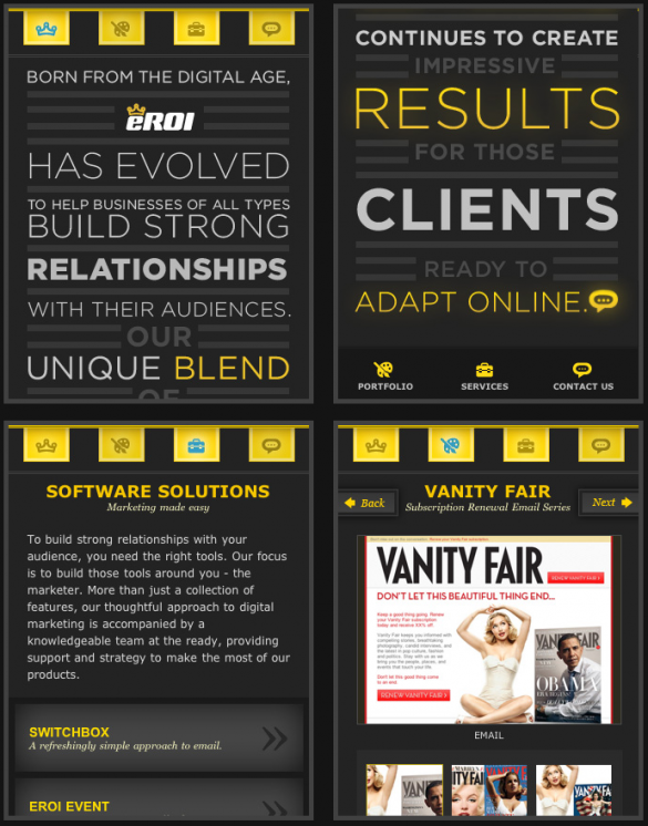
Example: submission of information in the form of short and capacious text blocks
6. Use site content items in the navigation.
Of particular interest in creating versions of sites that are adapted to the touchscreen, is the possibility of using content elements as navigation elements: pressing a finger on a particular area of the screen can already become a tool for performing a particular action. In mobile versions of the site, you do not need to use, for example, a scroll bar: the screen itself will take over its functions.
Practical recommendations:
1. Use the menu lists to go to submenus or other screens.
2. Design your site as a gallery of screens; use a creative approach to organizing visitors walk through this virtual gallery.

Example: the organization of the mobile version of the site as a virtual gallery (the site of the American rock band Neon Trees).
7. Pay attention to colors
The mobile phone screen is substantially smaller than the screen of a standard monitor. To read from this screen, you need as close as possible to his eyes. Therefore, the colors of the mobile version of the site should not be too sharp.
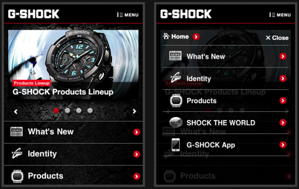
Example: a minimum of colors and contrast - the key to a successful design (http://world.g-shock.com/).
Practical recommendations:
1. Do not unnecessarily use too bright colors in the design of the site.
2. The site should not be too "colorful".
3. Use the colors most pleasing to the eye.
4. Do not forget about contrasts. On the screen of a mobile phone, contrasting colors look very impressive.
8. In the general style of the site, simplicity
Both the visual solution of the site and its text content should be characterized by simplicity and clarity. In the design of the mobile version of the site should avoid extravagant, non-traditional elements. Use common words whose meaning will be clearly understood by everyone (for example, "username" and "password", not "nickname" and "secret code").

Example: a form to enter the mobile version of the site (social network for beer lovers Untapped- untappd.com/?mobile=true )
9. Provide feedback
Mobile browsers support Java — take advantage of these and create dynamic feedback for users. You can, for example, show the progress of the page loading using animation. If the user forgot to fill in any field, inform him about it immediately. Create dialog boxes informing the user about what is happening while working with the site.
Practical recommendations:
1. When you click on a specific area of the screen, the site's view should change (this confirms that the click actually took place).
2. Use JavaScript (for example, JQuery or Scriptaculous) to organize a full-fledged dialogue with the user.
3. Show the progress of the page loading using animation.
10. Save empty spaces.
Most smartphones have a touch screen, but it’s more difficult to control the site solely with your fingers than with a mouse. There should be enough free space around the clickable elements of the site so that the user can click on them.
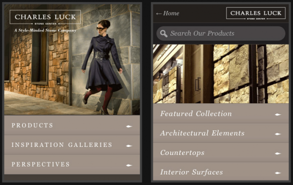
An example is a menu that is easy to navigate using touchscreen devices (mobile version of the portal www.charlesluck.com ).
Practical recommendations:
1. To designate links, use not text underlining, but buttons, objects, icons.
2. Create internal fields of sufficient size so that the user can clearly distinguish the elements.
3. Increasing the height of the lines makes the text more readable on the screen of the mobile device.
Source: https://habr.com/ru/post/117950/
All Articles