Create an application for Windows Phone 7 from start to finish. Part 5. Navigation between pages, page layout
Previous part
If your application has more than one page, you will have to give users the ability to navigate between these pages.
Creating a layout is the process of adding panels, placing controls and setting properties to achieve the desired look and feel for your pages.
')
In this part you will learn:
In addition to automatic navigation at startup and shutdown, navigation usually occurs as a result of activating a user interface control, such as a hyperlink or button, or pressing the “Back” hardware button. The “Back” button automatically jumps back without any special processing.
The easiest way to implement navigation between pages is to use the HyperlinkButton control. You can use its NavigationUri property to navigate to the desired page. The following example shows how to go to a page called SecondPage.xaml.
To go back, you can use the NavigationService.GoBack method, which returns to an instance of the previous page. Of course, this duplicates the functionality of the Back button, so you will most likely call this method as part of some other functionality.
For example, in the Fuel Tracker application, on the vehicle information page and the refueling information page there is a “Save” button that saves the changes made by the user, and then jumps back to the first page with summary information. If the user presses the Back button instead, the transition back will occur without saving the data. The application should always ask for confirmation before resetting user data, so it’s helpful to respond to the event of pressing the “Back” button. Additional information can be found in the “Validation of Input Data” section.
Interface Design Recommendation:
You need to implement only the behavior of the “Back” button, which moves backward or hides the context menu and dialog boxes. All other implementations are prohibited.
When you create a new Windows Phone Application project in Visual Studio, you automatically get several panels and items for marking your page. Most of your layout decisions will be in the ContentPanel. The following image shows the standard panels and elements for a page in portrait orientation.

The user interface for Windows Phone applications is created using a declarative markup language called Extensible Application Markup Language (XAML). XAML is an XML file that allows you to separate the definition of the user interface from the run-time logic (run-time logic) using the code-behind (separate code) files joining the markup through the definition of a shared class (partial class). If you are familiar with web programming, you might think of XAML as HTML, but more powerful. Like HTML, XAML consists of elements and attributes.
Visual Studio 2010 Express for Windows Phone and Expression Blend for Windows Phone allow you to drag and drop controls onto the designer’s surface, place them, and set properties in a visual way. These tools generate the necessary XAML code for you, so you don’t need extensive XAML knowledge to create an application for Windows Phone. However, the general idea is useful for those cases where you find it necessary to change the XAML code manually. Visual Studio's XAML editor offers IntelliSense and statement comletion (operator completion). In addition, the image in the designer is updated as the XAML changes. If you need help with a particular item, move the cursor over that item and press F1 to go to the help topic for that item.
In a XAML file, each user interface object is a XAML element, and the properties of this object are set using attributes. XAML implicitly passes the child / parent relation of the user interface markup. The following XAML code displays a panel (StackPanel) that contains an image (Image) and some text (TextBlock). In this example, properties are set using attribute syntax.
You can start creating layouts by simply dragging items from the Visual Studio toolbar onto the designer’s surface. As soon as you change something in design mode, the XAML code is updated. The following image shows some visual indicators offered by the Visual Studio designer for placing controls, such as snap lines, grids, and margin lines.
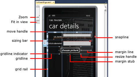
When moving controls over the designer’s surface, margin settings and specific heights and widths are used to determine the exact position and size of the controls. The limit line from the control to the edge of the application indicates that the field is fixed and the distance from the control to the edge of the application will remain unchanged. Which fields are fixed can affect how controls resize or move when the application is resized.
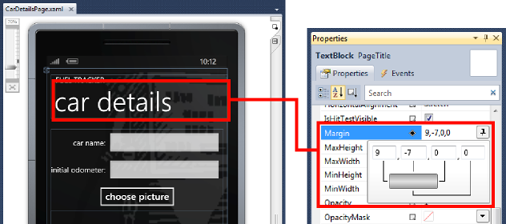
The field editor in the Properties window displays the settings for each field (margin) and how this affects the placement of the text field (text box). The following image shows the field editor.
You can also place controls using the Canvas markup control. Controls are placed on the Canvas based on the x and y coordinates specified in the pixels.
Interface Design Recommendation:
The Canvas control uses pixel-based markup and can provide better performance than the Grid control for deep embedded or nested controls in fixed orientation applications.
In case the positioning of the controls is accurate, the layout of your application may be broken, when the text is larger than you expected, the images will be of a different size, and when you need support for both portrait and landscape orientation. Dynamic markup is the best way to guarantee an acceptable appearance for your application in a wide variety of situations.
Dynamic is called markup, which changes the size and adjusts to the content and orientation. If you are planning to localize your application or support landscape orientation, you should create dynamic markup.
To create dynamic markup, you usually start with one of the following derivatives of the control panel.
A grid is the best choice when an application frame needs to expand, contract, or rotate.
In addition to choosing the right markup control, there are some property parameters that you can specify in order to ensure that the controls will automatically change depending on the orientation.
There are two important size settings for dynamic layout.
Interface Design Recommendation:
Avoid using fonts that are smaller than 15 points. You must first use the Segoe font.
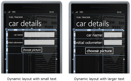
In the Fuel Tracker application, most controls are placed dynamically using the Grid and StackPanel controls. The following image shows the vehicle information page that uses the Grid. Rows and columns were defined with dynamic sizes (Auto and asterisk). In the image on the right, you can see that the text size has been increased and the markup is automatically adjusted.
Next part
If your application has more than one page, you will have to give users the ability to navigate between these pages.
Creating a layout is the process of adding panels, placing controls and setting properties to achieve the desired look and feel for your pages.
')
In this part you will learn:
- How to implement a jump to another page using a hyperlink.
- How to implement a transition to another page using the navigation service.
- What are the standard panels used on the page.
- What is XAML and how it is used to create the user interface.
- How to place controls on the page.
- How to create dynamic markup.
Navigation between pages.
In addition to automatic navigation at startup and shutdown, navigation usually occurs as a result of activating a user interface control, such as a hyperlink or button, or pressing the “Back” hardware button. The “Back” button automatically jumps back without any special processing.
The easiest way to implement navigation between pages is to use the HyperlinkButton control. You can use its NavigationUri property to navigate to the desired page. The following example shows how to go to a page called SecondPage.xaml.
If you do not want to use the HyperlinkButton, you can implement navigation using the NavigationService class. This class contains several properties, methods, and events that will help you with navigation. You can use the NavigationService.Navigate method to jump to a specific page. The following code snippet shows a click event handler on an application button button that calls the Navigate method.< HyperlinkButton NavigateUri ="SecondPage.xaml" /> * This source code was highlighted with Source Code Highlighter .
< HyperlinkButton NavigateUri ="SecondPage.xaml" /> * This source code was highlighted with Source Code Highlighter .< HyperlinkButton NavigateUri ="SecondPage.xaml" /> * This source code was highlighted with Source Code Highlighter .
The Navigate method always creates a new page instance at the specified URI. You can also add URI parameters to initialize the requested page to a specified state (the Fuel Tracker application does not pass state information in the URI parameters). Other options for transferring data between pages include using application-level properties, external utility classes, or the PhoneApplicationService.State property.* This source code was highlighted with Source Code Highlighter .
- private void FillupButton_Click ( object sender, EventArgs e)
- {
- NavigationService.Navigate (
- new Uri ( "/views/FillupPage.xaml" , UriKind.Relative));
- }
To go back, you can use the NavigationService.GoBack method, which returns to an instance of the previous page. Of course, this duplicates the functionality of the Back button, so you will most likely call this method as part of some other functionality.
For example, in the Fuel Tracker application, on the vehicle information page and the refueling information page there is a “Save” button that saves the changes made by the user, and then jumps back to the first page with summary information. If the user presses the Back button instead, the transition back will occur without saving the data. The application should always ask for confirmation before resetting user data, so it’s helpful to respond to the event of pressing the “Back” button. Additional information can be found in the “Validation of Input Data” section.
Interface Design Recommendation:
You need to implement only the behavior of the “Back” button, which moves backward or hides the context menu and dialog boxes. All other implementations are prohibited.
Page Layout: Standard Panels
When you create a new Windows Phone Application project in Visual Studio, you automatically get several panels and items for marking your page. Most of your layout decisions will be in the ContentPanel. The following image shows the standard panels and elements for a page in portrait orientation.
Introduction to XAML
The user interface for Windows Phone applications is created using a declarative markup language called Extensible Application Markup Language (XAML). XAML is an XML file that allows you to separate the definition of the user interface from the run-time logic (run-time logic) using the code-behind (separate code) files joining the markup through the definition of a shared class (partial class). If you are familiar with web programming, you might think of XAML as HTML, but more powerful. Like HTML, XAML consists of elements and attributes.
Visual Studio 2010 Express for Windows Phone and Expression Blend for Windows Phone allow you to drag and drop controls onto the designer’s surface, place them, and set properties in a visual way. These tools generate the necessary XAML code for you, so you don’t need extensive XAML knowledge to create an application for Windows Phone. However, the general idea is useful for those cases where you find it necessary to change the XAML code manually. Visual Studio's XAML editor offers IntelliSense and statement comletion (operator completion). In addition, the image in the designer is updated as the XAML changes. If you need help with a particular item, move the cursor over that item and press F1 to go to the help topic for that item.
In a XAML file, each user interface object is a XAML element, and the properties of this object are set using attributes. XAML implicitly passes the child / parent relation of the user interface markup. The following XAML code displays a panel (StackPanel) that contains an image (Image) and some text (TextBlock). In this example, properties are set using attribute syntax.
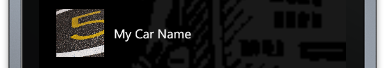
The following image shows how this XAML code is displayed when the application starts.* This source code was highlighted with Source Code Highlighter .
- <! - Car photo and name .-->
- < StackPanel Orientation = "Horizontal" Margin = "12,130" Height = "110"
- VerticalAlignment = "Top" >
- < Image Height = "75" Width = "75" Margin = "15" Stretch = "UniformToFill"
- Source = "{Binding Picture}" />
- < TextBlock Text = "{Binding Name}" VerticalAlignment = "Center" />
- </ StackPanel >
Control Placement
You can start creating layouts by simply dragging items from the Visual Studio toolbar onto the designer’s surface. As soon as you change something in design mode, the XAML code is updated. The following image shows some visual indicators offered by the Visual Studio designer for placing controls, such as snap lines, grids, and margin lines.
When moving controls over the designer’s surface, margin settings and specific heights and widths are used to determine the exact position and size of the controls. The limit line from the control to the edge of the application indicates that the field is fixed and the distance from the control to the edge of the application will remain unchanged. Which fields are fixed can affect how controls resize or move when the application is resized.
The field editor in the Properties window displays the settings for each field (margin) and how this affects the placement of the text field (text box). The following image shows the field editor.
You can also place controls using the Canvas markup control. Controls are placed on the Canvas based on the x and y coordinates specified in the pixels.
Interface Design Recommendation:
The Canvas control uses pixel-based markup and can provide better performance than the Grid control for deep embedded or nested controls in fixed orientation applications.
In case the positioning of the controls is accurate, the layout of your application may be broken, when the text is larger than you expected, the images will be of a different size, and when you need support for both portrait and landscape orientation. Dynamic markup is the best way to guarantee an acceptable appearance for your application in a wide variety of situations.
Create dynamic markup
Dynamic is called markup, which changes the size and adjusts to the content and orientation. If you are planning to localize your application or support landscape orientation, you should create dynamic markup.
To create dynamic markup, you usually start with one of the following derivatives of the control panel.
- The Grid control allows you to place items as rows and columns.
- The StackPanel control automatically places children vertically or horizontally.
A grid is the best choice when an application frame needs to expand, contract, or rotate.
In addition to choosing the right markup control, there are some property parameters that you can specify in order to ensure that the controls will automatically change depending on the orientation.
There are two important size settings for dynamic layout.
- Auto - allows controls to resize to fit their content, even if the content changes size.
- * (Asterisk) - distributes the free space between the rows and columns of the Grid control in the proportions corresponding to the weights.
- Set the "Height" and "Width" properties to " Auto ", which means they will fill the entire width or height of the parent page or panel.
- Add rows and columns to the Grid using the Properties window or the designer.
- Specify Auto size or asterisk (*) for rows and columns.
The following example shows a Grid control named ContentPanel on the vehicle information page in the Fuel Tracker application. The height of the first three lines is set to Auto , and the fourth is set to * . This means that the height of the first three lines will be determined by the size of their contents, and the last line will take the remaining space. The width of the first column is set to Auto , and the second column takes the remaining space.- < Grid.RowDefinitions >
- < RowDefinition Height = "Auto" />
- < RowDefinition Height = "Auto" />
- < RowDefinition Height = "Auto" />
- < RowDefinition Height = "*" />
- </ Grid.RowDefinitions >
- < Grid.ColumnDefinitions >
- < ColumnDefinition Width = "Auto" />
- < ColumnDefinition Width = "*" />
- </ Grid.ColumnDefinitions >
- Place the child controls in specific rows and columns, using the Grid.Row and Grid.Column properties, or dragging them to the right place on the designer's surface.
- If necessary, assign multiple rows or columns to the child controls using the Grid.RowSpan and Grid.ColumnSpan properties.
- Review each fixed margin (margin) for the controls and make sure they are necessary.
- Consider the size for all controls and, if necessary, remove the Height and Width properties, set the MinHeight or MinWidth properties instead.
Interface Design Recommendation:
Avoid using fonts that are smaller than 15 points. You must first use the Segoe font.
In the Fuel Tracker application, most controls are placed dynamically using the Grid and StackPanel controls. The following image shows the vehicle information page that uses the Grid. Rows and columns were defined with dynamic sizes (Auto and asterisk). In the image on the right, you can see that the text size has been increased and the markup is automatically adjusted.
Next part
Source: https://habr.com/ru/post/117629/
All Articles