The principle of cicada and why it is important for web designers
 A couple of years ago I read interesting facts about the life cycle of periodic cicadas . Usually we do not see many insects around us, because they spend most of their lives underground and suck the roots of plants quietly.
However, depending on the species, every 7, 11, 13, or 17 years, periodic cicadas simultaneously massively emerge into the light and turn into noisy flying creatures, mate and soon die.
Although our strange cicadas are fun to go to another world, an obvious question arises: is it just an accident, or are the numbers 7, 11, 13 and 17 any special?
It turns out that these numbers have something in common. All of them are prime numbers that are divisible only by themselves and by unit (these are
')
Why is this so important?
Studies have shown that the number of animals that feed on cicadas — usually birds, spiders, wasps, fish, and snakes — often show a shorter cycle of 2–6 years between the peak and decline of a population. Thus, if our cicadas appeared, for example, every 12 years, then each predator with a life cycle of 2, 3, 4 or 6 years could synchronize the cycles of raising its numbers with the regular appearance of cicadas. In fact, they probably would have announced a universal gluttony festival called Cicada Day.
It's not so much fun if you're a cicada.
On the other hand, if the brood of cicadas was so unlucky as to appear during the three-year peak of the number of wasps, then the next time it will happen only after 51 years. In intermediate generations, cicadas can safely restore their population and far exceed the number of predators.
Resourceful small, right?
Wonderful. But how does this relate to web design?
A couple of weeks ago we looked at how to make a seamless fill (tiling). This is a super useful thing, but it can be difficult to maintain the right balance.
On the one hand, you want to use files as small as possible to get the most out of the tiling effect. However, as soon as you notice a particular feature in the background - for example, a small knot against the background of wood fiber - which repeats at regular intervals, then all the illusion of natural chance is lost.
Maybe you can borrow some ideas from cicadas to break this pattern?
Generation of natural randomness by CSS
Example 1
Stop talking. Here is a small concept check. The test should not look perfectly beautiful, but it demonstrates the essence well. Remembering the "cicada principle", I made three square translucent PNGs of 29, 37 and 53 pixels, respectively, and set them as background images in the HTML element on the test page.
 29-a.png (2.0kb)
  37-a.png (1.7kb)
  53-a.png (2.5kb)
html { background-image: url(29-a.png),url(37-a.png), url(53-a.png); padding:0; margin:0; height: 100%; } And here is the result.
Result
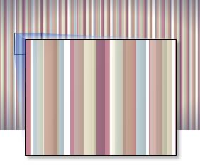 As you can see, these boxes overlap each other and interact, generating new patterns and colors. And since we use magic prime numbers, the pattern will not repeat for a very long time.
How long is it exactly? 29 × 37 × 53 ... or 56,869 pixels!
This was for me some kind of revolution. I checked my calculations three times, but the mathematics is completely reliable. Remember, these are tiny graphic files, less than 7 kilobytes together, while generating a texture of almost 57,000 pixels wide.
Can you imagine what will happen if you add another fourth square, for example, 43 pixels? Or you can not imagine, because the numbers become slightly brutal and can hypnotize if you look at them for too long. Suffice it to say that you get a number that is more suitable for terraforming the planets than for web design.
Ok. Theoretically, geometric shapes work well, but how else can you use this idea?
Example 2
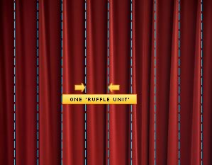 Take a more photorealistic example that each of us could see in one form or another: a theater curtain. For starters, I found some nice graphics here . If you look at our curtain, you can see uniform vertical blocks.
For this example, I will call this gap “the assembly unit (ruffle unit), and unlike the first example, it will be more important than the strict dimensions in pixels of those images that we worked with.
First, I'm going to choose one of these blocks and turn it into an element for a seamless background. This JPEG is only 8kb in size .
 When rendering a single block, this graphics personifies everything that we hate in a seamless background. In addition to the clearly visible joints, it looks very mechanical and absolutely unconvincing.
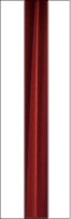 For the second level, we use the prime number three. I'm going to choose a new section of the curtain and place it inside a transparent PNG, which will be three blocks wide in the assembly . I blurred the left and right edges, so that it blends seamlessly with the background. The resulting file is 15kb .
 When we mix this new element with the previous layer, we get clearly the best result. The unnatural periodic pattern is still noticeable, but it begins to break a little bit.
The magic number of our third layer is seven .
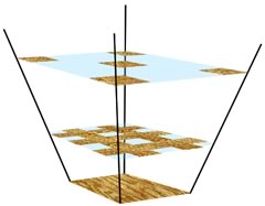
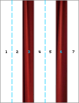 We are making a new transparent PNG seven blocks wide, and I'm going to place two new sections of the original image in positions 3 and 6. If this sounds unclear, the diagram on the left should slightly clarify the situation. Again, I blurred the edges of the image to ease the docking with the previous layers.
Obviously, this image will be larger in both pixels and file size, but it still has a size of about 32kb - not too cruel by any measure.
 That's what happened when we cover the two previous layers with this graphics . I am quite pleased with the result. Of course, your eye may notice small fragments of the image, which is supposedly repeated (because it actually repeats), but the lower layers are so random that the eye soon stops looking for a pattern.
If you look at this background from the numerical side and present each block as a number, you get the following: 1, 2, 3, 1, 2, 6, 1, 2, 1, 3, 2, 1, 6, 2, 1 , 1, 3, 1, 1, 6, 1, 1, 2, 3 ...
The pattern is there, but it is very difficult to recognize.
In this example, the almost endless background in the form of a theater curtain cost us only 53kb. And of course, you can easily add a fourth layer - perhaps 11 blocks in size - if needed. However, I do not think this is required here.
Also keep in mind: in this example, the most minimal prime numbers are used - 1, 3 and 7. If we took, say, 11, 13 and 17, we could make a much more complex variation on a given size. In reality, it all comes down to the scale of the texture relative to the width of the screen.
Example 3
My last example is not so much a practical plan as for the sake of entertainment with prime numbers. I’m not going to break the theory again, because the basic concept is the same as in the previous two examples, but I’ll be glad if you try to edit it in FireBug.
2,200 years ago, the Chinese emperor, Qin Shi Huang, created a terracotta army of 8,000 men to guard his grave. The full-size statue of each warrior, horse and weapon is a unique handmade product.
Using simple CSS, simple numbers and a set of images, we are going to build our own mighty army. Maybe she does not have enough growth, but she takes its multiplicity.
I will show you ... My Mighty Legion Lego!
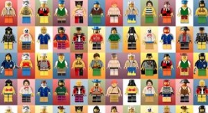 The Legion is made up of just eight images that combine to create thousands of combinations. It uses:
- 2 pictures for background
- 2 foot images
- 2 torso images
- 2 head images
Summary
Experimenting with this idea, I discovered several principles that seem to work. First, the texture mapping order is better if it is organized in an inverted pyramid.
 It is quite possible to make the bottom layer quite small and repetitive, since it is overlapped by all the layers above. In reality, it will be visible only by 20–40%.
On the other hand, the topmost layer must necessarily be the largest, but at the same time the least saturated , since this layer will never overlap by others. It is also probably best not to include well-defined, eye-catching details on the topmost layer. Leave it lean and generalized.
In any case, it is almost always necessary to use the trial and error method.
Browser support
I left the markup simple, using multiple backgrounds in the HTML element. This option is supported by all modern browsers (Firefox 4, Chrome 10, IE9, Opera 11, Safari 5), but, obviously, not by all the old versions.
However, if we presuppose backward compatibility, then a suitable option would be tiling in
html , body and a container div . Perhaps the container may not be semantic, but this little indulgence has the potential to greatly affect the entire site. You decide.These three examples came to my mind first, but I am sure that there are many more competent ways to use the idea. For example:
- Endless cityscape
- Non-repeating wood texture
- Starry sky
- Dense jungle
- Cloudy sky
Source: https://habr.com/ru/post/117160/
All Articles