Features of foreign typography
A few months ago I was faced with the task of laying out a booklet in French. It turned out that in RuNet, the topic of foreign typography is presented very sparingly, therefore, the necessary information had to be found and translated by itself.
In this article I would like to tell about the most remarkable, in my opinion, European typographical traditions, their similarities and differences.
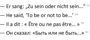
The first thing that the observant reader is likely to notice is the punctuation of punctuation marks in the third sentence. This is an amazing feature of French typography; non-breaking space is put to the semicolon, colon, question mark, exclamation mark, after opening quotes and before closing quotes. It is believed that all this simplifies the perception of typesetting text.
Up to the twentieth century, such a design could be found not only in French, but also, for example, in English-language publications.
')
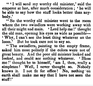
The same could be found in the pre-revolutionary Russian-language press.
However, it must be admitted, in those years, depending on the cultural affiliation of the owner of the printing house, one could come across the most diverse stylistics of the design of the publication.
Magazine "Apolon", St. Petersburg, 1910
Speaking of national typographic traditions, one cannot ignore the youngest and most diverse sign - quotes . In appearance share:
There is another type of quotes - hieroglyphic, this is a double L-shaped character. However, a logographic letter is a fundamentally different graphic culture, which is not considered in this article.
In different languages, the manner and the very principle of quotation marks may differ. For example, in Finnish and Swedish, unpaired right-hand French quotes are used, and in early English editions (and not only), one could see duplicate quotes on each line of a paragraph of quoted text.
A similar culture of quotes has been preserved in our days in some conservative French, mainly book editions: each new line of such a paragraph begins with a closing quotation mark.
In my opinion, French chevrons look the most attractive against the background of German (“paws”) and English quotes: due to their balance with respect to the vertical line, as well as their visual authenticity, which allows to avoid ambiguity when quotations with commas and apostrophes meet.
In many English-language editions you can find headlines from sentences in which each word is typed with a capital letter. This method of separating the title is known before the appearance of typographic printing. Reception, which for our eyes may seem somewhat doubtful, has its own, special rules of use. However, depending on what kind of guidelines for the design of the publication you will adhere to, these rules may differ slightly. Here, for example, is an excerpt from the Chicago Style Guide :
The capital is a somewhat archaic competitor of italics, which nevertheless has not lost its charm. Such a set of height and saturation corresponds to a number of lowercase letters; in order to achieve the same contrast between lowercase and small capital letters, the strokes of the latter are usually made fatter than that of their older brothers, and the letters themselves are slightly wider.
This decorating technique is capable of qualitatively complementing the gentleman’s set of the typesetter (bold and italics), in particular when this set is not enough: for example, in scientific publications, dictionaries, encyclopedias, maps, etc.
In foreign publications (for example, USA Today), capital is often used to write abbreviations and abbreviations longer than 4 characters.
Before the advent of lower case in the eighth century AD, texts in the Latin alphabet were typed in one register - exclusively in capital letters. As an example of the typographic art of that era, we can recall the documents and architectural monuments of ancient Rome that have survived to the present day.
This period is a natural stage of development from the ancient hieroglyphic to the Latin alphabet known to us. So in the logographic letter there was simply no need for any registers. It is not difficult to track on the example of modern oriental languages (Arabic, Chinese, Japanese, etc.).
However, even before the middle of the 20th century, most Western publications widely used the set in upper case for the design of titles of publications. Today, this design is much less common. The reason for the decline in the popularity of this technique, on the one hand, is the negative impact on readability, on the other hand, technical development, which expanded the set of typographer’s typographic tools.
It is worth noting that the undoubted attractiveness of this technique is to obtain rectangular text blocks, of which it is much easier then to build a strip composition: a book cover, a label or a poster.
In the case of the Cyrillic alphabet, aesthetics in such a set is always less. Unfortunately, his drawing doesn’t really shine with a variety of graphemes (AI, HER, LPD, SCHSCH, WB, GT, PbL, SO), therefore, often, as soon as we lift the entire set into the upper register, we make it, not only less readable, but also visually more boring.
Starting the study of foreign typography, one should remember the most important thing - that typography is not a set of immutable rules - it is a regional set of customs and traditions. (I will make a reservation, however, that there are certain canonical standards here: for example, for administrative documents or correspondence). Therefore, the first thing to do at the start is to carefully read the most popular and authoritative publications produced in this language in a given country over the past 10-20 years - this will increase your chances of not failing.
In this article I would like to tell about the most remarkable, in my opinion, European typographical traditions, their similarities and differences.
The first thing that the observant reader is likely to notice is the punctuation of punctuation marks in the third sentence. This is an amazing feature of French typography; non-breaking space is put to the semicolon, colon, question mark, exclamation mark, after opening quotes and before closing quotes. It is believed that all this simplifies the perception of typesetting text.
Up to the twentieth century, such a design could be found not only in French, but also, for example, in English-language publications.
"The living age, Volume 16", Boston, 1846
')
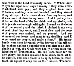
Guliver's Journey, London, 1826
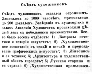
The same could be found in the pre-revolutionary Russian-language press.
“Collected Works of A.S. Pushkin ", Edward Prats printing house, 1859
However, it must be admitted, in those years, depending on the cultural affiliation of the owner of the printing house, one could come across the most diverse stylistics of the design of the publication.
Magazine "Apolon", St. Petersburg, 1910
Used single German quotes-paws.
Speaking of national typographic traditions, one cannot ignore the youngest and most diverse sign - quotes . In appearance share:
- Typewritten , unmatched quotes.
- English quotes are paired characters in the form of an inverted comma and apostrophe (6/9), placed in upper case. In the British editions, single quotes are used most often for first level quotations, double quotes are used for the second; in the USA it is usually the opposite.
- French quotes - Christmas tree quotes as they are called in Russia, or quotes chevrons (fr. "Chevrons pointés"), in similarity with V-shaped stripes on the sleeves of military uniforms.
- German quotes - two forms of characters are used. Either opening and closing quotes, paws (9/6), located in the lower and upper registers, respectively, or mirror quotes of herringbones: opening - pointing to the right, closing - left. You can use both types of quotes, as well as their combination.
There is another type of quotes - hieroglyphic, this is a double L-shaped character. However, a logographic letter is a fundamentally different graphic culture, which is not considered in this article.
In different languages, the manner and the very principle of quotation marks may differ. For example, in Finnish and Swedish, unpaired right-hand French quotes are used, and in early English editions (and not only), one could see duplicate quotes on each line of a paragraph of quoted text.
"The Roman empire, Volume 8", London, 1816
A similar culture of quotes has been preserved in our days in some conservative French, mainly book editions: each new line of such a paragraph begins with a closing quotation mark.
A few words about style
Typewritten quotes, as an element of monospaced font - a side result of the evolution of typewriters. Today on the standard keyboard layout they are the default used by users. And although their undoubted advantage is the versatility and convenience of typing, these advantages are completely leveled when we think about reading comfort and aesthetics.In my opinion, French chevrons look the most attractive against the background of German (“paws”) and English quotes: due to their balance with respect to the vertical line, as well as their visual authenticity, which allows to avoid ambiguity when quotations with commas and apostrophes meet.
"English" headers
(title caps)
In many English-language editions you can find headlines from sentences in which each word is typed with a capital letter. This method of separating the title is known before the appearance of typographic printing. Reception, which for our eyes may seem somewhat doubtful, has its own, special rules of use. However, depending on what kind of guidelines for the design of the publication you will adhere to, these rules may differ slightly. Here, for example, is an excerpt from the Chicago Style Guide :
- A capital letter always begins with the first and last word.
- All nouns, pronouns, adjectives, verbs, adverbs and subordinate unions begin with a capital letter (“as”, “because”, “although”).
- With lowercase always written articles, conjunctions and prepositions, regardless of their length, if they are not the first or last word in the title
- The preposition “to” is written with a small letter if it is used in the infinitive.
Capital
(small caps)
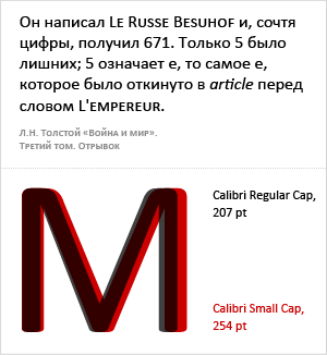
The capital is a somewhat archaic competitor of italics, which nevertheless has not lost its charm. Such a set of height and saturation corresponds to a number of lowercase letters; in order to achieve the same contrast between lowercase and small capital letters, the strokes of the latter are usually made fatter than that of their older brothers, and the letters themselves are slightly wider.
This decorating technique is capable of qualitatively complementing the gentleman’s set of the typesetter (bold and italics), in particular when this set is not enough: for example, in scientific publications, dictionaries, encyclopedias, maps, etc.
In foreign publications (for example, USA Today), capital is often used to write abbreviations and abbreviations longer than 4 characters.
Set in capital letters
(all caps)
Before the advent of lower case in the eighth century AD, texts in the Latin alphabet were typed in one register - exclusively in capital letters. As an example of the typographic art of that era, we can recall the documents and architectural monuments of ancient Rome that have survived to the present day.
This period is a natural stage of development from the ancient hieroglyphic to the Latin alphabet known to us. So in the logographic letter there was simply no need for any registers. It is not difficult to track on the example of modern oriental languages (Arabic, Chinese, Japanese, etc.).
However, even before the middle of the 20th century, most Western publications widely used the set in upper case for the design of titles of publications. Today, this design is much less common. The reason for the decline in the popularity of this technique, on the one hand, is the negative impact on readability, on the other hand, technical development, which expanded the set of typographer’s typographic tools.
It is worth noting that the undoubted attractiveness of this technique is to obtain rectangular text blocks, of which it is much easier then to build a strip composition: a book cover, a label or a poster.
In the case of the Cyrillic alphabet, aesthetics in such a set is always less. Unfortunately, his drawing doesn’t really shine with a variety of graphemes (AI, HER, LPD, SCHSCH, WB, GT, PbL, SO), therefore, often, as soon as we lift the entire set into the upper register, we make it, not only less readable, but also visually more boring.
Typographic standards
Starting the study of foreign typography, one should remember the most important thing - that typography is not a set of immutable rules - it is a regional set of customs and traditions. (I will make a reservation, however, that there are certain canonical standards here: for example, for administrative documents or correspondence). Therefore, the first thing to do at the start is to carefully read the most popular and authoritative publications produced in this language in a given country over the past 10-20 years - this will increase your chances of not failing.
Source: https://habr.com/ru/post/117142/
All Articles