Cross-browser inline-block
Let me present to you a translation of the article “Cross-Browser Inline-Block” written by Rainy Doherty on cold February 2009. The article describes the layout of the elements of the list with the setting for the display property of the inline-block value. An article about this, as well as about the difficulties that arise in the process of achieving the result and about the methods of their "treatment".
Inline-block , a tempting value for the display property, which promises a lot and performs very little. Very often I received PSD files like this:
')

and cried.
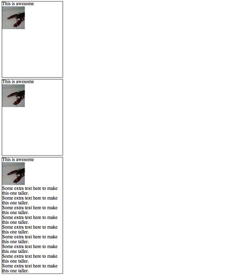
Typically, this display method does not cause problems. Fixed width, fixed height, float: left and ready. If not for one, but! The design should be displayed correctly with any amount of content. In our case, if there is a little more data in one of the blocks, it will “break” the entire grid.
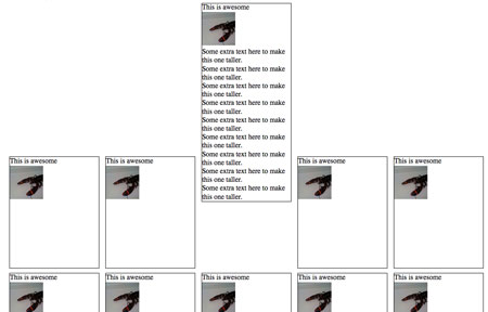
Since the first element is higher than the next, the fifth one is not under it, as we would like, but “flows around” along the right edge. In general, we need the elasticity of the table, but in the correct, semantic layout.
Let's start with a simple example, where the list property for the display property is set to inline-block :
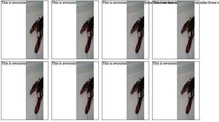
The result looks correct in Firefox 3, Safari 3 and in Opera:
It seems that something is wrong with the vertical alignment. To tell the truth, there are no errors, this is just the correct behavior of the browser, but not the result that we would like.
And the following happens here, the baseline ( baseline ) of each element <li> is aligned with the baseline of the parent element <ul> . You ask what is the baseline? Better to see once than hear a hundred times:

The baseline in the figure above is indicated by the line through the base of the characters. The default value for the vertical-align property for inline and inline-block elements is baseline . This means that the baseline of the elements is aligned with the parent's baseline. The figure below shows an example of this alignment:
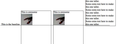
As you can see, each baseline of the blocks in the figure above is aligned with the baseline of the text “This is the baseline”, which is not an element of <li> . This is simply a text node, located directly in <ul> , placed there as an indicator of the location of the baseline of the <ul> element.
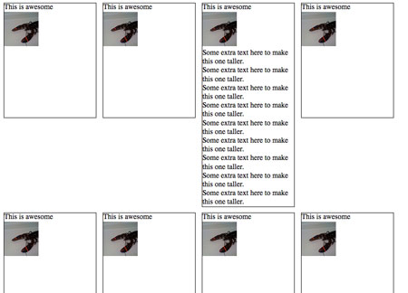
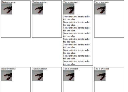
It is quite simple to get the alignment option that was initially desired; it is enough for the vertical-align property to specify the top value and get a perfect grid as a result:
That's just it does not work in Firefox 2, IE 6 and 7:
To get started, let's do Firefox 2.
Firefox 2 does not support the inline-block value, but understands Mozilla - specific -moz-inline-stack value for the display property. It leads to results similar to the inline-block action. When we add it before display: inline-block , Firefox 2 ignores the above because it does not understand it, and uses -moz-inline-stack . Other browsers use inline-block , ignoring the incomprehensible for them -moz-inline-stack .
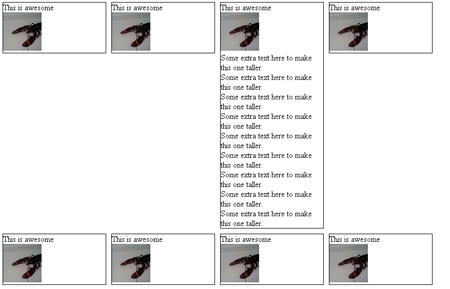
Unfortunately, this causes a small bug:
Honestly, I don't know what caused it. Fortunately, it is treated quite simply by wrapping the entire contents of the <li> element with an additional <div> .
Now let's move on to IE 7. It also does not support inline-block , but we can use the trick by which the <li> elements will be displayed on the screen as if they were using the inline-block value. How? We will use hasLayout , a magical IE property that makes many manipulations available. You cannot explicitly specify a hasLayout: true element or do it in some similar simple way, but you can start the mechanism by specifying zoom: 1 .
Technically, elements with hasLayout set to true are themselves responsible for rendering themselves and their children. Combine this with min-height and width , and get a result very close to display: block . It is like a magical powder that makes all the problems that appear when displaying disappear.
When we add zoom: 1 and * display: inline (the asterisk is a hack for IE 6 and IE 7) for the <li> elements, we will teach IE 7 to display them just like inline-block :
Almost done. Only IE 6 remains:
IE 6 does not support min-height , but instead we can use its incorrect reference to the height property. Set the _height (note the underscore in front ) to 250px and get all the <li> elements with the right height. If the content exceeds the specified value, then simply stretch your container. All other browsers will ignore _height .
The final CSS and HTML look like this:
Inline-block , a tempting value for the display property, which promises a lot and performs very little. Very often I received PSD files like this:
')
and cried.
Typically, this display method does not cause problems. Fixed width, fixed height, float: left and ready. If not for one, but! The design should be displayed correctly with any amount of content. In our case, if there is a little more data in one of the blocks, it will “break” the entire grid.
Since the first element is higher than the next, the fifth one is not under it, as we would like, but “flows around” along the right edge. In general, we need the elasticity of the table, but in the correct, semantic layout.
Let's start with a simple example, where the list property for the display property is set to inline-block :
<ul> <li> <h4>This is awesome</h4> <img src="1450821541436477177797" alt="lobster" width="75" height="75"/> </li> ... <ul> <style> li { width: 200px; min-height: 250px; border: 1px solid #000; display: inline-block; margin: 5px; } </style> The result looks correct in Firefox 3, Safari 3 and in Opera:
It seems that something is wrong with the vertical alignment. To tell the truth, there are no errors, this is just the correct behavior of the browser, but not the result that we would like.
And the following happens here, the baseline ( baseline ) of each element <li> is aligned with the baseline of the parent element <ul> . You ask what is the baseline? Better to see once than hear a hundred times:
The baseline in the figure above is indicated by the line through the base of the characters. The default value for the vertical-align property for inline and inline-block elements is baseline . This means that the baseline of the elements is aligned with the parent's baseline. The figure below shows an example of this alignment:
As you can see, each baseline of the blocks in the figure above is aligned with the baseline of the text “This is the baseline”, which is not an element of <li> . This is simply a text node, located directly in <ul> , placed there as an indicator of the location of the baseline of the <ul> element.
It is quite simple to get the alignment option that was initially desired; it is enough for the vertical-align property to specify the top value and get a perfect grid as a result:
That's just it does not work in Firefox 2, IE 6 and 7:
To get started, let's do Firefox 2.
Firefox 2 does not support the inline-block value, but understands Mozilla - specific -moz-inline-stack value for the display property. It leads to results similar to the inline-block action. When we add it before display: inline-block , Firefox 2 ignores the above because it does not understand it, and uses -moz-inline-stack . Other browsers use inline-block , ignoring the incomprehensible for them -moz-inline-stack .
<style> li { width: 200px; min-height: 250px; border: 1px solid #000; display: -moz-inline-stack; display: inline-block; vertical-align: top; margin: 5px; } </style> Unfortunately, this causes a small bug:
Honestly, I don't know what caused it. Fortunately, it is treated quite simply by wrapping the entire contents of the <li> element with an additional <div> .
<li> <div> <h4>This is awesome</h4> <img src="1450821541436477177797" alt="lobster" width="75" height="75"/> </div> </li> Now let's move on to IE 7. It also does not support inline-block , but we can use the trick by which the <li> elements will be displayed on the screen as if they were using the inline-block value. How? We will use hasLayout , a magical IE property that makes many manipulations available. You cannot explicitly specify a hasLayout: true element or do it in some similar simple way, but you can start the mechanism by specifying zoom: 1 .
Technically, elements with hasLayout set to true are themselves responsible for rendering themselves and their children. Combine this with min-height and width , and get a result very close to display: block . It is like a magical powder that makes all the problems that appear when displaying disappear.
When we add zoom: 1 and * display: inline (the asterisk is a hack for IE 6 and IE 7) for the <li> elements, we will teach IE 7 to display them just like inline-block :
<style> li { width: 200px; min-height: 250px; border: 1px solid #000; display: -moz-inline-stack; display: inline-block; vertical-align: top; margin: 5px; zoom: 1; *display: inline; } </style> Almost done. Only IE 6 remains:
IE 6 does not support min-height , but instead we can use its incorrect reference to the height property. Set the _height (note the underscore in front ) to 250px and get all the <li> elements with the right height. If the content exceeds the specified value, then simply stretch your container. All other browsers will ignore _height .
The final CSS and HTML look like this:
<style> li { width: 200px; min-height: 250px; border: 1px solid #000; display: -moz-inline-stack; display: inline-block; vertical-align: top; margin: 5px; zoom: 1; *display: inline; _height: 250px; } </style> <li> <div> <h4>This is awesome</h4> <img src="1450821541436477177797" alt="lobster" width="75" height="75"/> </div> </li> Source: https://habr.com/ru/post/117109/
All Articles