Vector from left to right
The article is my personal opinion, trying to figure out how convenient it is. This material is not a guide. It is also not a criticism of any design decisions.
Actually the topic topic is vectors, directions for submitting information. Perhaps I am not right in expressing myself, and it is necessary to call it in other words, but I think my thought will be clear to you.
I, like many people, are a person of habit. I used to be so right and so comfortable. But there are also obvious things that go against what is right. I am talking about contradictions. On many news sites and blogs, we see page-by-page navigation (paging). And they seem to be used to the same direction. Right? From left to right. It is this vector that has been driven into us since childhood as Right . And on most sites I see exactly this vector. We meet it everywhere, in office programs, in file browsers, and in Internet browsers.
')

We see the vector precisely from left to right , and at the same time, left is automatically associated with the action back. Because in front, and therefore the direction of the vector, it is to the right. In programs, for example, the same code editors, this is cancellation. We perceive this vector as correct. He is explained to us unconsciously. Because even in speech, for example, as they say about family betrayal - to the left ; fake documents - left documents ; so it’s got that all is negative, to the left I mean if you don’t exaggerate. Cancel, Back, Not correct. Our vector, I repeat - from left to right
But sometimes I meet things that are incomprehensible to me. Honestly, personally, my brain is confused when I see such things, I cannot explain them to myself. But the most disgusting thing is that many usability experts think that this is so true! Or I do not understand the logic of these specialists or something is really wrong with their logic.

Such a vector confuses me instantly. The mouse pointer moves to the right corner to click on the button / link further but no! Uncle is free, all on the other hand. The first thing that comes to mind: the designer is Arab, they have the same inversion in writing. But then I immediately caught myself thinking that the same thing could be said about me. Not much by another example.
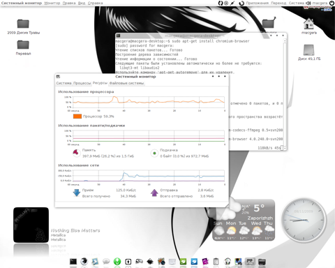
The fact is that my laptop, not for work which, but for life, lives under the control of Ubuntu. I like the Gnome environment and I like Ubuntu Unity. But. As always, a small but . I always customize, like most, the interface for myself. But actually what I find convenient for myself.

In this case, the starting point, the counting of coordinates begins on the right. Well, what you do not Arab approach?

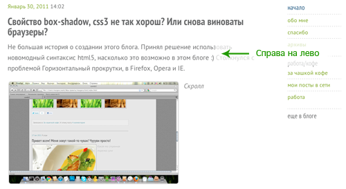
Guided by exactly the same logic, I made the navigation menu in my blog on the right.

I explained it to myself quite simply. I prefer the menu, and the other controls are on the right because I am right-handed, and somehow intuitively I perceive better when the same menu or sidebar is on the right. But what about site content, sidebars and other things ... this is a separate topic for conversation. If I have enough time, I will raise it later.
But as for page navigation, I'm still convinced that paging with the vector from right to left is a mistake. Or just an unreasonable way to stand out some designers. But then again my opinion, maybe it is different with the opinions of other people. Although I do not think that the developers of the same, Chrome, Firefox, Opera, Safari (this is the simplest example, browsers are used by everyone) were mistaken for the vector direction values.
Actually the topic topic is vectors, directions for submitting information. Perhaps I am not right in expressing myself, and it is necessary to call it in other words, but I think my thought will be clear to you.
Navigation: menus, pagers
I, like many people, are a person of habit. I used to be so right and so comfortable. But there are also obvious things that go against what is right. I am talking about contradictions. On many news sites and blogs, we see page-by-page navigation (paging). And they seem to be used to the same direction. Right? From left to right. It is this vector that has been driven into us since childhood as Right . And on most sites I see exactly this vector. We meet it everywhere, in office programs, in file browsers, and in Internet browsers.
')

We see the vector precisely from left to right , and at the same time, left is automatically associated with the action back. Because in front, and therefore the direction of the vector, it is to the right. In programs, for example, the same code editors, this is cancellation. We perceive this vector as correct. He is explained to us unconsciously. Because even in speech, for example, as they say about family betrayal - to the left ; fake documents - left documents ; so it’s got that all is negative, to the left I mean if you don’t exaggerate. Cancel, Back, Not correct. Our vector, I repeat - from left to right
But sometimes I meet things that are incomprehensible to me. Honestly, personally, my brain is confused when I see such things, I cannot explain them to myself. But the most disgusting thing is that many usability experts think that this is so true! Or I do not understand the logic of these specialists or something is really wrong with their logic.

Such a vector confuses me instantly. The mouse pointer moves to the right corner to click on the button / link further but no! Uncle is free, all on the other hand. The first thing that comes to mind: the designer is Arab, they have the same inversion in writing. But then I immediately caught myself thinking that the same thing could be said about me. Not much by another example.
Controls on the right (not in page navigation)
The fact is that my laptop, not for work which, but for life, lives under the control of Ubuntu. I like the Gnome environment and I like Ubuntu Unity. But. As always, a small but . I always customize, like most, the interface for myself. But actually what I find convenient for myself.

In this case, the starting point, the counting of coordinates begins on the right. Well, what you do not Arab approach?

Guided by exactly the same logic, I made the navigation menu in my blog on the right.

In custody
I explained it to myself quite simply. I prefer the menu, and the other controls are on the right because I am right-handed, and somehow intuitively I perceive better when the same menu or sidebar is on the right. But what about site content, sidebars and other things ... this is a separate topic for conversation. If I have enough time, I will raise it later.
But as for page navigation, I'm still convinced that paging with the vector from right to left is a mistake. Or just an unreasonable way to stand out some designers. But then again my opinion, maybe it is different with the opinions of other people. Although I do not think that the developers of the same, Chrome, Firefox, Opera, Safari (this is the simplest example, browsers are used by everyone) were mistaken for the vector direction values.
Source: https://habr.com/ru/post/115347/
All Articles