Color film palettes
Surely, many people remember the post Stylish background in 5 minutes , where it was said that you can make a background from any photo, by a few simple transformations. The pictures that were made by the participants of the MovieBarCode project are a bit like stylish backgrounds, but differ in purpose.

The fact is that the presence of various colors in life is necessary to maintain the human nervous system in good shape. There are cases of so-called. “Color starvation” when asthenia symptoms developed during the color poverty of the surrounding landscape and environment (Greek astheneia impotence, weakness) decreased functional capacity of the central nervous system, manifested by deterioration of performance, mental fatigue, deterioration of attention, memory, increased reactivity with irritable weakness ).
')
When watching a movie, you eat color energy for an hour and a half, or even more. Therefore, it is not surprising that a particular work of art is pleasant to you, and your friend doesn’t like it, it may be that it’s not a matter of lack of taste, but of individual energy demand or color starvation. Before watching any film, struggling with color starvation, look for its color palette. For example, in the picture above you see the film "The Matrix".
Children living for a long time in conditions of “color starvation” have intellectual development delays.
Using the methods of the Personal semantic differential, the authors of the color test of relations E.F. Bazhin and A.M. Etkind (1984; 1985) concluded that a person’s color preferences may reflect the objective need of his central nervous system for the energetic effects of color. This is indirectly confirmed by the data from the study of correlations between the various indicators of electroencephalographic research and the color sympathies of the subjects conducted by them. Color effects can exacerbate the vegetative manifestations of stress. So the “color load” using brown, orange and especially yellow noticeably intensifies the nausea present in kinetosis (LA Kitaev-Smyk, 1977).
A quick installation in front of the subject of a bright yellow screen could induce vomiting in the presence of nausea, while, as Kitaev-Smyk notes, the subjects experienced a subjective sensation of “a blow to the stomach”. Conversely, exposure to blue, violet and especially blue color somewhat reduced nausea during kinetosis (sea sickness).
Blue, and to some extent green, justifies its characteristics as relaxing, soothing, and therefore is particularly preferred by people who need to relax and rest. However, prolonged exposure to these colors leads to inhibition and even depression, evoking the impression of something sad and boring.
Red and yellow as stimulating also justify their traditional characteristics of the colors of the “active side”. In these colors, "interested" in the nervous system of a person who is well rested, regained strength, feels the need for intense activity, the manifestation of his energy. Prolonged exposure to these colors can lead to overexcitation, and then to a protective inhibition of the nervous system (Boris Bazyma, monograph Color and Psyche).
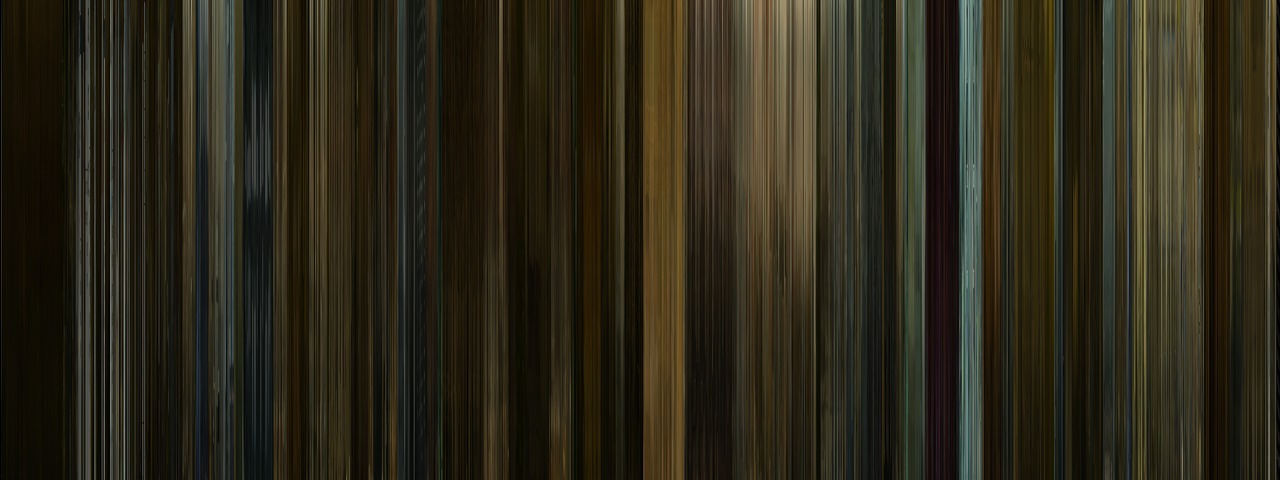
Participants in the MovieBarCode project implemented the idea of generating a movie’s color spectrum by compressing each frame to one pixel and placing them in even columns.
And now the expression "Bright film" or "Gray despondency" can be fully justified.
The only remaining thing is to wait for such “bars” next to the advertisement or description of each film.
Examples:
Requiem for a Dream

Social network
Hero

Start

In order not to complicate the lives of those who have a slow Internet, you can look at the rest of the “bars” on the project website , which is nothing more than a gallery of palettes.
The fact is that the presence of various colors in life is necessary to maintain the human nervous system in good shape. There are cases of so-called. “Color starvation” when asthenia symptoms developed during the color poverty of the surrounding landscape and environment (Greek astheneia impotence, weakness) decreased functional capacity of the central nervous system, manifested by deterioration of performance, mental fatigue, deterioration of attention, memory, increased reactivity with irritable weakness ).
')
When watching a movie, you eat color energy for an hour and a half, or even more. Therefore, it is not surprising that a particular work of art is pleasant to you, and your friend doesn’t like it, it may be that it’s not a matter of lack of taste, but of individual energy demand or color starvation. Before watching any film, struggling with color starvation, look for its color palette. For example, in the picture above you see the film "The Matrix".
Children living for a long time in conditions of “color starvation” have intellectual development delays.
Using the methods of the Personal semantic differential, the authors of the color test of relations E.F. Bazhin and A.M. Etkind (1984; 1985) concluded that a person’s color preferences may reflect the objective need of his central nervous system for the energetic effects of color. This is indirectly confirmed by the data from the study of correlations between the various indicators of electroencephalographic research and the color sympathies of the subjects conducted by them. Color effects can exacerbate the vegetative manifestations of stress. So the “color load” using brown, orange and especially yellow noticeably intensifies the nausea present in kinetosis (LA Kitaev-Smyk, 1977).
A quick installation in front of the subject of a bright yellow screen could induce vomiting in the presence of nausea, while, as Kitaev-Smyk notes, the subjects experienced a subjective sensation of “a blow to the stomach”. Conversely, exposure to blue, violet and especially blue color somewhat reduced nausea during kinetosis (sea sickness).
Blue, and to some extent green, justifies its characteristics as relaxing, soothing, and therefore is particularly preferred by people who need to relax and rest. However, prolonged exposure to these colors leads to inhibition and even depression, evoking the impression of something sad and boring.
Red and yellow as stimulating also justify their traditional characteristics of the colors of the “active side”. In these colors, "interested" in the nervous system of a person who is well rested, regained strength, feels the need for intense activity, the manifestation of his energy. Prolonged exposure to these colors can lead to overexcitation, and then to a protective inhibition of the nervous system (Boris Bazyma, monograph Color and Psyche).
Participants in the MovieBarCode project implemented the idea of generating a movie’s color spectrum by compressing each frame to one pixel and placing them in even columns.
And now the expression "Bright film" or "Gray despondency" can be fully justified.
The only remaining thing is to wait for such “bars” next to the advertisement or description of each film.
Examples:
Requiem for a Dream
Social network
Hero
Start
In order not to complicate the lives of those who have a slow Internet, you can look at the rest of the “bars” on the project website , which is nothing more than a gallery of palettes.
Source: https://habr.com/ru/post/114882/
All Articles