Rebranding of the Nenets Autonomous District
Not long ago, a respected designer and studio of the same name talked about the new corporate identity of the Kaluga region. Have you seen? Who has not seen - can admire here .
 I would like to tell you about our experience in territorial branding. Literally today, it has become possible and it is possible to officially announce the completion of work on the rebranding of the Nenets Autonomous District. The project was made in the agency Notamedia . Perhaps this is one of the first examples of integrated territorial branding in our country.
Work on the new image of the district began with an audit of the existing brand and a number of studies related to the perception and attitude to the region by the target groups. Taking into account the priorities and the challenges facing the administration, the concept of a new NAO brand, as the North European storeroom of Russia, was developed. Such a definition of the region emphasizes its northern (as opposed to the Komi Republic) and European (as opposed to the Yamalo-Nenets Autonomous Okrug) situation, the presence of large and strategically important reserves and mineral resources (unlike all competing regions).
')
According to the developers, a new brand should differentiate the NAO in relation to its competitors, facilitate the influx of new residents and investments.
Before the rebranding, the symbolism of the Nenets Autonomous District consisted of traditional heraldic symbols - the coat of arms and the flag. To more effectively convey the characteristics of the new brand, a logo of the region was developed, based on the priority areas of the administration’s work - people, deer, fish, oil. They were visualized in the form of icons, the style of which preserves the continuity of heraldic symbols and national patterns.
Color marking with various shades of blue reflects the characteristics of the territory: low temperature, water, sky, snow, northern lights. The color of each square corresponds to the depicted sign: the blue color of the sky - with the icon of the national dwelling (people), gray - deer horns, greenish aquamarine - fish and seafood, the darkest blue as possible - oil.
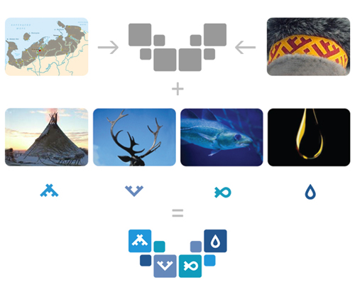
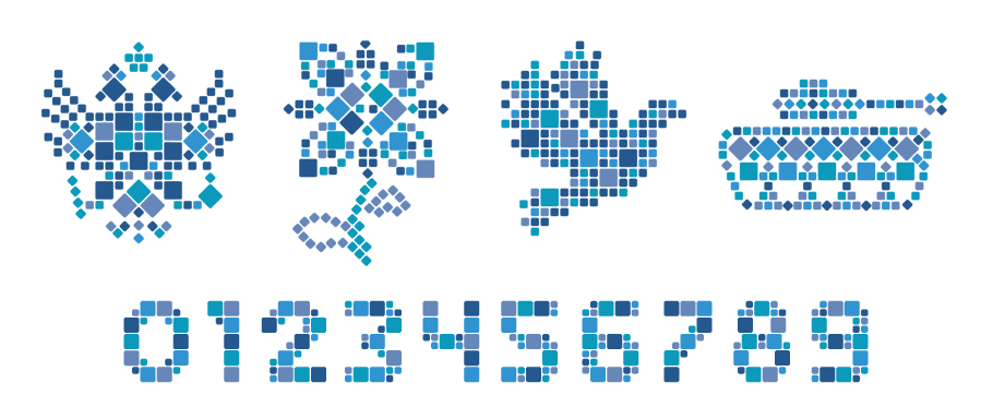
The shape of the logo at the same time resembles the territory of the district, the national pattern, antlers of a deer, a flying bird. Logo elements are a kind of designer. Of these, you can lay out any form in the form of a mosaic with the required information message.
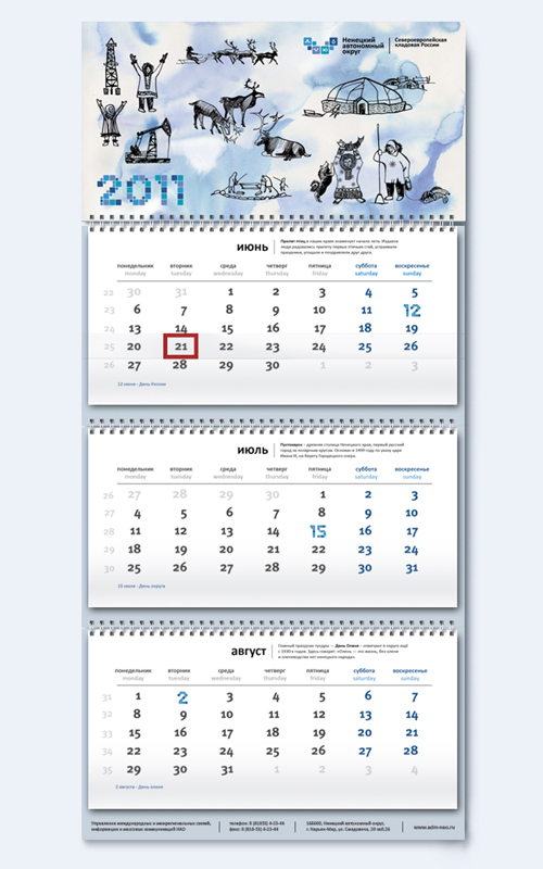
Based on this logo, a set of corporate identity for the region was developed, which includes a set of postcards for all official holidays, a personal invitation, a wall calendar, envelopes and a congratulatory address.


The project also developed a strategy to promote the region and the interaction of its brand with all the main target groups. The main audience for the brand is investors. An investment passport and a catalog of investment proposals of the district were compiled for them. This information served as the basis for a new website of investment proposals of the Nenets Autonomous District (the site will open in the very near future)
As a result, the Administration of the Nenets Autonomous District received a brand book containing a description of the brand concept and its platform, a guideline on the logo and corporate identity, as well as a description of the brand development strategy.
Since the work was completed, too little time has passed to sum up any results. But now we can talk about the appearance on the map of Russia of the region with an expressive corporate identity; region, which will actively fight for "oil" dollars with the Yamalo-Nenets and Khanty-Mansi Autonomous Area.
I would like to tell you about our experience in territorial branding. Literally today, it has become possible and it is possible to officially announce the completion of work on the rebranding of the Nenets Autonomous District. The project was made in the agency Notamedia . Perhaps this is one of the first examples of integrated territorial branding in our country.Work on the new image of the district began with an audit of the existing brand and a number of studies related to the perception and attitude to the region by the target groups. Taking into account the priorities and the challenges facing the administration, the concept of a new NAO brand, as the North European storeroom of Russia, was developed. Such a definition of the region emphasizes its northern (as opposed to the Komi Republic) and European (as opposed to the Yamalo-Nenets Autonomous Okrug) situation, the presence of large and strategically important reserves and mineral resources (unlike all competing regions).
')
According to the developers, a new brand should differentiate the NAO in relation to its competitors, facilitate the influx of new residents and investments.
Before the rebranding, the symbolism of the Nenets Autonomous District consisted of traditional heraldic symbols - the coat of arms and the flag. To more effectively convey the characteristics of the new brand, a logo of the region was developed, based on the priority areas of the administration’s work - people, deer, fish, oil. They were visualized in the form of icons, the style of which preserves the continuity of heraldic symbols and national patterns.
Color marking with various shades of blue reflects the characteristics of the territory: low temperature, water, sky, snow, northern lights. The color of each square corresponds to the depicted sign: the blue color of the sky - with the icon of the national dwelling (people), gray - deer horns, greenish aquamarine - fish and seafood, the darkest blue as possible - oil.
The shape of the logo at the same time resembles the territory of the district, the national pattern, antlers of a deer, a flying bird. Logo elements are a kind of designer. Of these, you can lay out any form in the form of a mosaic with the required information message.
Based on this logo, a set of corporate identity for the region was developed, which includes a set of postcards for all official holidays, a personal invitation, a wall calendar, envelopes and a congratulatory address.
The project also developed a strategy to promote the region and the interaction of its brand with all the main target groups. The main audience for the brand is investors. An investment passport and a catalog of investment proposals of the district were compiled for them. This information served as the basis for a new website of investment proposals of the Nenets Autonomous District (the site will open in the very near future)
As a result, the Administration of the Nenets Autonomous District received a brand book containing a description of the brand concept and its platform, a guideline on the logo and corporate identity, as well as a description of the brand development strategy.
Since the work was completed, too little time has passed to sum up any results. But now we can talk about the appearance on the map of Russia of the region with an expressive corporate identity; region, which will actively fight for "oil" dollars with the Yamalo-Nenets and Khanty-Mansi Autonomous Area.
Source: https://habr.com/ru/post/114843/
All Articles