Need usability lynch
Denis deniskin Kryuchkov, the creator of Habr, is not a public person. But for our listeners, he will make an exception, and in April he will give them a closed lecture in DigitalOcotber. Want to go? It's simple. Recently, our guys have completed a new practical task: the online ticket booking service has set them the task of creating a new “main” layout. Students received funding, broke into teams and found designers. Now the customer can not choose from two options and requires habr-expertise in design and usability.
Below you will find both options. Two people who gave the most meaningful “lynch” of projects in the comments will be able to attend Kryuchkov’s lecture. Winners he chooses himself. And in order to “lynch” it was more interesting, we publish the remarks of Dmitry Satin (UsabilityLab). At our request, he has already commented on the results of the work.
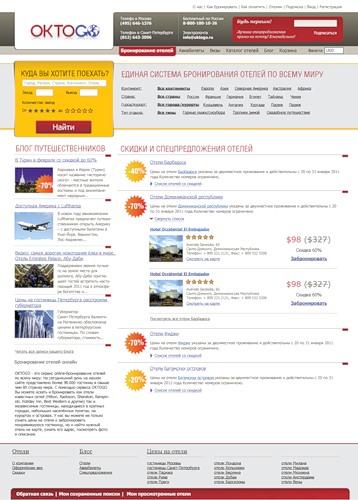
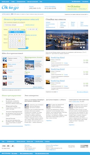
TK: Two teams received the task to create a more intelligible section with information about discounts from hotels, to draw attention to the form of selection of hotels by parameters and to keep people on the site. You can compare screenshots with the current version of OkToGo by going to the service website ( link ). As you can see, in its current form, Oktogo is pretty boring. Eyes do not catch anything. In the block of discounts, repetitive headlines that do not carry specific information. And the “successful” search form is closed by an advertising banner, which follows the “Find” button in form and color.
Option 1
View original
')
Examination of Dmitry Satin. Design "exciting", credibility. Perhaps it's in the fonts and color scheme. Another big plus is the clearly stated positioning of the “Unified Hotel Booking System Worldwide” for those who are on the site for the first time.
The main thing was achieved - the hotel search form attracts attention. It was simplified, made more contrast and balanced. Perhaps because of this, they threw out the calendar icons next to the "Check in" / "Check out" fields. Without this, their function is less clear. This option is designed for a person who knows exactly where he is going. The hotel's search form dominates the entire main field, completely overshadowing the contact area of the company's offices.
The second important element is the discount offer. Asterisks indicating discounts attract attention, and large price signs should be the very call-to-action that will force the user to book a room in this hotel.
Option 2
View original
Examination of Dmitry Satin. Aesthetically looks unfinished. A lot of italics - from the logo to the subtitles, which subconsciously inspires less confidence. But on the other hand, the logos of well-known payment systems, Visa, MasterCard, were very well placed at home. I know them all, they must compensate for the lack of user confidence in the service. Another obvious success: the field with the contacts of the company's offices is clearly visible.
The hotel search form stands out due to its size. It's nice that it has drop-down calendars for the “Check in” / “Check out” fields. Sadly, the "Find" button does not stand out against the general background of the site. But the form itself, apparently, is not the central object: it is “empty”, especially the right side.
The design is creative and designed to retain the user. The central element is the block for selecting the best hotels in the proposed countries and cities. A banner overlooking the desired city draws attention. Only it is not very clear that the information under it is just the best hotels in this region. Block "Travel Ideas" - an interesting move. If you give a “tip”, people will say: “Yes, I have long dreamed about this variant.” But his neighborhood breaks the unity of the image of the main page, it will simply be difficult for them to get along together.
Below you will find both options. Two people who gave the most meaningful “lynch” of projects in the comments will be able to attend Kryuchkov’s lecture. Winners he chooses himself. And in order to “lynch” it was more interesting, we publish the remarks of Dmitry Satin (UsabilityLab). At our request, he has already commented on the results of the work.
TK: Two teams received the task to create a more intelligible section with information about discounts from hotels, to draw attention to the form of selection of hotels by parameters and to keep people on the site. You can compare screenshots with the current version of OkToGo by going to the service website ( link ). As you can see, in its current form, Oktogo is pretty boring. Eyes do not catch anything. In the block of discounts, repetitive headlines that do not carry specific information. And the “successful” search form is closed by an advertising banner, which follows the “Find” button in form and color.
Option 1
View original
')
Examination of Dmitry Satin. Design "exciting", credibility. Perhaps it's in the fonts and color scheme. Another big plus is the clearly stated positioning of the “Unified Hotel Booking System Worldwide” for those who are on the site for the first time.
The main thing was achieved - the hotel search form attracts attention. It was simplified, made more contrast and balanced. Perhaps because of this, they threw out the calendar icons next to the "Check in" / "Check out" fields. Without this, their function is less clear. This option is designed for a person who knows exactly where he is going. The hotel's search form dominates the entire main field, completely overshadowing the contact area of the company's offices.
The second important element is the discount offer. Asterisks indicating discounts attract attention, and large price signs should be the very call-to-action that will force the user to book a room in this hotel.
Option 2
View original
Examination of Dmitry Satin. Aesthetically looks unfinished. A lot of italics - from the logo to the subtitles, which subconsciously inspires less confidence. But on the other hand, the logos of well-known payment systems, Visa, MasterCard, were very well placed at home. I know them all, they must compensate for the lack of user confidence in the service. Another obvious success: the field with the contacts of the company's offices is clearly visible.
The hotel search form stands out due to its size. It's nice that it has drop-down calendars for the “Check in” / “Check out” fields. Sadly, the "Find" button does not stand out against the general background of the site. But the form itself, apparently, is not the central object: it is “empty”, especially the right side.
The design is creative and designed to retain the user. The central element is the block for selecting the best hotels in the proposed countries and cities. A banner overlooking the desired city draws attention. Only it is not very clear that the information under it is just the best hotels in this region. Block "Travel Ideas" - an interesting move. If you give a “tip”, people will say: “Yes, I have long dreamed about this variant.” But his neighborhood breaks the unity of the image of the main page, it will simply be difficult for them to get along together.
Source: https://habr.com/ru/post/114833/
All Articles