How to create an effective design for preview sites in Google
According to Google, search engine users are 5% happier after introducing a new tool - Google Instant Preview, which allows you to see a screenshot (about 300px image) of the home page before it opens.
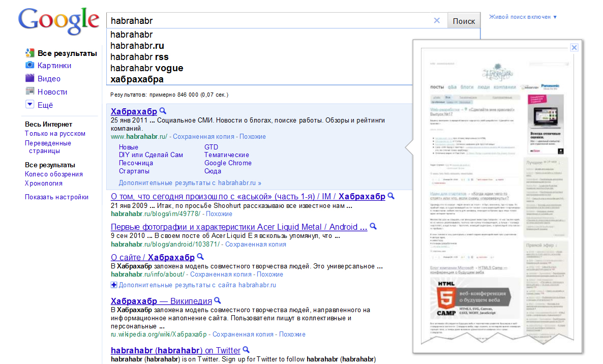
The Internet audience will now easily decide which resource to open, and which not, depending on what they see. I suppose that many people already use this convenient function both in the west (where Google is all) and in Russia. The only question is how this will affect the work of designers and web developers in the future when creating websites?
')
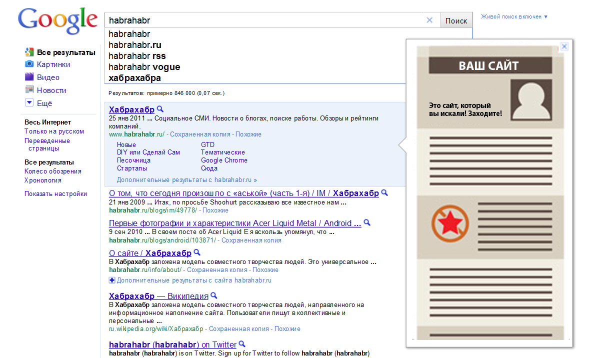
Here are some tips given by Western guru Ivan Raszl about what to consider when optimizing a site for Google Instant Preview.
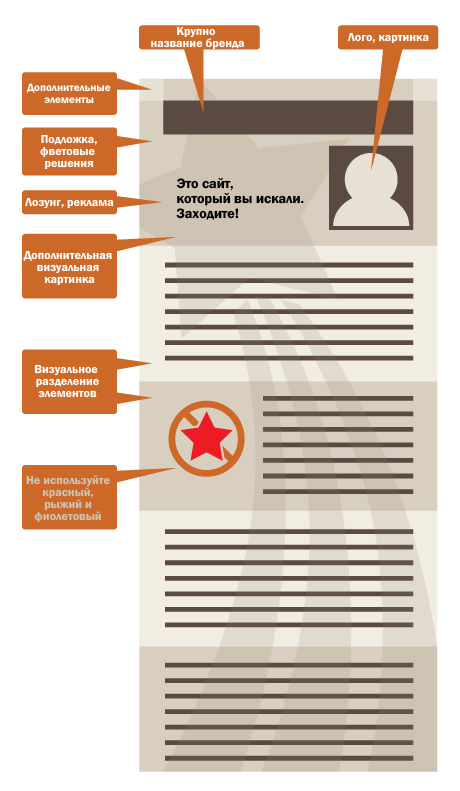
1. Use a fairly large brand logo at the top of the page. This is necessary so that people at least remember your brand, even if they do not click on the link.
2. Make sure that the structure of the site is simple enough to look comfortable for use and navigation.
3. Use colorful illustrations in the upper half of the page (before scrolling). It attracts attention and increases the number of clicks.
4. If you can, include a symbol that would explain what your site is about and invite people to enter it.
5. Make sure the site looks decent, even if the main page is visible as a single column. The visual separation of content by the color substrate will work in this case in the best possible way. For example, an alternate color background for blog posts (on the site) will create a contrast effect.
6. It is unfortunate when the image of the site in Google Instant Preview contains empty spaces on the sides, which visually narrows it. On the contrary, it will be natural if you fill the page with graphic elements that have free space between. From this preview will look bigger and tidier.
7. Use underlays that look contrast compared to the white Google search page. Light warm shades will look most advantageous against the white and blue color scheme of the search engine.
8. You will most likely want to experiment with design elements that are invisible when opening a website in a browser, but remember that in Google Instant Preview it can trigger unexpected system messages.
9. Please note that your design elements with red, purple or orange colors can lose in quality compared to other shades. The reason for this is the problem of displaying all compressed pictures in jpeg online.
I would like to know your opinion, colleagues. If you have the opportunity to add to what has been said, please write. I think the experience with Google will always be relevant.
The Internet audience will now easily decide which resource to open, and which not, depending on what they see. I suppose that many people already use this convenient function both in the west (where Google is all) and in Russia. The only question is how this will affect the work of designers and web developers in the future when creating websites?
')
Here are some tips given by Western guru Ivan Raszl about what to consider when optimizing a site for Google Instant Preview.
1. Use a fairly large brand logo at the top of the page. This is necessary so that people at least remember your brand, even if they do not click on the link.
2. Make sure that the structure of the site is simple enough to look comfortable for use and navigation.
3. Use colorful illustrations in the upper half of the page (before scrolling). It attracts attention and increases the number of clicks.
4. If you can, include a symbol that would explain what your site is about and invite people to enter it.
5. Make sure the site looks decent, even if the main page is visible as a single column. The visual separation of content by the color substrate will work in this case in the best possible way. For example, an alternate color background for blog posts (on the site) will create a contrast effect.
6. It is unfortunate when the image of the site in Google Instant Preview contains empty spaces on the sides, which visually narrows it. On the contrary, it will be natural if you fill the page with graphic elements that have free space between. From this preview will look bigger and tidier.
7. Use underlays that look contrast compared to the white Google search page. Light warm shades will look most advantageous against the white and blue color scheme of the search engine.
8. You will most likely want to experiment with design elements that are invisible when opening a website in a browser, but remember that in Google Instant Preview it can trigger unexpected system messages.
9. Please note that your design elements with red, purple or orange colors can lose in quality compared to other shades. The reason for this is the problem of displaying all compressed pictures in jpeg online.
I would like to know your opinion, colleagues. If you have the opportunity to add to what has been said, please write. I think the experience with Google will always be relevant.
Source: https://habr.com/ru/post/113974/
All Articles