Ubuntu Cyrillic Font
Probably you are familiar with the font Ubuntu from Canonical.

I like it very much with its personality and rounded shapes, it is nice to see it in the menu, on web pages or simply in the text. But from the moment of its appearance I was not satisfied with the too sharp differences between Cyrillic characters and Latin characters. Of course, these are different languages, in Russian letters there are much more right angles and different squiggles, but still I think that the Cyrillic version should be more like the Latin version.
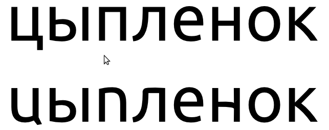
I started with the publication of a new bug report , then the discussion moved to the next one . I think now the moment has come when it is required to speak to a Russian-speaking audience. Those who use this font every day. Let's try to decide together how we would like to see him.
UP: The topic gets a sequel, in the last post, Paul Sladen asks what font style should be by default. The one that users see first. I think this is what users themselves consider appropriate and beautiful. Let's speak out on this.
"For each language, it should be a question,"
I like it very much with its personality and rounded shapes, it is nice to see it in the menu, on web pages or simply in the text. But from the moment of its appearance I was not satisfied with the too sharp differences between Cyrillic characters and Latin characters. Of course, these are different languages, in Russian letters there are much more right angles and different squiggles, but still I think that the Cyrillic version should be more like the Latin version.
I started with the publication of a new bug report , then the discussion moved to the next one . I think now the moment has come when it is required to speak to a Russian-speaking audience. Those who use this font every day. Let's try to decide together how we would like to see him.
UP: The topic gets a sequel, in the last post, Paul Sladen asks what font style should be by default. The one that users see first. I think this is what users themselves consider appropriate and beautiful. Let's speak out on this.
"For each language, it should be a question,"
')
Source: https://habr.com/ru/post/113170/
All Articles