Working with Forms, Lists, and Tabs in Samsung Bada
Good day!
The topic summarizes the basics with code examples illustrating how to work with some user controls and forms on the Samsung Bada platform. An example application with buttons, input fields and labels (Label) is available here . To whom it is interesting - we ask under cat.
')
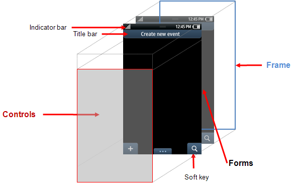
In the Bada documentation, the form refers to the main screen area of the mobile device that the application occupies and is divided into three parts:
The scheme of this (picture from the documentation) is as follows:

Samsung Bada has several types of applications (including those based on Flash), but so far only “form-based” are considered here. How to work with them?
Let's look at the diagram (also from the documentation):
The basis of the Bada application is “Frame” - the main “window” of the application, which can be only one.
"Frame" manages its visual state with the help of forms, which can be as many as you want (or rather, how much smartphone hardware resources will allow). Based on this, the order of working with forms looks like this:
It should be noted that forms in Bada can be created in two ways - either with the help of a GUI designer, or from code. Warm memories of Delphi make me start with the first option.
Having created a “form-based” application (there is quite an obvious master there), you will immediately get some form on which the environment has already placed a button. Add another form and visually fill it with some controls - to do this, in the Resources window of the environment, find the Forms node, right-click on it and in the obvious Insert Wizard select the size of the new form being created. It will appear in the resources as IDF_FORM2 (accurate to a digit). You can change the visual properties of the form in the Properties tab of the development environment; transfer to the form from the GUI-designer and any controls so that the second form is somehow different from the first - the button, for example, or the timer.
Now the code.
In the header file of the form class, we will add an inclusion (include) to the project <FApp.h> in order to have the ability to work with the Application object and through it influence the “Frame”. Immediately in the protected section add a link to the new form:
Let's go back to the class implementation, find the ActionPerformed method with the event identifier processing template (for details, the link to my first topic for beginners is at the top) and write the following code there:
What is happening there? We get a link to the "Frame" of the application, create a form from the project resources using its name (it could be changed on the Properties tab), then add the form to "Frame", make it current and show it.
Now we start the simulator, click on the button and see the new “second” form you created (as if everything is obvious here, it seems, therefore I will allow myself not to attach screenshots). In the form shown, you can set the current first form (using SetCurrentForm) and thus go back.
The second version of the form creation is “software”.
I will cite immediately the code:
The actions that take place here are similar to the previous ones - first we declare and create a form, then we set its visual properties (here we ask that the form has a title, an indicator (a strip with a charge level, etc.), we also want the form to have a softkey and an optional menu), we get a link to the application and add a form to it.
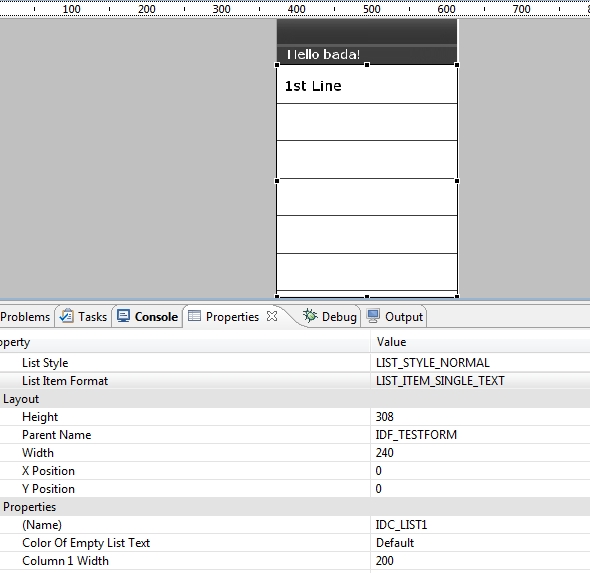
Let's see how to create a simple text list on the form - an extremely simplified version of the phone book, for example. To do this, there is a GUI component with the appropriate name List - it should be placed on the form in some convenient way for you (though it usually takes up the whole form :). Having a list on the form, go to the tab of its properties in the environment and change their values:
We get something like this on the form:
And, in fact, the code that needs to be added to the OnInitializing (void) form initialization method:
The first line is getting the link to the List itself, the next line is adding five elements to the list. The list's AddItem method is declared in the SDK as follows:
- here pText1 and pText2 are a couple of lines, pBitmap1 and pBitmap2 are a couple of pictures and itemId is the identifier of the list item if you need to handle clicking on it. Here, by the way, there is a certain riddle of the SDK developers - a couple of pText1 and pText2 lines may be needed for the list style called LIST_ITEM_DOUBLE_FULLTEXT_TEXT_IMAGE , which displays two lines and a certain picture, but why pBitmap2 is needed is a question, since no suitable style (which would be displayed two pictures) I did not find. Although, maybe I didn’t understand something else :)
Run the simulator and admire the result:
Of course, if the list items do not fit on the form, then they can be scrolled.
Everything is pretty simple here too. For the form that you want to provide “tabs” in its properties, you must set the Show Tab to one of the desired Text Tab or Icon Tab values (the meaning of the properties is obvious, isn't it?). At the top of the form, there will be an empty space under the “tabs” pages, which we will add “programmatically” to the OnInitializing (void) forms.
Run the simulator and see:

In my opinion, just :) But here it is necessary to make a remark. It is already clear that “tabs” can have not only textual, but also graphic headlines, and at the same time 3 textual and 4 graphic “taba” can be seen on the screen. If there are more, then a cue is displayed next to it (“cue” - in terms of the SDK), making it possible to understand that “tabs” can be scrolled.
Thanks for attention! I hope this topic will help someone if there is a need to work for Bada. Good luck;)
The topic summarizes the basics with code examples illustrating how to work with some user controls and forms on the Samsung Bada platform. An example application with buttons, input fields and labels (Label) is available here . To whom it is interesting - we ask under cat.
Forms
')
In the Bada documentation, the form refers to the main screen area of the mobile device that the application occupies and is divided into three parts:
- Indicator area (Indicator area) - designed for system functions that display its current state, as well as signal level, charge, etc.
- Client area (Client area) - the main part of the screen, designed to display the graphical component of the application.
- Command area (Command area) - the lower part of the screen, designed for soft buttons (Softkey) and the optional menu (Option menu)
The scheme of this (picture from the documentation) is as follows:
Samsung Bada has several types of applications (including those based on Flash), but so far only “form-based” are considered here. How to work with them?
Let's look at the diagram (also from the documentation):
The basis of the Bada application is “Frame” - the main “window” of the application, which can be only one.
"Frame" manages its visual state with the help of forms, which can be as many as you want (or rather, how much smartphone hardware resources will allow). Based on this, the order of working with forms looks like this:
- We get a link to the Frame to be able to add a form to it and display it.
- Actually, we create the form
- Attach to Frame, if necessary, make it current and “ask us to draw”
It should be noted that forms in Bada can be created in two ways - either with the help of a GUI designer, or from code. Warm memories of Delphi make me start with the first option.
Having created a “form-based” application (there is quite an obvious master there), you will immediately get some form on which the environment has already placed a button. Add another form and visually fill it with some controls - to do this, in the Resources window of the environment, find the Forms node, right-click on it and in the obvious Insert Wizard select the size of the new form being created. It will appear in the resources as IDF_FORM2 (accurate to a digit). You can change the visual properties of the form in the Properties tab of the development environment; transfer to the form from the GUI-designer and any controls so that the second form is somehow different from the first - the button, for example, or the timer.
Now the code.
In the header file of the form class, we will add an inclusion (include) to the project <FApp.h> in order to have the ability to work with the Application object and through it influence the “Frame”. Immediately in the protected section add a link to the new form:
Osp::Ui::Controls::Form *__newForm; Let's go back to the class implementation, find the ActionPerformed method with the event identifier processing template (for details, the link to my first topic for beginners is at the top) and write the following code there:
switch(actionId) { case ID_BUTTON_OK: { Frame *pFrame = Application::GetInstance()->GetAppFrame()->GetFrame(); __newForm = new Form(); __newForm->Construct(L"IDF_FORM1"); pFrame->AddControl(*__newForm); pFrame->SetCurrentForm(*__newForm); __newForm->Draw(); __newForm->Show(); } break; default: break; } What is happening there? We get a link to the "Frame" of the application, create a form from the project resources using its name (it could be changed on the Properties tab), then add the form to "Frame", make it current and show it.
Now we start the simulator, click on the button and see the new “second” form you created (as if everything is obvious here, it seems, therefore I will allow myself not to attach screenshots). In the form shown, you can set the current first form (using SetCurrentForm) and thus go back.
The second version of the form creation is “software”.
I will cite immediately the code:
Form* pForm = new Form(); pForm->Construct(FORM_STYLE_TITLE | FORM_STYLE_INDICATOR | FORM_STYLE_SOFTKEY_0 | FORM_STYLE_OPTIONKEY); Frame *pFrame = Application::GetInstance()->GetAppFrame()->GetFrame(); pFrame->AddControl(*pForm); pForm->Draw(); pForm->Show(); The actions that take place here are similar to the previous ones - first we declare and create a form, then we set its visual properties (here we ask that the form has a title, an indicator (a strip with a charge level, etc.), we also want the form to have a softkey and an optional menu), we get a link to the application and add a form to it.
Lists
Let's see how to create a simple text list on the form - an extremely simplified version of the phone book, for example. To do this, there is a GUI component with the appropriate name List - it should be placed on the form in some convenient way for you (though it usually takes up the whole form :). Having a list on the form, go to the tab of its properties in the environment and change their values:
- List Style on LIST_STYLE_NORMAL, letting the system know that we want to see a “regular” list, not numerical or with radio buttons (however, it is quite possible to experiment here)
- List Item Format on LIST_ITEM_SINGLE_TEXT, this will lead to the creation of a simple list, without pictures
- Column1 Width is an obvious property, I set it to 200, that is, the width of the form
- Row 1 Height is a not less obvious property, I have it equal to 50, so that the list item is not too “fat”
We get something like this on the form:
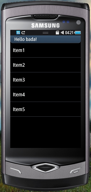
And, in fact, the code that needs to be added to the OnInitializing (void) form initialization method:
// , __pSimpleList = static_cast<List *>(GetControl(L"IDC_LIST1")); // __pSimpleList->AddItem(&String("Item1"), null, null, null, 0); __pSimpleList->AddItem(&String("Item2"), null, null, null, 1); __pSimpleList->AddItem(&String("Item3"), null, null, null, 2); __pSimpleList->AddItem(&String("Item4"), null, null, null, 3); __pSimpleList->AddItem(&String("Item5"), null, null, null, 4); The first line is getting the link to the List itself, the next line is adding five elements to the list. The list's AddItem method is declared in the SDK as follows:
result Osp::Ui::Controls::List::AddItem ( const Osp::Base::String * pText1, const Osp::Base::String * pText2, const Osp::Graphics::Bitmap * pBitmap1, const Osp::Graphics::Bitmap * pBitmap2, int itemId = 0 ) - here pText1 and pText2 are a couple of lines, pBitmap1 and pBitmap2 are a couple of pictures and itemId is the identifier of the list item if you need to handle clicking on it. Here, by the way, there is a certain riddle of the SDK developers - a couple of pText1 and pText2 lines may be needed for the list style called LIST_ITEM_DOUBLE_FULLTEXT_TEXT_IMAGE , which displays two lines and a certain picture, but why pBitmap2 is needed is a question, since no suitable style (which would be displayed two pictures) I did not find. Although, maybe I didn’t understand something else :)
Run the simulator and admire the result:
Of course, if the list items do not fit on the form, then they can be scrolled.
"Tabs"
Everything is pretty simple here too. For the form that you want to provide “tabs” in its properties, you must set the Show Tab to one of the desired Text Tab or Icon Tab values (the meaning of the properties is obvious, isn't it?). At the top of the form, there will be an empty space under the “tabs” pages, which we will add “programmatically” to the OnInitializing (void) forms.
// "" Tab* pTab = GetTab(); // , - "" pTab->AddItem(L"1st", 0); pTab->AddItem(L"2nd", 1); pTab->AddItem(L"3d", 2); Run the simulator and see:
In my opinion, just :) But here it is necessary to make a remark. It is already clear that “tabs” can have not only textual, but also graphic headlines, and at the same time 3 textual and 4 graphic “taba” can be seen on the screen. If there are more, then a cue is displayed next to it (“cue” - in terms of the SDK), making it possible to understand that “tabs” can be scrolled.
Thanks for attention! I hope this topic will help someone if there is a need to work for Bada. Good luck;)
Source: https://habr.com/ru/post/112781/
All Articles