The future of web standards

Jeffrey Zeldman predicts an exciting era in web design
Contrary to the general opinion, the phrase “Web 2.0” was not coined by Tim O'Reilly, and from the very beginning it did not mean that these are web applications, such as Facebook.com or Twitter.com, which enable people (not professionals on the Internet ) share information online.
More than a decade ago, Darcy Di Nucci (born Darcy DiNucci) predicted: “The Internet, which we know today and load into the browser as a static screen, is only the germ of the future Web. We see only the first glimpses of Web 2.0 and just begin to monitor its development. The Internet will imply not only texts and graphics, but also a transportation mechanism - some kind of broadcast on which concerted actions take place. The web will appear on computer screens, on TV, on the dashboard of a car, on a mobile phone, in games, and perhaps even in a microwave oven. ”- Darcy Di Nucci (1999),“ The Future Is Broken. ”
Translation: Randall Roffe *
Translation sponsor: Aiken Studio
For the first time, the phrase “Web 2.0” was used in the sense that we now call the “ ubiquitous computer ”, and the marketing specialists - “convergence at one point” or convergence.
As always, from the point of view of the futurists, based on the assessment and understanding of past events, some statements by Darcy DiNucci are naive and several of her predictions have not been fulfilled.
')
Of course, your TV has not yet become the center of entry into the Internet, unless you believe that downloaded episodes of your favorite TV shows from the Internet is the highest level of consistency of your TV with other systems via the Network.
But Di Nucci accurately predicted mobile phones, because the ubiquity of CSS3 and HTML5-compatible high-resolution smartphones and equipped with WebKit make significant changes in our lives.
Convergence
Inexpensive, versatile devices like the iPhone and Droid appeared at the moment when HTML5, CSS3 and web fonts were ready for use; when standards-based Internet development was not of the lowest rank; and when it became not enough for web designers just to draw up images on the screen, and they began to create provocative, multi-platform solutions. Is this the dawn of a new, more mature and ubiquitous World Wide Web?
In a word - yes. After the deceptive dot-com boom and its failure, aggressive advertising sales in the blogosphere, endless social media flaws, we, the creators of web design, find ourselves at a real inflection point.
With browsers and high reliability devices that support existing standards, and, apparently, with limitless requirements for applications mechanized by this standard, and consumers queuing in the rain to get the newest device before the neighbor does the era of mature standards-based design is ours. The web we grew up with is old-fashioned, like the concept of a “printed photo album” (boys and girls, ask your parents).
Just yesterday, each site was independent, like the Beatles album “Sgt. Pepper's Lonely Hearts Club Band. ” Today, the site is so good, how good is the third-party API, and it’s even much simpler. Yesterday, the sites were for "Internet Explorer Version X" or "Netscape Navigator Version Y". Today, habituation, dependence of users and their feeling of relief during the use of mobile versions of sites and applications for phones under the same sites is vital for owners of Internet resources.
There was a time when the definition of “cool design” was the meaning for “created in Flash”. But after more than a decade in standards-oriented design and with the advent of using non-standard fonts on web pages , we know that (X) HTML, CSS, and JavaScript can create impressive, unusual and beautiful solutions — and, more more likely than Flash technology to be the driving force for the most powerful web applications.
Very successful sites, such as Flickr.com, Twitter.com and Facebook.com, offer portable social solutions - at your desk or on the street. You do not even have to log in to Facebook.com or Twitter.com to view their content or share any third-party content with friends from these sites.
Removing the training wheels
Since our knowledge of standard design reached maturity (ironically, to a greater extent, five years between IE6 and IE7, they gave us time to avoid and understand mistakes and developments, and teach this even to colleagues who are not averse to standards), most of We are becoming more and more interested in user experience and content strategy. This discipline has existed with us for a long time, but only now it is receiving well-deserved attention, thanks to Christine Halvorson (Eng. Kristina Halvorson).
We have become user-oriented and know well how to use all the practical skills of previous years. The emerging standards offer us new incredible features, and modern browsers (for both mobile and desktop platforms) give us a chance to take advantage of these opportunities. I'm talking about convergence!
With consumers buying two smartphones on each PC, the demands, demands and prospects of mobile phones change our assumptions about the design and behavior of users.
So, let's look at this moment of change, and eliminate the misconceptions and half-truths that prevent some of us from using the opportunities provided. To begin, let's look at CSS3. So, CSS3 is the latest, most competent, and most comprehensive version of the standard language for visual design from the World Wide Web Consortium.
CSS3 Media Expressions is a technology that helps create more “responsive web design,” with the emergence of better practices and techniques, as well as a key component of a mature and multi-platform Web. This is just as important as what CSS3 cannot do.
CSS3 is not a monolithic specification (like CSS 2.1), which must be fully implemented before users discuss the safety of its use. Studying during the struggle for the implementation of browsers of past years, W3C wisely chose to design CSS3 as a series of modules that can be developed in part-by-browser.
Clean CSS3: iPhone icons without image
But if the previous W3C specifications looked like a complete site upgrade, which should be “perfect” on launch day, then CSS3 is more like a series of site updates, step by step, presented over months and years. All this in order to give users time to get used to them, and designers and developers - time for their proper understanding and application.
This means that you should not read and remember the entire CSS3 specification at once, and the browser creators should not try to use every part of it immediately, in the way they received bug reports for the past, and as we (the developers) were stuck on the half-ready CSS for years. Think of the old IE blogger with a block model that was more intuitive than the current CSS1 block model, but wrong. HTML designers had to use the well-known trick with the block CSS model from Tantek Celik for almost ten years. Those who refused to use the “hacks” of the principle often changed this model in IE by significantly increasing the amount of code.
Fortunately, we will not have a similar problem, because browser designers are working on the new CSS specification, because the modularity of CSS3 allows browser followers to work on the details one by one, step by step. Thus, we get a thoughtful, consistent implementation of all the nuances in the most recent “Safari”, “Firefox”, and “Opera”.
And since leading web designers are more experimenting with CSS3, browser designers get instant feedback on what works and what doesn't. Sometimes, this feedback returns to the W3C test sample before it is completed, creating a kind of feedback that we have never had before. This is a completely new network of general knowledge, open and accessible, where anyone who has a good idea can read and contribute.
Browser Prefixes
How do browser developers use a technically unfinished CSS3 module, without limiting the designers in the methodology (and the code) that might later become obsolete? Using browser prefixes.
Experimental use of border-radius in Safari (now and in Chrome) has the prefix -webkit-borderradius; Firefox uses -moz-border-radius. Best use: first list the prefix codes, and only then the standard W3C code without prefixes, for example:
.comment {
-webkit-border-radius: 6px;
-moz-border-radius: 6px;
border-radius: 6px;
}
Listing the standard version without the prefixes of the latter, the border-radius parameter should change between this experimental version and the final specification released, and the actual specification will win in browsers that support it - so the old rules will still work for older versions of Firefox and Safari, which support the experimental version.
Like vector graphics in the browser, CSS3 stirs the mind because of its ability to please the eye. Whereas previous versions of CSS required extensive use of background images to create deviations, shadows, and other graphic effects, CSS3 has the ability to create images simply by using code.
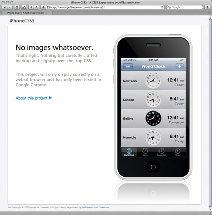
Impressive demo features include iOS icons from Louis Harbaugh and iPhone icons from Jeff Butterton , both fully designed in CSS and viewed only through the latest WebKit browsers Safari 5 and Google Chrome 5.
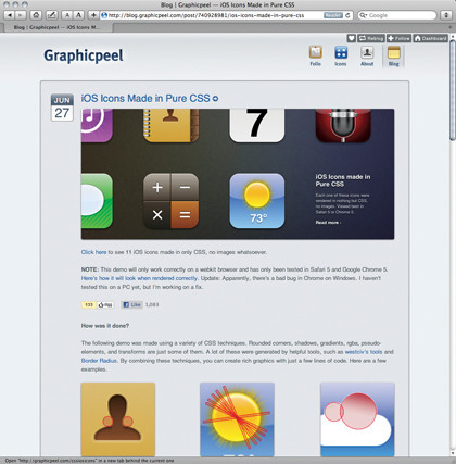
DEMOS WITH DE'MOST: iOS icons created in pure CSS
Now, unless you are already demonstrating your abilities in creating beautiful designs using CSS3, no one recommends writing complex CSS markup as in such demonstration works. But at the same time, there are many practical, real-world applications using the amazing CSS3 artistic abilities.
We are talking about the ability of CSS3 to create smoothly varying saturation of colors, shadows, and other effects, without the need to use background images for this. This makes it an invaluable and effective partner that does not require a wide channel, which makes websites faster. This is important for any site, and especially important for sites viewed on portable devices where the bandwidth speed is as unpredictable as the weather.
Also, CSS3’s special visual styling makes it the most valuable tool for creating layout-dependent resolution. It's like vector graphics in the browser. Add HTML5 canvas and step aside!
The main features of CSS3 that you can use today are: border-radius, text-shadow, box-shadow, RGBA, dullness, and even multiple background images (finally!) That are processed this way:
body {
background: url(top.png) repeat-x top left;
background: url(middle.png) repeat-y bottom right;
background: url(bottom.png) no-repeat bottom right;
}
Typically, the selected CSS3 properties work in the most recent versions of Safari, Chrome, Firefox, and Opera, although some also work in IE9, and some work in older Safari 1.3 and Firefox 2 browsers! Not all of the CSS3 properties listed above work in every browser.
This situation is complicated by the fact that site visitors use different browsers, ranging from IE6 / 7/8, to Chrome and Camino. And does this mean that while someone is arguing, you should say goodbye to CSS3 until IE 10 and Safari 5 are used all over the world? Of course not!
Why use additional visual decorations that are not shown in IE? Ask iPhone users. Apple sold more than 40 million before the end of 2009 — and, at least half, to people who use Windows on their PC at home, and perhaps continue to use outdated IE in the office.
Now they are as familiar with the resolution of “CSS3 WebKit” as they are with “Internet Explorer”, and they do not experience any internal discomfort when switching between the two.
These convenient operating conditions for multiple browsers for consumers also help drown out the voices of those customers who insist that websites should look and act the same in every browser.
And since mobile phones overtake desktop computers, due to their preference for interactive applications, people are now enjoying and expecting a certain amount of visual and typographic brilliance. Now, more than ever, you enjoy using CSS3 and share it with others.
HTML5: it's alive!
Spreading like marijuana at a Phish concert and approaching CSS3 with the wind breeze, HTML5 appears here, albeit in an incomplete form. If you are afraid of HTML5, think about a more lenient version of XHTML 1.0 - where EMBED is finally “valid”, and nobody cares if you forget to close the IMG tag. Of course, HTML5 is more than that. This is the first major upgrade to the Web markup language, and is the only HTML version designed for web applications, not just documents.
In addition, there are different ways to make sausages. In the usual web standards scenario, the W3C committee comes up with the material, giving the creators the right to implement it or not. Ultimately, the creators of the Web accept it or not. But, HTML5 has inverted this paradigm. Browser manufacturers (not W3C) invented HTML5, basing most of it on what designers and developers have already done, and one person (ed. Ian Hickson), not a committee, decides what will happen. HTML5 is in the news not just because Apple uses it as a trident in gladiatorial battles with Adobe, but because it displays the canvas and plays video and audio, and with built-in controls, without any plug-ins.
These new abilities, with their ability to destroy established monopolies, provoke lawsuits. But HTML5 is interesting to you and me for other reasons, including adding its structural semantics to HTML terminology through a limited number of new elements, including article, section, and nav (names taken from Google’s research of millions of web pages to see which class names have already been used web designers; HTML5 doesn't want to reinvent the wheels, he wants to give us better tires).
So, what can you do with these new elements, besides using them to structure modular, reusable content? Can you also choose their style? Safari, Chrome, Firefox, Opera, and IE9 will actually recognize and allow you to style these new HTML5 elements if you include the rule in display: block CSS. In older versions of Internet Explorer, you cannot choose the style of these elements unless you “create” them in JavaScript using the technique that John Rezig (the author of the jQuery JavaScript library) calls “ HTML5 shiv ”.

SHIV SCRIPT: A handy script to automate the creation of code on shivs
To automate writing code on shivs, Remi Sharp (approx. Co-author of one of the best books on HTML 5) created a simple script that allows you to "create" all new HTML5 elements and style them for previous versions of IE (all up to 9.0) . If you are not comfortable using JavaScript for this purpose, you can continue to use standard HTML 4.01 / XHTML 1.0 divs, with styles and corresponding class names, for example, div class = "section". Then, when your users will use WebKit browsers, as well as Firefox, Opera, or IE9 +, you can freely replace
<div class="section"> with <section> ).Now is the right time.
Half the work of creating standards is the details, the second half is politics. Right or wrong, I figured that HTML5 was in part with Hixie's revenge against XHTML , served as text / html.
Then a funny story happened. Friends and I gathered to discuss the pros and cons of HTML5 and the prospects for web designers focused on semantic markup (as opposition to equivalent perspectives of browser engineers and web application developers, two perspectives that primarily controlled the creation of HTML5).
Studying different views on some controversial design solutions, we found markup, designed for easy use by developers, and designed to support developers, because they are the ones who make new generation web applications, desktop or not.
New HTML5 semantics is aimed at real publishing, which is happening more and more through the Web (even ePubs often start as HTML, which means that soon more and more printed books will follow this example).
In the meantime, its new, brilliant and bright parts are forcing entrepreneurs and programmers to abandon their own platforms for the Web - at the very moment when CSS3 breaks old page layout restrictions, and facilitates design that uses flexible grids and CSS3 media expressions for an elegant jump from desktop to mobile phone, and from wide screen to small.
Some people worry that the success of the iPhone and iPad will usher in a new era of “Corporate
management, and Apple plays the role of “Big Brother”, which has just left Microsoft. Of course, we are watching Apple’s tight control over its reserves and limitations, with which you can use software tools to create applications for the iPhone.
But when I see things like iGizmo being swept off the shelves, I see WebKit in people's pockets. I see CSS3 and HTML5 in their hands. I see the Web, which I could only dream of. And I see a lot of fun in the next decade.
* A few words from translators
If in a few words about the author of the article, Jeffrey Zeldman, then this guy really is respected over the hill as a cool web designer, a professional with a capital letter and as a fighter for the standardization of the Web. Zeldman is the author of best-selling Designing With Web Standards (New Riders: 2003), Taking Your Talent to the Web (New Riders: 2001), numerous articles written for A List Apart, Adobe, Creativity, Digital Web, Macworld, PDN-Pix, and other online and paper publications.
We had a hard time with this translation, because Zeldman is still a hippie, he uses so many different turns and incomprehensible words to a Russian person, that, damn it, try to understand what he meant. We had to connect an English (American) language carrier, and then rewrite everything, because it was difficult to understand the essence.
PS This translation does not claim to be the most correct and most read translation of the year (although we expect comments and corrections from you). This is just an attempt to convey to our compatriots and friends the essence of what the future of web design is thinking about and how our “bourgeois” web shop colleagues are going to standardize the development (as a whole) a decade ahead. Our main activity is website creation, not translation of articles. Thank you for understanding.
Source: https://habr.com/ru/post/112601/
All Articles