Exposing font rasterization algorithms (1/2)
An attempt to improve the rasterization algorithms of fonts, using only publicly available information.
The first time I ran into this article was in 2008. Since then, I have repeatedly thought about the translation (as the best material on the topic is not found), and suddenly a link to the original surfaced on Habré in the discussion of the topic "Font smoothing, anti-aliasing, and sub-pixel rendering . " This was the decisive factor (once the material is referred to, it means that someone needs it), and the work was finally completed.
Some terms used have no generally accepted Russian counterparts. I will translate anti-aliasing as anti-aliasing (as Wikipedia thinks, and I tend to agree with it), hinting as hinting (hinting, in my opinion, is not too melodious and not at all common word), and rendering as rasterization (as applied to fonts this term seems to me more appropriate than tracing from English; “drawing” is, in my opinion, a very general concept).
For those who have not previously been interested in the topic of on-screen typography, it will be useful to read the above links before reading the article, and to understand what all these terms mean.
')
The article was published in 2007, and the latest version of Windows, referred to in it - Vista. Nevertheless, most of the article is relevant to this day: in Windows 7, font rasterization mechanisms are not far from Vista, and the tendency to transfer interfaces to the web platform added rasterization differences in different operating systems to rasterization differences in different browsers. So, in my opinion, the ideas given in the article do not lose their relevance until now.
I did not translate the texts in the screenshots: on the one hand, I did not have the technical ability to prepare correct images, on the other hand, the texts on them in no way affect the meaning of the article.
I traditionally try to convert units to metric ones, except for those generally accepted in the Russian IT industry, such as DPI. In addition, I translate the names, but leave the English names of the companies and their products.
I would be grateful for any additions or corrections of the translation. For obvious errors and typos, please write private messages - we will not clutter up comments. Thank.
Joel Spolsky in his article “Font Smoothing and Sub-Pixel Rendering” [1] ( the same article in an earlier translation on Habré , approx. Translation ) compares text rasterization methods in Microsoft and Apple products, and makes a guess why Windows users do not like Safari. He explains this by saying that the text in Safari looks overly blurry. I want to go further and summarize my own experience on this issue. I am not an expert in digital typography, however, I have something to say. At a minimum, some of my ideas can be useful to the GNU / Linux community.
Jeff Atwood in his post "Rasterization of fonts: stick to the grid of pixels" [5] writes:
I would answer this way: as long as Microsoft adheres to its aggressive hinting policy, monitors with a resolution of more than 100 DPI simply do not appear. Through the efforts of Microsoft, we just can’t break out of the vicious circle.
Jeff does not approve the rasterization method used in Apple products. He is not very cute to me either. But maybe Apple’s mission is to bring closer the era of 200 DPI monitors? Well, my bar is even higher, I want 300 DPI. According to my feelings, even 200 DPI is not enough to completely abandon the hinting. However, in this article I will try to highlight Apple’s strategy as well. The article may seem long and boring, but I feel the need to carefully and thoroughly analyze the situation.
To add a little bit of intrigue, I'll look ahead and show you some examples.
Looks blurry? But pay attention to the size of the text. And keep in mind that it remains perfectly readable, smooth and at the same time clear. And at the same time, the shape of the characters is fully preserved (using the “Arial” headset).
Ok, how about this example?
Looks too heavy? No problem, we can make it brighter.
And a couple more examples:

This is a Georgia font. Please note that the shape of the characters in both cases is perfectly preserved, just in the second example, the text is intentionally made more “heavy”.
But it was just a demonstration, this is the main idea of this article: we can refuse to snap to the pixel grid horizontally! From this point on, you can use the horizontal positioning accuracy of the text in 1/256 pixels! You can move the text horizontally to any fractional value, while maintaining the beautiful appearance of the text! This "little thing" really means a lot. How about this:
Sounds like something impossible? Well, here is another example.
Look carefully. Have you noticed anything strange? Each row is shifted to the right by one tenth of a pixel, so that as a result, by the 30th row, the offset smoothly accumulates, and is already three pixels. I think you can imagine what this example would look like if we used the classic snap to the grid of pixels.
If you have no idea, here is an example:
The most amazing thing is that there is nothing fantastically complicated! There is nothing even to patent. All the information that I used is available publicly and / or logically derived from what we know about the currently used font rasterization algorithms. You just need common sense and some engineering flair. So let's go. You can download the demo program with all the sources at the end of this article and play with it, but first, please show some patience to read this rather long story to the end.
I'll start with a pretty hard statement. Microsoft played a cruel joke with the rest of the world. The way to rasterize fonts in Windows XP is a bad taste with a complete lack of engineering culture. The text in XP looks clear and attractive, but it is completely wrong.
A little test. Imagine that we have one line of text typed in a Times New Roman headset and printed in high resolution (say, exactly 1000 DPI). This line takes on paper 87% of a given distance (suppose, 12.7 cm). Now we need to get a proportional image in low resolution, say, in 100 DPI so that our 12.7 cm corresponds to exactly 500 pixels. Is there a way in Windows to display text that occupies exactly 87% of 500 pixels? Not! This is evident from the screenshots below. They are removed with Windows XP, “Display properties -> Options -> Advanced -> General -> Scale (dots per inch) -> Special settings ...”.

They ( Microsoft. Approx. Transl. ) Sacrificed the honor of engineers for the sake of money, which led to a lack of technical progress ( in increasing the resolution of monitors, approx. Transl. ) For many years. They use excessively aggressive hinting, which not only distorts the shape of the characters, but also accumulates a significant error ( in horizontal coordinates, approx. Transl. ) Throughout the entire line. As a result, fonts cannot be considered freely scalable, they only look scalable, but in reality this is not the case. This fact has affected the computer monitors industry. Can you imagine Windows XP on a monitor with a resolution of 600 DPI? Say 8000x6000 pixels? I can not, and not only because of the raster pictograms, but mainly because of the terrible scaling of the text. If you change the resolution in the properties of the screen, some dialog boxes in programs will inevitably be displayed incorrectly. Accordingly, what is the motivation to produce high-resolution monitors?
You might argue that software designers should take into account different font sizes. I would agree with you if it were not for one small detail. Creating 100% correct dialog boxes is monstrously tedious. In Windows Vista, free scaling is implemented much better, but the situation has already developed, and it will take a long time before it is corrected. In other words, we cannot freely scale dialog boxes.
Some time ago I worked for Johnson & Johnson (hi Dimitris Agrafiotis and other colleagues) and I had to design complex dialog boxes for the .Net WinForms platform. By default, something like "Tahoma, 10pt" was used for any static or editable text. But I constantly had to worry about some extra free space at the end of each line of text, because after changing the resolution, the text did not regularly fit into the allotted space, and it was absolutely impossible to use forms. So if you are worried about proportional scaling, you have to arrange your forms in a terrible way, leaving a large amount of free space in reserve. Another way is to tightly bind the size of the text to the pixels. That is, use something like “Tahoma 14px” ( note, px, not pt. Comment. Transl. ). It means a lot. This means that your software can not be used at high resolutions. No matter how well Windows Vista supports text scaling: anyway, trouble has already happened. There is a huge amount of software that relies on a fixed resolution and this does not allow monitor manufacturers to develop high-resolution screens. There is no motivation! You should not blame me and many other software developers and designers. Blame Microsoft for their brutal hinting, which leads to unpredictable creeping of text on graphic elements.
Yes, in Windows Vista using WPF, everything becomes freely scalable. It's a good news. The bad news is that you still can't use high resolutions. The problems are described in detail by Long Zeng and Jim Matthews:
Long Zheng, Windows Vista DPI scaling: my vista is bigger than your vista.
www.istartedsomething.com/20061211/vista-dpi-scaling
Jim Mathies, XP Style DPI Scaling.
www.mathies.com/weblog/?p=908
In Microsoft Word, which is built on the principle of WYSIWYG, it is important to preserve the correctness of the markup at any resolution. This means that the markup must be freely scalable, and it is truly scalable. But let me do a little investigation. Below is the text as it looks in Microsoft Word from the Office 2003 package. It makes no sense to read this text, just take a look at it.

And compare with how it looks in Adobe Acrobat Reader:
You can better feel the difference if you download both images and switch between them in some program that supports the slideshow (I use nice and free IrfanView ). The text in Adobe Acrobat looks more evenly, besides, it is much closer to what we see on the printer. The text in MS Word looks clearer, but in general it is uglier. Why? Because of the kerning curve. It looks like they refuse to kerning at all at low resolutions (and 96 DPI is very little). Snapping glyphs to pixels ultimately results in randomly scattered spaces that look just awful. There is only one way to make the text look better - use horizontal sub-pixel positioning. This is a physical law closely related to the Kotelnikov theorem (in the English-language literature, the Nyquist – Shannon theorem or the reading theorem), which says:
In our case, the signal spectrum we mean the sampling rate. In practice, this means that you cannot correctly display a set of vertical lines at the same time clearly and at equal intervals as long as the intervals are multiples of pixels. Either the distance between the lines will jump, or some lines will look blurry. There is no other choice, period.
Pierre Arnaud demonstrated this in a more understandable way :
Yes, they are. This is exactly what is happening in Microsoft Word.

Thus, Microsoft does not allow sub-pixel positioning, while Adobe does. This means that the same glyphs in different positions can produce different actual displays on the screen. This is clearly visible in the word “institutions”, marked with a red box in the examples above.

Take a look at the Adobe's glyphs “i”, “n”, “s”, “t”. There are at least two different versions of their display in different positions. That is why the text in Adobe looks more uniform, but at the same time more blurred.
Now, if you type the same word “institutions” in WordPad, the result will be different (and it will look much better). So why does he look so bad in MS Word? Only because of visual inaccuracies in positioning. The TextOut () function, which, apparently, is used in WordPad, does not care about it, but MS Word is forced (in order to maintain the correct markup when scaling, approx. Transl. ). I’m not sure one hundred percent, but I can assume that the MS Word developers are calculating the displacement of the glyphs at high resolutions with non-sorted glyphs. There is only one way to do this, using the documented Win32 API, to call GetGlyphOutline () with a greatly increased affinity matrix so that the resulting glyph fits into a rectangle of 1024x1024 or so. Direct use of this technique gives exactly the same result as TextOut (). It looks good, but it accumulates a tangible error throughout a line of text (larger than the size of one character over just one word!).
In the case of dialog boxes, it seems to me, they decided that it was acceptable not to keep the exact width of the text. Why? Because otherwise, captions, menus, dialog boxes and the like would not look so tempting. There would be the same problem with randomly scattered kerning, which would obviously harm the sales of their software. So, nice and sharp text in dialog boxes contributes to business, but accumulates significant inaccuracy in the width of text, which makes it impossible to change the size of dialog boxes, and this, in turn, forces manufacturers to produce monitors with 96 DPI - as a result we have a vicious circle which eventually turned into a great profanation.
From a purely engineering point of view, there should be a reasonable compromise between text clarity and functionality. The problem is that Microsoft has focused on the glamorous design, while completely ignoring the functional part. Paradox: at a resolution of 300 DPI you don’t need hinting at all, besides, the text becomes freely scalable (and at a resolution of 600 DPI and higher you don’t even need anti-aliasing), but you cannot use your software at 300 DPI because calculated at best at 100 DPI! Here is the price that the whole world pays for glamorous design. This price is too high, just incredibly high.
Despite this, another 5 (five!) Years ago it was technically possible to have freely scalable forms and dialog boxes. All we needed was to allow a certain degree of blur, very small, not as high as in Mac OS X. Rather, as in Adobe products. Windows users do not like Safari for too vague output. I partially agree with them, with the exception of blind denial of any other rasterization methods, except those used in Windows. This is just reckless fanaticism. It is like saying “I don’t care about resolution, let Windows look like I’m used to, even at 96 DPI forever, even if you need to stop technical progress.” Can such a view be considered reasonable?
I am not agitating in favor of Apple, since I, too, am not happy with the rasterization of Apple. In my opinion, it really looks overly blurred. It seems that they use something like an auto quoting algorithm, which blurs horizontal strokes, but in fact does not provide any advantages. In fact, their hinting also looks crooked, especially for sans-serif fonts, as if they specifically shifted clear text by 0.2 ... 0.5 pixels. That is why Windows users do not like Safari so much. But at the same time, many of them gladly use the Adobe Acrobat Reader and are satisfied. This is because the text in it looks acceptable (not perfect, but acceptable for Windows fans). At the same time, it remains freely scalable! Just try to load any document and smoothly increase or decrease it. The markup of the text remains correct, and at the same time kerning also. So I would call the Adobe rendering method the best because their trade-off looks very close to optimal.
Jeff Atwood [5] unequivocally speaks in favor of strict binding to the pixel grid. I have my own opinion. I agree to reckon with the pixel grid, but only along the Y axis. For X, it is preferable to use sub-pixel positioning. At the same time, we sacrifice harshness (but only slightly), but we gain complete freedom.
The irony is that Microsoft already has subpixel positioning in hinting glyphs. The funny thing is: it is clearly visible on the pages of Jeff with the font that he uses.
Look carefully: the word “common”, highlighted in red, as well as the letter “m”.

See, the three vertical “m” strokes are different! Despite this, in the original text they look quite clear and attractive. What does it mean? Much. This means that with ClearType it is possible to use positioning with an accuracy of 1/3 pixel. So why do they attach glyphs to pixels ?! I do not understand this. Accuracy of 1/3 pixel would be enough for accurate kerning and at the same time clear text! Well, if I have not convinced you yet, I will demonstrate in details. I took a screenshot of a line of text from Microsoft Word. He looked like this:

Then, using simple software manipulations, I converted the colors to a bitmap that allows three values of each color:
And then I produced the “alpha blending” of this map in the RGB color model, perceiving each color channel as a separate gray pixel. I did this 12 times with an offset of 1 gray pixel, getting 1/3 pixel offset in RGB. See what happened:

But this is subpixel positioning! You can easily verify this: 4 extra pixels have accumulated over 12 lines, while the clarity of the characters has not suffered. Well, the lines are slightly different, but you have to look at them very closely in order to notice this (I note that my eyesight is one and I don’t wear glasses). Believe me, this is a very low price for the freedom of accurate sub-pixel positioning! So it works. It is quite possible. Why don't you use subpixel positioning, dear Microsoft, answer! No answer.

By the way, is there any sub-pixel positioning in Windows Vista? Looks like no. In any case, I could not find a single example where the same glyph would be rasterized into different sets of pixels in different positions. You see, they slightly increased the default font size (for 96 DPI), but, more noticeably, they increased the inter-character spacing so that incorrect positioning was less conspicuous. This is good, but what about more accurate forms of characters? I have to admit that the digital typography situation has not improved much since the release of Vista. And we can hardly expect that it will change in the near future.
Another big question is the name "Microsoft ClearType Font Collection". Why do they call it the ClearType font collection? Is this technology tied to specific fonts? Then, again, this technology gives the impression of a very highly specialized local solution, so it cannot be successfully applied to absolutely any font. Below I will demonstrate how using the FreeType autochinter you can get an honest, universal and font-independent rasterization method. All you need is vector glyph curves. Nothing else.
Jeff, among other things, refers to the documentation for FontFocus [4]. With all due respect, I have to disagree with her.

They align the strokes by pixels, while ignoring the vertical hinting. You see, the characters “T”, “W”, “C” and “g” are very blurred. In addition, the "W" looks heavier than the rest.
In my opinion, it looks pretty careless. The implication is that this is Times New Roman. Seem to be? No, more like a primitive raster font. So what's the point? Wouldn't it be easier once to save the font as a bitmap and use it at low resolutions? What is the point of smoothing if we can afford to distort the shape of the signs?In addition, it seems that the text has “spots”, as if it was written in ink on a soft napkin: most of the strokes are correct, but in some places they are smeared. In any case, the problem is the same: either you refuse the correct markup, or you get a kerning curve.
Here I want to mention Safari again. I can not say with complete certainty, but it seems that Mac OS also does not use subpixel kerning, which ultimately leads to the problems I wrote above, criticizing the approach of Microsoft. The Safari method is much closer to getting the correct markup while maintaining the correct positioning of the characters, but it looks like they are also tightly tying the characters to the pixels, and no matter how blurry the result is. So what is their policy? Specially use rasterization, which (at low resolutions - approx. trans. ) gives a very blurry text, only so that people buy screens with higher resolution? Foul play!
Below you will see how to achieve a pleasant and correct display of the text, and, most interestingly, as a result of very simple manipulations. I used the FreeType [10] library and the GetGlyphOutline () function from the Win32 API. In other words, such a rasterization scheme is possible both in Windows and Linux, and, of course, in Mac OS, in which FreeType also compiles perfectly. In addition, I found out that the FreeType autochinter works quite correctly if you use it the way I did (under normal conditions, the result of its work cannot be called acceptable). But first, I’ll talk about the situation in the Linux world.
Continued ...
From translator
The first time I ran into this article was in 2008. Since then, I have repeatedly thought about the translation (as the best material on the topic is not found), and suddenly a link to the original surfaced on Habré in the discussion of the topic "Font smoothing, anti-aliasing, and sub-pixel rendering . " This was the decisive factor (once the material is referred to, it means that someone needs it), and the work was finally completed.
Some terms used have no generally accepted Russian counterparts. I will translate anti-aliasing as anti-aliasing (as Wikipedia thinks, and I tend to agree with it), hinting as hinting (hinting, in my opinion, is not too melodious and not at all common word), and rendering as rasterization (as applied to fonts this term seems to me more appropriate than tracing from English; “drawing” is, in my opinion, a very general concept).
For those who have not previously been interested in the topic of on-screen typography, it will be useful to read the above links before reading the article, and to understand what all these terms mean.
')
The article was published in 2007, and the latest version of Windows, referred to in it - Vista. Nevertheless, most of the article is relevant to this day: in Windows 7, font rasterization mechanisms are not far from Vista, and the tendency to transfer interfaces to the web platform added rasterization differences in different operating systems to rasterization differences in different browsers. So, in my opinion, the ideas given in the article do not lose their relevance until now.
I did not translate the texts in the screenshots: on the one hand, I did not have the technical ability to prepare correct images, on the other hand, the texts on them in no way affect the meaning of the article.
I traditionally try to convert units to metric ones, except for those generally accepted in the Russian IT industry, such as DPI. In addition, I translate the names, but leave the English names of the companies and their products.
I would be grateful for any additions or corrections of the translation. For obvious errors and typos, please write private messages - we will not clutter up comments. Thank.
Introduction
Joel Spolsky in his article “Font Smoothing and Sub-Pixel Rendering” [1] ( the same article in an earlier translation on Habré , approx. Translation ) compares text rasterization methods in Microsoft and Apple products, and makes a guess why Windows users do not like Safari. He explains this by saying that the text in Safari looks overly blurry. I want to go further and summarize my own experience on this issue. I am not an expert in digital typography, however, I have something to say. At a minimum, some of my ideas can be useful to the GNU / Linux community.
Jeff Atwood in his post "Rasterization of fonts: stick to the grid of pixels" [5] writes:
“I don’t understand why Apple sacrifices the present to the future. Why we can not use hinting at low resolutions, while respecting the accuracy of rasterization at high? Binding fonts to the grid of pixels is likely to be irrelevant when everyone can enjoy a great picture on the screen of his monitor with a resolution of 200 DPI. But as long as this wonderful time has not come, snapping to the grid of pixels uniquely makes the text much more readable for those who live in the present. ”
I would answer this way: as long as Microsoft adheres to its aggressive hinting policy, monitors with a resolution of more than 100 DPI simply do not appear. Through the efforts of Microsoft, we just can’t break out of the vicious circle.
Jeff does not approve the rasterization method used in Apple products. He is not very cute to me either. But maybe Apple’s mission is to bring closer the era of 200 DPI monitors? Well, my bar is even higher, I want 300 DPI. According to my feelings, even 200 DPI is not enough to completely abandon the hinting. However, in this article I will try to highlight Apple’s strategy as well. The article may seem long and boring, but I feel the need to carefully and thoroughly analyze the situation.
To add a little bit of intrigue, I'll look ahead and show you some examples.
Looks blurry? But pay attention to the size of the text. And keep in mind that it remains perfectly readable, smooth and at the same time clear. And at the same time, the shape of the characters is fully preserved (using the “Arial” headset).
Ok, how about this example?
Looks too heavy? No problem, we can make it brighter.
And a couple more examples:
This is a Georgia font. Please note that the shape of the characters in both cases is perfectly preserved, just in the second example, the text is intentionally made more “heavy”.
But it was just a demonstration, this is the main idea of this article: we can refuse to snap to the pixel grid horizontally! From this point on, you can use the horizontal positioning accuracy of the text in 1/256 pixels! You can move the text horizontally to any fractional value, while maintaining the beautiful appearance of the text! This "little thing" really means a lot. How about this:
- You can apply subpixel kerning without worrying about adding an extra blur.
- You can freely scale the text as you like, with an absolute guarantee of preserving the proportions and the absence of text falling outside the boundaries of graphic elements.
- You can be sure that the calculated width of the text will always correspond to the image on the screen and on paper.
- You can apply interesting vector effects, such as “artificial bold” or “artificial italics”, without risking a blurred text.
Sounds like something impossible? Well, here is another example.
Look carefully. Have you noticed anything strange? Each row is shifted to the right by one tenth of a pixel, so that as a result, by the 30th row, the offset smoothly accumulates, and is already three pixels. I think you can imagine what this example would look like if we used the classic snap to the grid of pixels.
If you have no idea, here is an example:
The most amazing thing is that there is nothing fantastically complicated! There is nothing even to patent. All the information that I used is available publicly and / or logically derived from what we know about the currently used font rasterization algorithms. You just need common sense and some engineering flair. So let's go. You can download the demo program with all the sources at the end of this article and play with it, but first, please show some patience to read this rather long story to the end.
Microsoft, Apple, Adobe and FontFocus
I'll start with a pretty hard statement. Microsoft played a cruel joke with the rest of the world. The way to rasterize fonts in Windows XP is a bad taste with a complete lack of engineering culture. The text in XP looks clear and attractive, but it is completely wrong.
A little test. Imagine that we have one line of text typed in a Times New Roman headset and printed in high resolution (say, exactly 1000 DPI). This line takes on paper 87% of a given distance (suppose, 12.7 cm). Now we need to get a proportional image in low resolution, say, in 100 DPI so that our 12.7 cm corresponds to exactly 500 pixels. Is there a way in Windows to display text that occupies exactly 87% of 500 pixels? Not! This is evident from the screenshots below. They are removed with Windows XP, “Display properties -> Options -> Advanced -> General -> Scale (dots per inch) -> Special settings ...”.
They ( Microsoft. Approx. Transl. ) Sacrificed the honor of engineers for the sake of money, which led to a lack of technical progress ( in increasing the resolution of monitors, approx. Transl. ) For many years. They use excessively aggressive hinting, which not only distorts the shape of the characters, but also accumulates a significant error ( in horizontal coordinates, approx. Transl. ) Throughout the entire line. As a result, fonts cannot be considered freely scalable, they only look scalable, but in reality this is not the case. This fact has affected the computer monitors industry. Can you imagine Windows XP on a monitor with a resolution of 600 DPI? Say 8000x6000 pixels? I can not, and not only because of the raster pictograms, but mainly because of the terrible scaling of the text. If you change the resolution in the properties of the screen, some dialog boxes in programs will inevitably be displayed incorrectly. Accordingly, what is the motivation to produce high-resolution monitors?
You might argue that software designers should take into account different font sizes. I would agree with you if it were not for one small detail. Creating 100% correct dialog boxes is monstrously tedious. In Windows Vista, free scaling is implemented much better, but the situation has already developed, and it will take a long time before it is corrected. In other words, we cannot freely scale dialog boxes.
Some time ago I worked for Johnson & Johnson (hi Dimitris Agrafiotis and other colleagues) and I had to design complex dialog boxes for the .Net WinForms platform. By default, something like "Tahoma, 10pt" was used for any static or editable text. But I constantly had to worry about some extra free space at the end of each line of text, because after changing the resolution, the text did not regularly fit into the allotted space, and it was absolutely impossible to use forms. So if you are worried about proportional scaling, you have to arrange your forms in a terrible way, leaving a large amount of free space in reserve. Another way is to tightly bind the size of the text to the pixels. That is, use something like “Tahoma 14px” ( note, px, not pt. Comment. Transl. ). It means a lot. This means that your software can not be used at high resolutions. No matter how well Windows Vista supports text scaling: anyway, trouble has already happened. There is a huge amount of software that relies on a fixed resolution and this does not allow monitor manufacturers to develop high-resolution screens. There is no motivation! You should not blame me and many other software developers and designers. Blame Microsoft for their brutal hinting, which leads to unpredictable creeping of text on graphic elements.
Yes, in Windows Vista using WPF, everything becomes freely scalable. It's a good news. The bad news is that you still can't use high resolutions. The problems are described in detail by Long Zeng and Jim Matthews:
Long Zheng, Windows Vista DPI scaling: my vista is bigger than your vista.
www.istartedsomething.com/20061211/vista-dpi-scaling
Jim Mathies, XP Style DPI Scaling.
www.mathies.com/weblog/?p=908
Microsoft and Adobe: subpixel positioning and kerning
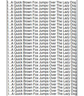
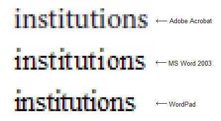
In Microsoft Word, which is built on the principle of WYSIWYG, it is important to preserve the correctness of the markup at any resolution. This means that the markup must be freely scalable, and it is truly scalable. But let me do a little investigation. Below is the text as it looks in Microsoft Word from the Office 2003 package. It makes no sense to read this text, just take a look at it.
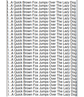
And compare with how it looks in Adobe Acrobat Reader:
You can better feel the difference if you download both images and switch between them in some program that supports the slideshow (I use nice and free IrfanView ). The text in Adobe Acrobat looks more evenly, besides, it is much closer to what we see on the printer. The text in MS Word looks clearer, but in general it is uglier. Why? Because of the kerning curve. It looks like they refuse to kerning at all at low resolutions (and 96 DPI is very little). Snapping glyphs to pixels ultimately results in randomly scattered spaces that look just awful. There is only one way to make the text look better - use horizontal sub-pixel positioning. This is a physical law closely related to the Kotelnikov theorem (in the English-language literature, the Nyquist – Shannon theorem or the reading theorem), which says:
If an analog signal has a limited spectrum, then it can be recovered unambiguously and without loss in its discrete readings taken at a frequency of strictly more than twice the maximum frequency of the spectrum.
In our case, the signal spectrum we mean the sampling rate. In practice, this means that you cannot correctly display a set of vertical lines at the same time clearly and at equal intervals as long as the intervals are multiples of pixels. Either the distance between the lines will jump, or some lines will look blurry. There is no other choice, period.
Pierre Arnaud demonstrated this in a more understandable way :
Suppose you need to display a glyph for the character “i”, which will be exactly 2.4 pixels wide. If you are using hinting, you will most likely get an image 2 pixels wide at the output. Suppose we have a space equal to four pixels.
Now imagine that you need to print "iiiiiiiiii" (glyph "i" 10 times). This will give us the word, which occupies 20 pixels on the screen, but the typographical position should move by 24 pixels. You will have to add 4 pixels to the subsequent space, actually doubling its size. It will look quite strange on the screen. Even worse, the “i” glyph really takes 2.6 pixels, and the hinter decides to stretch it to 3 pixels. In this case, you will occupy 30 pixels on the screen, although the typographical position should have shifted by 26 pixels. In this case, you will get an error of -4 pixels, and compensation for this error will completely eat the subsequent space.
Another attempt might be to position the glyphs “i” rounding their typographical positions. As a result of this approach, we would get the following coordinates along the x axis (in the case of a 2.4-pixel glyph width):x = 0 ----> 0 error = 0 width = 2 x = 2.4 -> 2 error = -0.4 width = 3 x = 4.8 -> 5 error = +0.2 width = 2 x = 7.2 -> 7 error = -0.2 width = 3 x = 9.6 -> 10 error = +0.4 width = 2
The result will be terrible:. *. * .. *. * .. * ............ . *. * .. *. * .. * . *. * .. *. * .. * . *. * .. *. * .. * . *. * .. *. * .. *
You get the idea ... The intervals between the glyphs “i” become variable.
Yes, they are. This is exactly what is happening in Microsoft Word.
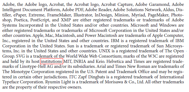
Thus, Microsoft does not allow sub-pixel positioning, while Adobe does. This means that the same glyphs in different positions can produce different actual displays on the screen. This is clearly visible in the word “institutions”, marked with a red box in the examples above.
Take a look at the Adobe's glyphs “i”, “n”, “s”, “t”. There are at least two different versions of their display in different positions. That is why the text in Adobe looks more uniform, but at the same time more blurred.
Now, if you type the same word “institutions” in WordPad, the result will be different (and it will look much better). So why does he look so bad in MS Word? Only because of visual inaccuracies in positioning. The TextOut () function, which, apparently, is used in WordPad, does not care about it, but MS Word is forced (in order to maintain the correct markup when scaling, approx. Transl. ). I’m not sure one hundred percent, but I can assume that the MS Word developers are calculating the displacement of the glyphs at high resolutions with non-sorted glyphs. There is only one way to do this, using the documented Win32 API, to call GetGlyphOutline () with a greatly increased affinity matrix so that the resulting glyph fits into a rectangle of 1024x1024 or so. Direct use of this technique gives exactly the same result as TextOut (). It looks good, but it accumulates a tangible error throughout a line of text (larger than the size of one character over just one word!).
In the case of dialog boxes, it seems to me, they decided that it was acceptable not to keep the exact width of the text. Why? Because otherwise, captions, menus, dialog boxes and the like would not look so tempting. There would be the same problem with randomly scattered kerning, which would obviously harm the sales of their software. So, nice and sharp text in dialog boxes contributes to business, but accumulates significant inaccuracy in the width of text, which makes it impossible to change the size of dialog boxes, and this, in turn, forces manufacturers to produce monitors with 96 DPI - as a result we have a vicious circle which eventually turned into a great profanation.
From a purely engineering point of view, there should be a reasonable compromise between text clarity and functionality. The problem is that Microsoft has focused on the glamorous design, while completely ignoring the functional part. Paradox: at a resolution of 300 DPI you don’t need hinting at all, besides, the text becomes freely scalable (and at a resolution of 600 DPI and higher you don’t even need anti-aliasing), but you cannot use your software at 300 DPI because calculated at best at 100 DPI! Here is the price that the whole world pays for glamorous design. This price is too high, just incredibly high.
Despite this, another 5 (five!) Years ago it was technically possible to have freely scalable forms and dialog boxes. All we needed was to allow a certain degree of blur, very small, not as high as in Mac OS X. Rather, as in Adobe products. Windows users do not like Safari for too vague output. I partially agree with them, with the exception of blind denial of any other rasterization methods, except those used in Windows. This is just reckless fanaticism. It is like saying “I don’t care about resolution, let Windows look like I’m used to, even at 96 DPI forever, even if you need to stop technical progress.” Can such a view be considered reasonable?
I am not agitating in favor of Apple, since I, too, am not happy with the rasterization of Apple. In my opinion, it really looks overly blurred. It seems that they use something like an auto quoting algorithm, which blurs horizontal strokes, but in fact does not provide any advantages. In fact, their hinting also looks crooked, especially for sans-serif fonts, as if they specifically shifted clear text by 0.2 ... 0.5 pixels. That is why Windows users do not like Safari so much. But at the same time, many of them gladly use the Adobe Acrobat Reader and are satisfied. This is because the text in it looks acceptable (not perfect, but acceptable for Windows fans). At the same time, it remains freely scalable! Just try to load any document and smoothly increase or decrease it. The markup of the text remains correct, and at the same time kerning also. So I would call the Adobe rendering method the best because their trade-off looks very close to optimal.
Subpixel positioning with ClearType: is it possible?
Jeff Atwood [5] unequivocally speaks in favor of strict binding to the pixel grid. I have my own opinion. I agree to reckon with the pixel grid, but only along the Y axis. For X, it is preferable to use sub-pixel positioning. At the same time, we sacrifice harshness (but only slightly), but we gain complete freedom.
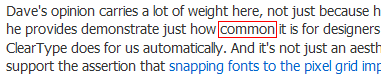
The irony is that Microsoft already has subpixel positioning in hinting glyphs. The funny thing is: it is clearly visible on the pages of Jeff with the font that he uses.
Look carefully: the word “common”, highlighted in red, as well as the letter “m”.
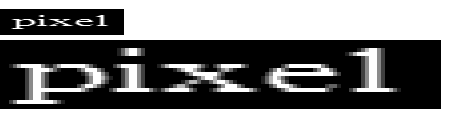
See, the three vertical “m” strokes are different! Despite this, in the original text they look quite clear and attractive. What does it mean? Much. This means that with ClearType it is possible to use positioning with an accuracy of 1/3 pixel. So why do they attach glyphs to pixels ?! I do not understand this. Accuracy of 1/3 pixel would be enough for accurate kerning and at the same time clear text! Well, if I have not convinced you yet, I will demonstrate in details. I took a screenshot of a line of text from Microsoft Word. He looked like this:
Then, using simple software manipulations, I converted the colors to a bitmap that allows three values of each color:
And then I produced the “alpha blending” of this map in the RGB color model, perceiving each color channel as a separate gray pixel. I did this 12 times with an offset of 1 gray pixel, getting 1/3 pixel offset in RGB. See what happened:
But this is subpixel positioning! You can easily verify this: 4 extra pixels have accumulated over 12 lines, while the clarity of the characters has not suffered. Well, the lines are slightly different, but you have to look at them very closely in order to notice this (I note that my eyesight is one and I don’t wear glasses). Believe me, this is a very low price for the freedom of accurate sub-pixel positioning! So it works. It is quite possible. Why don't you use subpixel positioning, dear Microsoft, answer! No answer.
By the way, is there any sub-pixel positioning in Windows Vista? Looks like no. In any case, I could not find a single example where the same glyph would be rasterized into different sets of pixels in different positions. You see, they slightly increased the default font size (for 96 DPI), but, more noticeably, they increased the inter-character spacing so that incorrect positioning was less conspicuous. This is good, but what about more accurate forms of characters? I have to admit that the digital typography situation has not improved much since the release of Vista. And we can hardly expect that it will change in the near future.
Another big question is the name "Microsoft ClearType Font Collection". Why do they call it the ClearType font collection? Is this technology tied to specific fonts? Then, again, this technology gives the impression of a very highly specialized local solution, so it cannot be successfully applied to absolutely any font. Below I will demonstrate how using the FreeType autochinter you can get an honest, universal and font-independent rasterization method. All you need is vector glyph curves. Nothing else.
The way that FontFocus aligns the pixel grid
Jeff, among other things, refers to the documentation for FontFocus [4]. With all due respect, I have to disagree with her.
They align the strokes by pixels, while ignoring the vertical hinting. You see, the characters “T”, “W”, “C” and “g” are very blurred. In addition, the "W" looks heavier than the rest.
In my opinion, it looks pretty careless. The implication is that this is Times New Roman. Seem to be? No, more like a primitive raster font. So what's the point? Wouldn't it be easier once to save the font as a bitmap and use it at low resolutions? What is the point of smoothing if we can afford to distort the shape of the signs?In addition, it seems that the text has “spots”, as if it was written in ink on a soft napkin: most of the strokes are correct, but in some places they are smeared. In any case, the problem is the same: either you refuse the correct markup, or you get a kerning curve.
Here I want to mention Safari again. I can not say with complete certainty, but it seems that Mac OS also does not use subpixel kerning, which ultimately leads to the problems I wrote above, criticizing the approach of Microsoft. The Safari method is much closer to getting the correct markup while maintaining the correct positioning of the characters, but it looks like they are also tightly tying the characters to the pixels, and no matter how blurry the result is. So what is their policy? Specially use rasterization, which (at low resolutions - approx. trans. ) gives a very blurry text, only so that people buy screens with higher resolution? Foul play!
Below you will see how to achieve a pleasant and correct display of the text, and, most interestingly, as a result of very simple manipulations. I used the FreeType [10] library and the GetGlyphOutline () function from the Win32 API. In other words, such a rasterization scheme is possible both in Windows and Linux, and, of course, in Mac OS, in which FreeType also compiles perfectly. In addition, I found out that the FreeType autochinter works quite correctly if you use it the way I did (under normal conditions, the result of its work cannot be called acceptable). But first, I’ll talk about the situation in the Linux world.
Continued ...
Source: https://habr.com/ru/post/112401/
All Articles